Given my experiments with thermal foiling this week, today’s dangle had to be foiled, in gold this time.
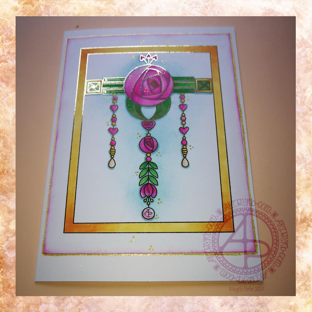
As I enjoyed creating a dangle design inspired by Art Nouveau last week I thought I’d like to do that again this week, and this is the result.
I drew the design digitally, using my usual tools of choice viz. Autodesk Sketchbook Pro, Microsoft Surface Pen and Microsoft Surface Studio.
I coloured the design in using Chameleon Markers. Then I added the blue background with Distress Inks, followed by a pink edge to the card. Not sure pink was the right choice, but it’s ok I suppose.
I mounted the design on an A5 card blank and drew a glittery gold line around it with a Uniball Signo gel pen. I also added some small groups of glittery gold drops to the design.
Overall, I’m quite pleased with this one. I like the combination of the more geometric designs with the more organic motifs.
I didn’t add any hand lettering or a sentiment so it makes it perfect for any occasion or as a note card. It would also make a fantastic page design for a BuJo (bullet journal) or as part of a scrapbook, journal, diary or notebook spread.
If you’d like to try your hand at creating your own dangle design but don’t think you could, well you could find my book ‘A Dangle A Day’ helpful. Not only are well over 100 different monograms and dangle designs included that you can use, but help and advice is given for creating your own, as well as plenty of words of encouragement. I’d love to see your dangle designs too.
I really needed some quiet, creative time this morning. Some time without any pressure on me in terms of requirements from publishers and others. Dangle designs are simple to draw, and there is a soothing quality in simplicity. Colouring is also a very soothing activity and the magic of hot foiling always makes me smile.
I’m feeling a bit below par in terms of my mental and emotional wellbeing. I have a stinking headache, which isn’t helping, and I’m feeling exhausted again. That’s all to do with emotional exhaustion.
Fortunately, I can take time today to just do what I need to do in terms of self-care. I managed to get three and a half out of the four edits for my next coloring book done. I have until Monday to get the other half finished, so that’s definitely do-able, either later today when the headache subsides or tomorrow.
My emotional and mental sea has some smooth waves on it, not stormy, not choppy, just swells that come and go. I may be in a bit of a trough at the moment, but I’ll soon be heading back up to the crest of the gentle swells.
I’ve had some fun today with thermal foiling. I’ve been waiting for an Amazon Basics laminator to arrive, which was the one that seemed to be the most recommended out of simple laminators. I’ve had the foil for quite a while.
For thermal foiling, the images need to be printed with a laser printer. The laminator then heats up the laser toner which becomes sticky and the foil sticks to it as you run the layers through the laminator. A quick cool down, peel the foil away and the black lines are left with foil covering them!
I played around with adding the foil first then adding colour, and coloring first before foiling. I also tried out alcohol markers, coloured pencils and Tombow Dual Brush markers both before and after foiling. They all worked well either way, though the alcohol markers do colour the foil, so for alcohol markers it may be best to colour first.
I then had to try them out on images and I chose to use two of my cute kittie designs. I coloured them with Copic markers before foiling. The one of the left has been foiled with gold, the one on the right with silver.
I mounted the designs on 4″ x 4″ square kraft card card blanks. To be honest, I could’ve done with printing these out a bit bigger as the lines were very bitty as they were so thin. Something I have to keep in mind when printing out future work. I think I’m going to have to design them to the size they’ll be printed at to make sure the lines are as thick as I’d like them.
I’m not a photographer. No matter what advice I’m given and follow I still don’t manage to get a good image. The gold shows up well and there are hints of silver visible on the right hand one, but I think you’ll get the idea.
I’m rather pleased with them and the sparkly, shininess keeps my inner raven quite happy.
I also now have a new tool in my creative tool box, one that I will use fairly often I think.
Emotional and mental wellbeing…
For the first time in ages it seems I feel awake and not needing to go back to bed for a nap in the afternoon. The emotional exhaustion of the recent EMDR, therapy sessions and Time to Change Wales anti-stigma talks is beginning to wear off. Mind you, that may change tomorrow as I have EMDR then rather than today just for this week. All the same, it’s nice to feel content and quite creative.
I’ve started a little book that I’ve titled ‘When it’s dark, look for stars’. It’s an A6 (UK size) sketchbook, and inside I am going to use Distress inks and other media to colour the pages and then add all shiny, metallic hand lettering and images and patterns with quotes and helpful words of advice, reminders for me on my darker days that I am not what the inner critic wants me to believe I am. Of course, my cute, foiled kitty and raven with rainbow and stars is definitely going to make it into the book.
I’m open to suggestions of what I could add to my little book, be it quotes, or kind words, or ideas for self-care. I’d also like to know if you’d like to see glimpses of it from time to time.
New coloring template in the facebook group
A new month means a new coloring template is available for members of the Angela Porter’s Coloring Book Fans facebook group.
This month, I’ve designed a mandala with some of the motifs I’ve been using in my more abstract works lately.
If you fancy printing and coloring a mandala designed by myself, pop over to the group, join and you’ll find the new template and quite a few others there available exclusively to members. Terms and conditions apply.
If you do join in, I’d love to see your finished coloration!
I had a lovely time this morning looking at Arts and Crafts Movement, Rennie Mackintosh and Art Nouveau designs. I’ve always love these styles of art with their organic lines and stylised motifs and it’s certainly influenced my style of art in some little way.
I got inspired as I looked at these styles and decided to use them as a start for my April BuJo page design, which you can see above.
The had lettering is a little heavy handed where the squares are concerned, but over all I’m fairly happy with it.
There’s definitely a touch of the Rennie Mackintosh’s there with the organic motifs and lines contrasted with the graphic squares and diamonds.
I chose warm and sunny yellows with light, fresh greens as they are so dominant in nature this early on in Spring.
A quick sketch on Rhodia Dot Grid paper followed by a scan and I inked it using some of my brushes in Autodesk Sketchbook Pro. Of course I wielded my Microsoft Surface Pen with some happiness on the screen of my Microsoft Surface Studio.
A simple but, I think, and elegant design. One which would look fab for any month in a BuJo (bullet journal), planner, diary, journal or even in a scrapbook. Of course it would make a lovely greetings or note card too. I’m sure there are many more instances of where this design would work beautifully.
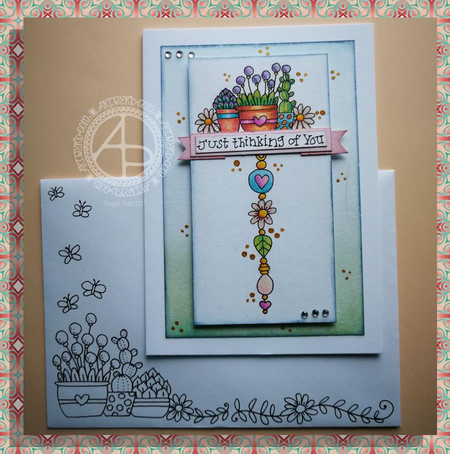
Friday is dangle day! Well, it is for me. I like to finish the working week off with a cute dangle design, and today I chose to do a greetings card or note card with a decorated envelope.
The media I used were :
pencil and ruler
05 Uniball Unipin pen
Copic markers
Kuretake Zig Wink of Stella brush pen
Claire Fontaine mixed media paper
Distress ink and sponge applicator
Kraft card and envelope
Sticky foam squares
Two self-adhesive gems
White Uniball Signo gel pen
As it’s still winter I thought some snowdrops would be appropriate, along with some crocus buds along with an evergreen wreath. Stars and hearts are always favourites of mine to include, as well as some swirls and spirals.
I chose quite cool and pastel colours for the design, along with very simple shading. The Wink of Stella added a little sparkle to the hearts, stars, beads and snowdrops in the design. A couple of self-adhesive gems added a touch of interest to the ribbon banner.
I used faded jeans Distress Ink to edge the paper panel, which I adhered to another slightly larger panel which I found in my stash of Distress Ink coloured papers ready to use. This one was also edged with faded jeans Distress Ink.
I then used Tombow Mono glue to stick the panel to the card blank.
I drew a simple arrangement of snowdrops and buds on the envelope in white ink and added some spirals and swirls to ‘ground’ the pot. I’m not happy with the spirals/swirls though, but it’s only an envelope so if I send this card to someone I can always decorate another envelope!
Replace the wreath with a photo of the recipient and you’d have a lovely, personalised keepsake of a card.
This design would also make a lovely page in a bujo (bullet journal), planner, scrapbook, or journal too.
My hand lettering is a little rusty; I’ve not done much in the past week or so as my focus has been on mandalas and work for my next book.
This little card and envelope took me around 3 hours to make. I had to remember how to do various things and find my supplies to do them with!
My first task was to make the sentiment banner. I had the idea for this one after someone asked me for recommendations of good books for learning hand lettering as they’re not at all happy with their handwriting.
Hand lettering and handwriting are not the same thing. Hand lettering is something you unconsciously do. Hand lettering is the conscious and deliberate drawing of letters, one by one. Practice, like everything else you want to learn and become good enough at, is important. I suggested that they try printing the sentiments out on their computer or using words cut out of books or magazines or stickers or stamps and ink pads used by card makers until they’re comfortable with their own lettering style.
That led me to thinking that rather than writing the sentiment directly onto the paper that I’m going to draw the dangle design on, what about if I hand lettered it on paper again and again until I’m happy with it and then cut that version out. I could then layer it onto coloured card to make a border, or onto the paper or or or…
So, that’s what I wanted to use here. A variation on what I’ve done in previous cards. I cut two trips of mixed media paper, one around 1cm wide, the other around 0.7cm wide.
On the narrow strip I wrote my sentiment. I did this confidently as I knew if I got it wrong I could always write it again – I’d not ruin my dangle design in any way. I then trimmed the strip close to the start and end of the sentiment.
Next, I coloured the wider strip of paper with victorian velvet Distress Ink. I trimmed one piece so it was just a little longer than the sentiment. Then, I cut two rectangles from the coloured strip. I cut triangular notches into one end of each of the rectangles. I used the sponge applicator to make sure the edges of the coloured pieces, including inside the notches, and the sentiment strip coloured. By doing this, there’s a darker edge to the pieces and this defines them against the background. The final step in making the banner was to glue the pieces together as shown in the photo.
I cut two pieces of mixed media paper for the front of the card. The smaller one I made a little narrower than the sentiment banner; I wanted the ribbon to hang over the edge a little. I used a pencil to mark where I wanted the banner to sit on the card. I then used a pencil to mark out the centre of the card so I could position my dangle centrally.
Above where the ribbon would sit I wanted to place an arrangement of pot plants – succulents and a cacti. Below I wanted a fairly simple dangle, but one that had elements that appeared in the arrangement of pot plants. I drew these with a 05 Uniball Unipin Pen.
I then wanted to colour the two pieces of mixed media paper before I coloured the designs in.
For the larger one I used Peacock Feathers, Bundled Sage, Weathered Wood and Tumbled Glass Distress Inks to colour the whole of the paper panel. I edged this panel with Faded Denim Distress Ink. Then, I lightly sprayed the panel with water so that I’d get some faded watermarks as a texture in the colour.
For the upper panel, I used a very light hand to add the same Distress Inks to the paper, but in a much paler shade. I also edged this panel with the Faded Denim Distress Ink. I realised it hadn’t erased the pencil guidelines before I added the Distress Ink so when I went to erase them they wouldn’t fully erase. I’d forgotten that I had to do that! Still, it adds a bit to the distressed feel of the cards, that and the damage marks that were on the larger panel too.
To colour the dangle design I used Mitsubishi Uni coloured pencils. I used a fairly limited palette across the design.
The last two steps before assembling the card were add dots of gold ink and some shiny adhesive crystal gems.
To assemble the card I used glue to adhere the lower panel directly to the card. I then used foam squares to adhere the dangle design panel to the lower panel and the sentiment ribbon to the dangle design panel. This card has quite a bit of dimension to it.
My final job was to decorate the envelope. I decided to draw some pot plants and some of the daisies along the bottom. I added some butterflies to the left as the area above the pot plant seemed empty, unbalance. I haven’t coloured the envelope in as I’m in two minds whether to or not. Also, it would be nice to edge the envelope with the Faded Jeans Distress ink too, maybe even colouring the envelope with the same Distress Inks as the card. There’s also the back flap of the envelope that would benefit from a little potted succulent drawing I think.
Distress Inks are water-reactive, so if I do this, once the envelope is addressed a light application of Micro Glaze would seal the colour in so it wouldn’t be damaged in the mail.
I’m actually quite pleased with this card. It’s got me thinking about how to do more of this kind of stuff – card making the ‘Angela’ way!
If you give making cards like this a go, I’d love to see what you create! Happy art-ing, lettering and crafting!
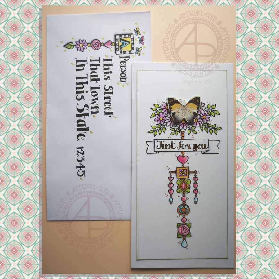
Here’s a pretty pair of whimsical and cute dangle designs card and envelope.
For the focal point of the card I used a butterfly from a pack of Ephemera from Tim Holtz called Botanical. I added some metallic gold ink highlights to the butterfly as I knew I’d be adding gold to the design. I also edged the butterfly with some Peeled Paint Distress Ink using a sponge ink applicator.
I then cut my paper to fit the card blank I wanted to use; I learned my lesson from the the last card I made! The card blank measured 8½” by 4¼”. So, I cut a piece of Claire Fontaine Mixed Media paper 7¾” by 3¾” to create the dangle design on.
I used the butterfly as a guide as to where I wanted to add some flowers upon which it could alight. I also drew pencil guidelines in for the centre of the design and the sentiment banner.
Then it was drawing the design. I used a 05 Unipin pen from Uniball.
I started by drawing the flowers at the top of the design.
Next, it was the hand lettering for the sentiment ‘Just for you’.
Flowers, hearts, stars and spherical and teardrop shaped beads are my goto choices for dangles. I did add a charm that was based on some jewellery, as well as a square charm with a geometric pattern inside it.
When I’d drawn the main dangle I realised I wanted to add a bit of width to it. So, I added two bars stretching out from the side of the square charm and used the ends to hang dangles made up of hearts and beads.
Colouring was the next task. I used Tombow Dual Brush pens to colour the design in. The colour gradients weren’t strong enough for me, so I used Chameleon Duotone Pencils to add depth to the colours.
Then, it was time to attach the butterfly using some foam squares.
I then used a dip ink pen to add some dots of gold FW Pearlescent ink around the design. I also used gold to fill in the lettering of the sentiment and various elements of the dangle design.
Next, I added white dots highlights to some of the design elements using a Sakura Souffle pen.
I also used a blue-grey Chameleon pencil to add shadows to the design at this point.
Before affixing the design to the card blank I used a sponge ink applicator and Peeled Paint Distress Ink to edge the design. That was the card done.
I then thought it would be fun to create an example of an addressed envelope using a dangle design as a monogram. I used some of the charms from the card for this design. I also drew some simple, whimsical butterflies above the monogram. I used Chameleon Duotone Pencils to colour the dangle design and to add a shadow to the dangle.
Pencil guidelines helped me to keep my lettering evenly spaced and of a consistent size. In this case I just guesstimated them, but in future I think I will need to measure the spacing of the lines!
Finally, I added some glittery golden stars with a gold glitter Uniball Gel pen as well as some white dot highlights using a white Sakura Gelly Roll pen.
One thing I realise I didn’t do was to make the colours in the dangle more harmonious with the butterfly. The color tones of the butterfly are quite antique and grungy and I used rather bright, clean colours to colour the design with. I also am not happy with the monogram on the envelope; it’s too small and the lettering style doesn’t seem sympathetic to the rest of the lettering.
I’m going to put these down to me still suffering the lingering effects of the stinking cold I’ve had for the past three days. It’s definitely broken now, but I’m still not 100%.
It’s also a learning experience. I’m not a wonderful card maker; I do dabble in it from time to time, however dangle cards are fun to make and with the decorated envelopes it’s double the fun! I think I need to start sending happy mail to people! I’d be happy to receive this card with a letter inside – how would you feel about it?
Today’s the day! A Dangle A Day is published in the US. Thursday is the day for the UK. It’s my very first tutorial book and the reviews I’ve seen so far are lovely!
Well over 100 dangle designs in the book with step by step instructions for each. Simple steps leading to even quite complex designs. Whimsical, cute charms. Funky monogram dangles. Plenty for each season and most occasions. I’ve also written encouraging words as everyone can draw dangles and they are perfectly imperfect which is what makes them personal and unique!
I’d love to see what dangles you create and how you use them – in your bujo, planner, journal, diary, scrapbook, or as greeting cards, note cards, book marks, gift bags, envelopes, framed art, or any other way you can think of! Tag me on twitter, instagram or facebook!
Naturally, I have a stinking, streaming cold and I feel rough as anything. I don’t think I’ll get much in the way of art done today. Coughing, sneezing, runny eyes and a thumping headache don’t do much for focus.
A couple of days ago I was musing about using a photograph instead of a monogram in a dangle design. That idea stuck with me and so I set out to make a card.
I had seen somewhere the Photobooth Ephemera by Tim Holtz and I was able to source a set at a sensible price. This pack contains thirty strips of three passport-sized, vintage, copyright free photos. Perfect for me as I have very few photos and none are a small enough size to be used in this way. Also, the photos are printed on fairly sturdy card.
I first started by trimming the photo and then tracing around it on a sheet of thick white printer paper. It was then easy to draw pencil lines to give a border or two around the photo as well as a pencil guide line for a central dangle.
My next job was to draw the flowers at the top of the design. I started with the big central blue flower and worked my way out, adding leaves and swirls as I went. The design here is symmetrical, but not perfectly so. I had to add some butterflies to finish this part of the design off.
My next steps involved drawing the borders. I wanted a black and white chequerboard pattern around the photo. I also added a thinner border around it.
My next step was to create a ribbon for the hand lettered sentiment ‘Hello friend’. I drew a pencil box, added some pencil guidelines for the height of the letters, then wrote the greeting in pencil so I could get the placement of the letters good enough.
My next step was to ink in the letters using a black Sakura Pigma PN pen, which I used for the rest of the drawing. I wasn’t concerned about perfection here. I wanted a kind of cutely whimsical feel to the lettering. For some reason, I always think adding wonky and uneven serifs to the letters helps a little with this. The final job was to draw the ribbon box with the cute ends.
I then needed to decide on the charms I’d use to build the dangle. Hearts are a foregone conclusion. When I think of time I spend with friends, tea and cake are often involved, so adding a coffee/tea cup along with a cupcake (or fairy cake as we used to call them here in the UK) was perfect. I joined the charms with small beads and a circular charm containing another heart.
To colour the dangle design I used copic markers. I did use two shades of pink for the greeting and the cupcake case. Everywhere else I used just one flat colour.
I used a fine brush and some black ink to fill in the square at the centre of the design. Next, I trimmed the paper around the design. I then used a foam ink applicator with Vintage Photo Distress Ink to edge the paper. I always feel that edging paper in this way not only gives a little bit of a vintage feel to it, which is in keeping with the photo, but it also gives a finished edge to the paper.
To mount the photo here I used some adhesive foam squares. These lift the photo above the paper, adding a little bit of dimension to the card. The photo was a little bit smaller than the square I’d drawn and so the black background gave black border around the photo. I then used a golden yellow copic marker to colour some clear adhesive gems and I attached three of them to the photo, just to add a bit more sparkle.
I used Chameleon duotone pencils to add shadow to the design elements. I also used a dip pen and gold FW ink to add some little dots here and there around the design as well as on the photo. Not sure that on the photo was such a great idea though. But once the dots were there, they had to stay there. The gold dots, however, did match the gold gems I’d added to the photo.
The final step was to affix the design to a blank card. I didn’t think to cut my paper to the size of blank cards I had in my stash before I started to work on the dangle design. I found that my design was too long. So, I just took a piece of A4 bristol board, folded it in half along the short edge. I burnished the fold and then attached the dangle design to the paper using strong double sided sticky tape.
To add a bit more dimension to the card, I could’ve used foam squares or a piece of fun foam cut to a little smaller than the paper the design is on. Fun foam would support the paper better, especially as I had a relatively weighty photo adhered to the paper already.
Instead of foam, I could’ve cut a piece of metallic card a little bigger than the design to give a metallic edge to it.
I decided, though, that there was enough dimension on the card with the photo.
I also could have used a Wink of Stella brush pen or a Spectrum Noir sparkle pen to add some shimmer to the design elements, but I decided that the gold dots were enough. However, I may go back and add some to the butterfly wings; butterflies should always shimmer and shine wherever possible as far as I’m concerned!
The only other thing I’d need to do is to make a custom envelope to fit the card.
I enjoyed making the card. My card making skills aren’t brilliant, but I kept it fairly simple, as I did for the dangle design itself and the colouring.
Oh, the patterned background for the photo is one I created from one of my mandala designs using Repper Pro, just in case you were curious! I thought it’s vintage feel would go nicely with the card.
On the whole, I’m quite happy with this card. I had serious doubts that it wouldn’t work out. It has, better than I thought it would. I think I need to make more of these in the future!
It’s Friday so it’s #dangleday. Today, I wanted to share a Christmas Dangle with you from my book ‘A Dangle A Day’. In the book I show how this design was drawn, step by step.
When I created this design, I first drew it in pencil on dot grid paper. The next step for me was to scan it in to the computer and then re-draw it step-by-step, saving each step as I went. For the book, the final step was to colour the design and then write the instructions to go with the images. My tools for this were a Microsoft Surface Book, a Microsoft Surface Pen and Autodesk Sketchbook Pro.
I wanted to include as many Christmas-themed charms to create the dangles as I could and still keep the design balanced. I also kept the length of the dangles uneven. The waviness in the ends of the dangles echoes the waviness of the fairy lights above the hand lettered word ‘Christmas’.
What I did this morning was to print the black and white line art design on an A4 sheet of paper. Then I used Chameleon Duo Tones and Color Tops markers to colour it in.
These pens make it easy to create gradations of colour, such as on the hand lettering. These gradations add ‘dimension’ to the charms and dangles. I keep the darker shades to the left and bottom of the designs so that there’s a consistency across the whole image. I also used a pale grey marker to add drop shadows to the left and bottom of the design elements; again this helps to add dimension to the design.
Finally, I added some highlights with a white Sakura Gelly Roll pen. I also added some sparkles around the fairy lights and individual stars with a gold glitter Uniball Signo gel pen. After all, it wouldn’t be Christmas without some sparkle!
Used individually with a monogram or Christmassy image the dangles would make lovely book marks. Printed at A5 in size, the design would make a fabulous BuJo page for the big day itself. It would also make a lovely design for greetings cards or note cards.
Of course, it would be easy to change the word at the top to, perhaps, Winter or Yule and use fewer dangles to suit the length of the word. Personally, I like to use an odd number of dangles wherever possible – it gives a more balanced design.
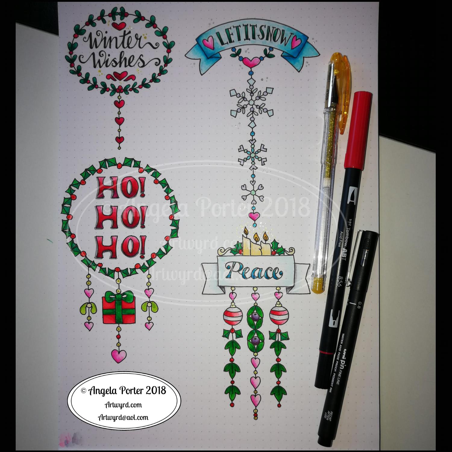
I did use some circle, oval and hexagon templates to help me design the wreaths and snowflakes. The dot grid paper helped me draw mostly straight lines for the dangles.
I did sketch them in pencil first before inking them in with a Uniball Unipin pen. Colouring was done with various Tombow dual brush pen markers and some sparkly elements added with Uniball signo sparkle gel pens.
These would look lovely as greetings cards. In fact, I’m thinking of redrawing them digitally and using them to make my own christmas cards this year. Printing out the black line work and then colouring them with traditional media. In the past couple of years I’ve designed my christmas/winter/yule cards digitally and had them printed professionally. This year, I think I’ll do it the way I suggest in my book ‘A Dangle A Day’.
They’d also look great as note cards or as pages in a BuJo, planner, scrapboook or journal. They’d lend themselves to cute bookmarks too.
These relatively simple and small dangle designs are perfect for practicing hand lettering too. And in these four dangles I’ve used four different lettering styles.
I’ve also kept the finished designs simple by not adding any drop shadows, except around the ‘HO! HO! HO!’. Not only that, a lot of the colouring is very simple too.
I do hope you’ll have a go at designing your own, maybe using these as a bit of a guide. If you do, I’d love to see what you’ve created.