Moth WIP

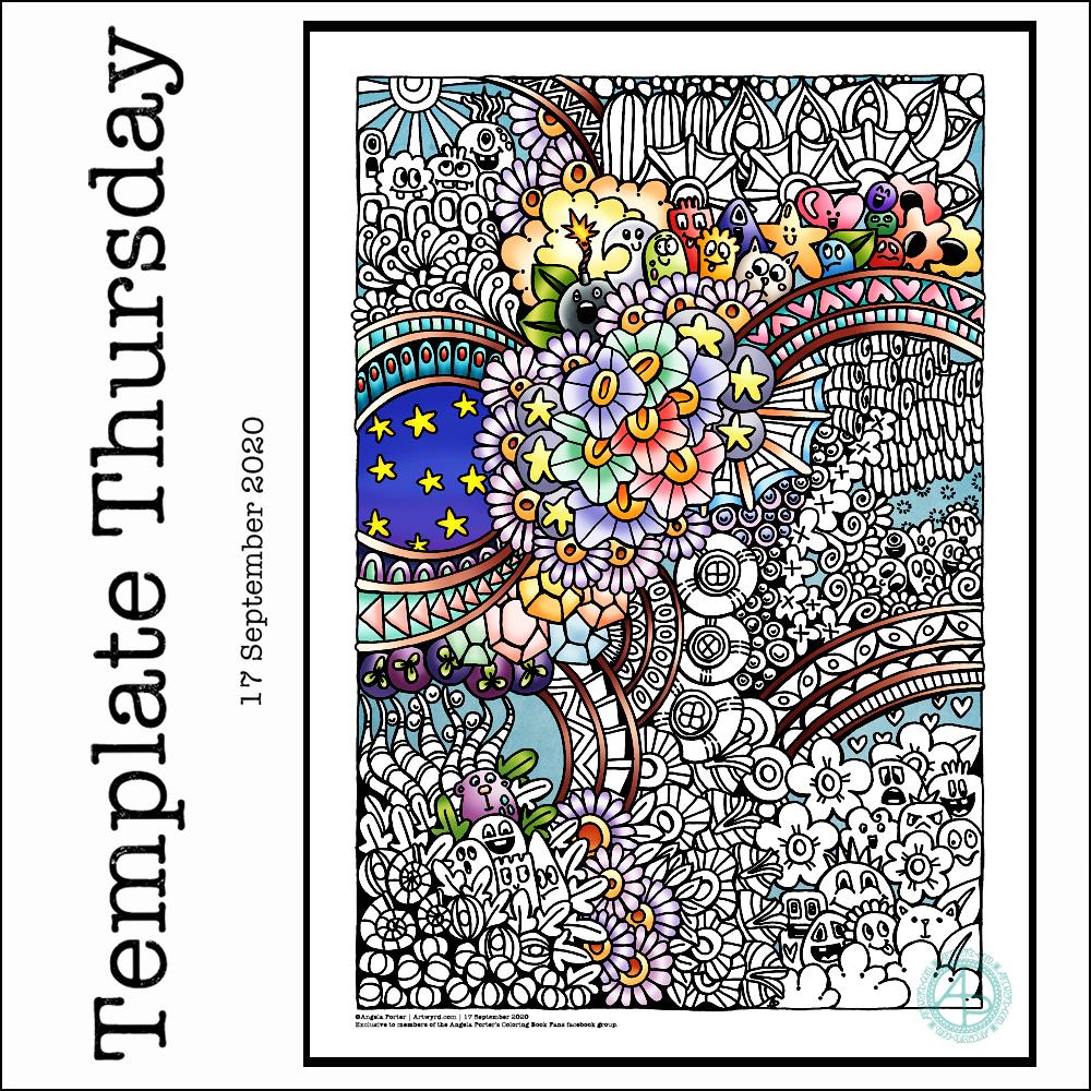
This morning, I wanted to start a new entangled drawing. But what to draw? I wasn’t in the mood to do another monogram, especially as there are some ideas on the periphery of my conscious mind about monograms. I thought about drawing a skull, something I find interesting, but that didn’t feel right either. But the idea of a moth flittered into my mind, so that’s what I went with.

I drew the moth digitally, in Autodesk Sketchbook Pro, simply because I wasn’t quite sure how my pen work would work on a moth, and I also like to use the symmetry tool. I’m fairly happy with the results. I started to add my entangled style motifs around the moth, and came up against two issues.

The first issue was that I would lose the detail around the head and antennae and I needed to come up with a way to preserve that. I came up with the idea of a simple circular border below the moth. This will also give me the option of adding colour to the central circle when I’ve finished the artwork.

The second was more of a problem – the sense of proportion. I have no idea why it’s so hard for me to work digitally on entangled drawings like this with a proper sense of proportion compared to the main motif or the printed size.

It has to do, I think, with the ability to zoom in to draw small details, which results in me adding too much detail. The only solution was for me to print the moth and circular border out and then for me to draw on that.

The only thing I wasn’t happy about in doing this is that I have a laser printer. That affects the surface of the paper in a way that my Unipin pens don’t like it. Also, I can’t print on marker paper.

So, I’ve started to add entangled artwork to the design. I can now see that leaving edges of the upper wings white would help them to stand out. That is something I can adjust digitally when the design is finished.

I feel so much happier working on the printed image. I do need to consider changing my printer, however. Though the laser printer is quick and economical, the print quality of line art isn’t the best. There’s also the issue of the way the surface of the paper is changed once it’s been printed on. I shall think on this in the coming weeks and before the toner needs replacing.

Template Thursday

Thursday means it’s Template Thursday for members of the Angela Porter’s Coloring Book Fans facebook group.

This week I have a mix of my entangled art along with some cute, whimsical, doodle-characters. Something fun, light hearted to lift the spirits somewhat.

I used a 05 Uniball Unipin pen to draw this design on Marker paper. I added some colour with Autodesk Sketchbook Pro.

As always, the weekly templates I draw throughout the pandemic are available from the facebook group to members of the group. They are free to members, and it’s free to join!

Blue Entangled Mandala

I have been awake since stupid o’clock, so rather than toss and turn for hours I decided to do some art. And another mandala appeared from the tip of my pen.

For this one, I thought I’d make the ‘white space’ areas in the design transparent so that the vibrant blue background could show through.

I’m not sure how well this works; I’m now too tired to think clearly. I do think it has potential for future mandalas, maybe.

Entangled Drawing

Dimensions : 8cm x 8.5cm (3¼” x 3¾”)
Smooth cartridge paper (acid free)
Uniball Unipin pens (05 and 01)
Digital editing and colour in Autodesk Sketchbook Pro

I drew this little drawing yesterday, but spent some time this morning scanning, cleaning and adding colour and shading digitally.

I deliberately left some ‘white space’ so I could fill it with colour. This contrasts rather well with the graphic black and white entangled art design. The coloured background adds depth to the image, and the subtle shading by grey and textural lines adds volume to the design elements and layers.

I often think I struggle with colour, unless I use a limited palette. This is a way to make use of colour in a way that adds interest to the design without detracting from the line work.

Monogram “a”

I got this monogram finished yesterday evening. I think I may have been a bit heavy handed with shading in some places. However, overall I like it and I like the volume or dimension that the shading adds.

I definitely enjoy working in such a detailed, intricate and organically intuitive kind of way. Having the monogram as a design to work around does help quite a bit.

On a kind of related point, I had a new A5 dot grid notebook delivered yesterday so I can start to make a collection of motifs and patterns as I use them or create them. The idea is I can winnow out those that I never/rarely use. The reason for this is that the dot grid notebook I’ve kept as a visual dictionary for the last couple of years is just about full! I will keep it as a reference, but it’s time to start a new, more relevant one I think.

I have a snazzy, teal coloured notebook, covered in vegan faux-leather. It has 218 numbered white pages that are a tad thicker than the usual dot grid notebook pages, The paper is velvety smooth and a pleasure to write/draw on. It’s made by Wordsworth & Black and I came across it on Amazon. Oh, the ink doesn’t feather, bleed through or ghost on the pages. I paid £15 for it and I’m very happy with it so far.

Slowtember Prompt list

This morning I needed a quiet, slow, simple time with some arty stuff.

Firstly, I get so frustrated working in a bound sketchbook. The binding always gets in my way even though I like the paper. I much prefer working on loose sheets of paper. I want to keep a sketchbook, or series of sketchbooks. So, the pennies dropped that I needed to put together a discbound sketchbook filled with acid-free cartridge paper and bristol board, and other papers I may wish to draw on.

Yes, I know I’ve got a disc bound sketchbook filled with papers coloured in many ways to draw on. But, my recent forays into art, the realisation that black and white line art is my favourite way of working, needed a solution too.

So, after a while of sorting out such a discbound sketchbook, I thought I’d like a cover page for the Slowtember part of my this sketchbook. It gave me a chance to practice some hand lettering, and to mess around with Tombow Dual Brush markers.

I also added drawings for pancake plant, the prompt for days 10 to 12 which I missed out and went straight to rubber plant!

I suspect that by the end of the month I will have a visual reference for leaves of these indoor plants.

Naturally, I messed up the numbers for the dates for each prompt. My hand lettering isn’t wonderful, nor are the leaves around the title. Let’s not mention the colouring. However, it will do; after all it is a sketchbook page not a finished, polished piece of art. That means no pressure on myself to get it perfect, or as near as I’m happy with. It’s about trying things out and if they don’t work then it’s an opportunity to reflect and learn more about my skills and artistic voice. It’s also a chance to use media that I wouldn’t normally use, and possibly to remind myself why I don’t usually use them as well!

#Slowtember – Days 2, 3 & 4

Yesterday afternoon and this morning I’ve spent time catching up with #Slowtember by @megaelod on twitter. Here’s the sketchbook page I created for the prompts monstera (Swiss Cheese Plant), areca palm and rubber plant.

I took the opportunity to practice my hand drawn typography / hand lettering, as well as my use of line to add volume to a line drawing.

I’m not the best with colour, or with traditional media to add colour, but I think I’ve done OK with some of these. I like the simple washes of gradient colours in the areca and rubber plant leaves. The line work is nice, but the colour brings it to life. The monstera leaf done in coloured pencils works well as far as a sense of volume goes, but I’m not the best with coloured pencils, even using blending solution.

I even found some microscopic images of cells from monstera and rubber plant leaves and stems. So, I just had to do quick drawings of patterns from these, with some imaginary colour added to them.

It’s nice to do this challenge. It’s not as full on and intense as Inktober is, and even if I fall behind there’s not so much to catch up with. It’s also nice to work in a sketchbook (or digitally) as there’s no pressure to complete a finished piece of work. I like how I’ve left some of my drawings partly coloured so I can compare how colour adds (or not) to the design.

When I’m looking at my page and writing about it I always have ideas about how I could’ve approached an idea, or get new ideas. Time for me to go and jot them down before I forget them!

Template Thursday

How are you all doing? Fine and well I trust.

Another week has passed us by during the global pandemic, so it’s time for another coloring template for members of the Angela Porter’s Coloring Book Fans facebook group.

This week I chose to create a mandala, which I’ve partly coloured in fiery autumnal colours. Looking at it now, I can see where I’ve used colours that are too similar so that the layers are a little lost. But the warm colours warmed my heart and soul this morning.

The background to the mandala is really unusual for me; I’m not sure where it came from, but there it is. It has just a bit of an Art Deco feel – do you agree? I’m looking forward to seeing how people add colour to it.

Sneak Peek

Yesterday and today my focus has been on colouring some templates for my Entangled Gardens coloring book that is due out next year – March 1st 2021 here in the UK to be precise.

This is just a small part of the second of three templates I need to colour. I thought I’d go with a night sky for this one. The first one I’ve given a sunshiny sky to, the third I’m going to go with a sunset colour scheme for the background.

It takes me quite a few hours to colour each template, which is a nod to how intricate and detailed my artwork usually is.

This template, like many in the book, was drawn with pen on paper. However, I like to colour the templates digitally, so I’m using Autodesk Sketchbook Pro along with my Surface Studio and Surface Slim pen to add colour.

I’ve spent so long working at my computer that I’m feeling a bit stiff and uncomfortable. I’m able to tilt the screen of my Surface Studio so that’s at a comfortable position to work at with pen on screen. Still, I’m feeling somewhat stiff. So as soon as I’ve finished my social media stuff for the day, I’m going to take a walk to ease some of the stiffness before I return to the task.

Monogram “a” WIP

Over the past couple of days I’ve started work on the next monogram. I took a fancy to a lower case ‘a’, so that’s what I’ve gone with!

Instead of working on the Claire-Fontaine Paint-On mixed media paper, which wrecks the nibs of my UniPin pens, I’m using some Daler-Rowney Marker paper. It has a smooth, soft texture and the pens glide over it and it’s a joy to use. The ink seems a lot darker on this paper, probably because of the way it’s treated to work well with marker pens and stop them bleeding. The paper is also quite thin and this makes it translucent enough that I can easily see the letter template below.

I’m trying to use some different motifs in this template instead of my go-to ones. Of course I’m still going to use some of my favourites, but it’s nice to branch out too.

It’s going to take me a while to get this one done in between contract work. But I will get it done.