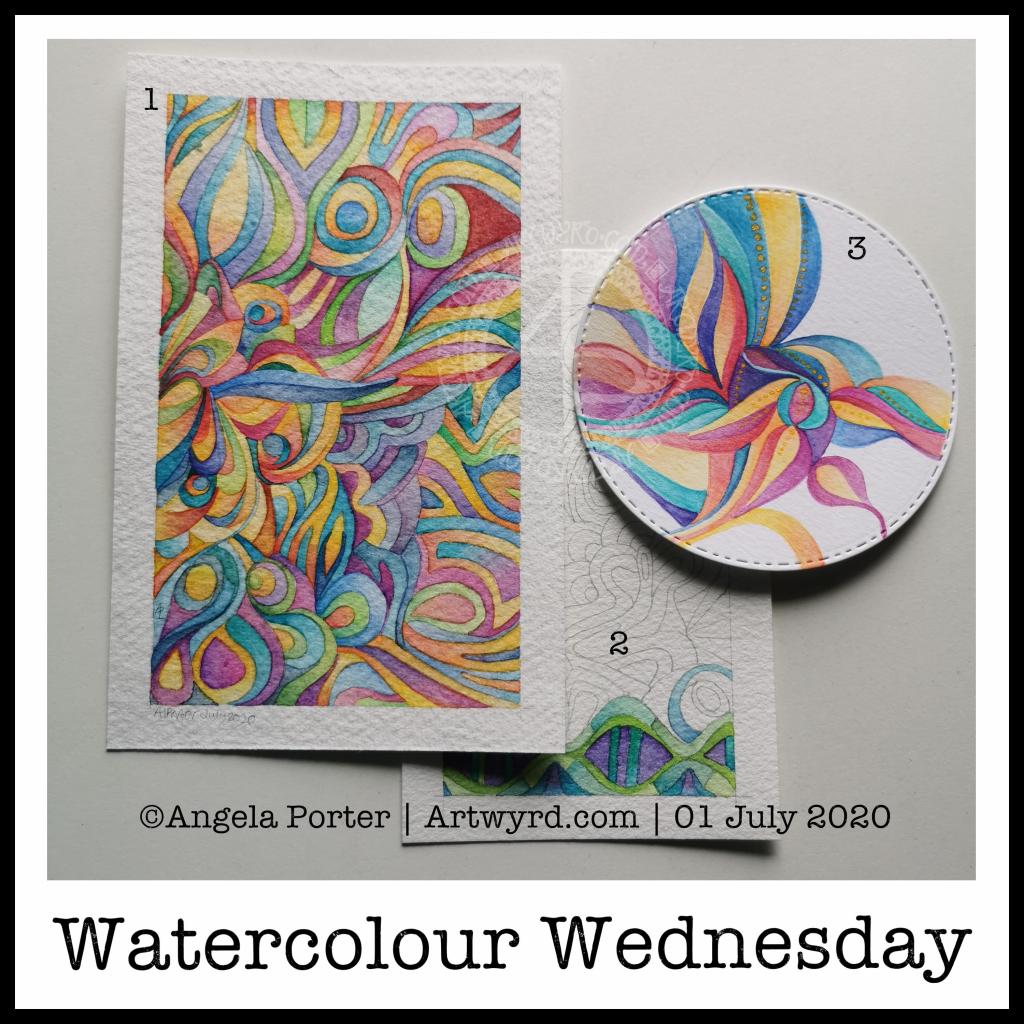
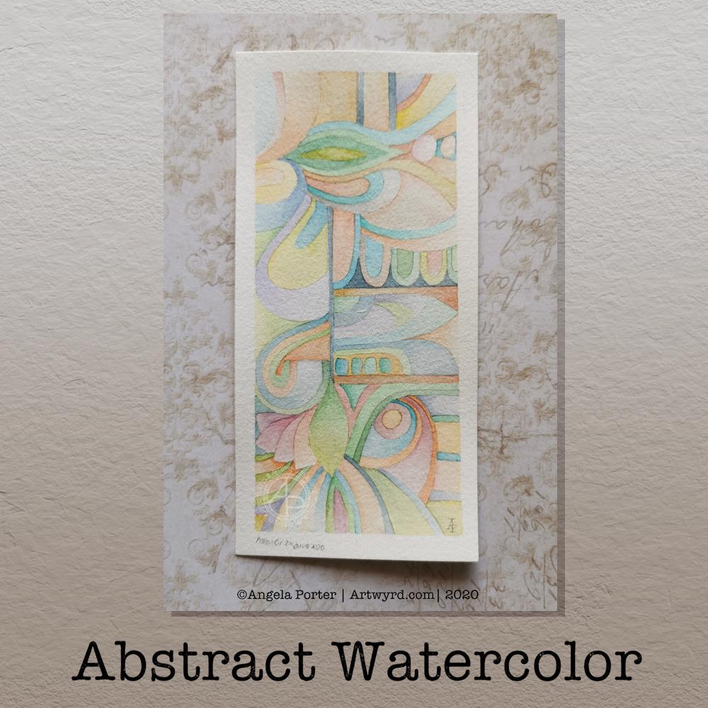
Watercolour Wednesday

I know, it’s been a watercolour day nearly every day for the past week or so. However, I do like alliteration. As did the Anglo-Saxons, who used alliteration in their poetry rather than rhymes.

Anyway, a fair amount of watercolour being done here in the past day.

Painting (1)
This one is now finished. It was an unusual one to do as I didn’t start with a sketch, but just added shapes as the painting grew. It’s colourful, for sure, which is my usual way of working with colour. I know I needed some colour to brighten my heart up yesterday.

Painting (2)
A work in progress, this one is on a piece of Arteza Premium watercolour paper, which is 100% cotton. It works in much the same way as the other 100% cotton paper I have, but it’s slightly more offwhite, with a yellow-ish tone, than the Khadi paper. It also has a different texture that is finer and not quite so bumpy. I’ve yet to work out which I prefer.

I’ve decided to complete this painting in shades of blue, green and purple, mostly. I’m sure I’ll end up changing that idea, or sneaking in other colours here and there.

With the 100% cotton paper, I am starting to become comfortable with dropping wet into wet and letting the colours spread and blend with each other. Judging the quantity to get the depth of colour and a smooth gradient is still a tricky task for me.

Painting (3)
I don’t know what got into my head this morning, but I felt the need to paint a mandala in much the same way that Carl Jung would to start his day with an idea of what is going on mentally and emotionally on a subconcious level.

I also had a kind of bright idea to use a diecutting machine to cut out circles of paper, in this case Daler-Rowney Mixed media paper.

With the first circles I tried watercolour and had really unsatisfactory results. This surprised me given the fairly pleasing experience I had with the ClaireFontaine mixed media paper.

So, rather than use watercolours, I thought I’d try Inktense pencils, using a damp brush to pick colour up from the pencil nib. I also used a solution of gum arabic to help keep the colour wet for longer. Gum arabic also increases the translucency of the pigments, and can add a glossiness to the colour too. This helped the Inktense colours to work more like watercolours.

I also added dots of gold Daler-Rowney FW Pearlescent acrylic inks to the design here and there. To finish the design off. I had thought of adding patterns in gold to the blank areas, but that just didn’t feel the right thing to do. It felt finished, white space and all.


The aim of this painting wasn’t to create a work of art, but to give an insight into what is going on within me at this time. I’ll keep my observations on this to myself. What I will say is I’m feeling out of sorts and rather sad and low today. I have a lot of confusion, anxiety, fear and despair surrounding various things going on and I’m just feeling a bit overwhelmed by it today. It’s all just emotional weather – just as the clouds cover the sun, they will move along by and the sun (or moon) will shine bright and clear once again, so it is with emotions.

Template Thursday

Another week has gone by with the pandemic still occurring. That means it’s time for another template for members of the Angela Porter’s Coloring Book Fans facebook group.

This week, I’ve created a rather abstract but typically entangled ‘Angela’ kind of template.

If you’d like to download the template to colour, you do need to be a member of the facebook group – it’s free to join and free to download the template (terms and conditions of use apply).

Abstract Watercolor

Last night, I was tired and emotionally drained, again. So, some self-soothing activities were in order. I thought I’d try to create an abstract watercolour painting in the same kind of style as the abstract digital art I’m working on.

Before bed, I got a small part of this done. I finished it this morning. I woke around 4am, with a headache. The usual kind of stress-comedown headache I’m prone too. Migraine-y in nature. I also was due to get up early for my weekly delivery of organic vittles from Able & Cole; they deliver to me just after 6am.

Oddly, the headache lifted as I started to work on the watercolour, which was a huge relief to me. A couple of hours later, and the watercolour was finished.

The paper is Bockingford cold pressed and it measures approx 5¾” x 2¾”, the artwork being approx. 5¼” x 2¼” in size. I used my set of White Knights watercolours and a Daler Rowney Aquafine brush (size 0, round). I did lightly pencil in the design before painting.

I love working digitally, but I also love to work with traditional media, watercolours becoming one of my favourites as I work out how I can get them to work for me.

I’ve said before that I love to create small works of art – precious little treasures that need to be the centre of attention in a huge frame.
The precision of this abstract watercolour painting really pleased my artistic heart. I worked with watercolours on paper in a way that is analogous to how I work with colour and shape digitally.

The realisation of this has been a ‘ta-da’ moment for me. As much as I love to see the way watercolour does magic when it’s worked wet in wet, my sensibilities tend towards having much greater control over the way the colours mix and blend. I even break the rules; I’m happy to mix colours on paper, while the watercolour paint is still wet or damp. I’m also happy to use glazes to intensify the colour or alter the tone.

What is a change for me, in terms of traditional art, is the lack of black line-art. In the past, that would have been something that really troubled me; the work didn’t look right without black lines.

Working digitally, with pure colour and no black outlines has certainly made me more confident in working traditionally this way.

In this painting, you can see influences from nature and architecture. Shapes that I love appear – rounded and pointy arches, curves, leafy and petal forms, circles, but no spirals this time.

Straight lines and rectangles add a counterpoint to the curvilinear forms, giving a sense of sections and also support in various places in the design.
The colours I chose are a lot more muted than is typical of me in the past, and I actually really like them.

Yet another piece of artwork that marks a development in my artistic voice. Actually, I think it’s more like a note in my artistic song. I seem to have a number of notes (styles) that are characteristically ‘Angela’ and this is very likely to become another of them.

Abstract Art WIP

I’ve had some time this morning to do some more to this abstract art piece. I’m still learning about digital art and how it can work for me, but I’m feeling quite pleased with how this is growing, bit by bit.

As I work on it, I’m changing it from the sketch, which is often the case; the sketch is just a suggestion, and outline, a whisper of an idea.

The crisp, clean lines of digital art really appeal to me in this piece, as do the more muted colours.

Plenty more left to do on it, so daily updates will continue.

Template Thursday

Another week has gone by, so it’s time for a new template for members of the Angela Porter’s Coloring Book Fans facebook group.

This week, it’s another of my collections of little windows. Yesterday was a day where I needed to draw a template that wouldn’t overwhelm me, and a collection of tiny drawings and patterns is a way to break the task down into bite-size, cute, whimsical pieces. As I result, I enjoyed the process and found some contentment and peace too.

In fact, some of the colorists in the group have told me that the really like the way the page is broken down into pieces that can be finished quickly if they are limited for time. The different sizes allow them to choose something that can be coloured in the time they have available. That part can then be left finished, freeing them of the worry of leaving something unfinished.

Coloring, like any creative activity, can help calm, relax, soothe and give a break from negative self-talk, to name a few of the benefits. I know that scientific studies have shown this to be the case and that losing yourself in coloring has a similar effect on brain activity as mindfulness meditation.

I use art to help me with times when my emotional weather is stormy, dull, unsettled. As I said earlier, drawing a collection of small designs was far less overwhelming than drawing a full page illustration yesterday. Yet, I still end up with a full page of mini-templates to colour.

I feel I struggle with colours. I tend to try to put all colours available to me into one template. Every now and then I do work with a limited palette, which also has it’s own problems. My window templates take away any pressure I put on myself regarding colour. Each window is a unique image in it’s own right and I can use whatever colours I wish in it without worrying about the overall cohesiveness of the project.

These window templates are also great fun for trying out different colour combinations, for blending colours, and even for trying out new techniques. You could make notes on the template, or cut out the pictures you want to keep and start an art journal where you note down the media, colours and techniques used to get the effects/blends you like. No longer any need to remember what they are, just refer to the journal!

Talking of cutting the designs out, that is a perfect way to make use of a finished coloring page like this one. The individual images, or groups of them, can be used to make greeting cards, bookmarks or to embellish art journals, journals, scrapbooks, diaries, planners and bullet journals!

As always, I love to see what people create using my templates – share with and/or tag me on social media :
f: @artwyrd
t: @artwyrd
i: @artwyrd

Journal Making – 16 May 2020

The Cover

On waking this morning, I wanted to work on the cover of my journal.

Yesterday evening, I managed to get a coat of gesso on to the cover and painted edge closest to the wire binding with gold. In hindsight, that may not have been the best idea.

I knew I wanted to use my silhouette iris drawing on the cover. Irises are my favourite flowers. Also, my aim for my journal is to use my own art as much as possible.

So, I printed out an arrangement of three irises, tore them out and coloured the paper with Distress Inks.

For the background, I used a piece of Claire Fontaine mixed media paper. I coloured it with Distress Inks – Old Paper, Tea Dye, a touch of Iced Spruce and a dusting of Vintage Photo around the edges and here and there on the main sheet.

This I adhered to the cover. I’d cut it narrower than the cover so that I didn’t have to butt it up against the wire binding. That’s why I wanted a gold border there.

Anyway, I decided to put some old book paper behind the irises. I added some ink to the edges of this paper too. I then glued them in place, along with the flowers.

I drew a border around this page with a copper-coloured Sakura Metallic gelly roll pen. Then, I used a gold glitter Uniball Signo pen to fill the background with tiny spirals.

I wanted to add the definition of ‘journal’ to the front cover. So, I did the typography in Affinity Publisher and printed it. After tearing the meaning out, I used Old Paper and Tea Dye Distress Inks to colour the paper, followed by Vintage Photo to ink the edge.

I then glued this to an old book page, tore that out and edged the paper with ink once again.

Before adhering the page to the cover, edged the paper with Ground Espresso Distress Ink as I didn’t think the edge was dark enough. I also coloured the edge of the journal cover with the same ink to hide the white.

An application of Distress Micro-glaze to seal the page and I could stick it to the cover.

I love the subtle sparkle of the spiral pattern on the cover. The micro-glaze picked up some of the fine glitter. It also makes the cover sheet feel very smooth.

I’m not happy with the gold edge to the journal, but I will, no doubt, find a way to make it look much better. Otherwise, I’m quite happy with the cover. I think it needs something else there, but I’ll work out what that is in the fullness of time.

The first three pages.

Page 1 I’ve shown before, and it’s now complete (apart from me adding journaling to the envelopes and other spaces.)

On page 2, I’ve added an experiment I did with Tombow Dual Brush Pens and a blender pen to draw designs on paper. I have some ATC cards coloured in the same blues/purples as the background of this page, so I’ll be finding a way to display them on the page when I’ve finished them.

Page 3 is a tiered series of simple pockets. I made them by tearing the paper of each page and layering them to create the pockets. The inserts are pieces of Claire Fontaine Mixed media paper that have been coloured in the same colours of Distress Inks as the pockets have been. I used Distress Oxide Inks for the pockets.

I’m not really sure what I’m going to do with the third page, yet. It will come to me, I’m sure!

Adobe Spark

I thought that I’d use Adobe Spark to make a short video rather than posting a montage of photos. I uploaded it to my channel on youtube so I could share it via social media more easily.

Adobe Spark is straightforward to use, and it does have a free option, though I pay about £10 per month for it. It makes creating simple content for social media really easy.

How am I feeling

I’m feeling much better today. The headache and light-headed/dizzy/drowsy feelings were with me for the whole day, including upset tummy and digestive system. I had weird pains in my right eye too. I slept a lot during the day, and just took it easy when I was awake. I wanted to crochet in the evening but found it hard to do even something familiar to me.

My digestive system is still uncomfortable and not quite right today, and I’m now beginning to feel rather tired. Like I’ve already done too much today. So, I’m going to be taking it easy for the rest of the day.

Ephemera

Ephemera ©Angela Porter |Artwyrd.com

I woke this morning with the desire to make a little box to store ephemera in. So I did.

I used a video from PootlesPaperCraft to help me make the box, which is 4″ square with a depth of 2″, so sizeable enough for some of my smaller ephemera such as inchies and little shrink plastic charms (you can just see them peeking out from under the envelopes to the left of the photo).

I used plain, white card for the box base, which I coloured with Tea Dye, Rusty Hinge and Vintage Photo Distress Inks. For the top, I used a piece of Tim Holtz card from my stash that I’ve had for a number of years. This I grunged up with Vintage Photo and Rusty Hinge Distress Inks.

Once I made the box up, I used Aged Mahogany to distress the edges of the box.

I coloured a square piece of white card with Aged Mahogany and Rusty Hinge Distress Inks and then used a light brown pen to draw a zentangle design on it. This panel was layered on a piece of the same Tim Holtz card I used to make the lid, and then I adhered it to the box.

The box really needed a label to identify it’s contents. Now, I could’ve printed the label out, but I thought this would be an opportunity to practice my hand lettering, which I did.

Then, I aged the label with Aged Mahogany Distress Ink, applied lightly over the face and a bit darker around the edges. Next, I layered the label on another piece of the Tim Holtz paper. Before adhering the label to the box lid, I edged the panel with some Rich Gold Starlights paint from Imagination Crafts.

It’s been a long time since I made any boxes, but they really are easy enough to do. I need to make a longer, thinner box to store tags and other bits and bobs in, once I work out the size I need to make.

Sketchbook / Art Journal

©Angela Porter | Artwyrd.com

I woke at around 4:30am again today and couldn’t get back to sleep. So, I got up, made tea, and did some work on my art journal / sketchbook.

Making Distressed Paper

I spent a good two or three hours making the papers you can see to the left. I used the following:

  • printer and layout paper, cut to A6 in size (UK size)
  • Distress Oxide Inks
  • 5″ x 7 ” Gelli plate
  • small Brayer roller
  • water in a spray bottle
  • heat tool
  • craft mat
  • pieces of cut and dry foam
  • metallic inks and paints

For some of the pieces, I brayered the Distress Oxides onto a Gelli plate and then pulled the print onto a piece of paper. For others, I used the Brayer to apply the ink to the paper. I also used the black side of a piece of cut and dry foam to apply ink to some of the papers.

I sprayed the papers with water to activiate the Distress Oxide, and used the heat tool to dry them. After doing this, I crumpled up a lot of the papers and then used the brayer to flatten them out. Both of these techniques resulted in textured paper. So, I used the cut and dry foam and some Distress Oxide ink to lightly brush the paper to help to accentuate that texture.

Finally I used cut and dry foam to brush metallic paint or ink over the paper to add some shimmer and shine. I used some textured cut and dry foam to add patterns too.

I now have quite a stash of very distressed papers to use in my art journal in the future.

Both the printer paper and the layout paper are much thinner than I would usually use for such a task. The light spritz of water on each, however, created a lovely, bumpy texture. They were also easy to crumple up, adding that kind of leathery texture.

The subtle shine that the gold metallic ink gave is rather lovely, though I do like the bright, shiny gold of some paint I found in my stash.

I can see me using these papers for collage, for making pockets/envelopes and other bits and bobs for a journal, and no doubt for other things I’ve not yet thought of.

Storing my custom papers.

I realised the papers I’ve made over the past couple of weeks have been piling up and I really needed to do something that would let me find them easily. So, the quickest and easiest solution was to use A4 poly-pockets and a ring binder, both of which I had to hand! That certainly has let me have a tidier desk, and I’ll be able to find the papers easily too.

Art journal pages.

I also finished up the two pages shown to the right. I attached inchies, to fill in some gaps.

I used simple paper hinges to attach the ATC cards on page seen in the bottom image. If I ever wish to remove them to swap/share/gift, then I can remove them easily. That simple solution has relieved my anxiety about adhering them permanently into the sketchbook!

I’ve also folded some squared paper, used distress inks to colour the edges and folds, and put them in the vellum pockets I’d made earlier, all ready for me to journal on. Unusually for me, I made use of some washi tape to embellish the pockets.

I’ve also noticed that I’m very ‘regimented’ about how I put things in my art journal. I much prefer carefully cut paper to torn edges most of the time. Everything needs to be arranged ‘just so’ with me. Just as it is with my line-art – precise and neat. I suppose it’s another example of me expressing my personality through my art.

So, Angela, how are you today?

I’m exhausted. I’m practically falling asleep as I type this; that’s what happens when I wake up at stupid o’clock once again. I’m now officially overtired! I may try to get back to sleep soon; I do have work I need to do today!

As far as me being under the weather goes…

Well, I still have a sensitive digestive system and I feel nauseous from time to time. I did wake with a bit of a headache today, but that could just be lack of sleep, as is the tiredness I feel. I have eaten and my tummy doesn’t seem to be objecting as it has done. This all makes me hopeful that I’m almost over this bout illness. I was really quite grumpy about it yesterday, and I’m entirely sure I’m not grumpy today!

Other than that, emotionally I’m doing just fine. The sunshine helps with my mood for sure, as did being able to hear the bird song as the world was slowly waking up this morning.

Sketchbook Sunday

Sketchbook Pages – 26 April 2020 ©Angela Porter | Artwyrd.com

Over the week I’ve been adding to my sketchbook- notes and images, ideas and reflections.

Each page has been coloured with combinations of Distress Inks, applied using the black side of a piece of Cut and Dry foam, followed with a spritz of water to bring out some water-staining grungy loveliness.

All the little drawings have been done on either Daler-Rowney Smooth watercolour paper (300gsm) or mixed media paper, either from Claire Fontaine or Daler-Rowney. The papers have been coloured with Distress Oxide Inks, Distress Inks, or a combination of them. Most of the pieces have had the inks applied with the foam, but some were made by brayering Distress Oxide inks onto a gelli plate and taking a print of them.

The reflection about what I like, what I don’t like, and ideas that arise is important to me in my sketchbook/journal. I do reflect on my art, a bit too much in my head. When I write it down, it forces my sometimes abstract and swirling thoughts into some kind of order. When I make these thoughts a material manifestation by writing them down, it helps me to recognise the thoughts, sift through that which is useful, and still record those that are not particularly useful at this moment but may be in the future.

I think I need to find a way to do this with my digital art. My mind goes to using One Note to do this. I shall think on this one, and make a note of it in my physical sketchbook/journal.

Sketchbook – Journal Pages

Sketchbook – Journal Pages 17 April 2020 © Angela Porter | Artwyrd.com

I’ve been creating a lot of little bits of art that I just don’t know what to do with. They’re often little experiments. Sometimes I mount them as greeting cards, other times they end up in a drawer.

This morning, I woke with an idea to start a sketchbook-come-journal as a place to keep safely and annotate some of these artworks. The annotation is important; it’s lots of notes to myself about the techniques and materials I used to create a specific type of effect, thoughts, ideas for the future, inspirations.

I dug out an A4 Goldline sketchbook to use for this. The white pages just looked uninteresting and stark to me. So, I added some colour using a piece of Cut and Dry foam and Distress Inks followed by a quick spritz of water. A blast from a heat gun, and the pages were ready.

I did prepare a couple more spreads with colour. I realised that if I did this after I’d attached my art to the pages I’d get all kinds of lines and marks that I wouldn’t want. So, I need to make sure I add coloured pages each time I add work to the journal.

I adhered the artwork to the pages using Tombow Mono liquid glue, outlines them with either a metallic or plain black pen, and then set to annotations and notes.

It also gives me a chance to practice my hand-lettering and to use design elements used in bullet journals or planners. I have to say that my handwriting appeared far more than hand-lettering. I used the hand-lettering for headings though.

I also let some of the design elements from the artworks to spill onto the page. I have a problem with leaving white space! This gave me a chance to remember media I have in my stash, such as the Chameleon fineliner pens, which I haven’t used much.

Some dangle designs appeared in one of the drawings, so I redrew them above it. And, of course, metallic gold gel pens add a touch of sparkle.

One thing I ‘discovered’ (maybe rediscovered) is how fab Copic Markers work to add colour and shadow to the Distress backgrounds. White gel pen adds bright highlights.

One thing I wanted to do was add notes about my digital art. I’d like to add prints of my art, but I only have a black and white laser printer. So, I’m going to see if I can have sheets of images printed via the web and posted to me so I can then use them in my journal too.

Part of me knows I could do this via One Note or similar, but there’s something lovely about having a physical record of the art completed and with notes to reflect on or get inspiration from in the future.

I am sure this is something I did in the past, but it’s time to do this again. It’ll be fun to add journal elements to the pages, like envelopes or pouches for notes.

I’ll have to be less of a perfectionist, something I still struggle with. I’m hoping it will help me me to recognise the value of work I’ve done that I may not be happy with, but can learn from and make notes about this, and ideas that arise, for future reference.