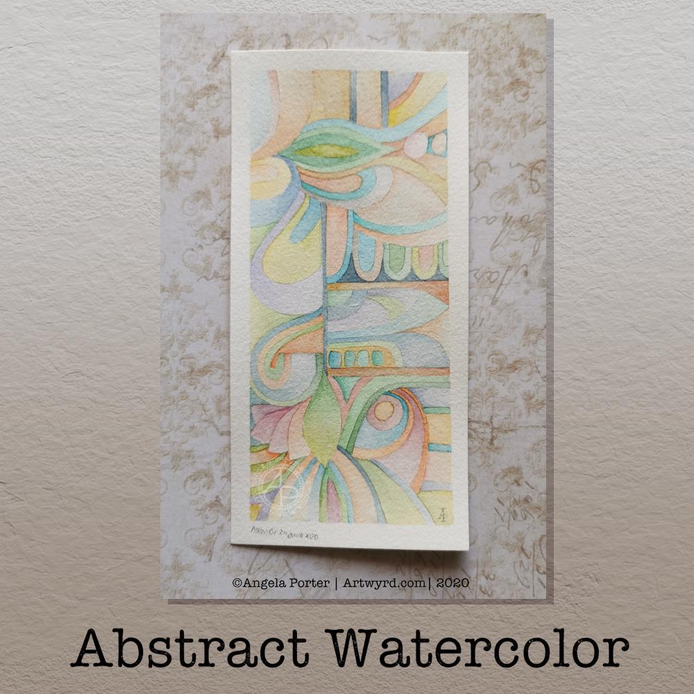
Last night, I was tired and emotionally drained, again. So, some self-soothing activities were in order. I thought I’d try to create an abstract watercolour painting in the same kind of style as the abstract digital art I’m working on.
Before bed, I got a small part of this done. I finished it this morning. I woke around 4am, with a headache. The usual kind of stress-comedown headache I’m prone too. Migraine-y in nature. I also was due to get up early for my weekly delivery of organic vittles from Able & Cole; they deliver to me just after 6am.
Oddly, the headache lifted as I started to work on the watercolour, which was a huge relief to me. A couple of hours later, and the watercolour was finished.
The paper is Bockingford cold pressed and it measures approx 5¾” x 2¾”, the artwork being approx. 5¼” x 2¼” in size. I used my set of White Knights watercolours and a Daler Rowney Aquafine brush (size 0, round). I did lightly pencil in the design before painting.
I love working digitally, but I also love to work with traditional media, watercolours becoming one of my favourites as I work out how I can get them to work for me.
I’ve said before that I love to create small works of art – precious little treasures that need to be the centre of attention in a huge frame.
The precision of this abstract watercolour painting really pleased my artistic heart. I worked with watercolours on paper in a way that is analogous to how I work with colour and shape digitally.
The realisation of this has been a ‘ta-da’ moment for me. As much as I love to see the way watercolour does magic when it’s worked wet in wet, my sensibilities tend towards having much greater control over the way the colours mix and blend. I even break the rules; I’m happy to mix colours on paper, while the watercolour paint is still wet or damp. I’m also happy to use glazes to intensify the colour or alter the tone.
What is a change for me, in terms of traditional art, is the lack of black line-art. In the past, that would have been something that really troubled me; the work didn’t look right without black lines.
Working digitally, with pure colour and no black outlines has certainly made me more confident in working traditionally this way.
In this painting, you can see influences from nature and architecture. Shapes that I love appear – rounded and pointy arches, curves, leafy and petal forms, circles, but no spirals this time.
Straight lines and rectangles add a counterpoint to the curvilinear forms, giving a sense of sections and also support in various places in the design.
The colours I chose are a lot more muted than is typical of me in the past, and I actually really like them.
Yet another piece of artwork that marks a development in my artistic voice. Actually, I think it’s more like a note in my artistic song. I seem to have a number of notes (styles) that are characteristically ‘Angela’ and this is very likely to become another of them.

It does look lovely. Very subtle without the black lines. I would find it hard to resist adding lines and doodles 🤣
LikeLike
Thank you. Yes, it can be hard to resist putting lines and patterns on it. However, I wanted to see how just colour and shape would work for me, and I think it has 🙂
LikeLike