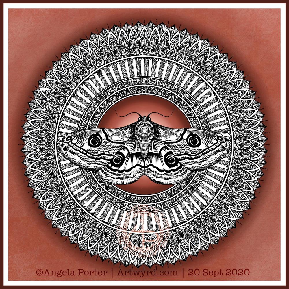
Moths are becoming a bit of a thing with me at the moment. They’re great for practicing my line work. They’re also surprisingly cute, in a buggy kind of way.
Of course, I’m still working on the first moth entangled drawing/illustration, so adding a mandala behind this drawing is a quick and easy way of adding to the moth. Mandalas are kind of my thing to do.
Again, I’ve used that spot of highlight behind the moth to draw attention to the centre of the design along with the main motif.
Today, a terracotta background seemed to be just right. Perhaps because it’s quite an autumnal colour. This morning there’s a definite nip in the air that I associate with autumn and we are just a couple of days away from the equinox.
Terracotta is a deeper shade of orange and is comforting in it’s warmth and earthiness. I find it quite soothing.
I’m also enjoying floating the graphic black and white elements of my artwork above a simple coloured background. That way I have some colour in my art, but the colour doesn’t distract from the design elements.
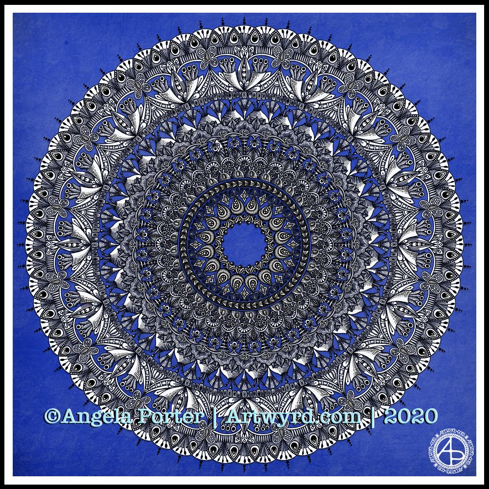
I have been awake since stupid o’clock, so rather than toss and turn for hours I decided to do some art. And another mandala appeared from the tip of my pen.
For this one, I thought I’d make the ‘white space’ areas in the design transparent so that the vibrant blue background could show through.
I’m not sure how well this works; I’m now too tired to think clearly. I do think it has potential for future mandalas, maybe.
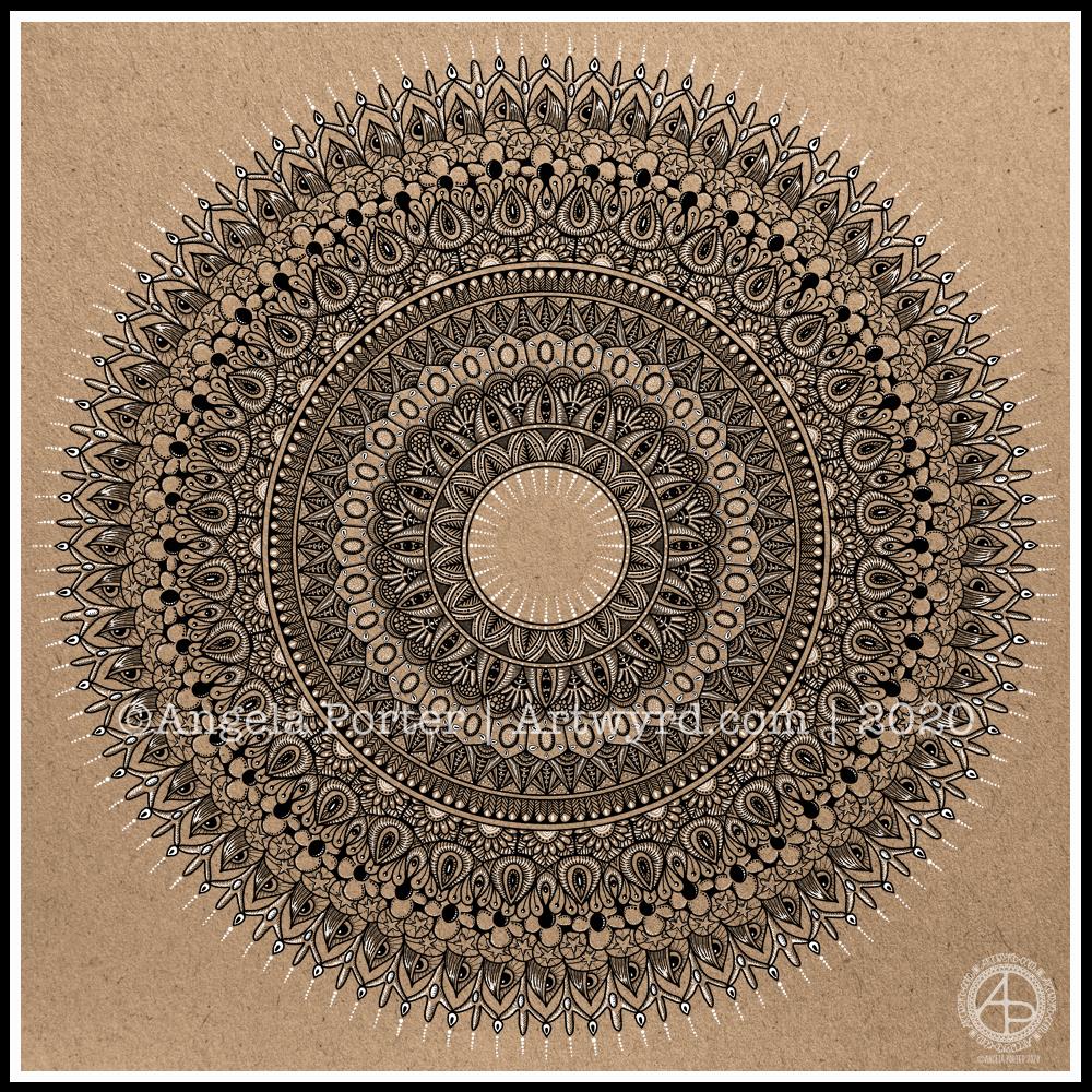
I really enjoyed creating this mandala this morning! I used some of my favourite motifs in this one. it was lovely to use white on the kraft background, to bring out some highlights and add dimension here and there.
I love to use Autodesk Sketchbook Pro to draw my mandalas in. It streamlines the process and allows me to focus on creating the design rather than the mechanics/geometrics. Of course the design is drawn by hand, just as it would be on paper. That’s the beauty of having a Microsoft Surface Studio and Surface Slim Pen – I can draw with the pen on the screen just as I would with pen on paper. The advantages are that if I mess up, it’s easy to correct, and the symmetry tool saves time, allowing me to focus on the fiddly details that I love so much.
This week I chose to create a mandala, which I’ve partly coloured in fiery autumnal colours. Looking at it now, I can see where I’ve used colours that are too similar so that the layers are a little lost. But the warm colours warmed my heart and soul this morning.
The background to the mandala is really unusual for me; I’m not sure where it came from, but there it is. It has just a bit of an Art Deco feel – do you agree? I’m looking forward to seeing how people add colour to it.
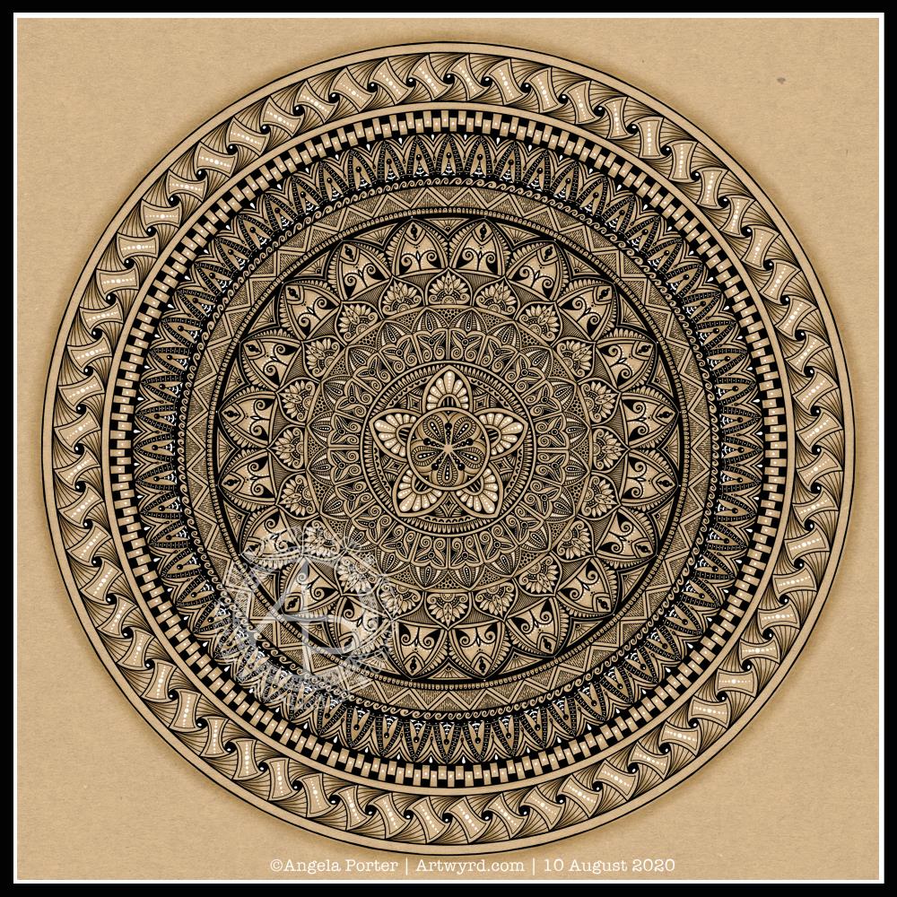
I actually started this mandala yesterday morning, but I did most of the work on it this morning.
Black, white and craft paper, with some warm grey shading to help to bring out a sense of volume to areas of pattern.
The number five.
I chose, to start with, five-fold symmetry.
The number five symbolises balance and harmony. It also can represent freedom, independence, adventure, curiosity, intelligence, individualism, courage, and important life lessons to be learned from your experiences.
Five can also be symbolic of a problem, but there are solutions to the problem. As five also symbolises inner wisdom, the solution comes from our own inner wisdom. Once a solution is identified, then a plan of action needs to be developed through passion, emotions, ideas or work. Then it needs to be followed through.
Star symbolism
The central motif of the mandala is reminiscent of a five-pointed star.
Stars are symbols of guidance and are often considered protective symbols. They are also associated with wishes, mysteries and magic. Most often, they represent something that is good, beautiful or positive. They are symbols of hope, truth and spirit.
The colour brown
Brown is a natural colour that evokes a sense of strength, approachabilityapproachability and reliability. It is often associated with resilience, dependability, security and safety.
Feelings of loneliness, sadness and isolation can also arise with brown, especially when used in large amounts, like a vast, expansive rocky landscape or desert. But it also can bring to mind feelings of warmth, comfort and security as brown also represents a hearth, the heart of a home, and so it represents a deep connection to one’s home.
Of course, brown also represents connections with the earth and so nature. It is a wholesome colour.
Symbolism and my art
I’m finding looking into the symbolism of numbers, colours and motifs quite interesting. I don’t often think overly hard about the colours I use when I create art, especially my daily ‘warm up’ art practice.
However, it is interesting to look at the meanings of colours, motifs I choose and how they relate to what I am currently experiencing on a personal level.
It all began with a drawing in my A5 sketchbook. I then wanted to use it for digital art, and this is the result.
I’m really happy with the flower design. The black lines work in this instance; they give a stained-glass feel to the design.
I’m not at all sure about the background, however.I think I’ve just gone over the top, again. I just can’t seem to leave ‘white space’ in my art.
As a result, I tried some gold patterns on a rich, dark colour. Whatever I tried, just didn’t seem to work. Perhaps I could’ve created the line art in gold instead of black before adding colour. That may have worked out OK.
I’ve left it as it is, for now, as I’m tired and hungry. I’ll look at it with fresh eyes at some point. For now it’ll do, even as an example of art to remind me to work out when enough is enough!
Even though I’ve ended up a bit frustrated with my efforts on the background, I still enjoyed the process of creating this morning. It does make my inner light shine that bit brighter, and we all really need that extra bit of shine at this time of pandemics and more going on in the world.
I wanted a quote that went with the art, so I chose one about blooming and that sums up how I feel when I create, be it art or crafty pursuits. Even when the art goes in a direction I’m not happy with, there’s still a happiness inside that comes from just creating. There’s also a positive feeling about things not working as I want them to, artistically. It’s an opportunity to learn something, either artistically or personally. Today, the lesson is a reminder that I need to learn to leave ‘white space’ in my art.
It’s free to join the group, and the template is a freebie for members of the group.
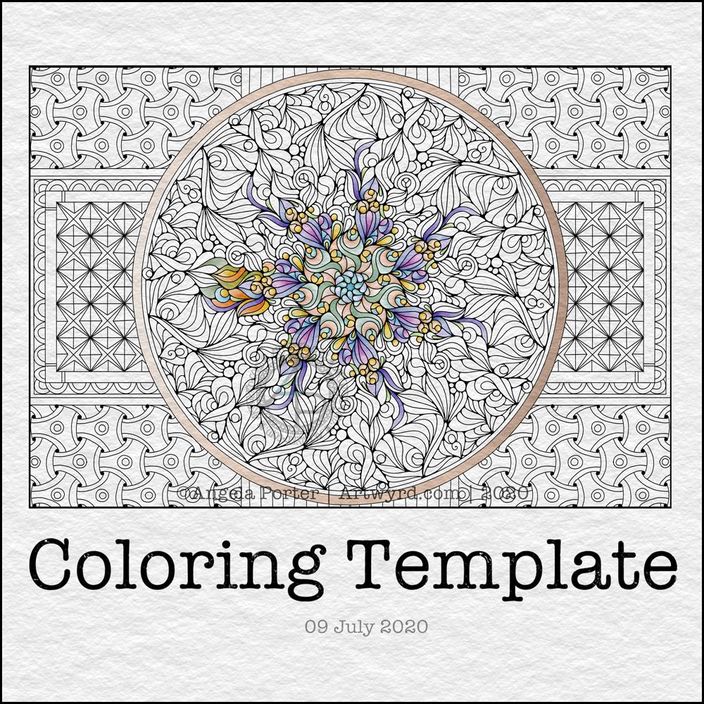
This week, I created a mandala design with a background of geometric, repeating patterns.
I’m still recovering from the stress of my first trip out since March 2020. Drawing (and colouring) mandalas is an incredibly peaceful, relaxing and mindful activity. So, it was natural that I drew one.
The mandala design is based on some of the abstract art I’ve been doing of late. It’s a bit unusual for my mandalas, but I really do like the organic flow of the lines.
Even though the design is abstract, the repeating symmetry of a mandala bring some structure to the design. I am looking forward to seeing how members of the group add colour to the design.
The geometric patterns in the background also result in a soothing, repetitive rhythm for colouring; a rhythm that results in soothing and calming ones mind and emotions.
De-stressing
I have been totally shaken by the level of anxiety/stress that resulted from my trip out on Tuesday. I am beginning to feel more my contented and calm self. However, I find I’m still irritable and grumpy and have withdrawn from social media and the like for most of the day.
It was a sobering thought when I realised I’d lived most of my life constantly at elevated stress levels, often as higher than what I experienced in the past couple of days.
It’s also a wonderful realisation that I can recognise this now, and I also am able to allow myself self-care time to let all the stress hormones leach from my body. It’s been a long time since they peaked in this way.
It makes me extremely grateful to my therapist for her years of patient work with me. Experiences like the Tuesday Trip remind me of how I used to be and show me how far I have come in recovery from cPTSD.
Yesterday, after my social media post, I binged watched the Harry Potter films from The Order of the Phoenix. I found I was irritated by crochet. I tried cross-stitch, which irritated me too. Eventually, I settled on knitting, which, oddly, soothed me. I think it’s because I could knit and watch the film. Knitting allowed me to channel my irritability into something creative. As I can knit without looking at the knitting, I could also watch and immerse myself in the films at the same time.
My fingers are itching to knit again, now I’ve thought about it.
Even though I slept well last night, I’m still feeling really tired today. This happens as part of the post-stress come-down. It can last a few days. I’ll not be rushing to nap, however. Napping has a knock-on effect on my ability to sleep at night when I’m like this. My naps tend to end up as periods of deep sleep, so I try not to take them unless it’s absolutely necessary.
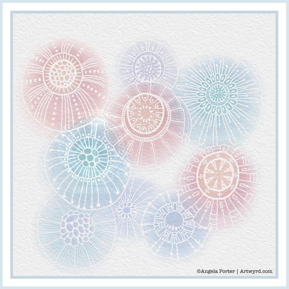
Another morning, another play around with watercolours, this time digitally.
Soft balls of watercolour, fuzzy edges, with white ink details added on top. Layers of transparent colour.
I overlaid a watercolour paper texture, which helps give the right ‘feel’.
This is my favourite attempt at digital ‘watercolours’ so far. I definitely like using white ink in this instance; black ink was just too harsh, hard and jarred uncomfortably with the softness of the watercolours.
I tried lots of ways of adding colour; not just brushes, but different brush effects. In the end I was happiest with white ink.
A nice way to spend a couple of hours as I wake up.
One of my ideas is to create a digital library of designs of things that interest me and that may be useful in my journal making, card making, or just other kinds of art.
For some reason, I decided on dragonflies. So, I sketched out some ideas and then inked the drawings in digitally. I also added details and patterns ot the designs that weren’t present in the sketches. The dragonflies are in my signature entangled style for sure.
I still have a few sketches to work on, and some alternatives of the wing shapes and body designs. I also want to do them as silhouettes. I like silhouettes on coloured backgrounds, like the one I’ve used today.
I used Autodesk Sketchbook Pro to ink in the designs. I also used it to add the background, shadows and typography.
The background is one of my own made using Distress Oxide inks and water. I love that I can recolour the image digitally; the original was in shades of pink and purple, but I thought that blues and greens would suit the dragonflies much more.
I’ve left the dragonflies uncoloured, for now, though adding colour will bring the designs to life and add some dimension to them.
I don’t have a colour printer anymore, just a black and white laser printer. I may consider getting a colour printer in the future, however, as I think being able to print my own digital art would be useful, especially for using in journal making. An inkjet printer would be the most useful; it would allow me to print on many different kinds of paper and lightweight card.
I’m also thinking of putting together digital collections of backgrounds and ephemera and/or digi stamps for sale via my Etsy shop. Let me know if you think that’s a good idea by dropping a comment.
On waking this morning, I wanted to work on the cover of my journal.
Yesterday evening, I managed to get a coat of gesso on to the cover and painted edge closest to the wire binding with gold. In hindsight, that may not have been the best idea.
I knew I wanted to use my silhouette iris drawing on the cover. Irises are my favourite flowers. Also, my aim for my journal is to use my own art as much as possible.
So, I printed out an arrangement of three irises, tore them out and coloured the paper with Distress Inks.
For the background, I used a piece of Claire Fontaine mixed media paper. I coloured it with Distress Inks – Old Paper, Tea Dye, a touch of Iced Spruce and a dusting of Vintage Photo around the edges and here and there on the main sheet.
This I adhered to the cover. I’d cut it narrower than the cover so that I didn’t have to butt it up against the wire binding. That’s why I wanted a gold border there.
Anyway, I decided to put some old book paper behind the irises. I added some ink to the edges of this paper too. I then glued them in place, along with the flowers.
I drew a border around this page with a copper-coloured Sakura Metallic gelly roll pen. Then, I used a gold glitter Uniball Signo pen to fill the background with tiny spirals.
I wanted to add the definition of ‘journal’ to the front cover. So, I did the typography in Affinity Publisher and printed it. After tearing the meaning out, I used Old Paper and Tea Dye Distress Inks to colour the paper, followed by Vintage Photo to ink the edge.
I then glued this to an old book page, tore that out and edged the paper with ink once again.
Before adhering the page to the cover, edged the paper with Ground Espresso Distress Ink as I didn’t think the edge was dark enough. I also coloured the edge of the journal cover with the same ink to hide the white.
An application of Distress Micro-glaze to seal the page and I could stick it to the cover.
I love the subtle sparkle of the spiral pattern on the cover. The micro-glaze picked up some of the fine glitter. It also makes the cover sheet feel very smooth.
I’m not happy with the gold edge to the journal, but I will, no doubt, find a way to make it look much better. Otherwise, I’m quite happy with the cover. I think it needs something else there, but I’ll work out what that is in the fullness of time.
The first three pages.
Page 1 I’ve shown before, and it’s now complete (apart from me adding journaling to the envelopes and other spaces.)
On page 2, I’ve added an experiment I did with Tombow Dual Brush Pens and a blender pen to draw designs on paper. I have some ATC cards coloured in the same blues/purples as the background of this page, so I’ll be finding a way to display them on the page when I’ve finished them.
Page 3 is a tiered series of simple pockets. I made them by tearing the paper of each page and layering them to create the pockets. The inserts are pieces of Claire Fontaine Mixed media paper that have been coloured in the same colours of Distress Inks as the pockets have been. I used Distress Oxide Inks for the pockets.
I’m not really sure what I’m going to do with the third page, yet. It will come to me, I’m sure!
Adobe Spark
I thought that I’d use Adobe Spark to make a short video rather than posting a montage of photos. I uploaded it to my channel on youtube so I could share it via social media more easily.
Adobe Spark is straightforward to use, and it does have a free option, though I pay about £10 per month for it. It makes creating simple content for social media really easy.
How am I feeling
I’m feeling much better today. The headache and light-headed/dizzy/drowsy feelings were with me for the whole day, including upset tummy and digestive system. I had weird pains in my right eye too. I slept a lot during the day, and just took it easy when I was awake. I wanted to crochet in the evening but found it hard to do even something familiar to me.
My digestive system is still uncomfortable and not quite right today, and I’m now beginning to feel rather tired. Like I’ve already done too much today. So, I’m going to be taking it easy for the rest of the day.