Monogram D entangled design (with some little dangles)

I had a day or two of subconscious reflection on how to pattern around a letter after not being all that happy with the lower case b design. So, I wanted to put my vague ideas into practice.

Yes, they were vague ideas, no clear idea of how I wanted things to look, but I just wanted to try them out and see where they led.

I started with a faint pencil outline of an uncial style letter d, and then used a fine nibbed Rotring Art Pen with black ink to draw the design with.

I used the pencil line as a guide to where the entangled designs would either butt up to the edge, spill over the edge or curl over it and I just let the designs flow and grow. I also left the design in an organic shape rather than working to a square or rectangular shape.

I did work on a piece of A4 paper, but the design is a little over a quarter of the size of the paper. I can’t believe I did such teeny-tiny drawings again! I really enjoyed it!

In some places I’ve made the edge too hard, too linear. In one place I tried to correct that (lower left of the d) by adding more bits to the pattern, but that linear line is still evident. However, it’s all learning.

After scanning in, I wanted to add some texture and a bit of colour to that letter to help it stand out more. I may try doing the reverse as in colouring the design in and leaving the letter plain later. I may even try using some watercolour brushes in Autodesk Sketchbook Pro, using my Microsoft Surface Pen and Microsoft Surface Studio.

I have designated friday as #dangleday, and I did add some tiny, fine danglesto the design. Dangles don’t always have to be big and fancy or a prominent feature of designs, like in my book ‘A Dangle A Day‘.

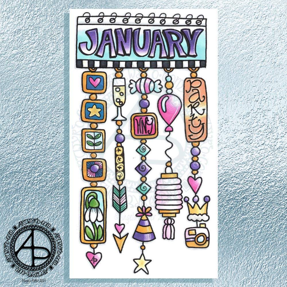
Hello January! A Dangle Design

©Angela Porter 2019

What a bright, sunshiny morning it is here in South Wales in the UK. The first sunshine of the new calendar!

I’ve been up for around 3 hours and have had a fairly artsy time.

My first job was to print out the lineart for this dangle design, which is one of many in my book ‘A Dangle A Day’ which is due for release on 8 January 2019 – just a week away!

In the book, I take you through how to draw this design, one step at a time. Not only this design, but well over 100 more – designs for all seasons and many, many celebrations and occasions.

This design I drew in Autodesk Sketchbook Pro using a Microsoft Surface Pen and Microsoft Surface Book. For the book, I coloured it digitally. Today, I printed out my black and white lineart and then coloured it using Chameleon Color Tones and Color Tops marker pens. I also added some details to some elements of the design using a 08 Uniball Unipin pen and a white Sakura Gelly Roll Pen.

Yesterday, I said I need to to spelunking through my stash of mixed media and cardmaking supplies to find forgotten supplies I could use to embellish my designs.

This dangle design would make a lovely monthly cover page for a BuJo (bullet journal), planner, diary or journal. It would also make a pretty greetings card or notecard to drop a line to a friend wishing them a wonderful January. Change the words and colours to suit the occasion or recipient! It would also be a lovely, whimsical, cute design for a winter party invitation.

I realised then that my old watermark wouldn’t do for this year. So I hand lettered a new one. I made my symbol, the one I hide away in my artwork, part of the design, along with a little intricate but simple geometric pattern around it. A little touch of the uncials for my blog address, along with a typed copyright statement and it’s done and saved! I may end up changing it a little, or having variations on the theme, as time goes on. But I’m fairly happy with it.

So, I’ve already had a productive morning! It may be a Bank Holiday in the UK, but I really do need to focus on those templates that need colouring for Entangled Forests…and I may venture forth into the peopley world later on today, maybe.

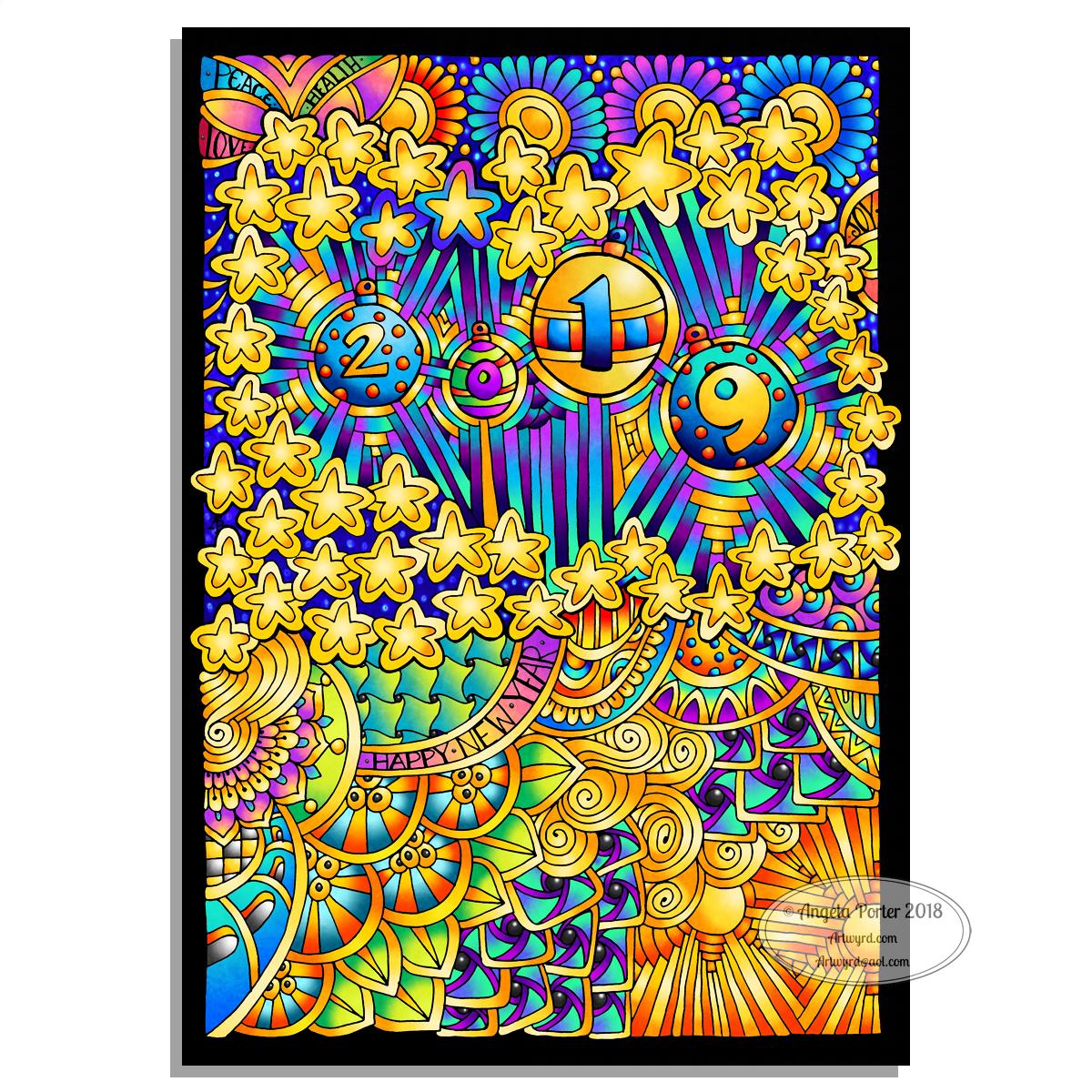
Hello 2019

©Angela Porter 2018
©Angela Porter 2018

Two colourful pictures to mark the changing of the calendars and dairies!

I created both for members of the Angela Porter’s Coloring Book Fans facebook group, and the colour explosion has already started over there! These coloured templates are set to be added to the group at midnight, so in around 40 minutes time as I tippy tap this blog post!

I drew the top one digitally using Autodesk Sketchbook Pro, Microsoft Surface pen and Microsoft Surface Studio. The bottom one I drew on dot grid paper, then coloured digitally using the same tools.

In both I went for a kind of psychedelic colour scheme – I needed a bit of brightening up today.

However you spend your New Year’s Eve and Day, May I wish you all the very best for each and every day ahead of you.

Merry and Bright

©Angela Porter 2018

A Christmas Greeting

Wishing everyone who visits this little space on the interwebs all the very best blessings and wishes of the season.

I also wish to thank you for visiting, for sharing my posts.

However you spend this day, whether with friends, family, at work, or by yourself, I wish you well and the best.

About this image

I woke early-ish this morning and had an idea that involved creating this mandala/wreath design, so I had to do it!

Unusually, I drew the motifs in colour! Yup. No black line, just colour.

They’re all very simple with simple colour gradations. The black lines were created by removing colour so the dark background would show through.

I think the outer ring of leaves could be a little lighter, but then it does give a sense of the outer ring bending away, with the hearts and mistletoe on the high point of the ‘wreath’.

Adding texture to the design helped to scuff up the perfection of the colours.

I really enjoyed doing this, as simple as it is.

I am really grateful that I used an insulated mug for my gingerbread mocha latte this morning – I forgot all about it for over 3 hours, so engrossed in my art as I was, and it’s now just the perfect temperature for drinking!

My tools were Microsoft Surface Pen, Microsoft Surface Studio and Autodesk Sketchbook Pro. Yes, this is a digital piece of art.

The rest of the day I intend to spend in arty/creative pursuits, including finishing off my knitted cuddly triceratops (yes, I know yesterday I incorrectly said it was a stegosaurus).

Holly Mandala – Version 2

© Angela Porter 2018

I woke early this morning, it was still dark. The night has now lifted to reveal a dull, grey, misty, damp morning here in the Valleys of South Wales.

I wanted to re-colour the holly mandala in a more traditional colour scheme of red, green and gold, and so I have done so.

The colours help to give an illusion of dimension to the concentric rings in the design. Of course, the colours are kind of my signature – bright and jewel-like. I chose to change the background colour from stark black to a very dark, inky night-sky blue. I did add some lighter texture to the background to break the colours up just a tad.

It’s worked out ok. I think I prefer it muchly to the green foil version. The foil images are fun to do, that’s for sure. And of course they’ve allowed me to work out another way of creating art digitally, which is essentially by removing black to reveal the design. This has resulted in me drawing my motifs in a slightly different way to how I’d usually do them. They definitely have more of that lino-cut feel to them with the simplification of designs and lines. I like that.

I also like how the holly berries in the outer ring seem to be floating above and below the leaves. That wasn’t intentional! It’s just how it’s all worked out.

Sprinkling stars everywhere is one of my favourite things to do it seems and they do add a little magic to this design for sure.

Which version do you prefer? This one or yesterday’s green foiled version?

Tools used – Microsoft Surface Pen and Surface Studio. Autodesk Sketchbook Pro.

Holly Mandala

© Angela Porter 2018

Holly is the major motif in this mandala, along with stars and geometric patterns.

Again, it’s a mandala I’m pleased with. The green metallic designworks quite nicely with the stark black background. I like the simplicity of the motifs too; they remind me of lino cuts just a little.

This one was, too, created with a Microsoft Surface Pen and Surface Studio along with Autodesk Sketchbook Pro.

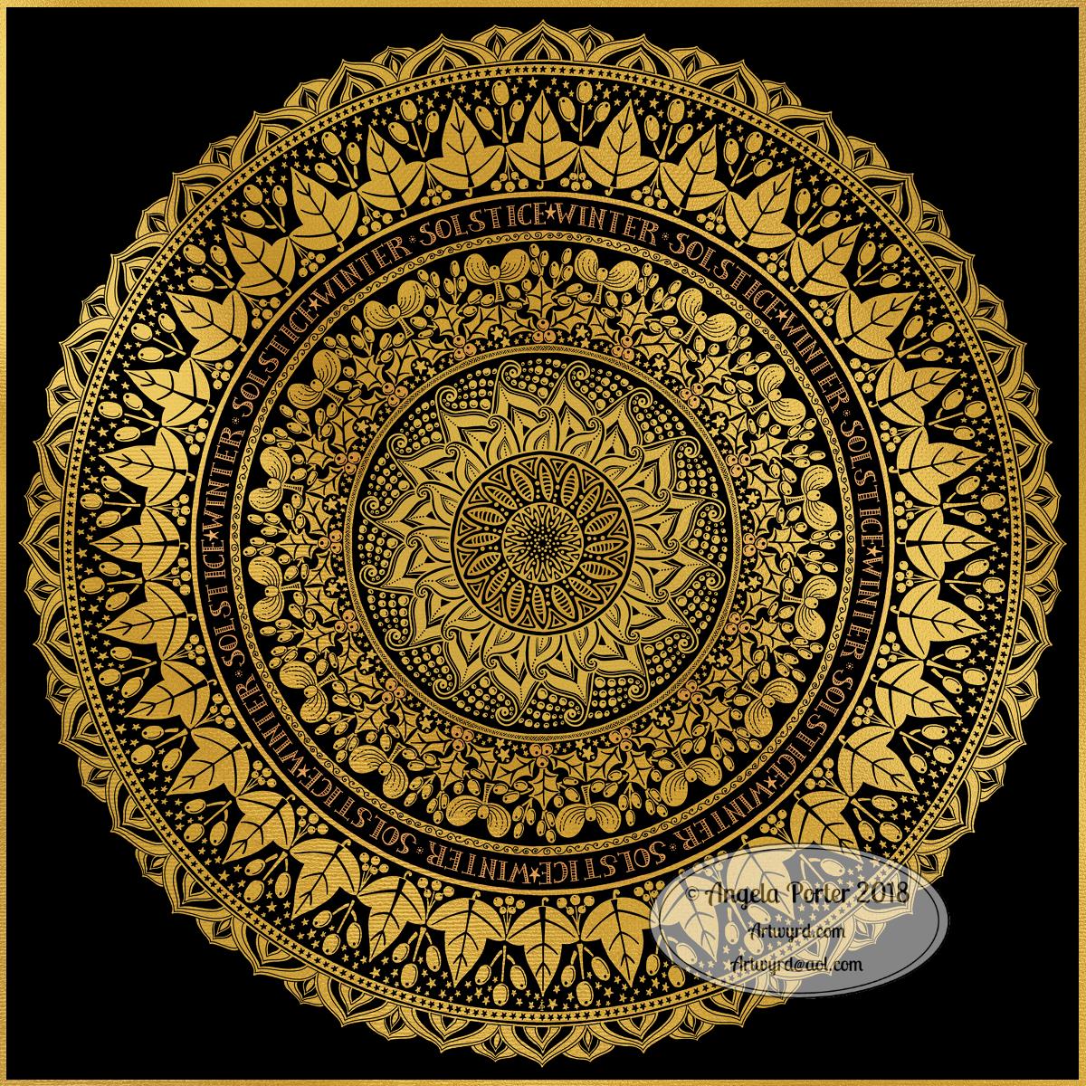
Winter Solstice 2018

©Angela Porter 2018

Winter begins! It’s the end of one astronomical cycle and the start of a new one. Winter Solstice is one of my favourite days of the year, along with All Hallow’s Eve. There’s always a feeling of excitement on this day that’s associated with ending and beginnings. Time to lay to rest that which is completed to make way for the new that replaces them as the Sun symbolically ‘dies’ on this day and will begin to ‘grow’ again in the days that follow until the Summer Solstice. It’s also a time to be grateful too.

I know there are many endings and beginnings; every moment in our lives is both an ending and a beginning. However, I feel that days like this, where we can focus on this never ending process in a bigger, more symbolic, more formal way, is important. Traditions are important as they bring a semblance of order to our rather chaotic lives.

I spent some time yesterday drawing this mandala to go with today. The dull gold represents the weakness of the Sun, relatively speaking. I’ve included mistletoe, holly and ivy as they’re traditionally associated with this day. I’ve also added berries as symbolic of the fruits of gratitude I carry for all the days since the last Winter Solstice. And, of course, there are plenty of sun-ray-like motifs and patterns. And stars. Plenty of stars, which from a distance look like snow drifting down.

Yes, I can say I’m rather pleased with this mandala. That’s not something I say often as I’m highly critical of myself and my work. But this one I really do like. I like the more graphic nature of the motifs. I like my hand lettering. I like the rhythm and flow of the design with the rings of designs radiating out.

So, I wish you all the very best that comes with the Winter Solstice, for today and all the days ahead of you and yours.

This was created using a Microsoft Surface Pen and Surface Studio along with Autodesk Sketchbook Pro and a gold texture purchased via Creative Market.

Yuletide dangle design

©Angela Porter 2018

Tomorrow is the Winter Solstice, or Yule. So, I wanted to create a dangle design for Yuletide, and wish you all the blessings of the season.

On the Winter Solstice here in the Northern Hemisphere, it is the shortest day and from here on in the amount of daylight begins to increase once again, albeit very slowly at first.

People gather at prehistoric monuments, such as Stonehenge, Newgrange and Avebury, to watch the sunrise on this day. These monuments have Winter Solstice alignments. That’s why I’ve got a pair of big stones framing the sun.

Of course I had to include holly, mistletoe and some evergreens in the design, along with stars, hears and a couple of cute robins.

It is a digital piece of art which started life as a pencil drawing on dot grid paper. The design was scanned in and re-drawn using a Microsoft Surface pen on the screen of my Microsoft Studio in Autodesk Sketchbook Pro. I did make use of the mirror symmetry tool to help me with the symmetrical nature of the design. I hand lettered the sentiment in the ribbon.

I did colour this quickly using gradient fills – yesterday I really wasn’t up to doing much. I am feeling a bit better today, though drained after a quick visit to my local town to run a couple of errands. I’m really easy to startle at the moment and me being jumpy at every noise and the number of people out and about was something I kind of expected but hoped I wouldn’t experience today.

I’m safely back home now and am starting to calm down a little, though I feel exhausted. So, the rest of the day will be spent quietly for sure.

I do have a Winter Solstice mandala to share tomorrow, and I’m rather pleased with this one. So, do pop back tomorrow.

‘A Dangle A Day’ is published on 8 Jan 2019.

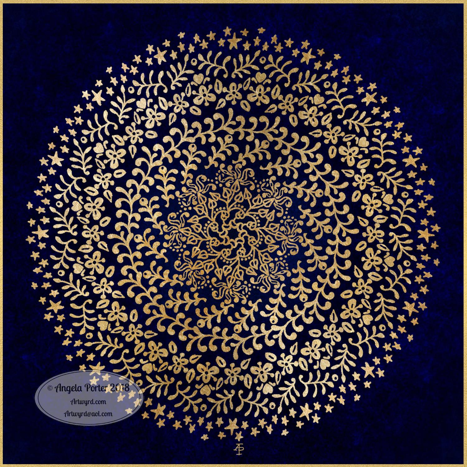
Golden Mandala 16 Dec 2018

© Angela Porter 2018

A little bit of playing around with textures and so on and I created this fun mandala, more like a concentric series of ‘wreaths’, but it was fun to do and I’m quite happy with the result. It’s fun, whimsical and just a bit shiny.

I used simple foliage and floral motifs, with the odd berry and heart thrown in for good measure, not to forget dots and stars! It’s amazing how simple motifs can result in a fairly complex looking design.

Instead of a black background for the design I went with midnight blues, with some texture added, though it’s rather subtle. Blue and gold is a classic colour combination – rich and opulent. Mind you, I rather like a rich burgundy with gold.

I have no idea how this would look when printed out, however it’s pretty to look at on the screen.

However, the main purpose of me creating these kinds of mandalas is to have fun and to explore more in the way of digital art and how I can make it work for me.

My tools for this were Microsoft Surface Pen and Studio, Autodesk Sketchbook Pro and a gold texture that I acquired in a set from Creative Market.

Yesterday I didn’t do that much in the way of art. I did get a template done for New Year, but I’m not at all sure about it. My mood was ‘off’ yesterday so I just spent a fair amount of the day relaxing and resting up. Sometimes that’s what is needed.

I’m feeling a bit more upbeat today, but I have a case of the sniffles. I know I have things to do later on in the day, but this morning, now I’ve tidied up the house a bit, I’m going to relax and maybe do some arty stuff.

Christmas Dangle Design

©Angela Porter
Design from ‘A Dangle A Day’, authored and illustrated by Angela Porter

It’s Friday so it’s #dangleday. Today, I wanted to share a Christmas Dangle with you from my book ‘A Dangle A Day’. In the book I show how this design was drawn, step by step.

When I created this design, I first drew it in pencil on dot grid paper. The next step for me was to scan it in to the computer and then re-draw it step-by-step, saving each step as I went. For the book, the final step was to colour the design and then write the instructions to go with the images. My tools for this were a Microsoft Surface Book, a Microsoft Surface Pen and Autodesk Sketchbook Pro.

I wanted to include as many Christmas-themed charms to create the dangles as I could and still keep the design balanced. I also kept the length of the dangles uneven. The waviness in the ends of the dangles echoes the waviness of the fairy lights above the hand lettered word ‘Christmas’.

What I did this morning was to print the black and white line art design on an A4 sheet of paper. Then I used Chameleon Duo Tones and Color Tops markers to colour it in.

These pens make it easy to create gradations of colour, such as on the hand lettering. These gradations add ‘dimension’ to the charms and dangles. I keep the darker shades to the left and bottom of the designs so that there’s a consistency across the whole image. I also used a pale grey marker to add drop shadows to the left and bottom of the design elements; again this helps to add dimension to the design.

Finally, I added some highlights with a white Sakura Gelly Roll pen. I also added some sparkles around the fairy lights and individual stars with a gold glitter Uniball Signo gel pen. After all, it wouldn’t be Christmas without some sparkle!

Used individually with a monogram or Christmassy image the dangles would make lovely book marks. Printed at A5 in size, the design would make a fabulous BuJo page for the big day itself. It would also make a lovely design for greetings cards or note cards.

Of course, it would be easy to change the word at the top to, perhaps, Winter or Yule and use fewer dangles to suit the length of the word. Personally, I like to use an odd number of dangles wherever possible – it gives a more balanced design.