Monochrome Abstract

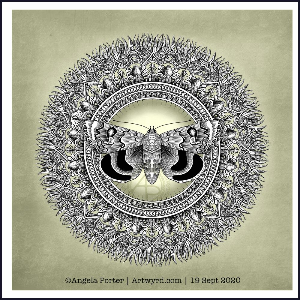
A bit of abstract art, along with a quote today.

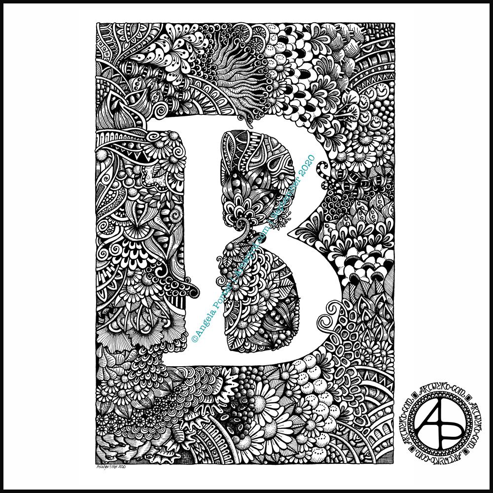
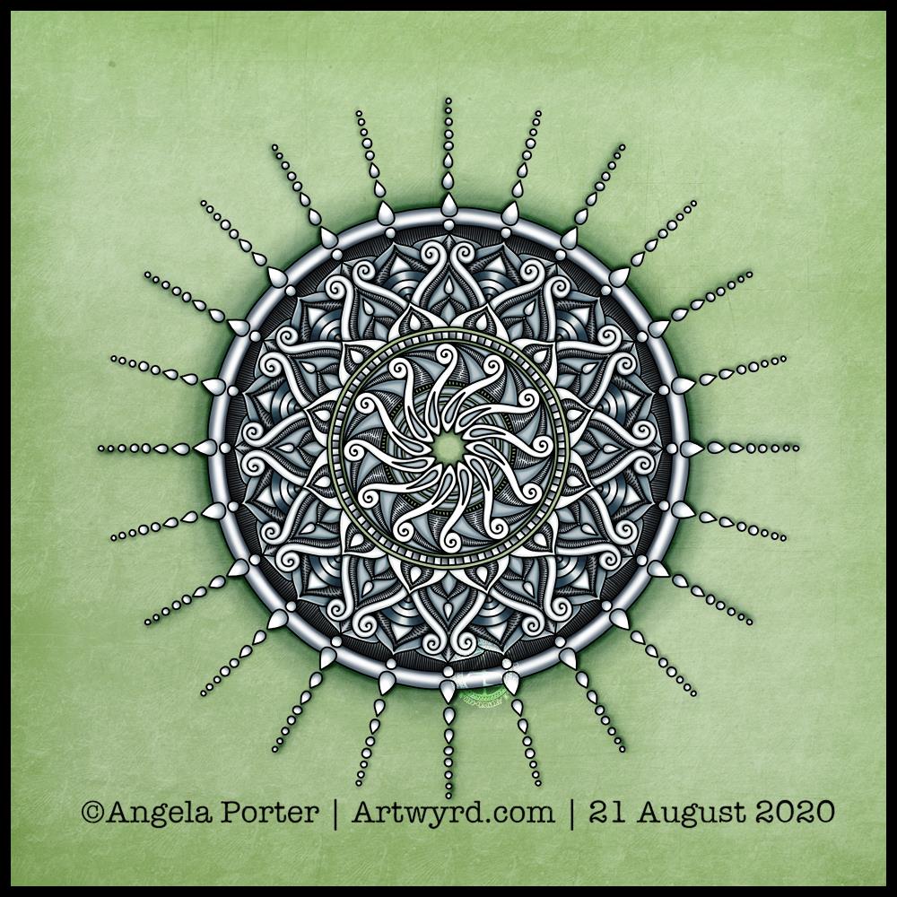
The patterns here remind me of the folds of fabric in Romanesque sculpture. The memories of visiting Romanesque churches, cathedrals and abbeys are filled with the sense of awe and wonder at the beauty of the sculpture, as well being fascinated, contented and happy.

The smooth curving forms, the play of light and shadow – these are things I love to play with in my work, whether pure abstract or with coloring templates.

The quote is how I feel about what I create. I know I put more of myself into my art than I realise, but creating beauty, allowing others to share in what I find to be beautiful and fascinating is what I do. And there is nothing wrong with that.

When I create, I carve out time to find a space of peace, calm, contentment in my life. Creating art is my sanctuary, a time and place where I can forget about the pressures of life, the pains of the past, and worry about the future for a while. If viewing my art, or colouring my colouring pages, even for a moment, gives another person a sanctuary from the pressures upon them, then that is a good thing.

In the pink

It’s funny how colours seem just right one day, and the next day I wonder what on earth I was thinking at the time.

Yesterday’s mandala, with it’s kind of yellow-brown background just doesn’t seem ‘right’ today.

I often mention about how I feel I really struggle with colour at times, but feel much better if I stick with simple color palettes, even monochrome ones, more or less.

So, this morning I wanted to draw a mandala, as is so often the case. They give me a chance to practice drawing digitally and using pattern and texture within them too.

The drawing was just fine and dandy, nearly always a pleasurable experience and I end up with a design I like well enough.

Then, there’s the coloured background. Today I wanted a soft pink colour. I like the colour I’ve chosen. Black lineart would look start on it, to my mind, but a soft, warm, cream was just perfect. It looks almost like lace.

And I can breathe a sigh of relief as my faith in my colour sense is restored somewhat. Monochrome is the way to go, unless it’s coloring templates. Though perhaps I should try a monochrome colour scheme for them, or at least analogous colours with a pop of complementary here and there. I’ll see what happens.

For the rest of my day, I’m going to be gathering sketches of ideas and elements for the coloring book I’m working on, and creating a mandala has got me somewhat in the right frame of mind to do this.

Tuesday Mandala

Another day, and the inner need to create a mandala. I’m not entirely sure about this one. Whether it’s the red colour I’ve chosen, or the dense texture of the widest ring, or something else.

It may not be the mandala itself, but how I’m feeling today and how the mandala is, perhaps, a reflection of that.

Perhaps I’m just trying to read too much into it.

Though I’m not too sure about the finished mandala, the process of creating it was pleasant, calming, satisfying in it’s own right. Maybe as the day goes on the mandala will reveal more about myself today.

Paleotober 2020 – Fossils

An entangled smorgasbord of fossils, stylised fossils, and some of my favourite patterns and motifs.

I enjoyed creating this one, though I feel I rushed the highlights and shadows a bit. However, I can always go back and edit or re-work them. I’m so much happier adding those highlights and shadows digitally than I am with Copics or other media.

Today, my colour scheme is monochrome, with many shades of grey, along with black and white. Those colours echo a conversation I’ve been having about how life isn’t always black and white, that sometimes no matter how you try to find the right path, make the right decisions, not everyone will agree, either totally or in part.

Art is something I do mainly for my own pleasure. Yes, I do work on adult colouring books, but within the broad topic it’s up to me what I create. I guess enough people like my art as I’m asked time and again to create another book and another.

My biggest problem is believing in myself, recognising that what I do is good enough, and that my own way of expressing myself, in drawings like this one, is good enough too. This way of drawing comes all too easy to me, and that lack of struggle makes me think it’s not worthy of consideration.

That is why I end up experimenting with different media, different ways of creating art, of expressing myself. Yet I always return to this style.

In the past, I’ve described it as my ‘comfort art’. I’m beginning to understand that it is my main artistic voice, the tune. Everything else is me just trying to find harmonies that add to that voice. Perhaps the voice itself is enough, as with Gregorian chants.

That is an insight that I need to dwell upon for a while, but it feels right to me.

Drawn with Unipin pens on marker paper. Background, highlights and shadows added digitally.

Moth Mandala

The Art

I have been working on the moth drawing from yesterday. It’s a long, laborious, yet enjoyable process. So, this afternoon I thought I’d create a mandala to sit behind my moth illustration.

I’m quietly pleased with this one. I like the choice of colour for the background, even though it’s an unusual choice for me. The central glow and shadow helps to lighten the background a little and brings attention to the moth, which is the main motif in this design.

I decided to use just black and white for the moth and mandala, though there are places in the mandala where I’ve let the background show through.

I will continue to work on the other design, it’s just going to take me a couple, or even a few, days to complete.

Monogram “a”

I got this monogram finished yesterday evening. I think I may have been a bit heavy handed with shading in some places. However, overall I like it and I like the volume or dimension that the shading adds.

I definitely enjoy working in such a detailed, intricate and organically intuitive kind of way. Having the monogram as a design to work around does help quite a bit.

On a kind of related point, I had a new A5 dot grid notebook delivered yesterday so I can start to make a collection of motifs and patterns as I use them or create them. The idea is I can winnow out those that I never/rarely use. The reason for this is that the dot grid notebook I’ve kept as a visual dictionary for the last couple of years is just about full! I will keep it as a reference, but it’s time to start a new, more relevant one I think.

I have a snazzy, teal coloured notebook, covered in vegan faux-leather. It has 218 numbered white pages that are a tad thicker than the usual dot grid notebook pages, The paper is velvety smooth and a pleasure to write/draw on. It’s made by Wordsworth & Black and I came across it on Amazon. Oh, the ink doesn’t feather, bleed through or ghost on the pages. I paid £15 for it and I’m very happy with it so far.

WIP Wednesday

Wednesday is work in progress (WIP) day. So, I thought I’d share my monogram “a” and the progress I’m making on it.

There’s a clutch of pens there! I decided to see if I could add grey to heop areas of the design stand out more, as well as adding some depth and dimension. I figured I had nowt to lose if I tried as the the design was becoming all much of a muchness to my eye. Looking at the image above, it seems to be working well in some areas!

I started using some grey unipin pens to add shades of grey to the design. They worked kind of well enough, but they were picking up pigment from the black and moving it around.

So, I thought I’d see what greys in Pitt Artist Brush pens I had and found some warm greys. They worked better as the colour could be laid down more smoothly.

I do have some new motifs to add to my visual dictionary, a corner of which you can see at the top right of the photo.

I’m not sure if I like adding the greys more than if I don’t add them. I suspect I’ll like them more as I work with them as I love the sense of volume that has appeared in various areas thanks to the contrast they confer on the design.

Let me know what you think – drop me a comment.

Monogram “a” WIP

Over the past couple of days I’ve started work on the next monogram. I took a fancy to a lower case ‘a’, so that’s what I’ve gone with!

Instead of working on the Claire-Fontaine Paint-On mixed media paper, which wrecks the nibs of my UniPin pens, I’m using some Daler-Rowney Marker paper. It has a smooth, soft texture and the pens glide over it and it’s a joy to use. The ink seems a lot darker on this paper, probably because of the way it’s treated to work well with marker pens and stop them bleeding. The paper is also quite thin and this makes it translucent enough that I can easily see the letter template below.

I’m trying to use some different motifs in this template instead of my go-to ones. Of course I’m still going to use some of my favourites, but it’s nice to branch out too.

It’s going to take me a while to get this one done in between contract work. But I will get it done.

Monogram B

Finally finished it! It’s taken many hours to do – probably around 15 I think, and it’s taken some perseverance by myself to get it done.

Uniball Unipin pens (05, 03 and 01) on Claire Fontaine Paint-on mixed media paper. Two pen nibs now wrecked; the paper is velvety smooth to touch, but just too rough for the tips of the Unipin pens. Will move to Bristol board for the next monogram.

That Friday feeling …

Mandala

Today’s art is a simple mandala. A cool grey, black and white colour scheme on a soft, calming green background.

Drawn in Autodesk Sketchbook Pro using a Microsoft Surface Slim Pen and Microsoft Surface Studio.

Confusion

I am emotionally drained, confused and overwhelmed again today. I don’t have much in the way of focus. I was surprised I could complete even this quick and simple mandala.

I don’t have the focus or energy to reflect on the choices of colours and symbols in the mandala and how they relate to messages bubbling up from my unconscious mind.

I feel trapped, caught between a rock and a hard place. I’m damned if I do, damned if I don’t. The stress of it all is giving me a migraine, upset digestive system and is dragging my mood downwards.

Heck, even the mandala looks like it is either sinking down, pulling itself up or hanging on by the chains of teardrops. That is how I feel, and I had no idea that was how the mandala would appear when finished.