Flower Buds – 29 May 2023

Flower Buds

I absolutely love the Kuretake Gansai Tambi Art Nouveau set of watercolours! I just had to get that off my chest!

I love the texture created by the watercolours – how uncontrollable it is, but it adds so much to the final drawing and it actually makes my arty heart and soul smile a tad.

This is a drawing completed, for once, in today’s YouTube video, due to premiere at 18:00 UK Time on 29 May 2023. In the video I show how to draw the design, add colour and gold and white details.

After doing this artwork, I really do think the Kuretake Gansai Tambi’s are the watercolours I’ve been searching for. They work with me, helping me to express myself. Also, embracing the imperfections of the textures in the colours as part of my self-expression rather than searching for the unattainable.

I used single colours for each section, except for the larger leaves. And that seems to have worked out well for me.

I love how the gold and green to the right seem to glow like sunlight shining through stained glass.

The only thing I wish I’d done was coloured the paper with Distress Inks before starting the drawing. I know that so little Distress Ink is added to the background that it won’t affect the colours in a noticeable way. So that will be my next arty experiment today!

Oh, and I wish I’d remembered to erase the pencil line before starting to add the watercolour!

Again, I used Canson Imagine mixed media paper(9.5cm x 10.5cm or 3.75″ x 4.25″) and it seems to make it so easy for me and the Gansai Tambi paints to work well together.

I’m absolutely amazed that I’m embracing imperfection! I never thought I’d get to that point, or let it be part of my artistic voice.

I’m actually smiling here. I really am. And a smile that is felt in my heart and soul too; something I’ve not done much for a long while.

A sudden realisation

I had a sudden revelation today, of a practical nature. I suddenly realised I tend to create art in sizes that require custom made frames and/or mats. So, I thought I should try to get a selection of ready cut mats in standard sizes and use them to cut paper and create the right sized art to fit the mat. So that’s what I did.

I can be such a numpty, feeling quite daft it had taken me this long to work that out! But then again, perhaps the time wasn’t right before now. I’ve thought for a while now that I could sell my art, particularly the more abstract, flowy, intuitive art. Next step is to work out how to do that and ‘promote’ it/me. And that is the problem, the promotion… it fills me with horror. But maybe I’ll work it out. Time will tell for sure.

Illustrated Journal – 2 Feb 2023

Illustrated Journaling

For a long while, I’ve been playing around with hand lettering, using my writing in art, and the idea of marrying together writing and drawing. Today, I started a new sketchbook dedicated to this idea and exploration. I woke up this morning with the concept clear in my head, and so I did!

A sketchbook is a perfect place to experiment and try things out. I’ve already got various notes on this page reflecting on what is working and what isn’t. And there’s some reflective journaling too. My handwriting is a mess. That Distress Ink-ed dot grid paper looks really grubby. The Inktense pencils and the use of a water brush may not have been a good idea on the sketchbook paper. However, it is a sketchbook. It’s not meant to be anything other than a place to explore, experiment, and unearth hidden thoughts and ideas.

The last paragraph had a lot of negatives in it. I do like the border, and this is something I’ll continue to do. The idea of collating notes onto a page intrigues me; even adding pockets and other things from junk journaling could be an idea. Places to store notes about ingredients and so on. I enjoy researching all kinds of things, including foods, ingredients, spices and condiments.

Food illustrations

What is new is me drawing food! I don’t know if I’ll ever draw a plate or bowl of food, but the ingredients or various elements interest me. So I’ve written a note to myself to see if I can make patterns or motifs for my more abstract, non-representational work from them.

I also must learn that colours can be imperfect; close enough is good enough! The ginger jam (more correctly, ginger preserve) was troublesome. But it’s good enough for now.

Soothing fraught emotions and thoughts

I’ve been relatively open with my mental and emotional health challenges, to a degree at least. And I thought it would be an excellent idea to combine that with food, and maybe more.

Art and food are two ways I can soothe and comfort myself. On good days, I’ll be adventurous with cooking. It may be a takeaway delivery or something quick and easy on bad days. On the in-between days, comforting food is the go-to, often more traditional recipes.

Cooking is always a challenge as a singleton. However, the motivation to cook and feed me wholesome and healthy food can be a considerable challenge, especially on my fraught and frazzled days.

Where will this lead?

I don’t know. I know it’s a personal project, but a friend and I have talked about collaborating on a project about cooking. So this may be a way of kicking the project off, even though I am still determining where it will go. If nothing else, it will give me a way to draw new and different things, explore various techniques, both in art and cooking, and reflect on all kinds of things. I’ll get to practice my handwriting and hand lettering as well. And perhaps work out how to create a pleasing layout!

This will, I trust, encourage me to take more care of myself in terms of nutrition. In addition, adding daily entries for at least one meal will hold me accountable.

A variety of meals/dishes will be required too and so will stop me from eating the same old things again and again! That’s a rut I can get stuck in. Also, if I find something I enjoy, I will eat it again and again, day after day, until I become sickened by it! That is not good either!

Am I overloading myself with projects?

I have a book to do for Creative Haven by the end of June. There are some self-published colouring books that I’d like to do too. Then there’s my creepy-cute monsters project. YouTube. Writing. And more!

I often can’t see the wood for the trees. Being able to prioritise has never been a strong skill of mine. However, I do need variety and options of what to work on. Otherwise, the work can become stale and uninspiring to me. And I can so easily get overwhelmed by the enormity of the task, or tasks, to be done. And then there’s the fear of failure, of not being good enough, that results in procrastination.

Also, I know that at the moment, my emotions and, thus, my mental state isn’t the best; new challenges in life outside of art and creativity. But that means that art and creativity are more important to me to help me calm, relax, get in the flow and give my mind and emotions a break!

I’m sure I’ll figure it out. I’m not one for schedules of work day by day and hour by hour. That may be something I need to look into.

But not now. Now I need a mega-big mug of good strong tea! I’m British (Welsh), and we think tea will solve everything!

Creepy Cute?

This is my latest sketchbook page. I’m exploring these weird creatures after a conversation with a friend a couple of weeks back now. Although these are pen and wash, I’m keen to get them drawn digitally and coloured. After all, a sketchbook is a place to try things out, make mistakes, crystallise ideas and then go forward.

There’s plenty about these creatures I like and a lot that I don’t like. They are, however, a place to start and build on.

What I do know is that they make me smile and giggle! Which is a good thing for sure!

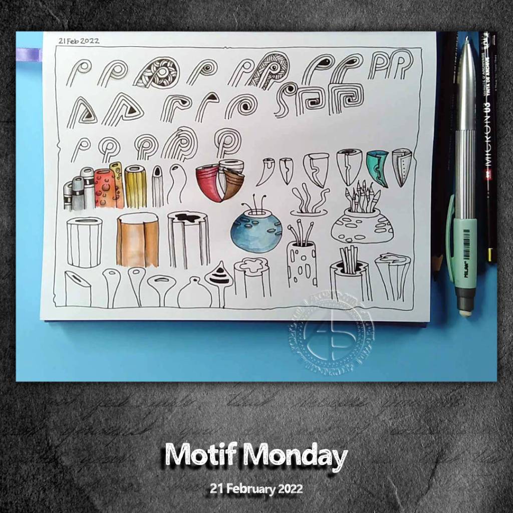
Motif Monday

Click on this link to see today’s video.

I love playing around with motifs, letting variations appear on my paper. So, having a day dedicated to exploring in such a way is, I think, a good idea for me!

Today, I chose two templates. One ‘seedling-y’, the other ‘coral-ish’. I ended up with this page (A5) full of possibilities and potential.

I worked in an A5 Arteza plain paper notebook rather than a sketchbook. I’m getting papers all over the place again. As much as I like the discbound sketchbooks I have, I just felt the time was right to dedicate a casebound book to my motif, tangle and fragment pursuits.

The paper reminds me of dot-grid notebook paper, without the dots. I didn’t expect it to work well with the washes of colour. However, as a sketchbook, it’ll be fine for me. The smooth surface of the paper is a pleasure to draw on. Also, I won’t wreck the nibs of my fineliner pens so quickly!

Oh, I also used a matt graphite pencil to add shadows – no tortillon or paper stump, just using pressure and/or layering to increase the depth of the shadow. I also worked with texture in the shadow in the blue seed-pod/sea anemone/round thing. That is something I want to look at a bit more going forward too.

Something Different Sunday – Bots invade my sketchbook…pesky things!

Click on this link to see today’s video!

A rainy, windy, grey morning here in the Valleys of South Wales. The perfect day to cwtch up in the warm and dry and work on some art.

I’ve been drawing robots, or bots, in my sketchbook lately. I blame Bill Making Stuff on YouTube. I stumbled across his channel a lil while ago, and it seems his insidious bots and makes have found a corner in my creative mind to lurk. It’s inevitable, I suppose, that they should creep out.

But my drawing style has exerted its muscle …and these are typical ‘Angela’ style drawings! Actually, I had started to work on some new bots and characters for my Doodleworlds style of cute and whimsical art. But Bill gave me, unknowingly by him, the push to have a go at drawing these creations.

Fun. Whimsical. Cute. Different. Just what I needed to do on a rainy, windy, grey morning.

Template Thursday | ATCs and Cards

Link to today’s vlog on YouTube.

This week’s coloring template / coloring page for the members of the Angela Porter’s Coloring Book Fans Facebook group is a bit different.

Instead of one large image, I created a sheet of eight, slightly smaller than ATC sized drawings.

ATCs (Artist Trading Cards) are 3½” x 2½” in size. The original idea was for artists, crafters, creatives to make small pieces of art and to swap them with other artists as a way to share and collect art. The idea was to swap and not sell, though people do sell them now, but many more do swap and collect work from other artists.

In today’s vlog, I colour and embellish one of the designs. Then, I turn it and another into first ATC cards and then into greeting cards.

This idea came about through a conversation with a group member who asked permission to create ATCs from my coloring templates for the group.

I do not have an Angel Policy for any of my templates in the group to allow them to be sold in any form. However, gifting or swapping them, or items made using them, is fine so long as the artist (me) is credited and the items are not sold.

For the individual coloring books, terms and conditions are mentioned in the books and should always be referred to.

Pen and Wash | Entangled Art | WIP

Link to today’s vlog on YouTube.

A very small penny dropped yesterday. I realised that what I’m doing is pen and wash, or ink and wash, or line and wash. I’m not entirely sure that a label is required, but it seems to fit.

I’m adding watercolour of one kind or another – Inktense, Ecoline, Mijello Mission Gold, Distress Inks, etc – to a pen drawing. Why I haven’t made that connection to the description of the method/process? I have no idea! Still, I have made that connection and a realisation that it gives a sense of artistic legitimacy to my work. That is a function of my insecurities when it comes to my artistic espression.

Yes, that’s right. Insecurities. Lack of confidence. Lack of belief in myself. Self-questioning about what on Earth I’m doing.

It is always nice for me when pieces of a rather abstract, metaphoric jigsaw fall into place, giving me a more coherent view of my method, my artistic voice.

These pieces always fall into place at the right time for me. I’m ready to accept that line and wash is what I do well, when I work within ‘an elegance of limits’ to quote the team at Zentangle. In this case a limited palette of colours harmonious with the background.

As well as working on this particular drawing, I have included some views of recent work in my sketchbook in today’s vlog. This other work shows me trying to work out how to add more contrast to the wash of colour. Fine ballpoint pen, graphite pencil and tortillon or coloured drawing pencils/chalk pastels are what I’m exploring. Eventually, I will settle on a method that I particularly like. I’m not happy with any of these at the moment.

I will continue to explore an figure it out. That’s what I’ve done with adding colour to my drawings, and that’s what I’ll do when it comes to increasing contrast with shadows and highlights.

Of course, I’m talking here about traditional art. When it comes to digital art, I think I have found a way I’m comfortable with in adding colour to pen drawings. I’m not quite there yet with traditional media, as well as finding the traditional media I like to work with.