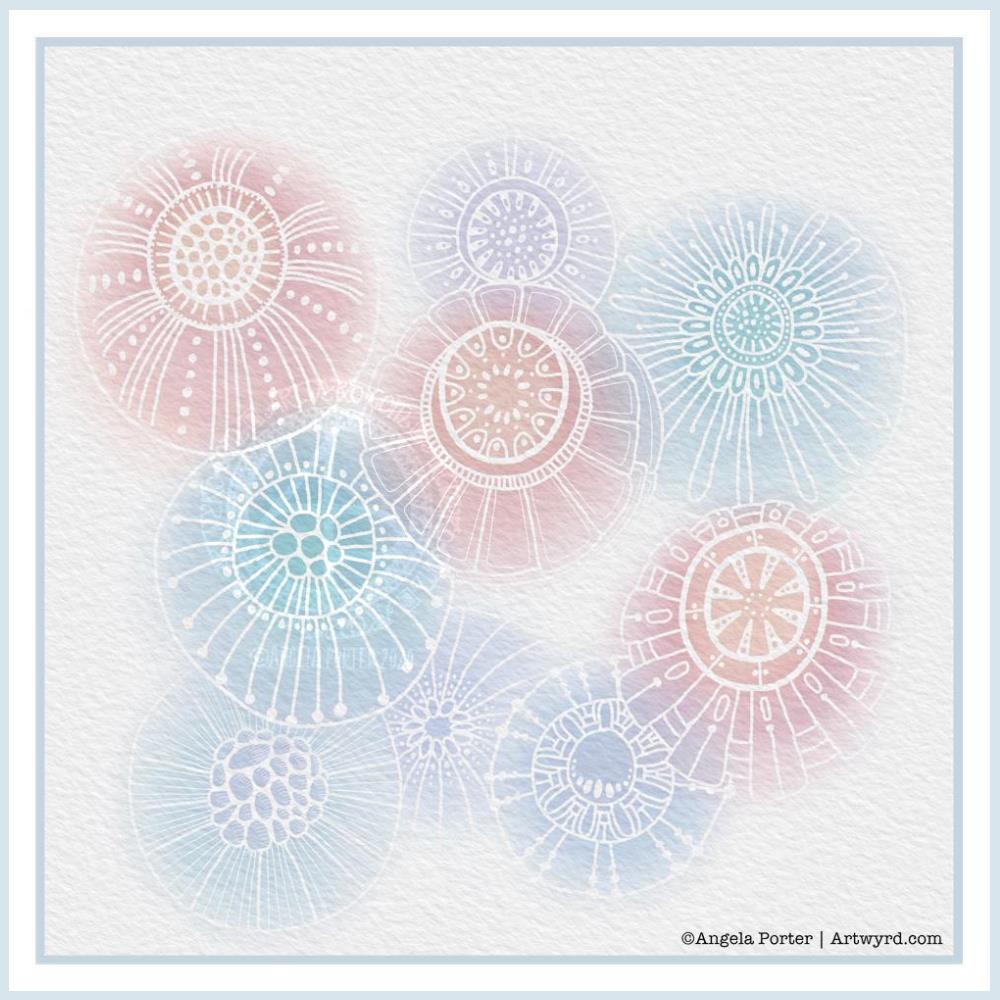
Another morning, another play around with watercolours, this time digitally.
Soft balls of watercolour, fuzzy edges, with white ink details added on top. Layers of transparent colour.
I overlaid a watercolour paper texture, which helps give the right ‘feel’.
This is my favourite attempt at digital ‘watercolours’ so far. I definitely like using white ink in this instance; black ink was just too harsh, hard and jarred uncomfortably with the softness of the watercolours.
I tried lots of ways of adding colour; not just brushes, but different brush effects. In the end I was happiest with white ink.
A nice way to spend a couple of hours as I wake up.
Another lock-down week has passed us by, so it’s time for another coloring template for members of the Angela Porter’s Coloring Book Fans facebook group. Here’s my partly coloured version. I’ve gone for rather soft yet glowing colours for this one.
As always, if you’d like to print and colour it, then pop over to the facebook group and join up. It’s free, it’s a lovely community of people who love my artwork and share their amazing colorations with each other. You’d be made most welcome.
I used one of the dragonfly designs from yesterday’s posting as the focal point for this design. Mandalas are something I love, so to place one behind the dragonfly felt the natural thing to do. I’ve used my signature style of entangled art to fill the space around the mandala.
This is digital art, drawn and coloured using Autodesk Sketchbook Pro, along with Microsoft’s Surface Studio and Surface Slim Pen.
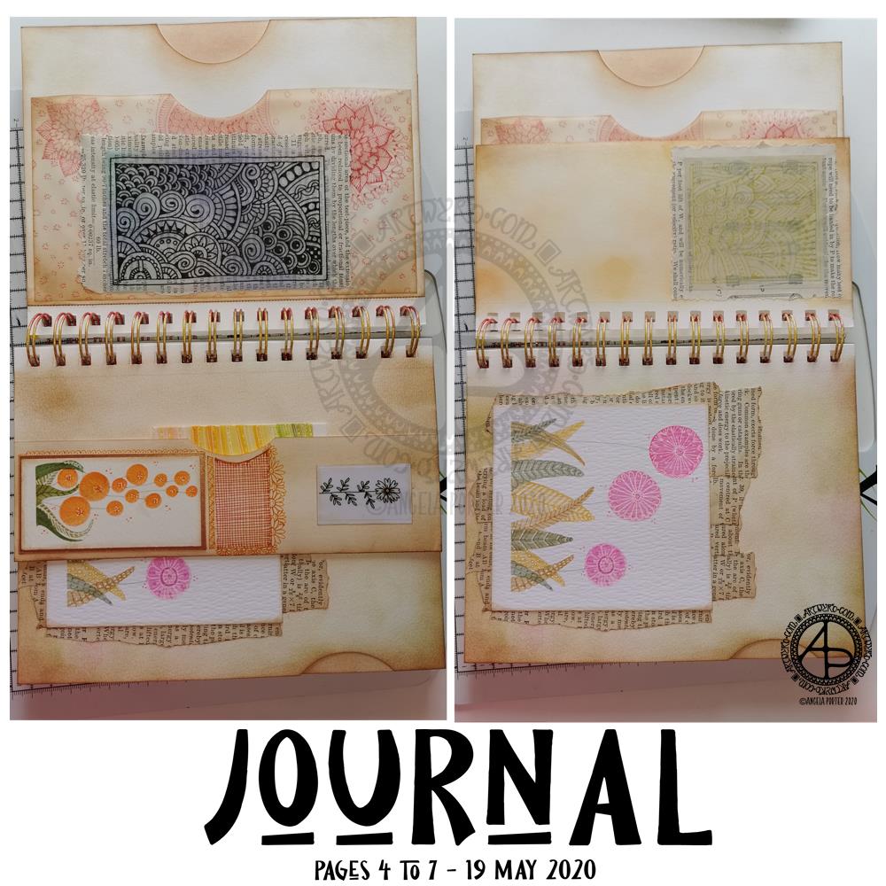
Over the past day or so, I’ve done some work on my journal and have pages 4 to 7 mostly complete. I’ve included lots of pockets to slip paper or artwork or other surprises into. I’ve also used some artwork I created as ephemera and embellishments.
Page 4 – top left.
This page has three pockets. One made by adhering two pages together, with a thumb notch punched out. Another is made from a sheet of tracing paper. The third is behind one of my signature entangled drawings; it’s a fairly secret pocket, unless I add something that peeks out from it.
I coloured the reverse of the drawing with Distress Inks as I didn’t know how they’d react with the pen drawing. Then, I adhered the tracing paper to some old book paper, and then adhered this to the tracing paper pocket, applying glue along three sides to create the pocket.
Once the glue was dry, I added some zentangle style patterns to the tissue paper pocket, just for fun. I used one of the Chameleon Fineliner pens to do this, using a colour that went well with the colours I’d used to ink the paper.
Page 5 – bottom left.
Page 5 is a little bit bigger than half the width of a page. I folded up the bottom of the page and adhered it along the edges to make a tuck-in. I punched out the thumb notch with a circle paper punch.
I decorated the tuck in with flower art at that I created myself. I also added some zentangle style patterns in between the flowers. I used Chameleon Fineliner pens, this time using a red and orange to get a gradient.
Page 6 – top right.
Again, a page that is a little more than half the width.
The drawing was done in gold ink on tracing paper. I used Distress Oxide inks to colour the reverse of the tracing paper before adhering it to some old book paper. The text and diagrams on the book page shows through faintly, as it does with the drawing on page 5.
Page 7 – bottom right.
This page just has a flower painting I created along with old book paper that have been collaged onto the journal page.
You can see the thumb notch on the edge of the page, showing I created a pocket by adhering two pages in the journal together.
Next steps…
None of the pages are fully completed. I’d like to add quotes or meaningful words or phrases. Some pages have gaps where I can add ephemera or pockets and so on. There’s certainly many spaces on the pages where I can draw patterns and designs.
I’m going to let the pages rest for a while as I turn my attention to other things today.
I’ve been feeling a bit ‘off’ or ‘meh’ in the last couple or so days. I’m finding it hard to settle to work of any kind. That I’ve been able to focus on getting some little bits and bobs done for the journal shows I’m feeling a bit more focused than of late.
Over the week I’ve been adding to my sketchbook- notes and images, ideas and reflections.
Each page has been coloured with combinations of Distress Inks, applied using the black side of a piece of Cut and Dry foam, followed with a spritz of water to bring out some water-staining grungy loveliness.
All the little drawings have been done on either Daler-Rowney Smooth watercolour paper (300gsm) or mixed media paper, either from Claire Fontaine or Daler-Rowney. The papers have been coloured with Distress Oxide Inks, Distress Inks, or a combination of them. Most of the pieces have had the inks applied with the foam, but some were made by brayering Distress Oxide inks onto a gelli plate and taking a print of them.
The reflection about what I like, what I don’t like, and ideas that arise is important to me in my sketchbook/journal. I do reflect on my art, a bit too much in my head. When I write it down, it forces my sometimes abstract and swirling thoughts into some kind of order. When I make these thoughts a material manifestation by writing them down, it helps me to recognise the thoughts, sift through that which is useful, and still record those that are not particularly useful at this moment but may be in the future.
I think I need to find a way to do this with my digital art. My mind goes to using One Note to do this. I shall think on this one, and make a note of it in my physical sketchbook/journal.
Gosh, Thursdays seem to come around so quickly these days! Thursday is the day I post a new colouring template for the members of the Angela Porter’s Coloring Book Fans facebook group, and above is this weeks offering.
I drew the line art on mixed media paper from Claire Fontaine with Tombow Fudenosuke flexible nib brush pens. I like to use variable line widths in my art from time to time. They give instant depth to the drawing and increase the graphic nature of the design.
I’ve used some really weird colours, for me, in my sample coloration. They’re really quite muted. That’s a hint to me that something is awry with my emotions/mood. I feel quite subdued and ‘meh’ at the moment, which is reflected in my colour choices.
Anyway, if you’d like to colour this, or any of many others in the archives, please pop along and join the Angela Porter’s Coloring Book Fans facebook group. I create these exclusive templates as a way of saying thank you to those who like my coloring books.
Yesterday, I spent some time drawing with a Tombow Fudenosuke pen on ClaireFontaine mixed media paper. The result was this coloring template for the Angela Porter’s Coloring Book Fans facebook group.
Last week, I said I’d do a template a week during the Covid-19 crisis to help people take some time out of worrying and fretting to relax with coloring.
If you’d like to grab the template, just pop along to the group, join, and it’s completely free! All I ask is you follow the terms and conditions of use.
The Fudenosuke pen has a flexible brush nib so I can produce lines of varying thickness. This isn’t something I do often for coloring templates. However, I do like the effect that I get. It’s so easy to give an illusion of depth and dimension.
Of course the template has a white background, but the version I’m sharing has a blueish-grey background which helps the colours to glow against it.
The design is typically my ‘entangled’ style. Abstract but with stylised motifs from nature and architecture and more.
So, how are you doing Angela?
I’m OK. The sun is shining. I have windows open to let some fresh air into the home, but they’re upstairs windows so no one can get within six feet of them! I also live in a very quiet, small, dead-end street (cul-de-sac if you want to be posh) so there’s very little foot fall here.
Reports are that people aren’t heeding the instructions to stay home here in the UK. That makes me fearful that the NHS will soon be overwhelmed by their selfishness and thoughtlessness.
The situation is surreal and feels unreal to people who’ve not had Covid-19 touch them personally – someone developing the disease, being hospitalised, or, sadly, dying. I hope that’s the reason that they’re playing russian roulette with everyone else’s health and well-being. I hope they don’t think that it’s a hoax, or that they’re invulnerable because of whatever reason they think they are.
Sadly, these people are helping to spread the virus. There’s sound reasons to follow the advice, instructions, orders to stay home.
Anyway… I’ve not yet had a text, email or snail-mail to tell me I’m counted as ‘vulnerable’ and will need to ‘shield’ for at least twelve weeks. I don’t know if I shall get one, but it will be in the next day or two if I do. Even if I don’t get one, I’m staying at home, as frustrating as it is on gloriously sunny spring days like this one here in the Welsh Valleys.
I really needed to do something creative today to sooth my mind, emotions and soul.
I tried digital art and I just couldn’t settle to it, so I thought a spot of traditional pen and paper drawing in an entangled or zentangle style might just fit the bill.
So, I cut some Claire Fontaine mixed media paper into 4″ x 4″ ’tiles’ and used some Uniball Unipin and Sakura Pigma Micron pens to draw the lineart.
I worked intuitively, not really thinking about what I was doing, just trying to lose myself in the flow so I could find my inner contentment and some peace.
I did scan my drawing in and digitally added a background and shading to the drawing, which really helps to lift it and bring it to life. If you’d like to see the black and white version, then pay a visit to my Instagram account – @angela_porter_illustrator.
Instagram is really irking me at the moment. I can no longer upload images or videos from my PC, only from my phone. I really loathe using the silly little keyboard on a phone to add the blurb that needs to go with the image. I may either reduce my posting to Instagram, or give up on Instagram completely.
Anyway, drawing in this style is something I’ve done for a long time. The familiarity of the process, patterns and motifs is a comfort to my troubled emotions and mind. It has helped to settle me down somewhat, though I’m still exhausted after a poor night’s sleep.
March the 1st is St David’s Day, the patron saint of Wales, which is where I live. The daffodil is one of his emblems and so it was fitting I included some in this month’s template. As we are heading towards the spring equinox and the official start of spring here in the Northern Hemisphere, I’ve also included plenty of flowers that would be lovely coloured in spring colours. They’d be lovely in colours of all the seasons, however. Flowers are beautiful no matter what season we’re in.
The template is drawn in my signature ‘Entangled’ style of line art, with very stylised flowers, foliage, and even butterflies and shells, along with patterns derived from architecture, sculpture, pottery, and more. Lots of my favourite things all in one abstract image.
If you’d like to print and colour this template, then please pop along to the facebook group where the members, and I, would love to see how you bring it to life with your own kind of colour magic.
This morning, after a couple of topsy turvy days, I managed to get some art done before I get sorted for the day.
It’s always lovely to return to art after a little break from it. Today, I used a photograph I took last August while visiting the National Botanic Gardens of Wales. Gorgeously coloured flowers were blooming in the great glasshouse, and this stylised flower is based on some of them, including the colour palette.
A bright, sunshiny, warmly glowing flower is just what I needed to paint this morning. I think I’ve chosen a background colour/texture that allows those colours to shine too.
Digital art created with Autodesk Sketchbook Pro, Microsoft Surface Studio and Microsoft Surface Slim Pen.
Leaving therapy…
Monday was a crazy kind of day. In the morning I got sidetracked by a friend, all while I was trying to pack gifts up for my therapist before I headed to my last appointment, for the foreseeable future anyway.
That’s right. I’ve finished with EMDR therapy, for now. I feel I’m good enough learn to fly through life without the support net of my therapist. My wings haven’t spread much, and though weak, they’re strong enough for me to take my first bumbling, solo flights in life (solo as in not with therapy). I’m going to crash onto the ground, bump into trees and obstacles, even get tangled up from time to time in branches and brambles. I do feel, however, that I can cope with the bumps of my flight through my post-therapy life.
Getting tangled up may result in me needing help to untangle myself as something happens in life that triggers a part of the cPTSD that is still hidden and causes it to rise up to the conscious mind where it can be dealt with. This may mean a return to EMDR to deal with that particular set of traumas.
It was both a little sad and a fairly exciting and happy time too. My therapist and friends are proud of me for the work I’ve put in, as well as the perseverance and courage I’ve shown in facing some of the traumas that have resulted in the cPTSD.
New Camera!
I’ve had a need floating around my head for a little while – to buy a DSLR camera. I’ve looked at them, read about them, tried to decode the technical blurb, and finally found myself drawn to one particular model time and time again.
Rather than purchase it online, I steeled myself yesterday to take a trip into Cardiff to visit Cameraland. I’d looked at various shops where you can buy cameras, but this one really ‘felt’ right. And I have to say, it was the right choice.
So, after breakfast, I headed off to Cardiff, parked up, and walked from the Museum to Cameraland through the town. For many years I’ve not been able to go into Cardiff. Loud voices, noises and the high number of people ramp anxiety in me up to a level of startle and hyper-vigilance. So, I used noise-cancelling earphones and upbeat music to help me cope.
And I did! This wouldn’t be possible to do if I was with someone or people, but on my own it’s completely do-able.
Anyways, the chap I talked to in Cameraland was very helpful, knowledgeable. I explained what I’d like a camera for, my experience with SLRs in the past, and the model I’d had my eyes on. He did say there were other options, but none as good as the one I’d chosen.
He showed me around the camera, let me hold it, use it, and then when I’d decided it was the one for me helped me with a uv lens filter, memory card and a camera bag that is spacious enough for me to use as a handbag too.
This camera is a celebration gift to myself for completing therapy, to mark a kind of rite of passage for me. It’s also a way for me to encourage myself to explore the world a bit more. I’ve invested a fair bit of money in the camera and I really don’t want to see it sitting in the bag, being unused.
I still can’t just go out because I’d like to go out. I still need a reason to leave my home. Going out to use my camera is a good reason in my mind.
It also means that when I’m with Liz, or others, on days out, I can record things that catch my attention that I’d usually sit and draw. Yes, I can use the camera on my phone, which is a good phone camera. However, the images aren’t as clear or colour-faithful as I’d like.
So, I may be sharing particularly nice photos I’ve taken too, of all kinds of things that I find interesting, fascinating.
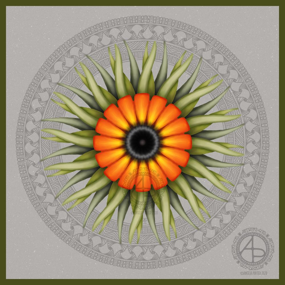
It’s a sunshiny morning in South Wales. A welcome respite from the rain we’ve experienced most of the week. The cleanup and return to ‘normal’ continue after the flooding that occurred just one week ago.
I had no idea what I would create this morning, other it would be a mandala.
I drew and painted the design digitally using Autodesk Sketchbook Pro along with a Surface Slim Pen and Surface Studio, both from Microsoft.
This one has the floral centrepiece with a zentangle-style background. The flower is an unusual colour choice for me; I tend not to use corals and red tones much. It’s easy enough to change colours digitally, but I went with it, knowing that my colour choice reflects how I’m feeling at this point in time.
Yes, I do tend to create rather intuitively. This design didn’t start with a sketch, but with the first shape to be drawn, which was reminiscent of a petal. The rest of the design grew from there.
I’m surprising myself with how I’m able to ‘paint’ digitally. I enjoy creating more stylised forms, but with added texture and contrast to bring them to life. I know I’m not an expert at this; however, each time I work in this way, I learn more.
Today’s big lesson was how to save a brush style I’d edited and liked as a new brush for my brush library.
I’m glad I’m learning and developing my digital art voices and styles and that it’s happening slowly over time and as my needs demand. I know if I watched videos or followed tutorials on how all this worked, I would become incredibly overwhelmed and frustrated.
I also know that by watching what others do, I would likely be tempted to emulate their style and way of working.
I need to work out my own style/voice and be comfortable with it. So, I’m not putting any pressure on myself to do something that I’m not yet ready for or haven’t had an awareness of what I could do.