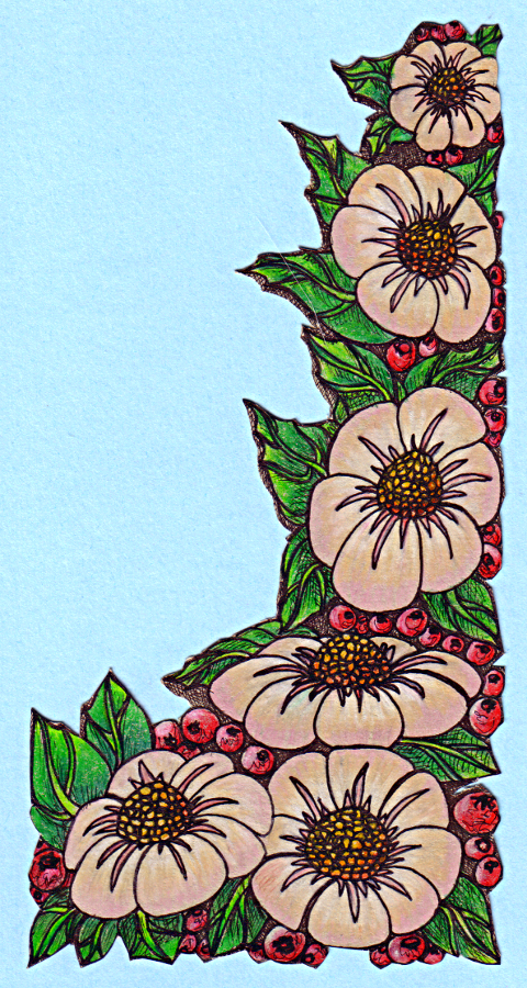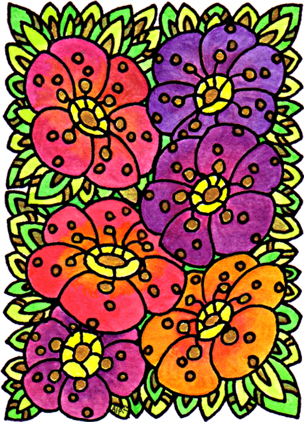
Non-dotty flowers – a reworking of the dotty flowers below. 3″ x 5″ approx.
Busy, busy, busy…
I’ve been kind of busy, but not busy-busy, since my last entry, busy with art. Being engrossed in arty pursuits has kept me up until the wee-small hours as the dark outside has given me no idea about the passage of time. Good thing I’m still on the long summer break from teaching.
I must admit that I’m not looking forward to going back to work. I think I’ve said before I need a different environment to flourish in. My only problems in changing career are that I need a certain income and I have no particular idea what I’d like to do instead of. I’d love to do more things that are creative – arty/crafty would be good. I’d also like to work in an environment where people actually get along, without the constant rumble of poor attitudes, disrespect for self and others and an unwillingness by the majority to want to learn or to see the point of having a good education and doing their best.
Anyway, before I drag myself down into a gloom, I still have two and a half weeks or so away (apart from a need to go in for a few days towards the end of the break to mark work, prepare work, and sort out displays for the walls) and so will be making the most of the time to be creative and explore my artsy-craftsy nature.
I managed to complete this torc. It took over 30 hours of work. It is available for purchase at Etsy at the time of this blog entry.

As always, spirals, circles and curves feathre in my work, along with some of my ‘custom made’ sequins. I enjoyed the work in this, and realised how many of the ‘tricks’ I had forgotten from previous endeavours like this. My earlier torcs can still be seen on Artwyrd at deviantART.
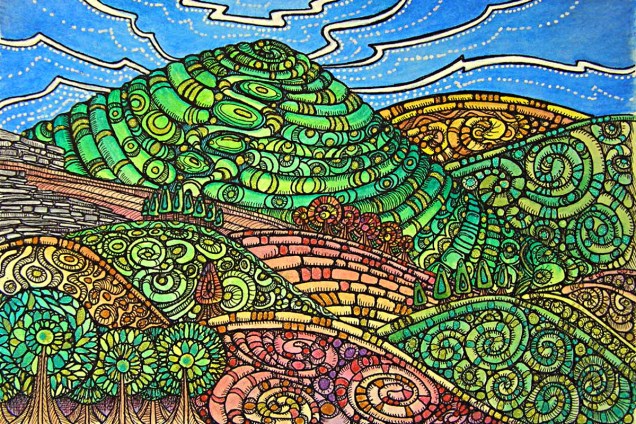
Experimental landscape number two.
I’ve also managed to complete another experimental landscape – this one from a photograph of a ‘real’ landscape in North Wales.

A dear friend of mine has made some interesting suggestions about how I can approach the ‘patterns’ for different land-uses. When I’m ready to do another landscape I will take his suggestions to heart.
There are glimmering, metallic, glittery highlights on the drawing/painting that don’t come out well when photographed/scanned. I do think I’m beginning to find my ‘style’ when it comes to landscapes – and that style involves simplifying the shapes/lines of the land, trees and so on, and then working out how to fill those shapes in. Spirals are, as always, a favourite motif of mine, along with circles and curves, influenced as I am by prehistoric rock art, early Celtic art, and anything with curves and curls in! If I try to work with perfectly straight lines and sharp corners in my work, well it just doesn’t seem to work or scream out ‘Angela’ at me.
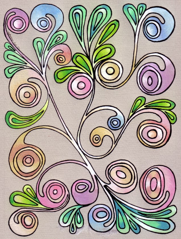
Abstract Floral.
This was an experiment in something a little different for me – pastel colours on a grey paper, with an open kind of design. The usual spirals and swirls are there, but there’s a lot of ’empty space’ which also works. The pastel colours are a definite change from me!

Flowers…
This started as a good idea and ended up a right ‘mare of an experience. A dear friend of mine reckons it is lovely and very William Morris…

I realised the rising flowers were on the wrong side if I wanted to add words to it as I was inking it all in.
Then, as I blended the coloured pencils, the ink rubbed off to mix with the coloured pencils, so it all had to be inked in again, which is often the case with my kind of work, but the ink subdued the colours somewhat.
I then started to fill in the blank space to the left with tendrils, without putting pencil lines down first as a guide, and ended up making a right hash of it. So, the shading under the leaves and so on was meant to disguise some of that, and cutting it all out and sticking it on blue paper … well it was a good idea, but not the blue! I also rediscovered how useless I am with a pair of scissors or craft knife too.
However, some of the most important lessons we learn are when things go wrong…
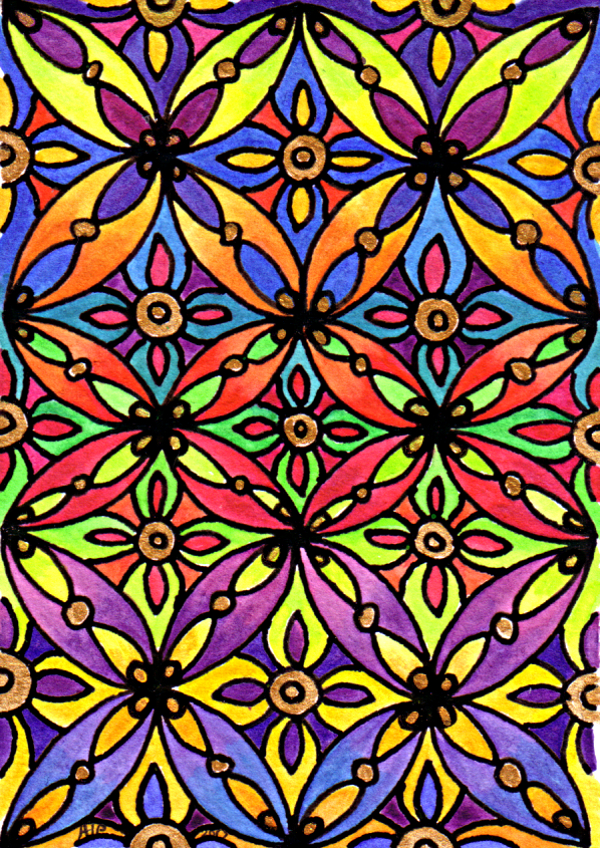
Geometricity 1
So, after the pastel colours and the disaster, a return to bright colours, and flashes of metallic gold.

A small piece of work – 7cm x 10.5cm, but jewel-bright watercolours used to fill in the pattern. I’m pleased with the work (though not with the scanned image – photographing/scanning my work is a major problem with the shiny Sakura Glaze pens that I use and the highlights of metallic/iridescent/glitter paints/inks that I so love. However, you get the idea.
I think that I’m going to play with geometric patterns and colour for a while, on a small scale, to see where it leads me. Of course, I may just change my mind as time goes along!
More flowers…
I completed this one with Geometricity1, and there are too many ‘dots’ on the flowers – another lesson to learn! I’ll be reworking this one in a little while. It will keep me occupied during the torrential rain that is falling here in waves. I love the sound of the rain…

 Believe … in yourself.


