
Today’s vlog is a flip through the work in my sketchbook during the past month, give or take a week!
I take the time to look at my work with fresh eyes after some time away from it. I also explain some of my thinking and methods along the way.

Today is a lazy, artsy day, Sunday. It’s raining, on and off, so I’m disinclined to wander out anywhere.
I started the morning drawing some half insects. Why half? Well, the plan is to scan the sketches in (which I’ve done), ink them in digitally (done too!) and then add colour (started!). Digitally, I can use the symmetry tools to complete the other half of the insect.
Of course, I could create mutant hybrids … but that doesn’t appeal to me much, that’s for sure.
I did film me drawing and wittering about my sketching and other arty stuff. I haven’t published the full-length video; I was very wittery and disjointed. My attention was focused on the process of observing and drawing. It seems that my ability to speak coherently vanishes as my concentration increases!
I enjoyed the half hour or so of quick sketches. I was focusing on creating simplified, stylised drawings, rather than detailed realistic ones.
Some connections were made as I wittered on. One was that when I draw in a stylistic way, I have no problem with using non-representational colours. It’s when I’m drawing more realistically that colours vex me. This is a problem that occurs with traditional media in particular.
I had a memory of falling in love with the work of Kandinsky, Juan Gris, and similar artists while doing my A Level art two decades ago. I particularly love the use of colour to communicate inner emotions, relationships with the art, and symbolism and metaphor.
I found this an interesting connection to make, even though I’m not entirely sure what that means yet. Other than that I’ve always found non-representational colour and stylised, abstract art something I’ve enjoyed doing. Indeed, as I write I remember that in front of me are three oil paintings I did for one of my art exams. They are abstract patterns from locomotive parts and Romanesque sculpture. Fiery reds, oranges, yellows and magentas were used for the locomotive parts. The painting based on Romanesque sculpture was in cool, calming blues. My focus for all the paintings was on pattern and contrast to get a feeling of volume/dimension.
Last summer, I was playing with watercolours and patterns abstracted from rock strata and nature. I used colours that appealed to me in these paintings.
I keep circling around this style of art. I return to it from time to time, enjoying the process of creating such art, often on a small scale too.
Where art comes from is a mystery. It comes unannounced. It has the quality of gift. The source from where it comes is hidden from us. Like all creativity, it stands us in possibility. It comes from impulse and dream, from raiding the inarticulate, from going below the floor of consciousness. To do this we must break free of the confines of the known and fixed. As artists we do this with our materials—with our hands. And in this confluence of mind and matter abstraction is not only relevant, it is essential. —Timothy Hawkesworth
Working from my creative subconscious is something I do…a lot. All my entangled art that just flows onto the page. Mandalas. Using observations of pattern and texture to create something that is non-representational, just, to my mind, pretty, pleasing.
I do the representational for coloring books, but my personal art … well … that can be anything I want it to be. I can use any colours I wish to use for it, and accepting that isn’t an easy thing.
I do my best to let colorists know that there are no rules for colour, that if they want purple trees and green people, that’s fine! And I’m able to do this in my coloring template style work. The stylised nature of these drawings allows that freedom. There really are no rules other than the ones we impose on ourselves.. I love to see the different ways people use colour, and the unexpected ways especially.
Yet, I am just realising that I’m very critical of myself when it comes to representational colors.
My problems start when I’m trying to create work that is representational of what I see with my eyes, such as succulents, or plants or anything else.
I can draw these things fairly well. Sketching and line art isn’t a problem, though it could be improved no doubt. But that improvement comes through practice.
My problems come when I start to add colour. If I can work with something that is non-representative then it works out OK, if often full of quite bright colours. Monochrome or limited color palettes really work well for me and produce a coloured piece of art that is cohesive.
It’s when I have a representational drawing that I want to add colour, that’s when my inner coloring critic comes knocking.
This inner critic took up residence most probably in my earliest school days when I was five or six. Well meaning teachers making sure you coloured inside the lines, that the sky was blue, the grass green and so on. If you deviated from these rules, well … trouble followed.
Trying to stay safe by using representational colours, and keeping this inner critic happy isn’t working at all. It’s time to sort this limiting inner voice out.
Making observations, creating stylised, imaginative versions of what I see, using patterns and textures I collect and not worrying about realistic colours is my way forward.
As Yoda said, “You must unlearn what you have learned.”
I thought I’d done that, I didn’t realise I was subject to the attentions of the inner coloring critic. Not until I started talking and writing about this as starting to dip into a book full of exercises for creating abstract art.
Time to invoke my inner art jedi master and deal with the self-criticism that is limiting me! “This is Jedi business, go back to your drinks.”
Saturday is becoming sketchbook Saturday with a vlog on YouTube!
As well as showing the most recent page(s) in my sketchbook and talking about the media/techniques/inspiration, I spend some time working on the current, higgledy-piggledy page.
I’ve become intrigued with using the humble biro / ballpoint pen in art, especially as they are waterproof. There’s some amazing portraits and other work out there by seriously talented artists.
However, I’m working out how they may work for me, especially in my sketchbook when out and about (when that finally happens!).
As well as talking about the various techniques and inspiration for the art on this page, I also talk about how I want to include more writing in my sketchbooks. I’m intrigued with using creative writing record my experiences, feelings, thoughts and the presence of place alongside any sketches done when visiting somewhere.
I’m also thinking that if I take photographs of what interests me, then sketches and further work could be done later. This is going to be important when I’m not by myself and don’t have the luxury of spending as much time as I’d like.
I’d like to create a story that is in words and pictures, recording my whole experience. Perhaps, I may want to share this with others, so that they can get a glimpse into my mind and emotions.
I’m not too bothered about creating a work of fiction, but to capture all those abstract feelings and observations and communicate them with others…
Actually, it would be about sharing them with myself by becoming more aware of them and giving an outlet for those abstract thoughts and impressions I rarely verbalise as I’m unaware of them unless I’m asked to verbalise them.
Something else I’d like to do is to revisit typographic art with all of this in mind. Finding a way to incorporate words and imagery that expresses who I am, rather than taking quotes from other people.
I do love words, always have. During this past year, I’ve had so few opportunities to speak out loud, that I’m finding it hard to dredge up the right word at times. Previously this was so easy for me. So, it would be good to give my vocabulary a good work out as well as add new words to it!
It’s going to be a work in progress for sure. I doubt I can do this, or that it will be interesting to others, or that it will be any good at all. However, if I don’t take the first tentative steps on this strand of my life’s tapestry, then I may never discover if it is something I can do, nor will I discover where it will lead me.
All that it will take are basic supplies, and to create a new ‘habit’ of writing throughout the day, whether I’m at home, or elsewhere, and drawing things that are of interest/importance to me at the time.
A bit of a challenge, but do-able I think.
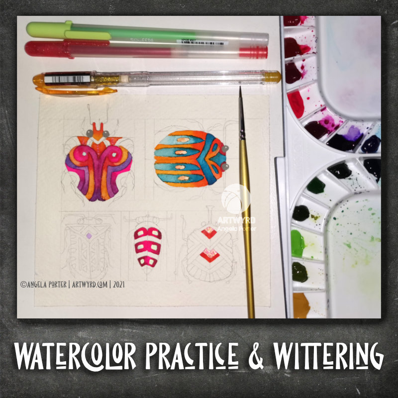
This morning, I spent some time watercolour wrangling. I had started this work yesterday, but kept getting myself into more than a little bit of a pickle with it.
So, after a day away from it, I thought I’d try an idea I’d picked up from a Domestika course by Lapin to see if I could recover some of the parts I’d made a bit of a mess of. That idea is to use Gelly Roll or other pens to add highlights/colours/add details. But in this case I wanted to try to ‘hide the crimes’ and use these pens as a kind of watercolour resist in the tinier areas that were seriously vexing me yesterday.
I’m not entirely sure my experimenting is successful. But, it’s something to ponder on and work with going forward.
In my vlog I mused about how the watercolours were, or weren’t, working for me and starting to make connections.
No matter how many books I read, videos I watch, courses I take on watercolour, translating that knowledge/information into practice just doesn’t seem to have worked for me entirely. Experimenting for myself is the only way forward I think. As is finding the balance between controlling the medium and allowing watercolour magic to happen too.
I think the best way for me to work is by allowing two colours to merge along a wet edge, so that I get a modicum of control, but the mixing of wet into wet can still happen.
I was out of action in terms of social media yesterday. I went for a walk on Saturday, didn’t watch where I was putting my feet and my right foot twisted over and I ended up on the ground on my hands and knees. One left knee with multiple cuts/grazes. One bruised, sore and aching right foot. And I was a bit shocked too. So Saturday went out of the window as far as anything arty was concerned.
Yesterday, I woke with various bits of my body aching from the jolt of the fall. I tried to do some art – the first steps in this particular painting – but it just kept going wrong. I started swearing, so decided to put it to one side.
Instead, I put my energy into editing some of the templates for the Whimsical Cats book, then inking in some of the sketches that have been approved (and declared “adorable”).
So, today I’m going to focus on inking in some of the sketches that need doing before getting some more sketches done.
I’m still feeling a bit out of sorts. I didn’t sleep well last night. So, I may crash and nap later on. So, now’s the time to get some work done. Inking in. Not too taxing, less likely to become frustrated with my artistic efforts while I’m tired and out of sorts.

Yesterday was a bit of an odd day. Between a couple of mediation meetings in the day and me still not feeling quite right – fatigued, headachy, tummy still not right – I just didn’t feel up to doing much when I was awake. Except for drawing. Drawing insects.
I started with pencil drawings and then decided to ink them in. I know from bitter experience how pencil drawings can quickly smudge and fade in a well used and referenced sketchbook.
I loved the delicate nature of the pencil drawings, but I know I can always draw in pencil again for future work involving bugs.
I started off with bugs that were quite true, in a simplified and stylised way, to the images I was looking at, Gradually, I found myself being more imaginative.
I now have a fair collection of insects in my sketchbook, and I am quite keen to add more! However, I really do need to turn my attention to the colouring book I’m working on for much of the rest of today.

Today’s Vlog (approx 33 mins long)
I finished the mushroom painting! I was so engrossed in the magic of watercolour and wanting to complete this work that I spent most of yesterday working on it!
I’m really quite happy with the outcome. It was very much inspired by Danielle Donaldson, but I think I may have given it some little twists of my own too.
I’m also beginning to think that I can make watercolour work for me, with a mix of ‘tight’ shapes, the magic textures achieved by wet into wet, and details with gel pens and drawing pencil.
I added the dots with a mixture of white Posca, Uniball Signo and Sakura Gelly Roll pens. I also tried adding dots of gold from a metallic Gelly Roll pen. I like the metallic dots, though they don’t photograph well.
I enjoyed this so much that I thought I’d do a smaller version on some of the Canson Imagine mixed media paper. That’s the work on the top left. I used Zig Clean Colour brush pens and Caran D’Ache Supracolour watercolour pencils on this one to see how they could work. I’m happy with some of the effects I achieved, but in other ways I’m not at all happy.
Surprisingly, I rather like the softer colours of the Supracolour pencils on the mushrooms at the top. I found I could get a ‘painterly’ effect with them too.
The dye inks in the Zig brush pens will reactivate with the slightest touch of water, which meant I had some interesting colour bleeds.
I think what I like most about this experiment were the different colours, particularly those peachy pink colours! I have a lot to learn about colour mixing of my watercolour set for sure!
Well, I thought I’d have a little play around with some cute insects, the start of which is at the bottom left.
I used a 0.3mm pencil to draw the design on Canson Imagine paper and then set to adding colour with Mijello Mission Gold watercolours. I’d forgotten that I wasn’t fussed about using them on the Imagine paper. However, I carried on working with them and worked with how they interacted with the paper. I definitely wasn’t working in the prescribed way of watercolour work. But, I ended up with some effects I rather like.
I often revert to working on a small scale. It’s something I’ve done throughout my art journey. I’ve never really been happy with working on a huge scale, except when working with pastels and charcoal.
Even when I create A4 art, which is the biggest I do in traditional media nowadays, my artwork is full of tiny details – the size of those details varies depending on whether it is personal art or art for a colouring book.
I get a lot of pleasure from creating small, precious works of art. If I were to frame them, I’d be tempted to put the tiny art in the centre of a huge frame to give that feeling of preciousness. But that would be very pretentious of me, wouldn’t it?


