Hello There!
It’s been a while, hasn’t it? The reason? I’ve been finding it difficult to manage my various autistic batteries viz. social, sensory, interoception difficulties and masking. That results in my mind ‘short circuiting’ and I find myself mentally tired, and unable to speak, listen or do much. When this happens, my mind and senses are just so tired that I need a lot of alone time, sleep, and activities that soothe me.
Add to the mix that menopause has hit and it has all intensified so much, especially with all the ways that the hormonal levels have changed.
So, I’ve not had the mental capacity to write blogs, post art or just do more than draw from time to time, listen to TV/Podcasts that don’t cause a drain on my resources, and sleep a lot. Oh, and StarDew Valley!
I’ve felt that I’m permanently on the edge of a shutdown, heading to a burnout all the time. I recover somewhat in a day or three, but then I end up draining the batteries again.
The odd thing, or perhaps not so odd thing, is that when I’m with people and and getting towards overwhelm, I’m discovering stims I never knew I had, particularly when I’m with people in person. That is interesting to me, as is the realisation they’re helping me cope with things so I can finish the event.
The hardest challenge for me is learning to manage my energy and remembering that ‘NO is a sentence’. One of my problems through life has been being a people-pleaser; another autistic trait. Using ‘no’ and not feeling guilty is really difficult, but I will get there… perhaps!
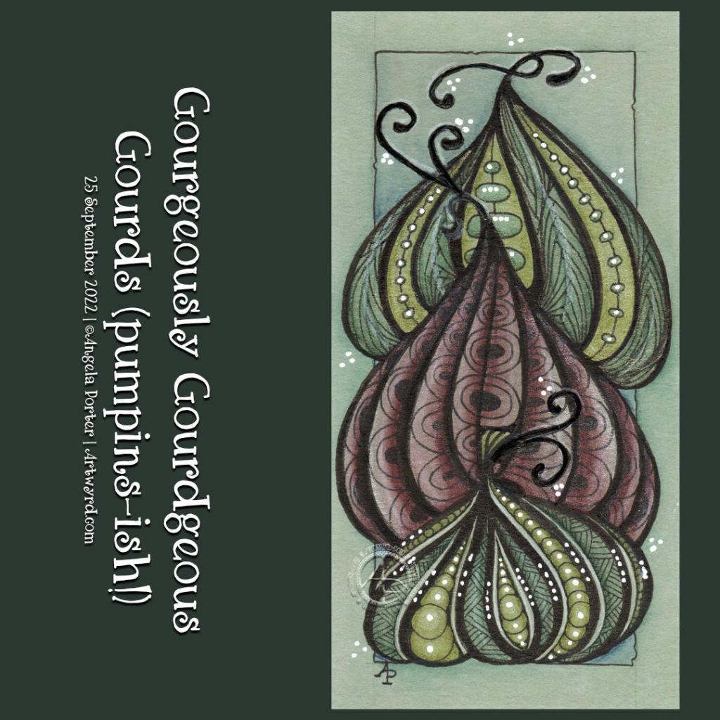
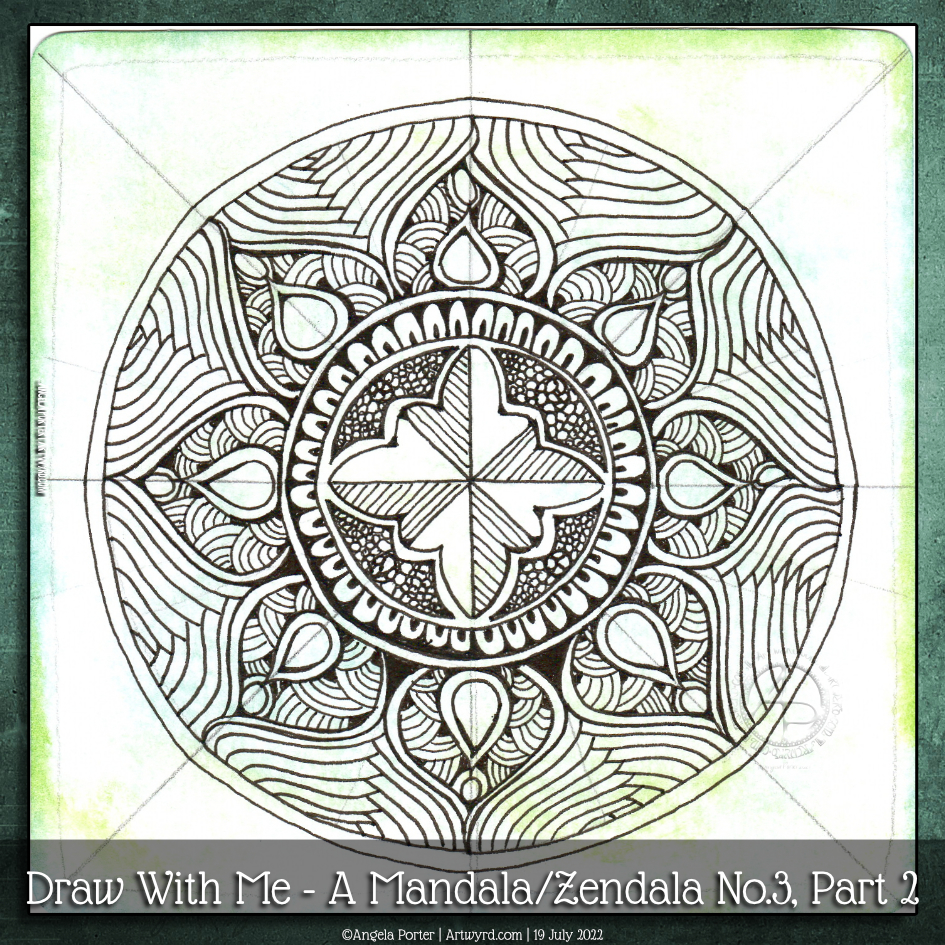
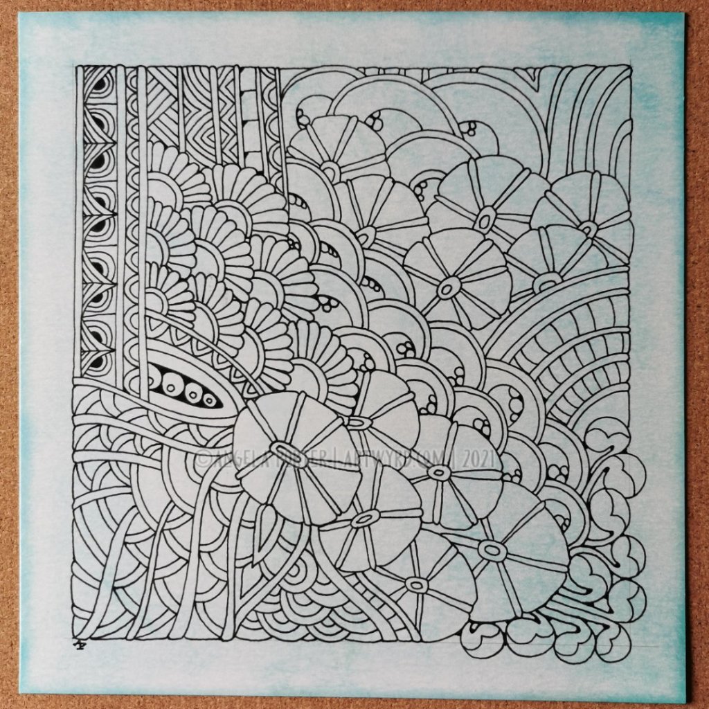
Three Pen and Ink Drawings
I read a book – “Draw Tiny and Make Great Art!” by Anna Tjalsma-Pogorzelec (@Licosmoss). It helped me to rediscover my love of drawing small motifs and patterns and weaving intricate drawings – the type of art that got me noticed and led to me working as an adult colouring book artist.
Over time, however, the requests from publishers was to be less intricate, larger motifs and characters, and though I enjoyed the work, I lost my connection with my love of intricacy.
I’ve rediscovered it and the three drawings at the top of this post are my latest versions. There’s a bit of creepy cute going on for Hallowe’en (one of my favourite times of the year!). But there’s also botanicals and my beloved arches that I don’t draw often now.
I smiled and giggled as I drew these drawings, something I’ve lost overtime as things got all too serious in some ways.
So, another thing I need to do is try to be true to myself as much as possible. Draw in ways that allow my arty heart to sing it’s song of creativity. Create work that makes me smile, and then share the joy with others.
This world needs more whimsy, smiles, and joy, and if my art contributes to that even just a smidgen then I’ve done something positive as an artist.
Inktober Tangles 2025
I did complete Inktober Tangles 2025! I did so in seven livestreams on YouTube. You can find the videos in the live section of my channel.
I really enjoyed the challenge, which I always seem to do as an exploration of each pattern, looking for variations and working with them.
I also have found that ‘going live’ is really good for me. I can get a video done when I have the mental/emotional energy and focus without the adding drain of editing and so on. It’s also nice to have some interaction with people who message in the chat during the livestream.
Creating content by livestreams isn’t as draining for me as you might think, given my comments above. I’m in my safe, quiet home. I’m essentially chatting about the art, things that are going through my mind as I draw. There’s not much noise going on around me (though at the moment noisy, bangy fireworks are going off…again) and I don’t get so drained. Even if I feel tired after the livestream, It’s a different kind of tiredness to interacting with people.
So, going forward with YouTube I’m going to focus on livestreams, as impromptu as they may be, as a way of creating content without draining me. Art is one of my passions, sharing my processes and lessons I have/am learning is too. Editing videos really is a real drudge and drain on my resources! Wellbeing boundary set!


