This is one of a couple of drawings I have on the go at the moment. The scan has washed out and altered the colours a tad. The gradations of colour are a lot smoother too. But I think you get the idea.
This was was drawn with Copic Multiliners on heavy smooth cartridge paper by Daler Rowney. I’m using Staedtler and Chameleon fineliners to add texture/pattern to the drawing. The larger areas of colour were achieved with Carbothello pastel pencils and a paper tortillon.
I was going to stick to a monochrome colour scheme, but some of those tendrils, fronds and leaves just needed a touch of a muted green. And then that led me to including that central ‘orb’ of turquoise (which isn’t as pale or lacking gradient as it appears).
I’m getting to the point where I need to decide how much white space to leave in the design, and where I’m going to add colour and/or texture and pattern. I also need to think about whether some of those coloured spaces need either more shadow or lightening up a bit. That means it’s time for me to take a break from this particular artwork and go and do another or something else completely different!
Before that, there are elements in this design that I really like – the strange columns/antenna at the top and bottom left, the organic trellis of fronds in the largest part of the design. That horizontal bar towards the top. however, just jars with the rest of th design.
Yesterday’s coloring template for the Angela Porter’s Coloring Book Fans facebook group all coloured and shaded. I used Chameleon alcohol markers to add the colour and some shading. I also used a graphite pencil and a tortillon to darken the shading and add shadow to the lighter areas. It’s turned out OK.
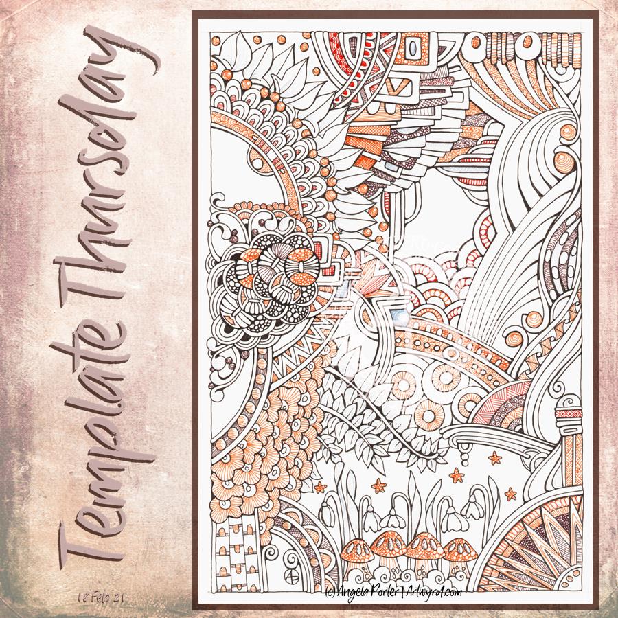
This week, I decided to create a coloring page / template that is in the ‘Angela’ Entangled style, similar to yesterday’s artwork.
I made the motifs bigger and less patterned for the coloring template, however. To add colour to my version of the template I used a mixture of brown fineliners by Staedtler and Stabilo. Instead of solid colour, I used patterns and textures to add colour and complexity. I did use a pale grey fineliner to add details to the snowdrops and leaves, but the scanner didn’t pick it up. Ho hum.
After I’ve had lunch, I may return to the drawing to add shadows to bring out some dimension and depth. I’m not sure what medium I’ll use, though alcohol makers may be the best option, perhaps. I’ll see how I feel when I get to it.
Of course this is the template of the week for the members of the Angela Porter’s coloring book fans facebook group. And this week there’s a challenge to colour this template, or another of their choice, in a monochrome colour scheme.
If you’d like to print the template and join in with the challenge then just pop along to the group!
I’ve been working on this drawing for the past three or four days. I finally finished it this morning. Here’s a list of materials used: A4 Daler-Rowney Bristol Board Copic Multiliners (05, 025, 02) Sakura Pigma Micron (01) Various shades of brown Stabilo fineliners Grey and sepia Uniball Unipin fineliners
I’m finally becoming comfortable with leaving open spaces in my art, though I still do like a clear border/edge. The spaces give a lighter, more airy feel to the design. I’m learning that I don’t have to fill every available space with pattern. I think that is a good thing.
I’m also really enjoying using shades of brown to add patterns to the design, and some grey too.
If you’d like to know where I started this drawing, it was with the small arrangement of boxes just above the blueberry-ish berries just above the left of centre. Everything else grew out from there.
I think this one is finished, though as I look at it now, I want to use a white Gelly Roll pen to add dots in places. Also, the shadows need to be tad intensified around the motifs to give the illusion of depth. I may use alcohol markers – Chameleons or Copics – to do this as the Copic Multiliners are alcohol ink safe.
Monday dawns and along with it is the desire to create a mandala.
This one is a work in progress for sure. I’m still playing around with various brush settings to get the depth of contrast I desire. It’s working out fairly well so far, especially as I’ve chosen a limited palette of blue, teal and green. Also, my favourite seedpod, leaf and arch shapes are very much in evidence here. There’s also lots of little orbs. It never ceases to amaze me how such a simple collection of shapes can result in a fairly complex design.
What is unusual for me, like last week’s mandala, is the lack of black lines in the design. I think that’s a bit of a rebellion by me to all the pen drawing I’ve been doing of late. Also, I love colour, but find it so frustrating to add to my pen drawings.
When I work digitally, colour seems to work differently for me. I think it may be the ability to work and rework the colour endlessly until I get something that suits me. Maybe it’s the ability to get the depth of contrast I like. Or maybe it’s something else entirely, I really don’t know.
This part of the mandala, about a quarter to a third, has taken me around three hours to do so far, thanks to the symmetry tools available to me in Autodesk Sketchbook Pro.
Waking at stupid o’clock meant drawing until I could go back to sleep. I got all the inking done for this particular drawing. Now, the colouring needs to be completed.
Materials: 21cm x 21 cm (8.25″ x 8.25″) piece of Claire Fontaine Paint-on mixed media paper – natural colour Aged Mahogany Distress Ink and a piece of cut and dry foam to distress/grungify the paper 03 and brush Uniball Unipin fineliner pens 01 Sakura Pigma Micron pen Staedtler Triplus fineliners Chameleon fineliners Water brush White Sakura Gelly Roll pen
Started yesterday evening, worked on during my hours of mid-night waking, and on waking this morning, this measures 21 cm x 21 cm (approx 8.25″ x 8.25″) The paper is natural coloured Claire Fontaine Paint-On mixed media paper coloured with Aged Mahogany Distress Ink. The design is being drawn with a mix of 03 Unipin and 01 Sakura Micron pens.
I’m using a mixture of Stadedtler Triplus and Chameleon Fineliner pens to add colour to the design, along with a barely damp waterbrush to spread the colour out. Interestingly, some of the colour lines added remain visible, to a greater or lesser extent, depending on how much I work the colour with the waterbrush. Also, I’m finding that I really enjoy adding colour and texture like this.
The finishing bright white highlights are added using a Sakura Gelly Roll pen.
I find the fineliners used in this way give me much greater control over how much the colour spreads in the small areas in my drawing. They also don’t spread as much as, say, Tombow Dual Brush pens or Inktense pencils. That helps to control the spread of colour too.
I rather like the vintage-y look that the palette of browns and olive greens confers on the design, helped along by the background colour and texture of the paper.
Oh, I do intend to leave a ‘hole’ in this first layer of designs. I’m not sure I’ll do inside the space; a quote, more layers of design. For now I’m not sure. But once this first layer is done, I can scan it in and use it in different ways digitally.
There are lots of my favourite motifs appearing in this one, rather organic ones for the most part. What will appear from the tip of my pen in the rest of the design? I don’t know yet! It could be more of the same, or not. All I know is that the intricacy, detail and revisiting old favourite motifs is making my arty crafty heart smile.
Cognitive dissonance
“The state of having inconsistent thoughts, beliefs, or attitudes, especially as relating to behavioural decisions and attitude change.”
Finally, the penny dropped as to why I’m feeling so out of sorts. Oddly, it was while I was listening to a documentary about the cult NXIVM as I was drawing during the stupid o’clock hours of drawing. Don’t worry, I’m not a member of a cult! However cognitive dissonance was mentioned and that was the ‘ta-da!’ moment for me.
Cognitive dissonance causes emotional distress related to holding contradictory beliefs or values. I’ve experienced this before during breakthrough moments in therapy where I’ve had to accept that I was a victim of trauma, that I really do have CPTSD and I’m not (as my mother would tell me) making it up, for example.
I’m poised on a knife edge, wanting to make a decision to leave something, but feeling guilty about thinking that way. I need to find a way to find some clarity to help me make that decision, and it has to do with my core values and beliefs.
Recognising this doesn’t make me feel any better, but it helps me understand what is going on, and that understanding will help me work my way through it! Making a decision won’t make it any easier for me to act upon it as there’ll be a lot of guilt and the old reactive feeling of believing I’m letting other people down.
However, I can’t put other people ahead of my own mental and emotional well-being. It’s never been easy for me to say ‘no’ to people, to leave organisations or people who are contributing to emotional and mental distress in myself. But I have done so occasionally, more so in the last year or two. And I will do so this time if it’s what I need to do to find that sense of balance, harmony, peace in myself once again.
Here’s a plethora of small drawings I’ve done over the past couple of days when I’ve woken up repeatedly through the night and needed to cool down before I could sleep again..
The various sizes are : circles – 8.5 cm and 10.5 cm diameter squares – 7 cm x 7 cm and 7.5 cm x 7.5 cm rectangles – 12.7 cm x 7.7 cm
Media used : Sakura pigma micron and sensei pens Distress Inks to colour the backgrounds Inktense pencils and Kuretake Zig Clean Colour Real Brush pens – colour spread with a damp brush Claire Fontaine Mixed Media Paper and St Cuthbert’s Mill Bockingford watercolour paper.
I sure do have a lot of colour, shadow and light to add to these! It takes me a lot longer to add colour and so on than it does to draw them!
Also, I have a larger drawing that is a work in progress. I think I’ll turn my attention to that one for a while.
I was without broadband from early Thursday morning until late yesterday afternoon. Hence the reason why this is late and I’ve not posted for a couple of days.
I did have internet access via my mobile phone and I used a mobile-hotspot so I could get online on my ‘puter. But, even on 4G, it was a tad slow on uploading and I have no idea if it would have coped with Zoom.
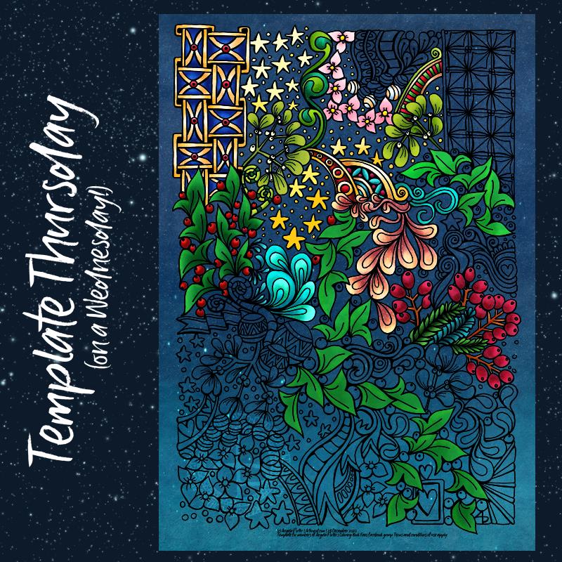
So, after a couple of meetings since it has been fixed, I’ve been able to finally scan and partly colour and post this week’s coloring template for the Angela Porter’s Coloring Book Fans facebook group.
This week it’s another typically ‘Angela’ entangled style of drawing. I used a Sakura Pigma Sensei 04 pen and A4 Bristol paper to draw this. After scanning, I added the background and some shadow and highlight.
This has been drawn with a Sakura Micron 05 pen on smooth, heavyweight cartridge paper (acid-free of course). I’ve added the background and colour digitally, keeping to a wintry, night-time kind of theme. Of course, this will work for any season at all, and any time of day.
As always, I look forward to seeing all the amazing, colourful interpretations of this template.
Taking a big of a break
I may not be as active on social media over the next few days. Christmas and New Year are difficult times of year for me emotionally and mentally and I know taking myself off into a largely Christmas-free bubble helps me drift through this time, as well as deal with anything that may creep in and cause some upset in me.
I know I’m not the only person who has difficulties with their emotional and mental health this year. Given all that has happened in the world this year, the huge number of people who have passed away during the pandemic and measures taken for people to keep themselves and their families free of Covid at this time, many more than usual will be struggling.
Being by myself at this time of year is not new to me, nor is withdrawing from the world at this time. I find it exhausting to keep up a mask of seasonal jollity when I feel anything but that. I find it easier to deal with whatever finds its way into my safe-bubble. It’s easier to deal with being alone if I do my best to carry on as normal.
I’m aware of what things I can do to self-care and self-soothe. Art. Music. Books, Films. TV. Naps. Nice food. Meditation.
Do you have a list? Have you learned to give yourself permission to take care of yourself, give yourself time and space to self-soothe?
Learning to give yourself permission to look after yourself, even if it means saying ‘no’ or setting limits, is one of the hardest things to do. And it takes a lot of practice. But it is one of the most important things we can learn to do.
I remind myself this is for just a few days a year, and that soon after the celebrations are done, life returns to ‘normal’, whatever that is in these pandemic times.