Abstract Botanical 9 September 2018

Angela Porter 9 September 2018

This one has taken many hours to do, and I’m not quite happy with the background colour/texture, but I need a break from it.

I drew the black and white line art on paper with Sakura Pigma Micron pens, scanned it in, created a transparent background and then coloured it digitally.

I used Autodesk Sketchbook Pro with a Microsoft Surface Pen on my Microsoft Surface Studio.

Fun to do. A nice way to spend time, jut playing. And it’s unusual for me to colour in one of my black and white pieces of line art.

Decorated Terry Pratchett Quote and Chameleon Pencils first impressions

Angela Porter 23 July 2018

Another quote from Terry Pratchett. This one from one of my favourite characters – Death. Death tries so hard to understand humanity, yet he gets it both very wrong and quite right at the same time.

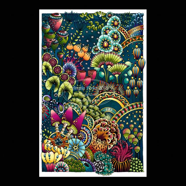
I like the way I’ve added colour to my black and white line art in this example, but one day I hope to get around to colouring in the black and white version.

Maybe I’ll print the art out and then colour it in using Chamelon Pen’s ColorTone Pencils, which arrived yesterday.

I have spent some time  colouring with them and so far I quite like them.

They are softer than Polychromos and others, but not quite as soft as Prismacolours. They blend quite nicely, and a little help from a blending pencil results in really nice blends.

I like the colour palette; the colours are nice and bright and just the colours I love to use in my art, which is a huge, huge bonus! As I often struggle to choose and use colours in a sensible manner when I have a huge choice, the limited palette of 50 colours is really useful for me, as are the double ended pencils. Being able to flip to add shadow or light is a nice touch, though I would like a bit more contrast between some of the colours as some are a bit too similar.

The leads are a bit thicker than other pencils, such as Prismacolours. However, this makes the barrels of the pencils a bit too thick for a standard pencil sharpener. My Staedtler pencil sharpener – the ones with the handles that you turn around – should cope well with them though.

At a price point of £45 on Amazon.co.uk with free prime delivery I think they’re good value for money, even though you essentially have 50 half-sized pencils. However, the thicker colour leads make up for that to some degree.

I’ve not been able to find out if you can buy individual pencils when some wear down. However, I can’t see that being a big issue as I suspect that I’ll use most of the pencils fairly equally.


If you want to know what a person’s like – revisited

Angela Porter 16 July 2019

I thought I’d revisit the previous quote, alter the words a bit and this is the result.

I used an oldy looking type-writer font for the quote and printed it out, I used a Sakura Pigma Micron PN pen to draw the design around it. I then scanned it in and altered the colours in Autodesk Sketchbook.

I learned a new ‘trick’ when using sketchbook, completely by accident, and it’s one I want to explore a little more in the future, especially for adding gradient colours to black and white work.

This would look lovely printed out and added to my BuJo, or even framed and hung on my wall.

Believe©AngelaPorter2013

This design started with the kind of infinity loop towards the top left.  The loops coming from it eventually were seen as a letter ‘B’ and the word believe seemed to be the right one to put on this.  Everything else grew, quite literally in some cases, from this point.

There are golden stars to wish upon and golden seeds and flowers and growth and sun and rain … and hope.

Approx. 6″ x 8″.  The black lines were worked using Uni-Ball UniPin pens.  Colour was applied using watercolours and gold watercolour paint.  The paper is heavyweight cartridge.

As always, I am the owner of this creation and it may not be used, shared, distributed or altered in any kind of way without permission from me.  Thank you.

Let It Grow

Let It Grow © Angela Porter

8″x 6″.  Rotring Rapidograph pen and black ink on heavy cartridge paper.

I’m not quite sure yet what I’m going to do with this outline – colour or not to colour, texture or not to texture.

Last night I had friends visiting and a look for the drawing that I did when visiting Tewkesbury Abbey a couple of years ago led they and I to looking through some of my old sketchbooks.  Suddenly, seeing all that had inspired me in the past, showed where my ‘visual vocabulary’ for my abstract art ‘doodles’ has come from.  Prehistoric art, Romanesque and Gothic architecture and sculpture, La Tene art, ammonites and other fossils, microscopic formanifera, microscopic images of cells, stained glass windows, insects, shells, flowers, ‘Celtic’ manuscripts and Anglo-Saxon art to name but a few.  I’d also picked up a copy of the BBC’s History magazine whilst out shopping as it had images of Anglo-Saxon artefacts which reminded me of patterns I use in my art.  Yesterday seems to have been a day of making links between all the work I’ve done in the past and how it flows out of me now, and a reminder of the things that inspire me as well as giving me a sense of validation with the way that I create art.

I think subtle colours for this one, with textures added in places, and just the hints of metallic highlights perhaps – after all, my inner raven demands the sparkle!