Medieval Inspired Botanical Bookmark

I have no idea why, but tall, thin drawings (bookmarks) just appeal to me. Indeed, they always have.

I enjoyed drawing this one, and I’m fairly pleased with the chosen colours. There’s a soft, muted, vintage palette along with the flowers, seed pods, berries and leaves mainly inspired by Medieval Illuminated Manuscripts and the work of the Arts and Crafts Movement artists.

If you’d like to follow a #comedrawwithme video for this design, just click on this link!

Let it flow

LetItFlow_Jan13_AngelaPorter_small

Approx. 15cm x 20cm (6″ x 8″).  Rotring Rapidograph pen on white cartridge paper.

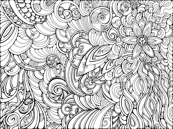
Let It Grow

Let It Grow © Angela Porter

8″x 6″.  Rotring Rapidograph pen and black ink on heavy cartridge paper.

I’m not quite sure yet what I’m going to do with this outline – colour or not to colour, texture or not to texture.

Last night I had friends visiting and a look for the drawing that I did when visiting Tewkesbury Abbey a couple of years ago led they and I to looking through some of my old sketchbooks.  Suddenly, seeing all that had inspired me in the past, showed where my ‘visual vocabulary’ for my abstract art ‘doodles’ has come from.  Prehistoric art, Romanesque and Gothic architecture and sculpture, La Tene art, ammonites and other fossils, microscopic formanifera, microscopic images of cells, stained glass windows, insects, shells, flowers, ‘Celtic’ manuscripts and Anglo-Saxon art to name but a few.  I’d also picked up a copy of the BBC’s History magazine whilst out shopping as it had images of Anglo-Saxon artefacts which reminded me of patterns I use in my art.  Yesterday seems to have been a day of making links between all the work I’ve done in the past and how it flows out of me now, and a reminder of the things that inspire me as well as giving me a sense of validation with the way that I create art.

I think subtle colours for this one, with textures added in places, and just the hints of metallic highlights perhaps – after all, my inner raven demands the sparkle!

Angel – Finished

12″ x 8″.  Sakura Glaze pen for outline (grey used), Inktense pencils and water wash for colours, Cosmic Shimmer gold and silver watercolour paints for various bits and bobs.

Just finished this experiment.  The photo isn’t really all that good (I’ve said before, often, photography isn’t one of my skills, and the painting/drawing is too big to fit in my scanner).  The outlines are glossy and so have reflected the flash too much, and there are places where the metallic highlights haven’t shown up well, but you’ll get the idea.

I’m actually fairly pleased with this, especially when it is shrunk in size as all the imperfections I perceive disappear.


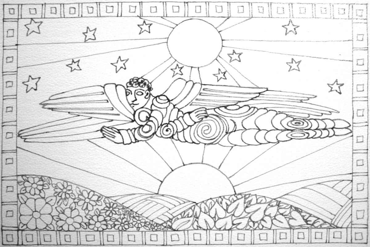
Angel – Work in progress

Well, it’s another grey, damp day here; the kind of day that is best spent pottering around the home, lost in art or creativity of some kind or other methinks!

A friend gifted me a set of three books all about Romanesque, medieval and Gothic art.  Browsing through them reminded me of how much I love architecture, especially Romanesque.  It also reminded me of the wonderful angels to be seen at Malmesbury Abbey and Kilpeck Church, and I woke up this morning with an idea in my head to sketch and draw and create.  I want to do this work in a simple, stylised form – influenced by Romanesque and by Art Nouveau, and possibly stained glass.

Here is the work so far.

Around 12″ x 8″ in size, it has been outlined using a grey Sakura Glaze pen, which gives it that ‘stained glass’ feel.  I want to use jewel-bright colours to complete the work, the kinds of colours seen in medieval manuscripts.