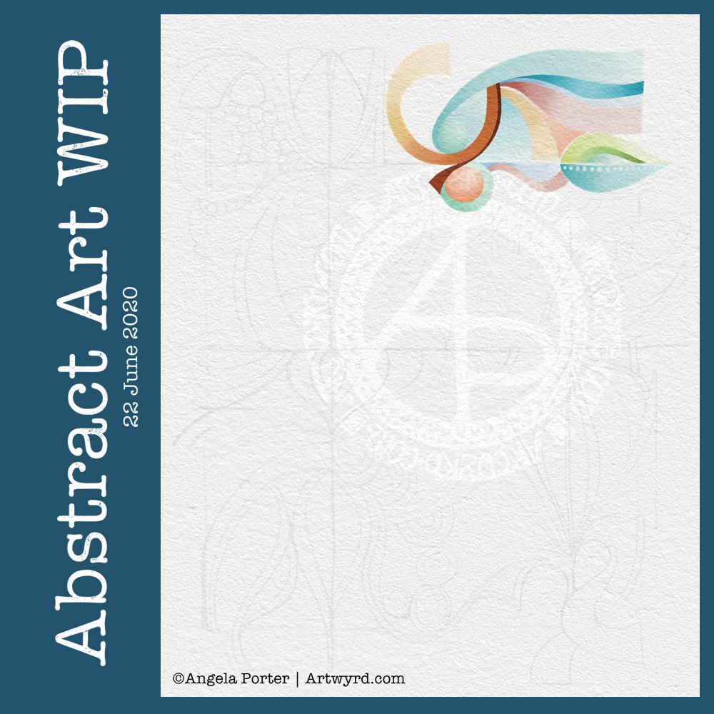
I’ve had some time this morning to do some more to this abstract art piece. I’m still learning about digital art and how it can work for me, but I’m feeling quite pleased with how this is growing, bit by bit.
As I work on it, I’m changing it from the sketch, which is often the case; the sketch is just a suggestion, and outline, a whisper of an idea.
The crisp, clean lines of digital art really appeal to me in this piece, as do the more muted colours.
Plenty more left to do on it, so daily updates will continue.
I’ve had a lovely couple of hours working on this particular piece of art. It is an abstract pattern, but the emphasis will be on shape and colour.
I drew the design out on paper and scanned it in to complete the artwork digitally in Autodesk Sketchbook Pro.
I was inspired by the work of Shell Rummel, and it reminded me of the type of art I did in my early arty exploratory days.
I wanted a watercolour feel to the art, so I’ve chosen to use rather soft colours and to try to keep the palette relatively limited. I also want to keep the extra patterns/lines to a minimum, though I do want some more detailed interest in places, such as the dots along the centre line of a leaf motif. This is going to be hard for me to do; I usually insist on filling every space with pattern and colour.
It’s also odd for me to work from a pencil sketch, usually I’m straight to pen on paper (or pen on screen). I do find it a lot easier to get my ideas/outlines onto paper than I do on the screen, and my lines flow. I think it’s because I get a better idea of the overall design as I do have a habit of zooming into whatever area I’m working on.
Overlaying a watercolour paper texture takes the art from the rather mechanical feel of digital art to something more textured and interesting, warmer and ‘human’ in feel.
This will take me a long time to complete, most probably over several days as I do have to do other stuff at this time. But it’ll be a nice thing to do as my ‘warm up’ art in the morning.
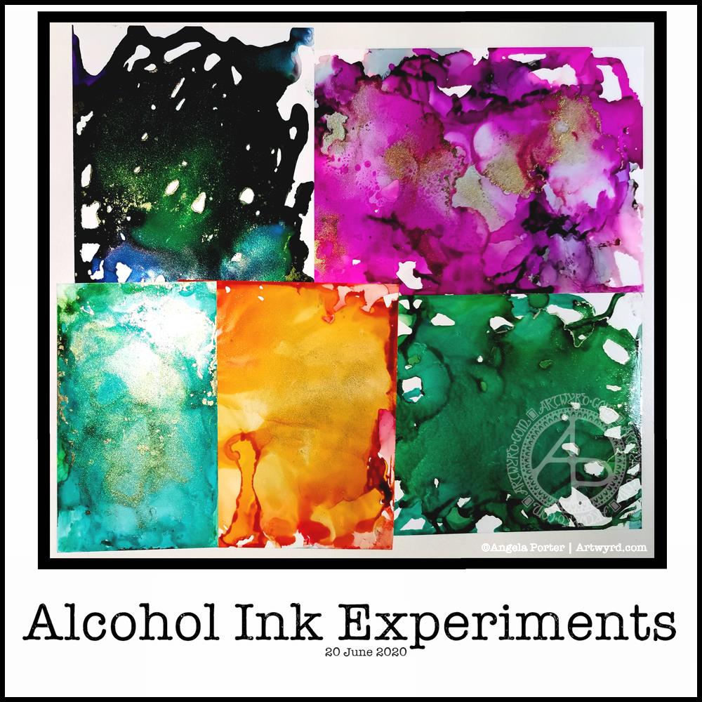
I’ve been enjoying watching the daily YouTube tutorial from Lavinia Stamps, particularly the ones using alcohol inks. So, I thought I’d dig out my small stash of alcohol inks, blending solution and Yupo paper to give it a go.
I can tell you, Lavinia stamps makes it look a helluva lot easier than it really is, as you can tell from my attempts above. The photograph makes them look worse than they are, but they’re still not what I was hoping for – fairly pale coloured, smoky, swirly, interesting backgrounds full of abstract texture and pattern, with seams of gold.
I have now bought a book about using Alcohol Inks and really hope that helps me. Apparently, you need to create a wash of alcohol inks or blending solution on the Yupo first to help the colours flow more easily. That may be why I have so many open patches in the colours.
I also used fairly small pieces of Yupo paper, which may not be the best size to work with.
For the record, I used a mixture of Piñata inks from Jacquard, Ranger Alcohol Inks. I had a gold mixative in the Piñata inks and that was most fascinating to watch work.
I tried a hair drier to move the ink around, but all I ended up with was a blend of the inks with a few ripples of tones of colour in them. I also tried blowing with a straw.
I was surprised how sticky the inks were when they seemed dry. However, after being left overnight, that stickyness is now gone, though I’ll leave them a while longer before doing anything with them.
I have ordered some alcohol lift reinker to try taking a print of the alcohol ink onto paper. That should lighten the colours somewhat. I then hope that I’ll have backgrounds to use for digital art, once I’ve scanned them.
As well as alcohol lift ink, I’ve ordered some Yupo card stock, which is thicker, less floppy and could work better for this. The book I bought suggests using a heat tool, carefully, for spreading the alcohol ink. It also has a recipe for making your own blending fluid for a fraction of the cost of the branded ones. So, I’ve ordered some isopropyl alcohol to go with the glycerine I already have in my stash.
It’s always fun to try out new techniques with media new to me. It can be incredibly frustrating until I work out how it can work for me!
As a side note, I really do need to order some gloves to use; I have really badly stained nails at the moment. A VOC respirator may also be a good idea; I don’t want the fumes to irritate my asthma or cause more respiratory problems. If I decide to draw on the alcohol ink backgrounds, then I will need to order some kind of varnish/sealant that I can draw on top of so my pens don’t get ruined. That, though, is for another time. Today, I’ll be using my more familiar media and tools.
Another morning, another play around with watercolours, this time digitally.
Soft balls of watercolour, fuzzy edges, with white ink details added on top. Layers of transparent colour.
I overlaid a watercolour paper texture, which helps give the right ‘feel’.
This is my favourite attempt at digital ‘watercolours’ so far. I definitely like using white ink in this instance; black ink was just too harsh, hard and jarred uncomfortably with the softness of the watercolours.
I tried lots of ways of adding colour; not just brushes, but different brush effects. In the end I was happiest with white ink.
A nice way to spend a couple of hours as I wake up.
I’ve spent several hours exploring and trying ideas out in the realms of both digital and abstract art, and this is the result.
I’m really not at all sure about it in any shape or form. I think I was influenced by watching a few YouTube videos about mixed media and abstract art.
It’s been an “interesting” time, as well as a frustrating time in some ways. I also have a bit issue with choice of colours.
I’m pleased to say that I’ve calmed down an awful lot from the stresses of the last week or so. I actually slept for nearly 12 hours last night, which happens once all the adrenaline/cortisol have left my body. It’s nice to be back to my ‘normal’ state of contentment.
I found this appropriate quote this morning, and thought I just had to try to add some pretty art behind it, and this is what I came up with.
I worked digitally and used some symmetry tools. I’m not entirely sure about it, but it let me try things out and let my mind work out some things, including how I’ve really been doing things a hard, long and laborious way in the past, digitally speaking. All part of the learning process, of course.
Yesterday, I had to take a total self-care day. I’ve had a very stressful couple of days, and that does take its toll on me. Today I feel less emotionally overwhelmed, I can sense that touchstone of contentment inside me, and the maelstrom of emotions concerning the events has mostly calmed down, and I hope the stressful situation will have done so, for a few days at least!
Shatterpoints of change causing stress and distress for someone in my circle, and supporting through it has been…difficult and unpleasant for me. Still, I think the situation has calmed, for now at least. The quote is really relevant to this situation, far more than for this person than for me.
As difficult as it has been, I have been able to see how far along my healing journey I have come. I can also see how my relationship with myself has become so much healthier. So that’s the positive pay off for me in all of this.
Yesterday turned out to be an incredibly stressful and tiring one. By the time a crisis was sorted out, it was late evening and, try as I might, art just wasn’t going to happen.
So, I did what I do when I’m emotionally overwhelmed – watched a Star Wars film or two! Sadly, I had no Ben and Jerry’s in the house, and just couldn’t be bothered to order any in as a take-away order. But Star Wars always soothes me.
I didn’t get enough sleep last night, so a nap may be in order shortly. However, when I finally came around enough to turn my attention to art, I knew I wanted to try a digital art version of the watercolour painting “Seeking Calm” that I posted yesterday.
I’ve been working on the image for the last four hours, give or take a half hour. It’s been lovely to work digitally once again, and fascinating to workout how to achieve a similar kind of ‘feel’ to this as I had in “Seeking Calm”.
I know that, for now, I’m not going to be able to replicate digitally the way watercolour paints move and blend. I need to work out how to set up and use brushes that will let me at least capture a flavour of that. My head isn’t working well enough this morning to work on that.
Watercolors are transparent, but I didn’t want to work with transparent colours today. I have worked with rather delicate colours, just as I tend to do with watercolors, which is odd for me given that I usually love bright, vibrant colours.
Today, I think the soft, gentle, warm colours are just what my soul needs to soothe my frayed emotions. I even have ClassicFM on, which is unusual for me. I started by listening to the audiobook version of “Shatterpoint”, a Star Wars novel about Mace Windu. However, I realised I wasn’t really listening. So, I switched to ClassicFM.
Anyway, I also used white ‘ink’ to draw in details on the shapes along with various brushes to add shadows. The white ink adds to the delicate feel of the image; black would be just too stark and heavy I think.
I’m not sure if the background will remain as it is. I like how the colours almost glow against it, but it’s not the right colour or tone yet. But it’ll do for now.
I’ve made a bit of a mess of the colours in the centre of the bottom right motif, I think. I need a break from that to work out how to correct them. It may be that the colours are just too saturated and I need to desaturate them a tad.
I’ve had quite a serious break from digital art over the past couple or few weeks. It’s nice to return to it with fresh ideas for ways of working digitally.
So, I look forward to finishing this image sometime soon. But for now I’ll need some tea and I fancy some toast to nibble on, and maybe I’ll take a nap as my eyes feel really heavy.
Another morning, another migraine-y headache. Yet again caused by stress and worry. Painkillers taken, just waiting for the pain to go so I can sleep the remains off.
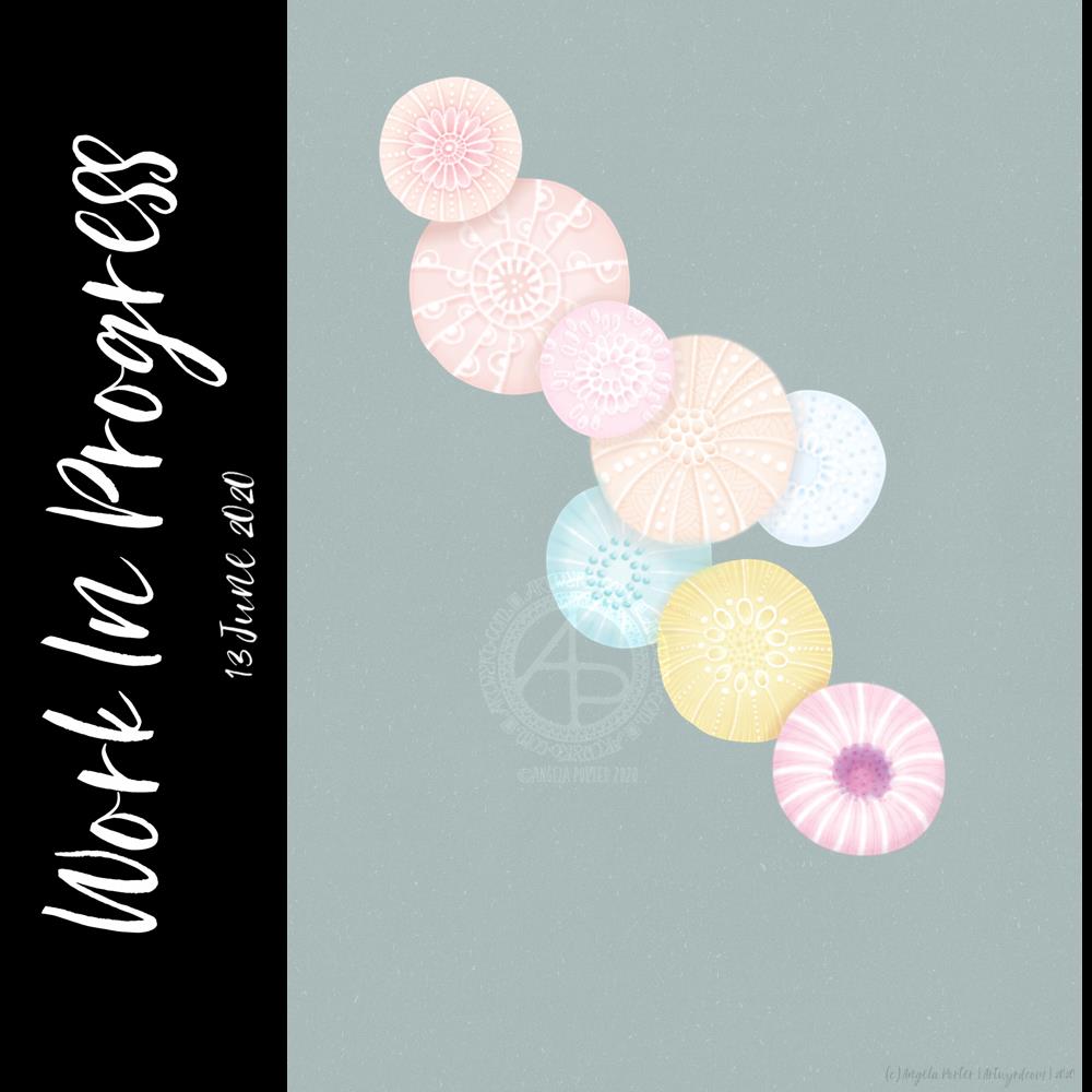
I also completed this peace of art which I started last night. I painted circles of watercolour on a 5.5″ x 6.5″ piece of Canson Moulin Du Roy watercolour paper and left it to dry overnight.
This morning, I wanted to add pattern to the circles. I tried using a white gel pen, but it wasn’t quite opaque enough. So, I used a fine brush and white gouache. That worked really well. It was also good practice using a brush like a pen or pencil. Is it still drawing if you draw with a brush, or is it painting? I don’t know!
The circles have ended up looking like diatoms, formanifera, microscopic bits and bobs, seeds, sea urchins…
Once the gouache dried, I added some more watercolour to add shadows and details to help bring some sense of dimension or volume. The white gouache works really nicely with the watercolour. Black pen can often feel too harsh to me with delicate colours. The white lines of gouache seems a lot more sympathetic with the delicate colours. It adds a lightness, airiness, delicateness to the design. The opacity gives a sense of more solid support, architecture.
While I like the transparency of watercolour, the way I’ve added the lines and shadows doesn’t quite work being able to see the lower layers, and my head doesn’t quite work right at the moment to work out how to add details from the lower layers that could be seen. Mind you, it does give me something to think about (when ny head will let me think) in doing similar kinds of work in the future. I definitely want to explore using gouache with watercolours.
I did think of adding some metallic dots, but haven’t done so at this time. I can always revisit this painting in the future.
It’s also giving me something to think about in working digitally, though I’m not sure what those thoughts are at the moment.
While I was doing this, I felt calm, content, at peace, and the headache wasn’t so noticeable. Hence the title – “Seeking Calm”. That’s exactly what I was hoping to find while finishing this artwork off.
Detailed drawing is something I love to do. Creating abstracts based on patterns/shapes that I’ve observed in the world around me and in nature is also something I love to do.
Exploring different ways of working with different media to see how I can get it to work for me (or not work for me) is also important. Watercolour is something I do struggle with and would like to work with. This little work of art is something that is a stepping stone on my way to finding a way of working that works for me.
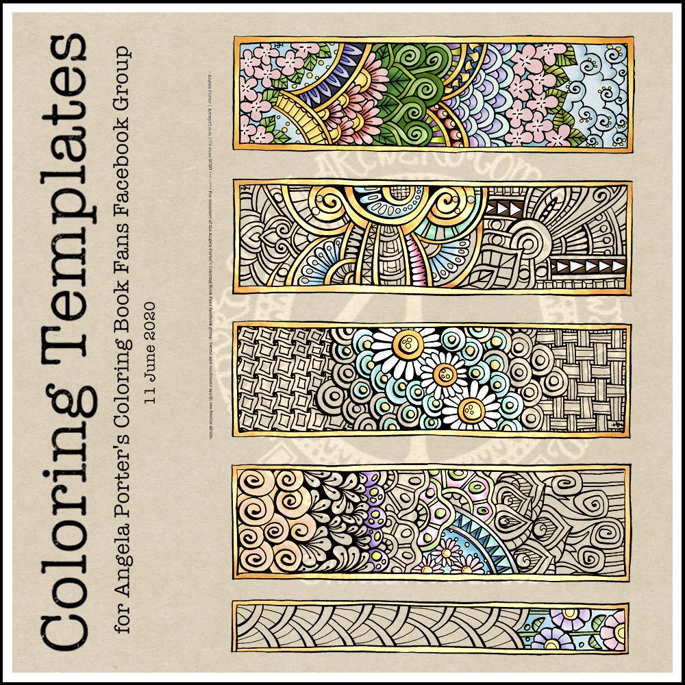
This week’s coloring template is a series of bookmarks. A member of the Angela Porter’s Coloring Book Fans facebook group said they’d like some designs that could be used as bookmarks, and so I went with the suggestion.
The designs are typically ‘Angela’ and ‘entangled’. I used a Tombow Fudenosuke along with an 04 Pigma Sakura Sensei pen to draw the designs. After scanning and cleaning up, I’ve partially coloured the designs, as well as adding a pale kraft paper background.
To use them as bookmarks, I suggest printing them on some card. If that’s not possible, then gluing the whole sheet to some card and then cutting out the book marks would make them sturdier. Of course, a laminator could prove most useful in preserving your beautiful coloring, as well as making really long lasting book marks that could be given as beautiful gifts, or used to mark the coloring page you’re working on too.
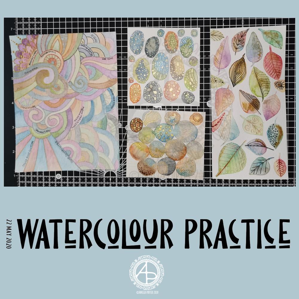
Yesterday was another day where I got lost in watercolour practice – unintentionally! I had planned to do some editing of drawings for ‘Entangled Gardens’. However, time ran away with me.
Panel 1
The first panel I completed was the one with leaves on. They do have plenty of gold metallic/iridescent watercolour paint along with traditional paint, though it doesn’t show up in the photo.
I tried different ways of adding details to the leaves – Faber-Castell Pitt Artist Pen (F) and metallic watercolour and brush. I find the black pen either too black or I used too thick a point. The metallics in a red-copper, gold and grey-black were more sympathetic to the colours of the leaves, in my opinion.
Panel 2
The next panel I created is the one at middle bottom. I made circles of watercolour and let them touch while wet so there was some flow of colour from one to another. After they’d dried I used a fine brush and both watercolours and metallic watercolours to add line and pattern to it.
I enjoyed making this one very much. I used some quite earthy colours that are unusual for me. The line and pattern added a lot of interest, though I did wonder if I’d covered up too much of the underlying watercolours.
Looking at this with fresh eyes today, I think it shows through just fine. I want to try using metallic paints that are complementary to the main colours in the watercolour to see how that works out.
Panel 3
This is the one at the middle top. I created ovals of watercolour, again using unusually muted, earthy tones.
Once they’d dried I used some Caran D’Ache Luminance coloured pencils, well sharpened, to add patterns to each oval. I used the variation in colour/tone to help me add the patterns, as well as to choose the colours of pencils I used on each oval.
Finally, I used a yellow-green metallic/iridescent watercolour paint to fill in some of the patterned areas.
I enjoyed making this panel too. Again, I thought when I finished it that the pencil lines were a bit thick. However, after a night’s sleep and with fresh eyes I can see that it’s worked out well. I think that using coloured fineliner pens may work out better than coloured pencils – something I’ll try another time.
Panel 4
The last panel I created yesterday was the fourth panel. I used a different kind of watercolour paper, by Tim Holtz. The paint just dried so quickly on it I couldn’t really drop colours in, though the paints would re-wet and I could blend colours that way. I didn’t really enjoy using this paper.
Anyway, I thought I’d make a typically ‘Angela’ entangled style painting. I did use a raw umber Caran D’Ache Luminance pencil to draw the design on the paper. This was such a pale colour it disappeared into the watercolour sections. Again, I used uncharacteristically earthy, muted colours.
The final panel was nice enough, however, it was lacking in pattern and interest. So, I decided to use it to experiment with different ways of adding outlines and pattern to the various sections. I also noted on the panel what method I’d used next to each one.
The metallic paints and pens worked nicely and were practically or totally opaque. I prefer using a pen rather than a brush, though I’d not be averse to adding line and pattern using a fine brush and watercolour.
The gold and silver Uniball Signo glitter pens worked really nicely, and because the glitter is suspended in a transparent ink, there’s interesting effect where the watercolour shows through. I actually really like this a lot.
I couldn’t find a gold Sakura Gelly Roll pen, so I used a silver one instead. This, surprisingly, wasn’t as shiny as the Signo silver pen, but it worked just as well in terms of opacity.
I tried two white gel pens – a Uniball Signo and Sakura Gelly Roll. Both seemed to be fairly opaque, the Sakura being very slightly more so.
Finally, I dug out some really fine black pens – 005 and 01 OHTO Graphic Liners and a 01 Sakura Pigma Micron. These worked much nicer than the thicker pen I’d used on the leaf panel.
Of course, I left some areas of the panel without any lines added for comparison.
Of all the pens I tried, I like the metallic and glitter gel pens the best for this.
On reflection…
I’ve found I really like to work on a smaller scale. I feel like I’m creating small ‘treasures’ full of interest and fascination. I’m happier working smaller and more detailed than I am working on a larger scale.
I want to try coloured fineliner pens to draw patterns on watercolours.
Another experiment will be for me to use metallic and plain acrylic and other inks to draw with. I do have a glass pen that will work nicely with indian ink and writing ink. I’ll have to dig some dip-nib pens out to try with the metallic acrylic paints as well as a brush. I think that ball tools could be used to dot spots of ink onto the work rather than a brush; something else to try.
I also need to find a way of leaving a border on the page! When I draw a colouring template or other piece of lineart, I start by drawing a pencil line to demarcate the area I want to draw in, leaving a border around the line. I need to do the same for watercolour panels, either using a pencil or masking or washi tape.
Something else I’ve worked out is that I tend to use too much water when I paint, and I need to experiment with using less and trying dropping colours in when the area is at different levels of dryness.
Lots of things to try and consider.
Doodling? Really?
I see a lot of people calling the addition of line, texture and pattern as part of an artwork ‘doodling’. I don’t like doodling being used in that way.
Here are the definitions for ‘doodle’ from Dictionary.com
verb (used with or without object), doo·dled, doo·dling. *to draw or scribble idly: He doodled during the whole lecture. *to waste (time) in aimless or foolish activity. noun *a design, figure, or the like, made by idle scribbling.
When I add line or pattern to my drawing, it’s not an idle or unconscious activity. I deliberately choose what patterns and textures I want to use and where to place them. The process of adding the lines, patterns and textures may be a more mindful process if the pattern is familiar to me.
The lines, textures and patterns are used to add interest to elements of the overall design. But they are not meaningless, as implied in the words scribble and doodle, and they are anything but idle or mindless scribbles. There is purpose in them, and this is why the use of the word ‘doodle’ irks me!
What am I going to do with the panels?
The leafy panel I created to add to a tag to put in my journal. The other panels will also live in my journal, even the one with annotations, possibly with a pocket behind it for my notes and reflections!