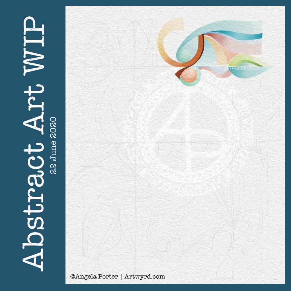
I’ve had a lovely couple of hours working on this particular piece of art. It is an abstract pattern, but the emphasis will be on shape and colour.
I drew the design out on paper and scanned it in to complete the artwork digitally in Autodesk Sketchbook Pro.
I was inspired by the work of Shell Rummel, and it reminded me of the type of art I did in my early arty exploratory days.
I wanted a watercolour feel to the art, so I’ve chosen to use rather soft colours and to try to keep the palette relatively limited. I also want to keep the extra patterns/lines to a minimum, though I do want some more detailed interest in places, such as the dots along the centre line of a leaf motif. This is going to be hard for me to do; I usually insist on filling every space with pattern and colour.
It’s also odd for me to work from a pencil sketch, usually I’m straight to pen on paper (or pen on screen). I do find it a lot easier to get my ideas/outlines onto paper than I do on the screen, and my lines flow. I think it’s because I get a better idea of the overall design as I do have a habit of zooming into whatever area I’m working on.
Overlaying a watercolour paper texture takes the art from the rather mechanical feel of digital art to something more textured and interesting, warmer and ‘human’ in feel.
This will take me a long time to complete, most probably over several days as I do have to do other stuff at this time. But it’ll be a nice thing to do as my ‘warm up’ art in the morning.

