A change in blog name. Exploring collage.

The new name…

Yesterday, I did a live stream on YouTube, where I tried my hand at creating collage papers, making collage and mark making. It was an interesting experience, but more about that later on.

The topic of adventures came up in my wintering and the change in title is a result. For me, art is always an adventure. I’m always trying out new things, exploring older ways of working, and developing in my artistic expression.

Adventures aren’t necessarily big trips to far away places. There are so many little daily things that feel like adventures to me- the change in light through the day, the weather, the rhythm of the seasons and stars, the humourous behaviour of my neighbourhood jackdaws. There’s also reading new books, listening to stories and documentaries, trying new dishes, listening to music that is new to me, and so much more. I have a great deal of curiosity and desire to know more about myself and the world that I live in.

It’s a good thing that an adventure can be described as new ideas and grand mysteries. It’s about enjoying the journey with no time pressure, no idea of a destination, just a desire to discover more about how I like to express myself creatively and, through that, learn more about the more profound mystery that is me.

Over the years, I’ve dabbled a bit with collage but never really found how I like to use it other than as an interesting background in a sketchbook or maybe a pleasing arrangement of papers at the edge of a sketchbook page.

I love paper, however, and want to use different kinds of paper, and perhaps fabric, in my work. However, whenever I try to, it doesn’t feel right.

All of my artsy journey has been an adventure. I try out new things and retreat into the familiar when I feel uncomfortable with art, life, and myself. But even with familiar methods, things change due to experiences. Progress is always made. Lessons are learned. Insights are gained, especially from what I don’t like about something and what can be done to ‘fix’ it.

So, chatting in the live chat as I created part of this collage, the idea of my blog changed to reflect my description of how art is a great adventure. I thought of “Angela’s Adventures in Art,” but Judy suggested “Art is the Adventure.” I chose that, though I was tempted by “Art is the Way,” a bastardization of “This is the Way” from the Mandalorian.

And so, now the time is to change the name, but not the web address of my blog; that will remain artwyrd.com.

Collage

I am intrigued by collage, mark-making, and mixed media. Yet, whenever I’ve tried them in the past, I’ve usually felt disappointed in myself.

I remember looking at the collages by Juan Gris during my A Level and loving his work. I actually created a quite nice collage using his methodology. However, I never really followed it up. Yet, the distant memory still brings a sense of joy and, I think, excitement. I have problems identifying my emotions, and they are often faint to boot.

Anyway, I love the work of so many mixed media artists, and I admire their skills and creativity. Again, I’ve tried mixed media many times, and each time felt like a fishie out of water.

I’ve recently looked at collage and bought some books that demystify the process, or so I thought until I tried my hand.

I wasn’t happy with the colours. I glued papers down before I should have. I didn’t think about the scale of the page (A5) when I decided to put really thick black lines. I had to troubleshoot the mess I felt I made of the little leaves down the stem/trunk.

Today, I’ve spent sometime treating this page as a page to reflect on my experience and create a kind of journal page as a result. (Hence all the writing on the page). I’ve also added some patterns and makes in pen and watercolour.

Also, I made some more collage papers to try again. This time, I used Canson Imagine mixed media paper, as watercolours and Distress Inks work well enough on it.

I know I need to consider the size of the paper I’m using as a substrate when cutting or tearing the collage elements. The same is true for the pen thickness.

I have an inkling that my strength may be in more abstract work. Last night, I tried creating a collage that would look like a collection of buildings, but it didn’t feel right. That’s a good thing, though, as it’s something else to reflect upon and make notes on the page.

I really hope I can find my way with collage/mixed media. It will let me use my love of pen drawing, patterns, textures, symbols and stylised art in a different way. I have a desire to involve my love of different kinds of paper in my work.

At the moment, I just feel lost at sea, without a paddle or rudder, and at the whims of the currents of creativity and art.

I was dithering about showing this debacle of a collage publically. Then, I realised that if I am going to write about my arty adventures, then I need to recount the tougher, messier, unsuccessful parts.

The perfectionist and the messy debacle

I have been plagued by perfectionism all my life. I can get very disheartened when my desire for something pleasing to the eye and heart falls even a little bit short. In this case it falls, to my mind and heart, a lot short.

One thing I have learned that this is ok. I’ve learned that even if something is a messy ‘failure’ it is a success in many ways as it’s an opportunity to learn!

I certainly have a lot to learn from this particular collage mini-adventure. But the adventure isn’t over. I have some new coloured papers to use. I’m going to stick with the A5 sketchbook and work on a smaller scale and try out more abstract/stylised shapes. Keeping it simple to begin with may be a very good idea.

I like the idea of using the colours in the collage paper to be the colours used in any artwork, lettering, stitching etc.

And, if nothing else, learning that my adventure may be to discover that while collage and mixed media may not be for me, I can still enjoy the work of others. It may lead to new ideas, new techniques, a different way of deconstructing and reconstructing motifs and patterns going forward.

I can’t possibly predict how this side-adventure in my artsy adventure will work out. All I know is it will lead to interesting places with plenty of things to learn from the experiences it offers.

Create with me | Collage and Zentangle Patterns

Please click on the “Watch on YouTube” button. Cheers!

This was a lot of fun to do earlier today. Before I filmed my process and thoughts, I made some collage papers using Paper Artsy Fresco paints, which are chalky, soft acrylic paints. I remembered I had some in my stash after watching a video about collaging by Art With Em. I suspect I have other acrylic paints somewhere, but the Paper Artsy paints were the ones I liked – they dry quickly, the opaque ones act like a coloured gesso, and they have nice flat, ‘soft’ surfaces which you can write/draw on.

Next, I made some A6 (approx 4″ x 6″) background panels. I added colour with Distress Inks and used a stencil to add some background patterns.

Creating a collage ‘cluster’ was my next step. So, as well as using a torn piece of one of the Paper Artsy papers, I used some digital papers and a quote I’d printed.

The quote didn’t stand out on the damask patterned paper, so I used some Inca Gold Alchemy Was from Imagination crafts to add a sheer layer of gold. When the light hits the gold just right, that’s what you see. Otherwise, the pattern is partly hidden by a dull, gold-brown. I quite like the ghostly look of the print on the paper this way.

As I put this three-layer ‘cluster’ onto the background, I didn’t like the blue-green against the yellow-green of the background panel. So, I used the Inca Gold Alchemy Wax to colour the area behind the panel. And that felt so much better!

Next, I drew some Zentangle style patterns above and below this central collage cluster. To do this, I used olive green and rusty brown Arteza Inkonic fineliners. With the leaves on the Fleavy pattern, I used a damp brush to kind of fill them in with some of the colour. Then, I wanted to bleach out parts of the panels with water splatters. A paper towel picked up the water with some of the ink – pen and Distress- and I ended up with a ghostly kind of pattern. I did the same with the rusty patterns, one of which is the Zentangle pattern Tripoli.

I wanted to add some Peeled Paint and Shabby Shutters Distress Ink to replace some that had been lifted off. Then, to finish it off, I splattered little drops of gold watercolour .

This is so different for me, yet I like it. I know that I’m in my early days exploring and experimenting with this kind of technique. One thing I really do want to do is practice, practice, practice and develop a hand lettering style that will work well with this.

Don’t compare. I create differently because I am different.

In today’s video on YouTube, I draw the leafy and berry-loaded kind of tangle pattern with Arteza Inkonic pens. Then, I use a brush and water to dissolve, move and blend the ink to give a watercolour feel to the pattern. Finally, I splatter water over the drawing to bleach the Inkonic ink as well as the background Distress Ink.

Away from the camera, I added a phrase that I’d printed out on some digital, vintage lined paper. I didn’t want to wreck this one with my clumsy hand lettering!

I’m quietly fairly happy with this particular artwork. I have never really felt comfortable drawing in colour. But, blending the inks with water and the softer, almost painterly look I find I really like. That has really, really surprised me! I even quite like the collaged papers. I can even say that this is now done, though I do have a bit of an urge to splatter some gold paint on it. I will reel in that urge and it will pass.

Sketchbook Saturday

Sketchbook Saturday 2 May 2020 ©Angela Porter | Artwyrd.com

I am enjoying working a little either on my sketchbook-journal or preparing bits and bobs for it each day.

The main thing I wanted to do this morning was to get some little word tags prepared and in use.

I created a list of words I’d like to add to bits and bobs of art. I copied the list, using different fonts, then printed out an A4 sheet of the words. I made a second sheet using different words and different fonts. Then, I cut the sheets up into smaller pieces for storage.

Then, I realised I’d need to create a storage space for them in my sketchbook and thought an envelope would be the easiest way. I do have some commercially produced envelopes, but I thought it was time to use my We’R’Memory Keepers envelope punch board for a more custom size.

I cut an 8″ x 8″ piece of ordinary printer paper. I coloured the paper with distress oxide inks (old paper, tea dye and dried marigold) and then made an envelope that measures 3.5″ x 6″.

I then realised I needed a way to keep the envelope closed. I could tuck the flap inside the envelope, but as I used copy paper I didn’t know how durable it would be. So, I came up with the idea of having a little pocket to tuck the corner of the flap into. And that meant I could cut out “words” from one of the lists and add it to the little pocket.

Before I did that, I aged the edges of the label with Distress Ink. Next, I glued it to a an old book page and cut it out with a border of text. That layer was also edged with Distress Ink, then it was added to the pocket. I used a metallic Gelly Roll pen to draw around the label.

On the page, you can see some small drawings I’ve done over the past couple of days.

On the left of the page are three ATC cards (2.5″ x 3.5″) made from a piece of mixed media paper coloured with the same Distress Oxide Inks.

On the right, is a larger artwork, an experiment and exploration of what I could do. I collaged some Distress Oxide coloured pieces of paper on to the background. I added metallic gold and copper paint to some of the pieces, and also to create patterns behind them. I drew little designs too, including a Dangle Design from one.

I’m not all that happy with the ‘explore’ card. There are bits I like, and other bits where I think I messed up. I think if I’d left it with the gold patterning on the background and just some simple patterns on some of the collaged rectangles, maybe some gold paint on the smaller ones, then it would’ve worked out better.

I think I’m going to make a vellum envelope or pocket to store the ATC cards in. Vellum in translucent and so will provide a tantalising glimpse of the card(s) safely stored within.

The ‘explore’ card will be placed into the sketchbook, with notes and reflections about it. It’s one that will be a learning experience more than anything else.

Mixed media wip

dav
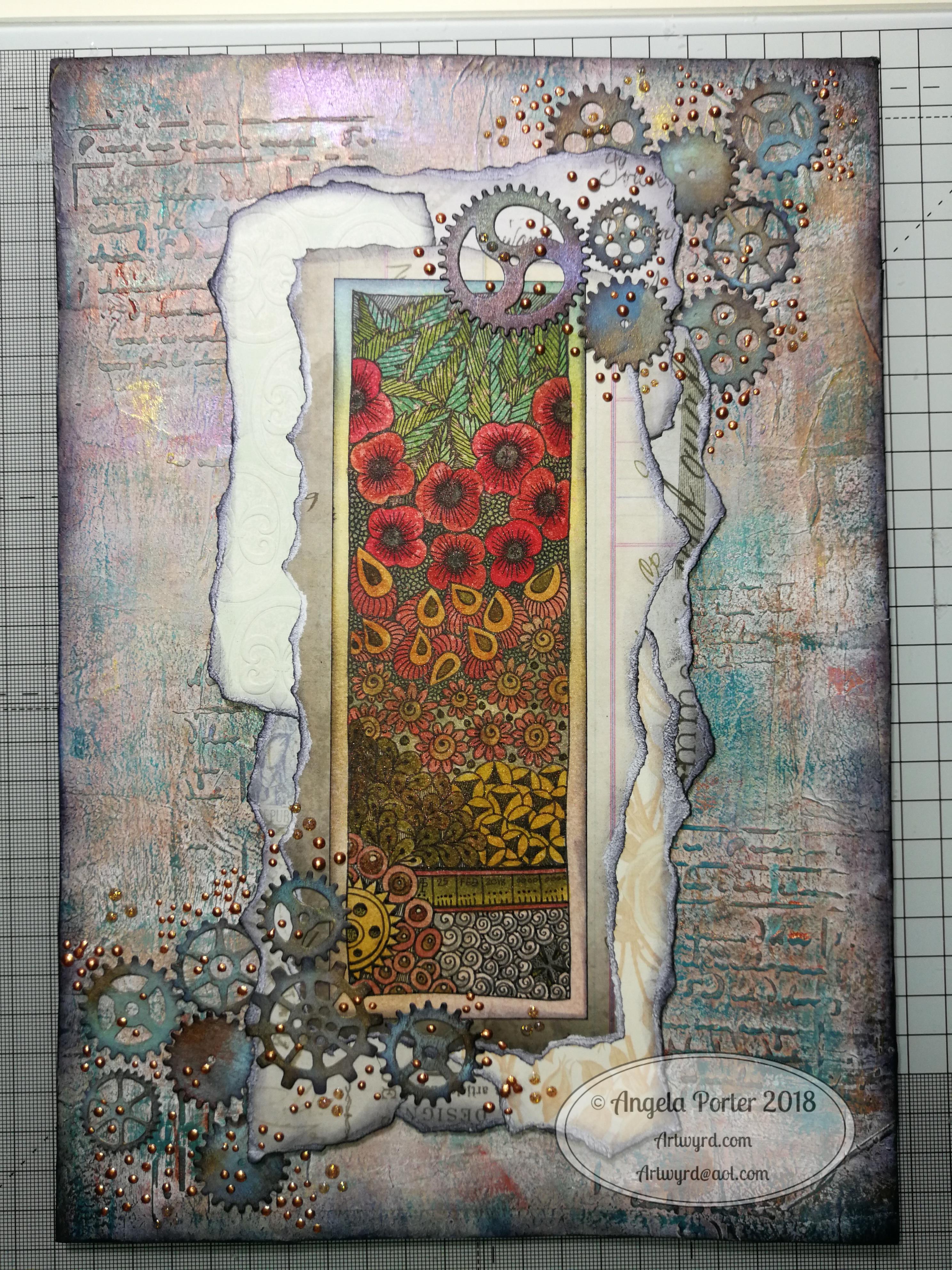
I’ve been working on a mixed media piece and this is as far as I’ve got.  It needs a focal image or quote or something.  I just don’t know what to add…

Feel free to make suggestions!

As it’s #supplysaturday to create this I’ve used :

  • Distress oxide inks from Ranger
  • Paper Artsy Fresco paints
  • Distress inks
  • Stencils
  • Gold paint from Cosmic Shimmer
  • Texture paste and gold acrylic paint
  • Perfect pearls and water spray

Mixed media 25 Feb 2018

Angela Porter mixed media 25Feb2018

I’ve been hard at work on my ‘A Dangle A Day’ book and felt I needed a break from the computer screen.  As much as I love working digitally, I believe it does the soul good to work in different ways from time to time.  A change is as good as a rest, it is said, and also a change can get the creative juices flowing!

A trip to Hobbycraft in Newport, Gwent, yesterday had me buying some A4 Daler-Rowney Mixed Media boards.

These are 1.4mm thick and sturdy board forms of their mixed media paper.  The board did warp when I added tissue paper with matt medium, and it’s still a little wobbly today.

The pictures shows how far I’ve got for now.  I’m letting the little drops of copper and golden glitter dry as I take a break from it to decide if I need to do any more to it.

The image I drew and then coloured using Distress Inks.

I’ve enjoyed getting a little inky, painty and messy for a change.

Mixed media cards – shells and fish

AngelaPorter_Cards1_10June2017AngelaPorter_Cards2_10June2017AngelaPorter_Cards3_10June2017AngelaPorter_Cards4_10June2017

Over the past few days I’ve been drawing shells, flowers, fish and fungi and sorting them out to be digi-stamps, work all done on my Microsoft Surface Book.  Some have been printed, coloured using my Chameleon Color Tones and Color Tops pens, cut out and mounted on mixed media backgrounds.  The photos above show the fruits of my labours.

Apart from the Chameleon markers, the media I have used are:

  • Distress and Distress Oxide inks
  • Iridescent and metallic paints from Liquitex and Pebeo.
  • Perfect pearls sprays
  • Stencils
  • Stamps
  • Black Archival Ink
  • Inktense pencils
  • 3D Crystal Lacquer
  • Alchemy Wax

I think that’s the complete list of media.  I used mixed media paper for the backgrounds, and the paper was cut out using rectangular dies.  Behind the backgrounds, I used silver mirriboard as a mat.

I’m quite pleased with them.  No so sure about the kraft card bases (which are 5¾” x 4″ in size), but they were what I had.

Now, all I have to do is work out a price for them and pop them into my Etsy shop, though I think I will have to take better photos for that!

Mixed media index cards – 5 June 2017; my own library of digital drawings

AngelaPorter_5June2017_MixedMediaIndexCard1

Mixed media index cards

Two index cards worked on over the last day or two.  The focal points are shells I drew, first on paper, then the image was worked on on my Surface book with Autodesk Sketchbook Pro and my Surface Pen,

I had to use scissors to cut out the shells (not my favourite task as I’m not good with scissors) after I’d coloured them using the Chameleon Color Tones and Color Tops marker pens.  I’m really pleased with the colouring.

Lots of different techniques/media were used on the index cards – stamping, stenciling, inktense pencils, distress inks and distress oxide inks, pebeo dyna paints, perfect pearls sprays, gesso, clear holographic embossing powder from WOW!

I’m happy with them, though I’m not sure they’re quite finished, especially the little one.

Digital drawing library

I’m beginning to build up a library of my own digital drawings – fungi, flowers, shells at the moment, oh and one angler fish skeleton that I’ve not used yet (but that’s an idea for later or tomorrow maybe).

I have to decide if I put these images together as packs of ‘digi-stamps’ for sale…I’m really pleased with my shells here, but the fungi have worked out fine too.  With my limited scissor skills, I’m keeping it in mind I need to keep the outlines relatively simple, but the inside of the design can be rather detailed, which is fun.

Mixed media index cards – 3 June 2016

AngelaPorter_3June2017_MixedMediaIndexCard1

Two more index card done!

I drew the fungi then coloured them with the Chameleon Color Tones and Color Tops pens.  Cogs have appeared in the background once again – gotta have a lil bit of steampunkishness!

I’ve used 3D Crystal Lacquer on the fungi caps and on the stars in the background.

I’m liking the slightly bigger format of the index cards compared to ATCs.

Yesterday’s Mixed Media Index Cards – update

AngelaPorter_1June2017_MixedMediaIndexCard4

I spent some time yesterday and this morning adding some details to drawing on each of the index cards.

I added stippling and lines to add shading on the focal points, both in black and white.

I also added some ground for them so they weren’t floating in air; the grasses or plants in the background I wanted as black silhouettes just so interest/texture/pattern was added.

Finally, I added either white dots or black ‘popping bubbles’ to the ‘sky’ for more visual interest.

I’m now much happier with them and feel that they are complete.