It’s been a while, again…
Learning how to navigate life as an autistic person. Doing my best to do what I have to do. Being with people I like is great, but it’s draining. I can be totally bushwhacked for a day or several. I can focus on drawing, but on writing a blog, holding a conversation, live streaming drawing and chatting on YouTube can be just too much.
When I’m burned out, the imposter syndrome weighs heavy on me, despite all the evidence to the contrary. A life time of being told I’m weird, difficult, histrionic, not good enough, not liked can bubble upwards, along with the feeling of being totally alone in life.
I’m not alone. I do choose to be solitary a lot of the time as it leaves me with the energy to join in with others, to do errands and tasks. Learning at my age of 62 that this is now abso-blooming-lutely necessary isn’t easy. It’s learning what lies beneath the lifetime of masking, the constant pushing to fit in and be as ‘productive’ as others, being told I’m selfish for needing time to myself, that I’m no fun. Over six decades … it’s not undone in a year or two.
Fortunately, I did go through several years of EMDR and Somatic therapy for cPTSD which helped me heal and release a lot of the trauma of my past.
But on some days, days where I don’t have the energy of mental focus to still the nagging messages learned from others in the past, they can overwhelm at times. And that can make it harder to recover.
The one thing that helps is drawing. Some days it can be too hard to do even that, everything is fraught with frustration, a lack of motivation, an inability to do anything at all. Most days I can find at least a little time to create.
And on those days, if I venture into the world to run an errand, attend an appointment, keep a commitment I have to keep, the mask is put back on. The mask that tries to let people know I’m ok, even though every part of me is overwhelmed by the lights, sounds, smells, the press of people, the hustle and bustle, the unfamiliarity of a new place (or even an old place if things have been rearranged/altered). The effort of trying to listen to the person talking to me when all around me is a cacophony of other voices, sounds, smells and more.
But there’s always the nap to look forward to…
And then some drawing or adding colour or shading…
Or just some cozy time with Stardew Valley…
All in the safe space of my home, as imperfect as it is. But it’s home, where I can relax as fully as I can and just continue learning more about me without the masking.
I know it’s hard for so many neurotypical people to not understand or get this. But putting my experiences as an autistic person ‘out there’ may help people to understand this – if you meet me I may seem a little ‘eccentric’ but seem to have it all together, to have the proverbial ducks in row. However what’s going on beneath the surface is a whole lot of stuff that isn’t visible, nor shared for fear of being called ‘attention seeking’ or ‘too much’ or ‘making it all about yourself again’. I use so much energy to keep it together for as long as I need to … but the aftermath….
The days of sleeping 12 or more hours, the inability to cook, washup, bathe, do some laundry, tidy-up, focus on anything other than gentle stories or games, of avoiding social contact…of existing in one corner of my daybed, scrunched up with a drawing board on my legs, drawing in spurts…. of not realising I need to drink and eat as I don’t recognise I’m hungry/thirsty…of finding it hard to get up and go to bed to sleep because I just can’t make that transition..
The Art…
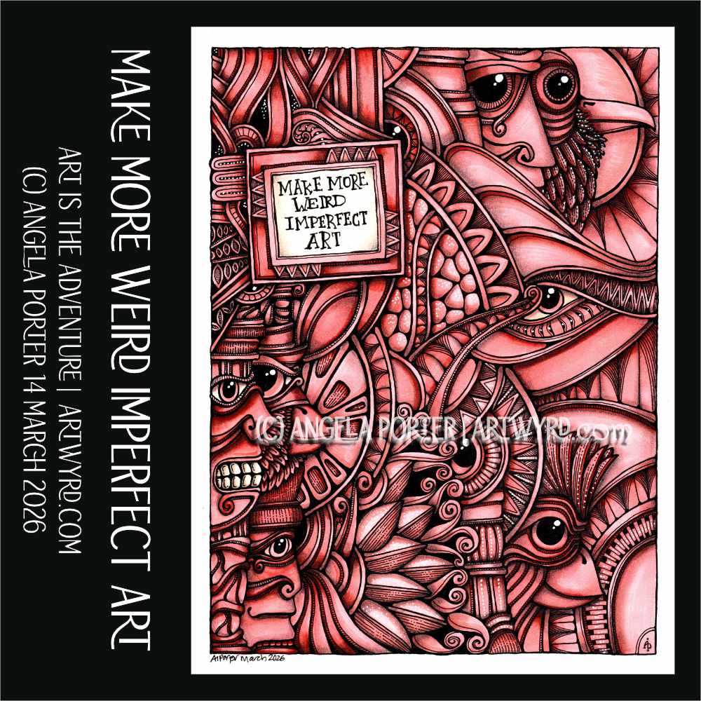
And yet, throughout this, I draw, I create, I seek out images that make me smile and interest my creative mind. I can question what my artistic voice is. I seem to fall back on old, familiar styles of art, like in the image above.
The old, familiar styles bring soothing to my overly frazzled senses. The way my muscles and mind flow with the curves, the intricacy of patterns, the playing with shadow and light. The way I feel the movement of the shapes of lines in my mind and the delight that brings.
I’m aphantasic; I don’t have a visual imagination. However, I do feel the shape or line I’d like to draw, The patterns come instinctively, mostly.
Colour is a frustration, especially if I use lots of colours. The drawing feels … too much … too disjointed … incoherent…
In the drawing at the start of this blog, I used just two colours of Ohuhu markers – R15 Lychee Juice and E610 LIght Mahogany.
They didn’t really blend too well together – the Mahogany was just too saturated and dark. I used a graphite pencil to add more shading, which helped to bring things together. And this time, I was sparing with the white gel pen dotty highlights.
And I’m actually happy with how this one turned out! It seems a simple colour scheme is the way to go for me! What do you think?
All I have to do is to remember this – to keep the colours simple, a light and dark colour that blend well, graphite pencil, or chalk pastel pencil to add shadow and white gel pen to add highlights (though I may try a white charcoal pencil to see how that works out too).
Shadow and light. Depth and dimension. Giving a 3D quality to my work. Severely limiting my colour choice… I always return to this. But when I have a big selection of colours … I have to learn it’s OK to use just two…one for the dark and one for the light, with white pen/charcoal/ for highlights and graphite/pastel pencils for shadow. Now all I have to do is remember this! Possibly easier said than done!


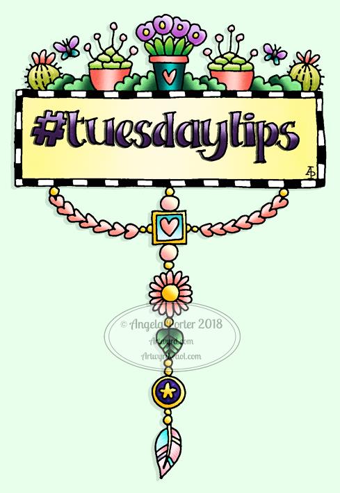 My #tuesdaytips are all to do with hand lettering this week, but taken generally, the advice applies to any skill, artistic, creative, practical or otherwise I’m sure.


 Finally, today my reMarkable tablet has arrived, and I am so pleased with it!


