Monday Mandala

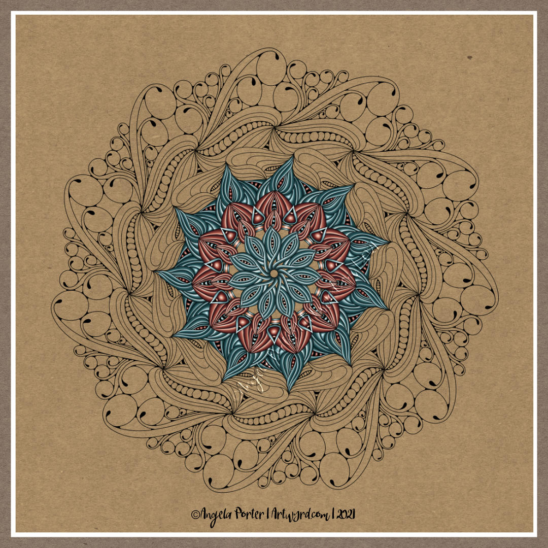
Monday is, usually, mandala day. I have at least one mandalas-in-progress, but I started a new one today, primarily because I wanted to try out some different brushes in Clip Studio Paint Pro.

It took me a few experiments to settle on one brush to work with for this mandala – a coloured pencil brush.

It also took me quite a few goes to work out how I wanted to lay down colour for this mandala too. Eventually I settled on highlight on one edge, shadow on the other, and quite a sharp delineation betwixt the two.

I didn’t realise it at the time, but the effect I was achieving reminded me of the abstract oil paintings I did many, may years ago. The abstract patterns came from Romanesque architecture and rusty parts of steam and diesel locomotives. I remember myself playing with light and shadow. I also remember at the AS level exam exhibition I was puzzled as people kept touching the paintings. I asked someone why they had. They answered that they wanted to see if the paintings were 3D in nature. I hadn’t seen that illusion at all, but once it was pointed out to me I could see what others could. I put it down to having worked so closely on the paintings.

This was around 17 years ago now, and I still tend towards working with highlights and shadows, and the resultant illusion of volume or dimension in my work.

I’ve also finally worked out that I tend to use light and shadow as part of the patterns in my work instead of related to a light source. I think that penny dropped when I was listening to a Zentangle video on youtube.

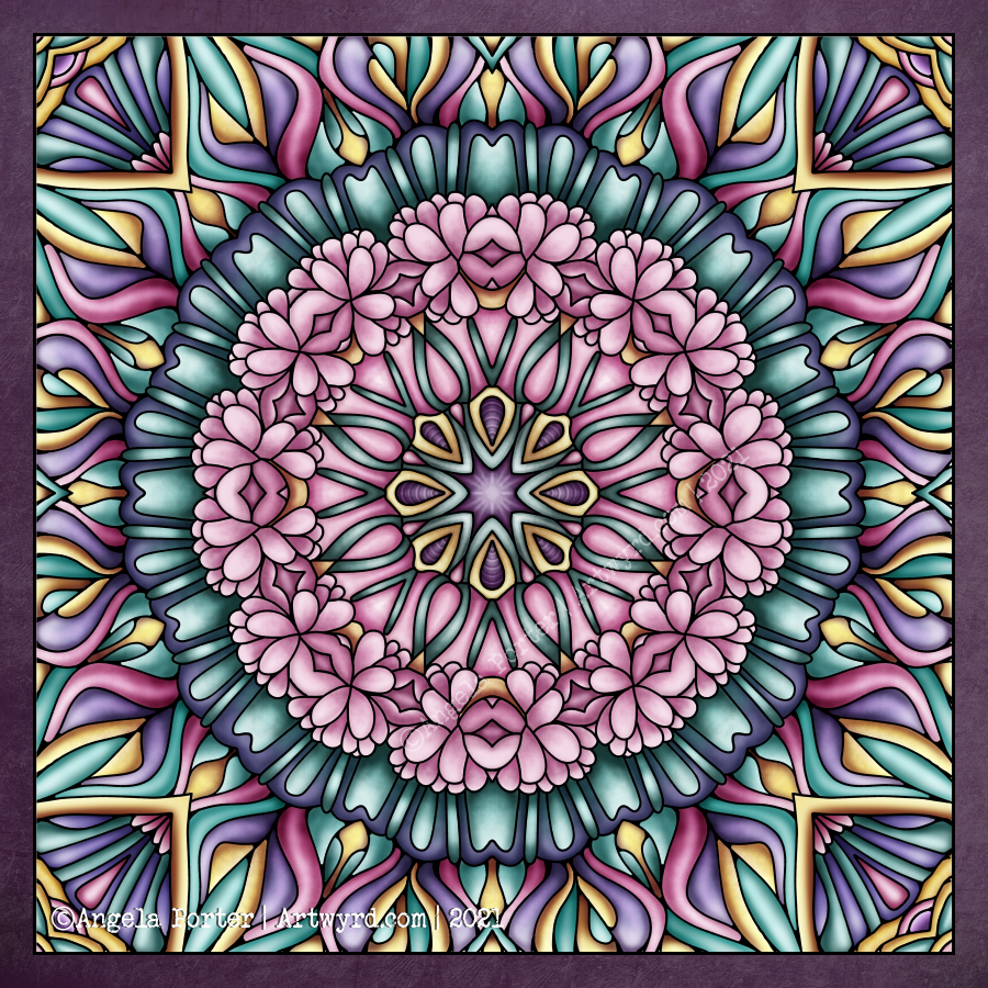
As lovely as it is to work with varied colour palettes, for this one I wanted to return to a simpler palette. I’ve chosen just two colours and various shades of those colours.

I can see how my colour blending technique has developed from the centre outwards! The difference between highlight and shadow has increased a tad.

I have so many works in progress at the moment, and I tend towards creating new all the time. I think I really do need to learn perseverance and get works finished more often!

Tuesday Work In Progress

I love drawing mandalas, if you hadn’t noticed. And creating a mandala is a perfect way to continue exploring and getting familiar with the tools and interface of Clip Studio Paint Pro.

The more I use Clip Studio Paint Pro, the happier I am with it, though I do seem to have had a hissy fit with the quality of this particular image. I need more tea I think.

Even though this particular peek at my work in progress, you can get the sense of the rich colour palette I’m using – magenta/red, purple, orange and golden tones.

Monday Mandala

My first mandala created in Clip Studio Paint Pro! It was a different yet similar experience to that I’d get in Autodesk Sketchbook Pro. In fact everything is similar, but different. It’s going to take me a while to work out how it all works.

I enjoyed the process, and the challenges it presented me weren’t huge. They were more opportunities to learn than to be frustrated.

One thing I really do need to look into are the settings on the symmetry tools. They didn’t work the way I expected them to, hence the rather unusual way the patterns are repeated around the centre. The fact that they work this way means that there’s a wider range of possibilities for such designs going forward. That is exciting!

I’ve mentioned in previous blogs how I’ve been dissatisfied at times with my artistic expression. It felt stale, samey, and just not working. Every now and again I have a need to explore new things, to shake it up a little. This is turning out to be one of those perfect confluences of frustration, opportunity and freshness.

It has to be said, though, that there are times when I return to what is more familiar, comfortable too. But when I do return to them, I do so with the lessons and outlooks gained from these fresh experiences. And so, my artwork develops, which is a good thing indeed.

Nature

Nature – an entangled artwork. It looks like batik, silk painting or stained glass!

The design was drawn in pen on bristol board and then coloured digitally in Clip Studio Paint Pro using a textured watercolour brush.

I’m determined to find my way around this piece of software, along with Affinity Designer at some point. The effects are the same as Sketchbook, but just not quite so easy to find the tools I want to use at first. It’s all a case of familiarity and I’m definitely outside of being familiar with the software at the moment.

Having said that, all that I’ve learned about layers, the various effects that can be applied, brush settings and so on, apply to all digital art platforms. It’s just finding my way around the software and learning more about it.

The one thing that’s top of my list at the moment is setting up a custom colour palette.

I’ve discovered that Clip Studio Paint has symmetry tools – phew! And these tools do a thing or two not available in Sketchbook as well as working slightly differently (and making certain things a lot easier for sure.

So, onwards and upwards I go.