Sketchbook Pages

Yesterday, I made a pair of covers for a custom sketchbook. I also spent some time cutting up watercolour and mixed media paper to go into it. Each piece of paper is approx. 4″ square.

I then added colour to both sides of four of the pieces of mixed media paper (Claire Fontaine brand) using PaperArtsy Fresco paints, Daler-Rowney gold acrylic paint and a piece of Cut’n’Dry foam from Ranger.

I also added watercolour to four pieces of watercolour paper, just on one side. I used this as an opportunity to just play with colour, no idea in my head of what to create.

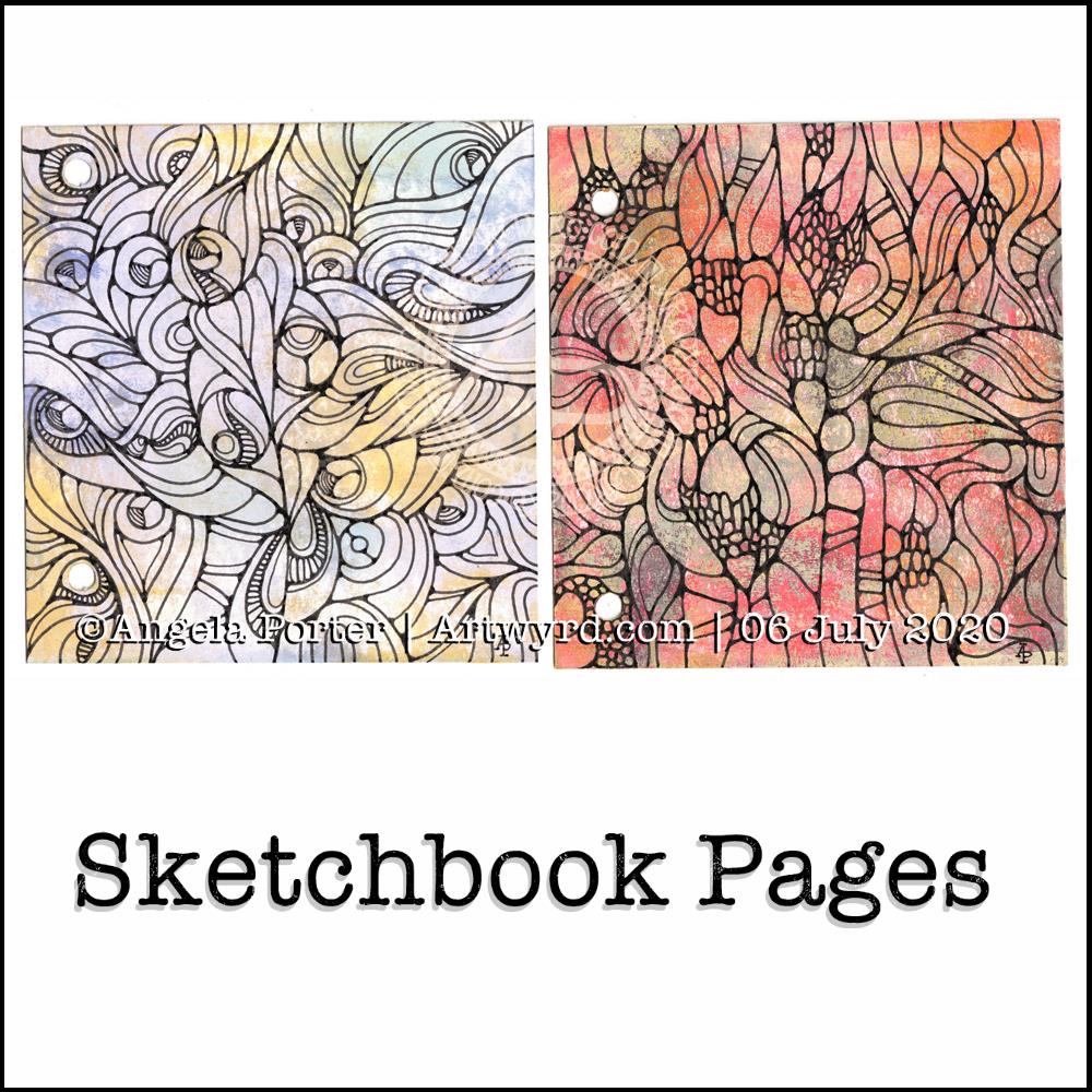
Later on in the day, I wielded Faber-Castell Pitt artist pens on one of the Fresco paint coloured pages (the one on the right). I just wanted to draw. No preconceptions of what would appear on the page.

It’s been quite a while since I’ve created art like this and I actually got a great deal of satisfaction out of the process. That surprised me, as black lines on colour had really not felt right to me for a long while now. It may be that I just needed a break from this style of art.

This morning, I took another piece of the Fresco paints coloured paper and drew a different design. Again, it was something I really enjoyed doing.

I’m really quite pleased with both designs. I think I’ll be using them for inspiration for some watercolour pieces in the near future. My only problem is whether to draw the designs out in black ink, dark pencil or faint pencil before adding watercolour! I think I’ll need to try these out before settling on a method.

What I also really like is working on a small scale. I’ve always been a ‘dainty’ artist; I find it hard to work on large scale artworks. It’s the fine, intricate detailed drawings and paintings that I enjoy creating, as well as abstract art.

Also, I really like the texture the Fresco paints leave on the paper – both for drawing on and the visual interest they create in the background. I’m so glad I haven’t done that destash and tidy-up yet as I know these paints were some of the items that were due to go. Now, they’ll be kept. I’m also glad I have a good supply of the Cut’n’Dry foam too.

I wish I’d placed the holes in the covers of my custom sketchbook closer together. That way I’d be able to add rectangular pieces of paper more easily. That’s something for me to consider the next time I make such a sketchbook.

I have some discs and a punch for disc binding in my stash. This may be something to consider using for another custom sketchbook as it would easily allow the inclusion of different sized papers in the sketchbook. Now my mind is working on using that! I think I need to jot my ideas down in my journal.

What I like about these kinds of systems is the ability to add different papers in where I want them – to shuffle things around as needed.

Template Thursday

The pandemic continues across the world and another week has passed us by. That means it’s time for another coloring template for members of the Angela Porter’s Coloring Book Fans facebook group.

This week, I’ve decided to do a mandala. Mainly because I find mandalas incredibly soothing and calming to draw. I have drawn and coloured the mandala digitally in Autodesk Sketchbook Pro.

As always, the template is only available to members of the group. It’s free to join the group, and free to download the template. All I ask in return is that you follow the terms and conditions, don’t share the uncoloured template, and credit me with the artwork when you post your wonderful colourations online.

Template Thursday

Another week has gone by with the pandemic still occurring. That means it’s time for another template for members of the Angela Porter’s Coloring Book Fans facebook group.

This week, I’ve created a rather abstract but typically entangled ‘Angela’ kind of template.

If you’d like to download the template to colour, you do need to be a member of the facebook group – it’s free to join and free to download the template (terms and conditions of use apply).

Summer Solstice 2020

Tonight, at 10:43 BST, the Sun appears to enter Cancer, as viewed from the Earth. Of course, it’s the Earth that is moving around the Sun. Today, marks the official start of summer, but it also marks the time when we have the days of most light here in the Northern Hemisphere, and we’ll soon notice there’s not quite so much daylight at the end of our days.

This year, English Heritage are live-streaming the solstice sunrise tomorrow morning on their facebook page. You’ll have to be up early (or just not go to bed!) as they start streaming from 04:07BST, with sunrise at 04:52BST. I’m certainly going to do my best to watch it. This is one of the good things to come out of the pandemic. The live stream hasn’t been done before. I would never go to Stonehenge on either Solstice as there would be too many people and far too much noise and bustle for me, but this is a nice way to see it as it happens, not recorded and shown after the fact.

I’ve always felt an affinity with the cycle of the seasons and marking the solstices and equinoxes has felt far more natural to me than any religious celebrations. The scientist in me appreciates the facts around these dates in the calendar, my heart and soul appreciate them in different ways that are personal to me.

I found this quote about the solstices, and it sums up a little bit about how I feel about them.

The artwork shows a lot more about how I’m feeling today – not quite with it, spaced out, emotional and well out of sorts. I had an idea in mind, but I just couldn’t execute it to my satisfaction today. It looks like I need another self-care day. Which is fine. I’ve learned that sometimes it’s best to go slow in order to go fast. By taking time out from commitments, I return to them in a better frame of mind and emotional state and I’m more able to fulfil them to my satisfaction for sure.

Watercolor Greeting Cards

About the artwork

I needed a quiet morning, again, today. So, I thought I’d dig out my Caran D’Ache Supracolor Soft watercolour pencils and try some stuff with them.

I wanted to use them to draw a flower, or two, and then use water to create a watercolour effect. The result you can see on the left-hand side card. I’ve left loads of white space on this card, which is unusual for me. I couldn’t resist, however, adding some gold dots around the flowers. The colour of the petals was so delicate that I used a 2H 3mm pencil to outline them and the leaves. Just for info, the piece of watercolour paper measures 4″ x 4″.

For the other cards, I just wanted to work with the pencils to create gradients and abstract patterns in colour. I drew on the little panels using a 0.25 Copic Multiliner SP pen and added some lines and details with metallic gold watercolour. These cards are approx 3″ x 4″ in size.

Watercolor pencils are nice to use when it comes to drawing in colour with them, then activiating the colour with water. They really glow on 100% cotton rag paper (bottom right) compared to the other cellulose papers.

Cute and whimsical cards, some very detailed, one not quite so. But a nice way to spend my morning.

Self-care time, again.

There’s a situation going on around me that is draining my emotions greatly at this time. I’m doing my best to not become overly emotionally involved in it, but it’s difficult when it’s to do with people you care about.

It all has a knock on effect with me. I’m anxious, tired verging on exhausted, really grumpy, irritable, and lacking patience at this time. I’m also not able to concentrate too well. These are all behaviours I could do without in dealing with this situation. Yet I’m exhausted by it.

I have been meditating, making sure I take time to do self-calming and self-soothing activities, such as my morning art, Though I have work to do for contracts, I need to take a day away from everything, if I can.

I know there are lessons for me to learn about myself in how I’m reacting ot the situation, stuff from my past that wasn’t processed during my EMDR therapy. If I can work out what it is, I can work through it myself now. Organising EMDR therapy isn’t possible at this time, with lockdown still very much in operation and me being very nervous of going out into the world as well.

So, I’m going to make time today to drink tea, meditate, journal and try to get to the bottom of my own issues and start doing what I can to work through them and heal the past traumas that are causing my reactions at this time.

I think I’ll also take time to crochet (I started a mosaic blanket earlier this week) and watch films or crafting shows on the TV. Eat healthily – I have a yearning for brussel sprouts, of all things! And take time away from social media and news. I may even pick up my flute and play it, for the first time in months and months.

Digital watercolours?

Another morning, another play around with watercolours, this time digitally.

Soft balls of watercolour, fuzzy edges, with white ink details added on top. Layers of transparent colour.

I overlaid a watercolour paper texture, which helps give the right ‘feel’.

This is my favourite attempt at digital ‘watercolours’ so far. I definitely like using white ink in this instance; black ink was just too harsh, hard and jarred uncomfortably with the softness of the watercolours.

I tried lots of ways of adding colour; not just brushes, but different brush effects. In the end I was happiest with white ink.

A nice way to spend a couple of hours as I wake up.

Flower?

I’ve spent several hours exploring and trying ideas out in the realms of both digital and abstract art, and this is the result.

I’m really not at all sure about it in any shape or form. I think I was influenced by watching a few YouTube videos about mixed media and abstract art.

It’s been an “interesting” time, as well as a frustrating time in some ways. I also have a bit issue with choice of colours.

I’m pleased to say that I’ve calmed down an awful lot from the stresses of the last week or so. I actually slept for nearly 12 hours last night, which happens once all the adrenaline/cortisol have left my body. It’s nice to be back to my ‘normal’ state of contentment.

Seeking Calm

Another morning, another migraine-y headache. Yet again caused by stress and worry. Painkillers taken, just waiting for the pain to go so I can sleep the remains off.

I also completed this peace of art which I started last night. I painted circles of watercolour on a 5.5″ x 6.5″ piece of Canson Moulin Du Roy watercolour paper and left it to dry overnight.

This morning, I wanted to add pattern to the circles. I tried using a white gel pen, but it wasn’t quite opaque enough. So, I used a fine brush and white gouache. That worked really well. It was also good practice using a brush like a pen or pencil. Is it still drawing if you draw with a brush, or is it painting? I don’t know!

The circles have ended up looking like diatoms, formanifera, microscopic bits and bobs, seeds, sea urchins…

Once the gouache dried, I added some more watercolour to add shadows and details to help bring some sense of dimension or volume. The white gouache works really nicely with the watercolour. Black pen can often feel too harsh to me with delicate colours. The white lines of gouache seems a lot more sympathetic with the delicate colours. It adds a lightness, airiness, delicateness to the design. The opacity gives a sense of more solid support, architecture.

While I like the transparency of watercolour, the way I’ve added the lines and shadows doesn’t quite work being able to see the lower layers, and my head doesn’t quite work right at the moment to work out how to add details from the lower layers that could be seen. Mind you, it does give me something to think about (when ny head will let me think) in doing similar kinds of work in the future. I definitely want to explore using gouache with watercolours.

I did think of adding some metallic dots, but haven’t done so at this time. I can always revisit this painting in the future.

It’s also giving me something to think about in working digitally, though I’m not sure what those thoughts are at the moment.

While I was doing this, I felt calm, content, at peace, and the headache wasn’t so noticeable. Hence the title – “Seeking Calm”. That’s exactly what I was hoping to find while finishing this artwork off.

Detailed drawing is something I love to do. Creating abstracts based on patterns/shapes that I’ve observed in the world around me and in nature is also something I love to do.

Exploring different ways of working with different media to see how I can get it to work for me (or not work for me) is also important. Watercolour is something I do struggle with and would like to work with. This little work of art is something that is a stepping stone on my way to finding a way of working that works for me.

#DYICAD 2020 #ICAD2020 Day 03 “Album”

This index card #ICAD2020 #DYICAD2020 was a bit of fun to create.

I used a mixture of Distress Oxide inks to colour the 6″ x 4″ index card. The colours I used were Old Paper, Bundlesd Sage, Dried Marigold and Chipped Sapphire. I built the background up in two layers, with chipped sapphire lightly dragged across the texture that the spray of water from the first background created. A final spray of water, a dab with some paper towel to leave some bleached areas and the background was done.

I decided I’d go with the typography theme today, so hand-lettered monograms for each letter. I used pieces of Canson XL Bristol paper coloured either with Distress Inks or Distress Oxide inks. After spraying the paper with water, I squished some cling film onto the surface to create abstract patterns in the colour.

Anyway, I used 06 and 03 Sakura Pigma Sensei pens to draw the monograms. Once I was happy with the designs, I edged the monograms with Ground Espresso Distress Ink. Then, I glued them to some brown-ish card, and cut them out with a border. I edged the brown paper mat with Ground Espresso Distress ink.

I then set to adding pattern and colour with Paul Rubens metallic watercolour set. Tiny dots and highlights were sparingly added to the monograms. Then, I used the same 01 brush to draw patterns around each monogram in colours that picked up the background colours of the monograms.

My final step was to edge the index card with Ground Espresso Distress Ink.

This was a perfect little project to practice my hand lettering as well as trying out the Paul Rubens paints. It was also good practice at using a fine brush to draw patterns. I do think a finer brush would’ve worked better.

The scan hasn’t picked up the sparkly, shimmery gorgeousness of the metallic paints.

This was a really nice way to come round after I’d slept off yesterday’s migraine-y stress-come-down headache. It was a small project that I didn’t feel overwhelmed by and there was no pressure on me for it to be perfect, as would be the case for my contracts for coloring books. So, it helped me calm and settle and find that sense of contentment, for a while at least.

ICAD2020 Day 02 Marigold

#DYICAD2020 #ICAD2020 – Day 02 – Marigold

I took an index card and used Dried Marigold and Bundled Sage Distress Oxide inks to colour it. I spattered on water to create some bleached spots. Then, I edged the card with Ground Espresso Distress Ink.

I knew I wanted to draw a marigold, which is what I did. In fact, I drew a few. The large one is a French Marigold (Tagetes sp.). The others are pot marigolds (Calendula sp.)

All the drawings are quick, loose, sketchy ones using an 04 Sakura Pigma Sensei pen. I did use a pencil to roughly sketch out the flowers.

As the theme for week one of the ICAD2020 challenge is typography, I added some hand lettering. I also looked for a couple of quotes about marigolds, which I hand lettered.

Finally, I added a wash of iridescent orange and yellow watercolours to the flowers, sage-y green to the leaves. I also added some graphic lines in iridescent orange to the letters. And I couldn’t resist spattering some of the iridescent paint on the card itself.

I think I may add the ICAD2020 creations into my journal, or maybe make one from them as time goes along. No need to make a decision today, I’m not really thinking straight at the moment.

Experimenting with watercolours

I woke with another raging headache this morning. So, some art was in order until the pills kick in and I can sleep the dregs of it off.

I thought I’d try some ways of adding texture and interest to watercolour backgrounds.

Putting some clingfilm (saran wrap I think it’s called in the US) onto wet watercolour creates a lovely texture. It’s not easy to see but I used it on the pieces at the top middle and top right. This is something I will definitely be experimenting with going forward.

I also tried salt again, on fairly damp, less damp and almost dry. The darker pink tile under the Marigold ICAD was where I added salt to rather damp watercolour and the blooms are just beautiful.

I also tried using white gouache. I spattered it onto a couple of tiles, but I also used it mixed with water to paint into wet watercolour. It adds a really interesting effect, the opacity of gouache looking intriguing against the transparent watercolour.

Finally, I used a straw to blow drops of watercolour around. That was a lot of fun and really created random, abstract patterns.

I added these to my journal with notes on how I achieved the effects so I can reference them in future. Today, I may not remember much about what I’ve done, all thanks to the dratted headache. All due to stress/anxiety/worry yet again.