It’s been a while…again…sigh.

It’s been a heck of a year, this 2024. Between anaemia, fatigue and brain fog exacerbated by COVID followed by tonsillitis in the last couple of months and other things going on, it’s been tough to focus long enough to post anything much to social media.

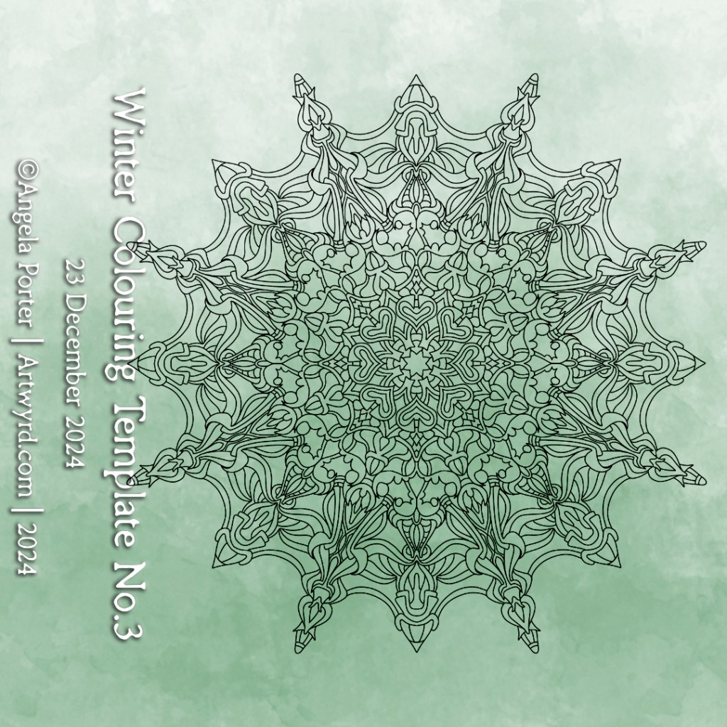
I haven’t done as many colour templates as I usually would in a year for the Angela Porter’s Colouring Book Fans facebook group.However, I’ve managed to get three done in the past couple of weeks and I’ve just uploaded them to the group. You can see the templates at the top of this post.

I’ll also be making them available for free on my Ko-Fi store. In both instances, terms and conditions for use do apply.

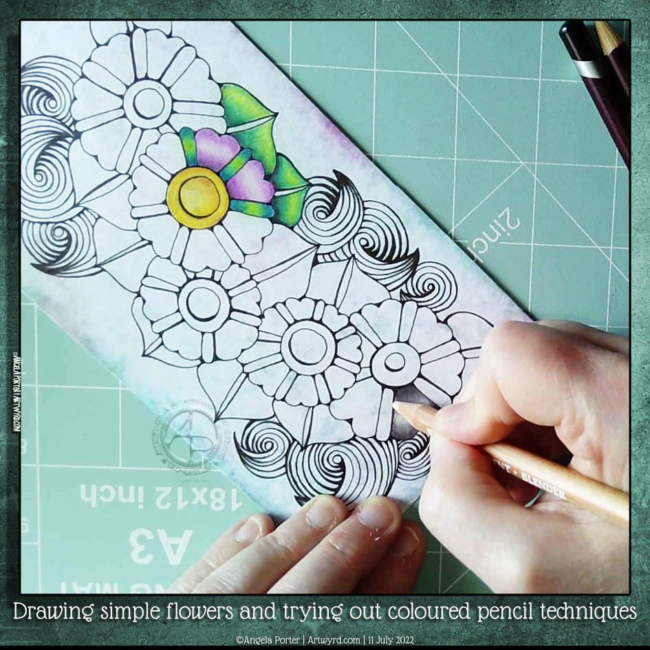
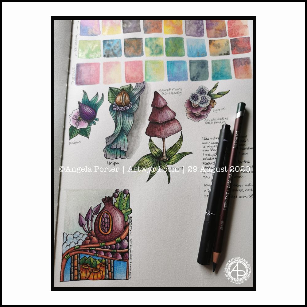
It’s soothing for me to draw and create, but so hard to put words onto a page, or into a YouTube video. I have, however, done a few Draw With Me live streams, which are easier for me to do than record, edit, upload and so on – less brain power needed.

I’ve also learned a lot about my art in the past year. Understanding what is an expression of myself, including in some ‘styles’, and accepting this has been a significant step forward for me. There’s more, but I’ll blog about it another time. The fog is closing in, and I have more to do today…

I know I’ll get better. I’m taking B12 and iron if it’s anaemia. If the fatigue is due to long COVID and/or perimenopause, things will also improve in time. I just have to learn to pace myself and not overdo things on a day when I have lots of energy (or when I’m masking my tiredness to interact with others). This is most definitely a work in progress.

Also, I’ve realised that I must draw designs/sketches before inking in digitally. My mind just can’t adapt to drawing entirely digitally. On paper, I quickly have an overview of the whole design and how it will appear to others’ eyes, too. I don’t get that sense digitally. So, I think that tradigital is a way for me to work – traditional pen drawing with digital colouring.

There is one exception to this, however. That is the drawing of geometric designs such as tiles and mandalas. I seem to be able to do them so much more easily digitally as I can concentrate on the lines and shapes I’m drawing rather than focusing on the maths and measurements.

Over the past few weeks, I’ve been getting used to my XPPen Magic Drawing Pad for drawing mandalas and adding colour. I’ve found that I like Sketchbook and ClipStudio Paint for designing and adding colour.

I really had hoped that the Magic Drawing Pad (an Android tablet that has a paper-like screen and the ability to draw smoothly accurately and with large artwork) would make it possible for me to use it instead of a paper sketchbook. I’ve tried so hard, but my brain just won’t adjust. C’est la vie!

Intricate Intuitive Art | 24 Feb 2024

These three works show my love of intricate, intuitive, flowing art. I continue to explore the use of colour to work on gaining more confidence in using it. I can appreciate how colour brings the drawing to life and sets the mood, too. I find using a fairly limited palette really helps me appreciate this.

I’ve worked on these over two or three weeks, give or take. It’s been a slow process as I’m recovering from a period of burnout from too much adulting and peopling. None are finished yet as I still have to indulge my love of pattern/texture to create more volume in the designs. Also, dots of gold acrylic paint have been added for that little bit of glitz and glimmer – something that makes my raven mind happy!

Drawing simple flowers, leaves, #tanglepattern spoolies and adding colour with coloured pencils.

Click on this link to watch the accompanying video on YouTube.

One of my YouTube subscribers (Chen Keith) requested I draw some simple flowers and show how I’d use coloured pencils to colour and add contrast.

Drawing, not a problem! Colouring? Yeuch colour choices! But I do show different approaches I use to adding colour with coloured pencils, or rather what I’ve done in the past. I rarely ever used coloured pencils now. Digital coloring or marker pens are my mediums of choice, with Inktense and the Karin Brush Markers close behind.

While the video was uploading and processing, I did try out other ways of adding colour and/or contrast. It’s way too hot here in the Valleys of South Wales for me to think clearly and explain things at the moment. The heat is making me feel very, very tired.

Sketchbook Page

Over the past few days I’ve been sketching in a black paper sketchbook. I’ve been indulging myself in sparkle and glitter, as well as using Derwent Colorsoft pencils, a Derwent blending pencil and a white Sakura Gelly Roll pen for these particular sketches.

In both cases, I started using coloured pencils. Only when I had finished the design did I add the white pen work to see how it would look.

I also enjoy the contrast between the sharp, bright white pen work and the softer, more fuzzy and hazy coloured pencil areas of the designs.

There is also something fascinating and enjoyable about bringing pattern, form and light into to the dark. Which works well as a metaphor for abstract art bubbling up out of the depths of my unconscious mind.

I enjoy creating abstract patterns. Like all my art, it brings peace, contentment and joy to my creative heart. By manifesting these designs on a page, I bring further ideas for art in the future.

Sketchbook Musings

Over the past week or so I’ve been gradually adding to this sketchbook page. It is entirely what a sketchbook should be, in my opinion. Pages full of ideas, sketches, unfinished drawings, practice of techniques, written notes… a visual zibladone for the creative soul!

It is a reflection of what is catching my attention in my world. That world encompasses the inner worlds of imagination and emotion, as well as the outer world of books, nature, architecture, photographs, and so on.

This page includes inspiration from Mayan glyphs/sculpture, rocks, nature, mushrooms, magic wands/staves/sceptres, pen textures and some inspiration from Hundertwasser.

Everything on the page is a bit wonky (not perpendicular), and I’m OK about that – it’s a sketchbook! But then wonky art, particularly colouring pages, seems to be part of my signature style. Perfectly straight lines just don’t look right to me, nor do sharp corners. Perhaps that’s why I like Hundertwasser so much.

The English gardener William Kent said, “Nature abhors a straight line”. Hundertwasser said, ” The straight line is godless and immoral.”

A sketchbook is always a work in progress (WIP), even when every page is full, it’s full of incomplete drawings and ideas, sketches and notes, jottings and doodlings. Nothing has to be perfect. Not a single thing.

A sketchbook is a place to try things out, experiment, just see what happens. With that comes an acceptance that not everything will work out, and where surprising things happen and discoveries are made that may otherwise never happen.

Sometimes the gems of ideas and colour combinations and ways of using media remain hidden until much later. A sketchbook is a place to practice and learn, to note down what is of interest at this time, what needs to be expressed, without any pressure to produce a finished, polished artwork.

That doesn’t mean, however, that a sketchbook can’t be something interesting to look at, even with it’s own kind of beauty. They are a reflection of the artist that creates them and so is a window into their arty heart and feelings. They are very personal things.

A sketchbook encourages me to use media that are gathering dust because I do so much art digitally. In a physical sketchbook, if I want any colour, then I have to use some of these media.

On this one page I’ve used Pilot Hi-Tec C4, Pilot Maica, Rotring Rapidograph and Uniball Unipin pens. To add colour, watercolours, Tombow Dual Brush pens, Derwent ColorSoft pencils, Derwent Procolour pencils, Derwent Inktense pencils have been used.

Sketchbook Saturday

What’s new?

I know, it’s that page in my Arteza watercolour sketchbook again! However, there are some changes, most noticeably the bottom left design.

I have added some depth and contrast in colour using coloured pencils to parts of the designs, and left other parts as just watercolour. I have used a blending solution and paper torchon to blend the pencils in most instances, but not all. Sometimes the blending just isn’t needed.

The bottom design was done today. It took around three hours to complete. Drawing the design with Pitt Artist pens, followed by the background washes of watercolour, finally the coloured pencils.

What I’ve learned

I like using coloured pencils on watercolour paper, and over a watercolour wash.

I find it really difficult to get the intensity of contrast with watercolours alone. Using coloured pencils makes that a cinch, especially on paper with a good ‘tooth’ to it, like watercolour paper.

I got a good sense of satisfaction as I completed the bottom design. I’m not all that happy with some of my colour choices, but that wasn’t my main consideration today; that was trying coloured pencils on watercolours on watercolour paper.

My colouring day coloured design!

11800358_1105879986108609_4919163736933435955_n

Admittedly not the best photo, but this was drawn yesterday.  I started to colour it yesterday, using various brands of coloured pencils, and completed it today.  An hour or so to draw, 10 hours to colour is my estimate!

I have also realised why I tend to use paints and markers and inks for colours so much these days – these media are kinder to my arthritic-y finger and thumb joints!  I do love coloured pencils, the intensity of colour you can achieve, but needs must.

I have ordered various designs of cushioned pencil grips to see if they help with keeping my joints ache-free in the future.

In the meantime, I return to designing and drawing colouring templates with drawing pencil and pens, which seem to cause very few problems with the old joints.

Arty times

Woodland Mandala © Angela Porter 2014

I’ve been busy with art.  This is just one thing finished recently.  It’s a little less than A4 in diameter.

Half-term at last…pheweee!

It’s been a long half-term at school; eight weeks to be precise.  In that time there’s been two training days, a twilight training session. a memorial walk to raise money for school funds and the Senghenydd Mining Disaster Memorial, almost daily incidents of poor behaviour/attitude to deal with, lessons observations, book reviews (as in how well and regularly work is being marked), a consultation with my union representative, a stress-meltdown and hopefully the end of three year period of what feels like persecution/bullying in a particular situation at work (culminating in the union consultation and the stress meltdown).

I still have a pupil to be dealt with who has been making threats to physically attack me because I apparently ‘start on him’ by asking him to do his work.  How shocking is that, that I should request he stop shouting around the class, distracting others and to do his work?

Oh the joys of being a teacher.

Having said that, there are joys.  The shared smiles and laughter with pupils enjoying the lessons.  The ones whose faces light up when they see me and who never exhibit poor behaviour in my class, even though they may do in other lessons), the shared laughter with colleagues, morning breakfast with ‘the girls’, the helpfulness of the lab tech, the enthusiasm and questioning of pupils because they are interested in something, their kindness and thoughtfulness.  And so much more that it’s a shame it can become dominated by the negative things that occur and dominate my ruminating, over-analysing, over-thinking brain.

It’s been really busy for me with having to prepare work for a new course I’m running with my special needs classes, as well as teaching mainstream classes that I’ve not done for years.  It’s meant late nights at work and even bringing work home – something I avoid doing as I do not want to go down the route of being a workaholic as I was in the first decade or so of my teaching career.

This busy-ness has really eaten into my creative time.  Little art has been done, and I’m am doing my best to settle back into it in this half-term, especially as I have two contracts to create artwork for two books, though I have been waiting for direction for what the artwork is to be for a long while now.

I’ve barely stopped in the first four day so of the half-term.  I seem to be running away from time with myself.  I can struggle with being alone, feeling lonely and end up keeping moving, moving, moving to avoid it.  Today I am remaining at home and trying to get things out of the way so that I will settle to some arty pursuits, or de-stressing after the last half-term.

I do seem to be a lot more resilient than I was a year ago.  Though things can get to me (such as loneliness, lack of a sense of belonging, the constant worry I’m doing things wrong that have precipitated the situation at work that led to a stress-meltdown), I often find there’s a content ‘centre’ in me that I can access when I do things of a creative nature or things that focus my mind away from it’s rumination and negative thinking.  It’s a little easier to spot when this is happening, though I don’t always catch it in time to stop the tears, the self-loathing and the comfort eating.

I rejoined a choir I’ve been a member of since I was in school myself.  Sadly, I had to leave again once the stress levels rose as my voice was, and still is, affected by the stress.

Out of all of this, and at odd times during the last couple of months, I have managed to do some arty things.  Here’s two mandalas of mine.

Calmly Does It © Angela Porter 2013

Autumn Splendour ©Angela Porter 2013d