Never give up and Foamiran flowers

AngelaPorter28April2017_01

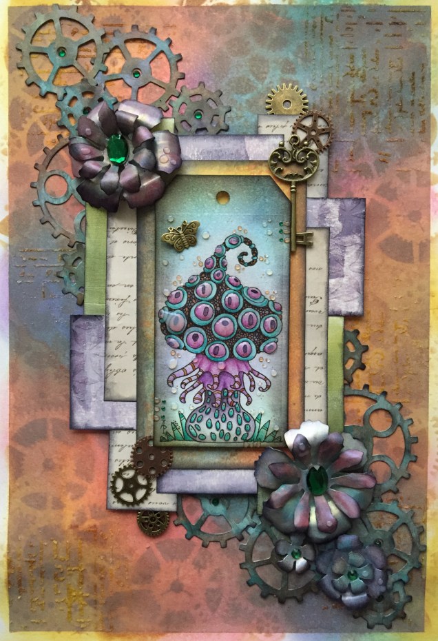
Back to playing with mixed media today, and this is the result…

It’s around 8″ x 6″ in size and 300lb Smooth watercolour paper by Daler-Rowney is the substrate.

First, I coloured the paper using Distress Oxide inks, with a light spray of gold mica mixture.

Once that had dried, I added the diamond motif and text to the background using texture paste through stencils.  Once the paste had dried, I used a rich gold System 3 acrylic paint from Daler-Rowney to paint the texture paste.

Yesterday, I had used embossing folders with my Big Shot from Sizzix to emboss coloured card which I then added metallic and iridescent colours to.  The dark red-brown layer of cogs is part of one of these papers. Behind it, there’s a piece of patterned paper.  Both have had their edges roughed up (distressed) and then inked using black Archival Ink from Ranger.

I next chose an ACEO or ATC card from my stash to act as a focal point.  I also firtled through my stash of steampunk diecuts to find some cogs and a clock dial to add to the background.

The diecuts were all made from kraft card and I used Distress inks to add the base colours of a rich blue, an intense blue-green and a red-brown before dry brushing metallic and iridescent acrylic paints from Liquitex over them to give the appearance of old metal.

Finally, I assembled everything together in an arrangement that pleased me.  I used a Payne’s Grey Inktense pencil and a water brush to add shadows, and finally a few sparkly gems (I can’t resist the use of sparkle!).

I thought I’d finished, however, the postman brought me a box that contained some Foamiran sheets I’d ordered a couple of days ago, and I just had to have a go at making some flowers.  You can see one of the flowers on the mixed media piece.

The flowers are quite easy to make.  I die cut flower shapes from the Foamiran.  I then used a couple of Faber-Castell Gelatos and a damp baby wipe to apply colour the the front and back of the flowers.

Next, I used my heat tool to warm the foam so it curled up a little and then shaped the petals before using hot glue to stick the layers together to make fluffy flowers.  Finally, I used an alcohol marker to colour some clear gems in so they complemented the flowers and attached to their centres.

I think I’m going to be making more of the flowers, they are easy to make, if a little fiddly given the current manicure I’m sporting.  Next time my nails are done, I’ll make sure they are kept fairly short!

More mandalas

Mandala3AngelaPorter26April2017

Mandala4AngelaPorter26April2017

Two more completed over the past couple of days.

Background colours done using Distress oxide inks and a light spray of mica infused water.

Mandalas – Angela style!

Mandala2AngelaPorter24April2017

Mandala1AngelaPorter24April2017

The last few days have seen me working in my sketchbook, and I may post some pictures from that later on.

I’ve spent some time the last day or three revisiting mandala drawing in my own inimitable way – definitely not symmetrical, with lots of flowing lines and intricate line patterns filling in the spaces, though not all.

I prepared the coloured backgrounds first, using Distress Oxide inks along with a light spray of either copper or pearl mica sprays.  The spray adds a gentle sparkle to the background, which hasn’t been picked up in the scan.

I used various pens – UniPins, Sakura’s Pigma Sensei, and Pilot Hi-Tec pens with nibs as fine as 0.25mm!

It’s been a long while since I indulged myself in these kind of mandalas.  I know that I really enjoy drawing on coloured paper.

Fantasy fungus mixed media

IMG_0624

This one is mostly finished. I need to add shadows around the elements and some shiny patterns to the layers I think.  Oh, and the hole in the tag needs something added.

The fungus I drew and coloured myself.  That was enjoyable to do!  In fact, the whole thing has been satisfying.

Romanesque bird ‘punked mixed media

IMG_0621

I’ve come to a standstill on this one.  I don’t think it’s finished but I don’t know what is missing.

The focal point is a small sketch I did of a Romanesque bird; I used coloured pencils on coloured paper followed by Pitt Artist pen.  I also ‘distressed’ it with Distress Inks and water spray.  It is a very, very sketchy drawing, but I feel I need to be a bit more confident in using my own drawings/art in such mixed media art.

I just don’t know what else this needs, though.  I’ve tried out the idea of using wire spirals wrapped with finer wire and beads, and that doesn’t feel it would work, not unless it’s one of the first things I make and use.  Flowers don’t work, neither does foliage…

So, I’ll leave it be for a while and come back to it at a later time…sometimes that’s the best thing to do.

Hope – flowerpunked. Art and my mental health.

IMG_0605

Just finished this one.

Hope.

Sometimes I have to walk away from something I’m working on as I despair it will work out to be anything near good enough.  Actually, it’s not sometimes, it’s most of the time!  However, I do persevere.

When I went to bed last night, this one was looking horrible.  I had the background done, the first layers of collaged patterned paper and the kind of hessian looking die-cut added too  I really wasn’t happy with it at all.

However, a good night’s sleep and a bit of inspiration on waking meant I knew where I wanted to go next, especially after I sorted out the jumble of die-cuts I have (note to self-get some way to organise these!).

Once started from the point of inspiration, the picture just grew to it’s finished state (well, I think it’s finished, that may change when I look at it again later on).

Hope.  A really good word here.  There’s always hope that no matter how bad I think something looks, , pushing past that often results in something good.  Indeed, sometimes the work can just be cut into pieces for use in another piece, which is how the iridescent, textured circles came to appear in this one.

Hope.  Making art always gives me hope that I can overcome the trials I face when my anxiety/depression/complex post-traumatic stress disorder kitcks itself up a few or several notches.  Art always gives me a place where I can lose myself in something that is meditative, mindful, self-soothing, and shows me that I can succeed even when the self-critic is telling me I’m useless, I can never get anything right, nothing is good enough, I’m a failure, and so on.

This past week or so, challenging myself to work with mixed media – something I’ve tried in the past and not really felt I was successful at – has been good to help me with the aftermath of a couple of rather strong anxiety attacks.  I’ve not had any for around a year now.

I was surprised by them and at their intensity and how they have impacted on how I live my life at the moment.  I find it difficult to go out into the world, want to hide away from people, and when I do go out it’s often in the dark hours so I’m not seen.

It also surprised me that this is how I used to live every single day for a very long time, most probably most of my life, until a few months ago.

Even though these two episodes have happened, I know I’ll get past them; I have in the past, and I can learn more about the triggers for them and also where this all comes from, which will help greatly in the counsellinge process.

So there’s hope I’ll improve in the long term, and blips are just that.  Just as I’ve hoped that my confidence and skill and expression via mixed media would improve.  I’ve just had a look back at the mixed media I’ve done in the last fortnight or three weeks, and even I can see how it’s all developed, in a positive way.

What’s made the difference for me with mixed media is finding the confidence to do my best to do it my way and to explore it in my way.  I have a lot more exploring to do, and a lot more confidence building in what I do with it. I will journey along this road, along with my drawing and illustration skills, maybe even writing, and with healing what I can of my mebtal health issues.

So, choosing the word hope for it to appear on this piece of art was most appropriate.

Flowerpunked

IMG_0602

This is todays mixed media creation (approx 5.25″ x 11.5″.  I think ‘Flowerpunked’ is a good name for it, or for the series of works like this.

I found a way to lift the flowers up so they have more dimension; wish I’d thought of that when I was adding the cogs., still there’s always the next one!  It’s all a learning process – it never ends!  I also think the stenciled patterns on the background are a bit dark and heavy … and just didn’t quite know what to do about them at the time as I didn’t want to lose the pretty background colours/patterns I’d already created.

Colorist Windows App – announcement and review

Colorist

First, the announcement!  I’m doing some coloring templates for the Colorist App, and my first book of ten pages – called DoodleWorlds – is now available for it!


Review of Colorist

fish-1.png

Colorist is the only app that lets you color with exactly the same feel as coloring pencils! Relax on the couch and enjoy coloring a complex design, a vacation spot, or a crazy cartoon cat – tons of pages to choose from. Even color the same picture more than once, to see what else you can do with it. No need to worry about losing your coloring pencils in the couch anymore!

I have tried the Colorist app out, and here’s an honest review of it.

I had a quick look at the app before I agreed to do any design work for Faction Apps as I’d not want to have my artwork on any platform that I didn’t think was a good thing.

I’ve given it a test run using my Surface book and the Surface pen.  I haven’t tried it out in touch mode with my finger. You can see what I did in the image above, which is one of the free downloads as my own weren’t available at the time I did this test.

Here’s a close up of the section I coloured in.

colorist-fish1.jpg


The colour palette

There’s a large number of colours available in the palette, and the bar that appears beside the image retains the last eight colours you’ve used, which is really useful and makes colouring in areas you want in the same colours easy to do.  It also means it’s easy to use many colours to get a smooth colour gradation, something that you can’t do with other colouring apps I’ve seen.

The pencil tool

There’s a slider bar with the tool so you can select the width of the pencil stroke, which is great.  The finest settings allowed me to add patterns to the image.  This is something that sets the app apart from others I’ve seen, which only allow a flood fill.

The finer lines and the ability to zoom in to the area you’re colouring mean you can get into the tiniest areas to colour, which at the original image size may have been a challenge, especially when printed on paper and coloured using coloured pencils.

The line isn’t a solid line, it has texture to it just as if you’re colouring on paper with a ‘tooth’ (texture).  This means that optical mixing of colours is possible, as well as adding texture to that mixing.  It also means that a smooth blend of colours is achievable.

The colours lay nicely on top of each other, thanks to that bitty texture; one colour doesn’t obsure the other, unless you use a lot of pressure and it’s what you want.

Oh, the colours don’t obscure the black outlines of the colouring page, no matter how hard you press.

My surface pen is pressure sensitive, and that makes the colouring experience a lot more comparable to colouring on paper with pencils, but without the mess!  I don’t know what it’s like on a screen that isn’t pressure sensitive, or how it works if I use my finger instead of the pen.

I am really impressed with the results and how the pencil tool works.

Also, I can get a bit irritated when I’m colouring with physical pencils; they often make my arthritic joints ache.  No such problem here; indeed, I wanted to carry on colouring but had to put it aside so I could get on with other things.

Eraser tool and Undo Button

It works!  However, I preferred to use the white from the palette to erase small areas to add highlights as I could control the thickness of the line being used to remove colour.

The undo button would be really useful too.

Together, they are things you can’t do when you’re colouring on paper, well not easily.

Saving your art

You can save your work at any time by using the save button on the app. You can also colour each page in as many times as you like in as many different colour schemes as you like too.

Final thoughts

I like this app, very, very much.  I found it easy to use, quick to master, and it gives really lovely results.  It’s a well thought through app, it does what it says it does, and the experience and results are a lot like using coloured pencils on paper!

I just want to repeat that although I have done some artwork for the app, these views are my own and not influenced by me working for them; if hadn’t htought the app was a good product I wouldn’t have agreed to do work for them!

Distress Oxide Inks – my first play.

angela-porter20170217_0022

Today, I picked up the first 12 colours in the new Distress Oxide inks from my fabulous local art shop – Dandie Crafts. I’ve been looking forward to getting them since I saw them launched by Tim Holtz just prior to and during the Creativation 2017 craft show.

The above image is a typical ‘Angela-doodle’ drawn using Sakura Micron and UniBall UniPin pens on a background prepared using the new Distress Oxide inks.  Before I let you know what I think of them, here’s a little bit about them.

The Distress Oxide inks are designed by Tim Holtz and made by Ranger. This is the description of them from the Ranger website:

Tim Holtz Distress Oxide Ink Pads are water-reactive dye & pigment ink fusion that creates and oxidized effect when sprayed with water. Use with stamps, stencils, and direct to surface. Blend using Ink Blending Tools and Foam. Re-ink using Distress Oxide Reinkers.

My first job on opening my ink pads was to test them out on different papers so I gained an idea of the colours they’d be, as well as how they react with water.  To create these test swatches I stamped two ‘feathers’ with each colour on the paper/card.  I then used an ink blending tool to smear some colour onto the paper.  Next, I used a wet paintbrush to add water to the second feather before swiping the paintbrush across the smear and adding droplets of water to it.

Here’s the inks on watercolour paper:

angela-porter20170217_0019

Secondly,  here they are on Kraft card:

angela-porter20170217_0020

Finally, I made test swatches on black paper:

angela-porter20170217_0021

The first thing I noticed was how easy it was to stamp with the Distress Oxide inks.  The original Distress Inks tend to stamp ‘blotchy’ – that’s the nature of them though!  These, because of the pigment portion of the formulation, stamp with a more solid line.  Not only that, the Distress Oxide inks are much more opaque than Distress Inks.

Blending the Distress Oxide inks using a mini Smoothie blending sponge by Crafter’s Companion was an absolute dream!  The inks went on so smoothly and, because they stay wetter for longer than Distress inks.  Admittedly, I may not have picked the best paper for applying the Distress Oxide inks to, and there was some unevenness in the blend/smear, but it was much better than I’d manage to get with Distress Inks, unless I used a stencil brush to apply the Distress Inks very thinly and build the layers up.

I don’t think I let the inks dry for long enough before adding water as I did note that some of the pigment moved when I brushed the feather with a wet brush, and the smear.  That may be because I used a brush rather than using a spray bottle to mist water on them.

It took longer for the Oxide effect to develop as I’d added more water than a misting would have, but the colours kind of soften on the white watercolour paper, and brighten on the Kraft and black papers.  The opacity of the pigment ink is increased by the addition of water, and the colours really seem to glow.

I then just had to go and create a background using the Distress Oxide inks.  I used mini ink blending tools this time, and I used Strathmore Bristol paper with a vellum surface.  The inks didn’t want to blend all that smoothly on this surface, however I wasn’t really too concerned as I just wanted a background to draw on.  When I was happy with the colour blend, I did mist the surface with water to bring up the Oxide effect, as well as to have a few small water splatters on the surface.

The Distress Oxide colours are much more ‘me’ than the original Distress Inks. They’re so creamy and rich in colour thanks to the pigment part.  I also love the suede-like feel that results after a light misting with water.

I’m really happy with these new inks and I look forward to experimenting with them more.  I plan to use them like watercolour paints, I want to try using stencil brushes with them to blend the colours out, and no doubt I’ll find other ways to make colourful backgrounds for me to draw upon.

Doodle, illustration from 11 Feb 2017

angela-porter20170211_0016-watermarked

I’ve done it!  I’ve worked out how to easily add a watermark to my scanned artwork to try to protect it as I share it online.

Autodesk Sketchbook Pro made it a doddle to do and so I’ll make sure I do this in the future.

To draw this one I found, after much searching, my Rotring Rapidograph pens.  It’s been a while since we were acquainted with each other, but yesterday was the day!  I’d forgotten what a joy they can be to draw with.  Also, unlike the UniBall UniPin or Sakura Micron pens I generally favour to draw with, I don’t wreck the nibs in a short space of time. I must press a lot harder than I think I do with them…

So, onwards to more art.  A lesson learned about protecting my ownership of my art and some control of it when I release an image of it into the wilds of the world weird web.