Saturday Entanglements

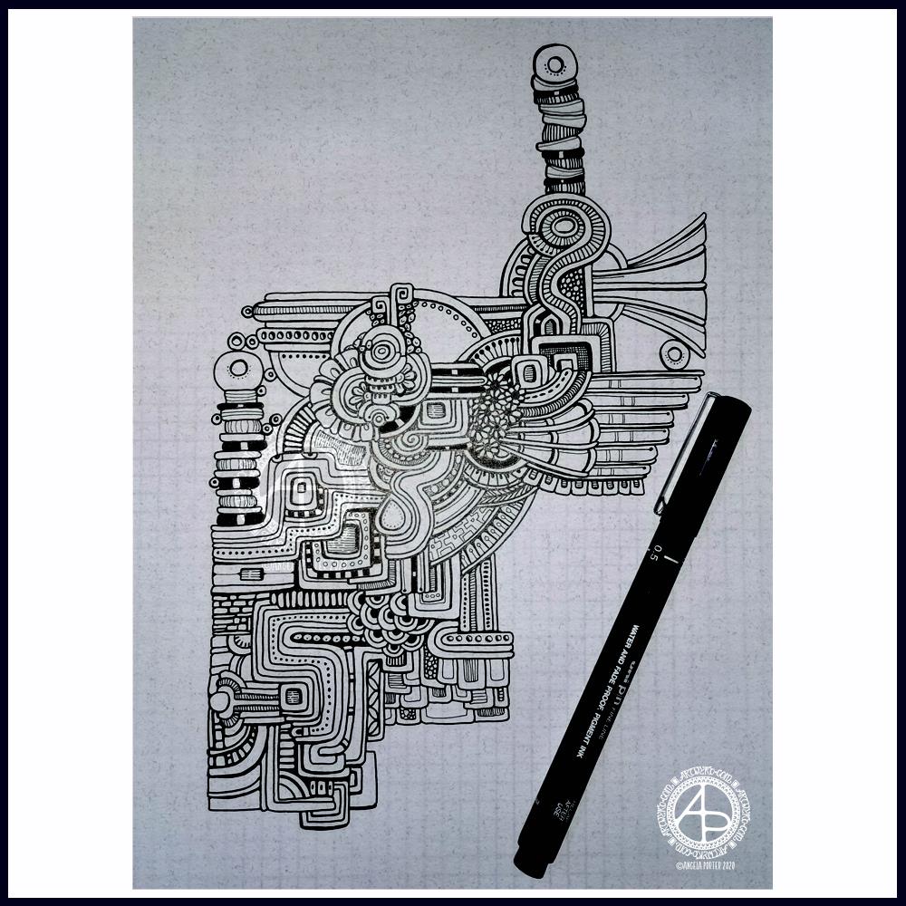
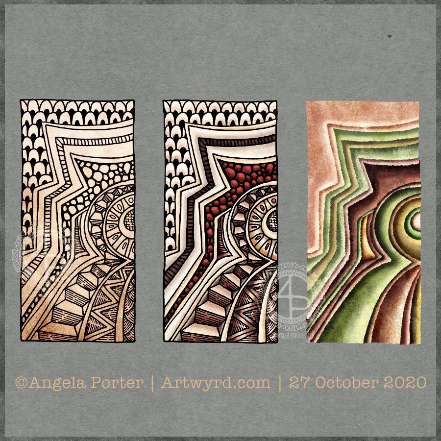
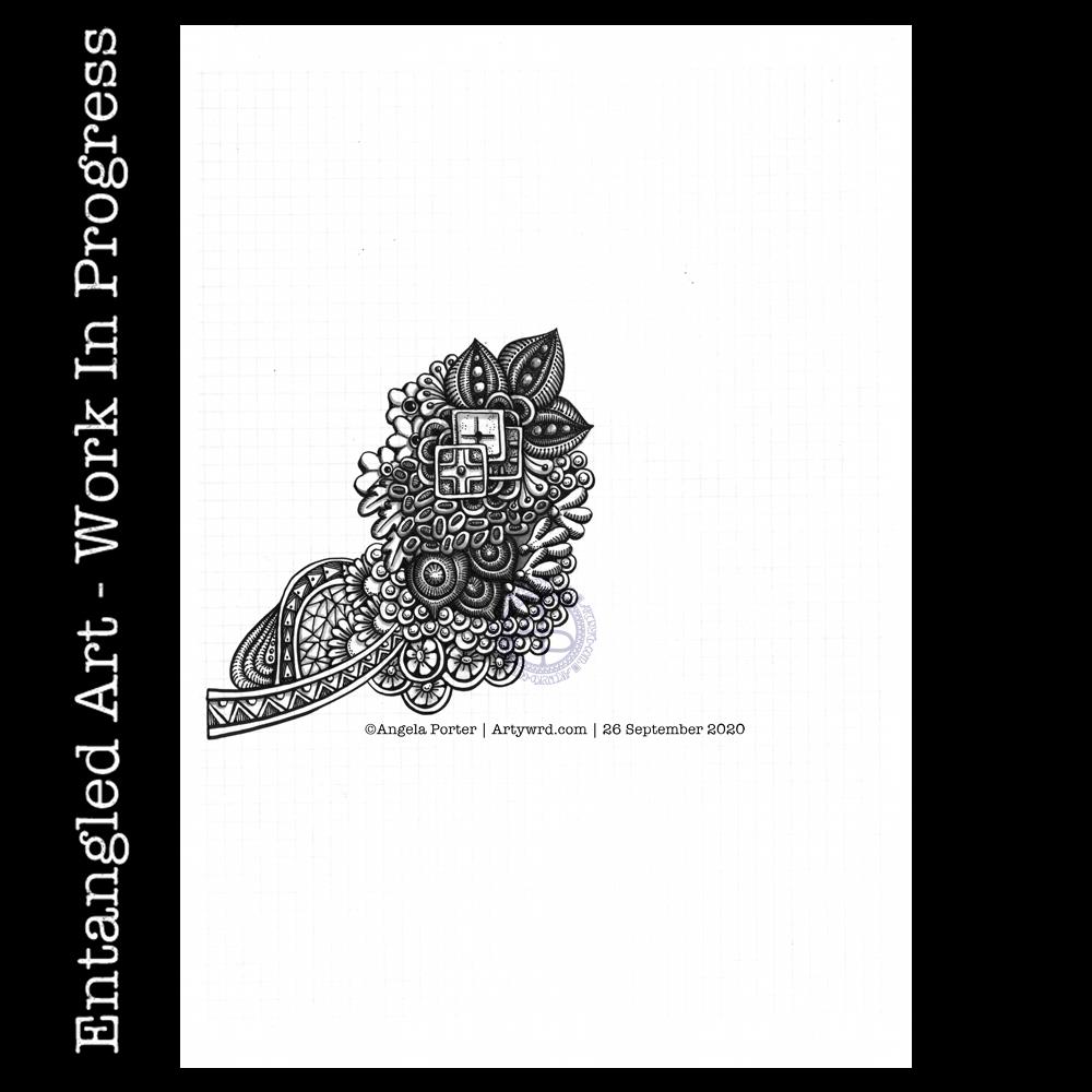
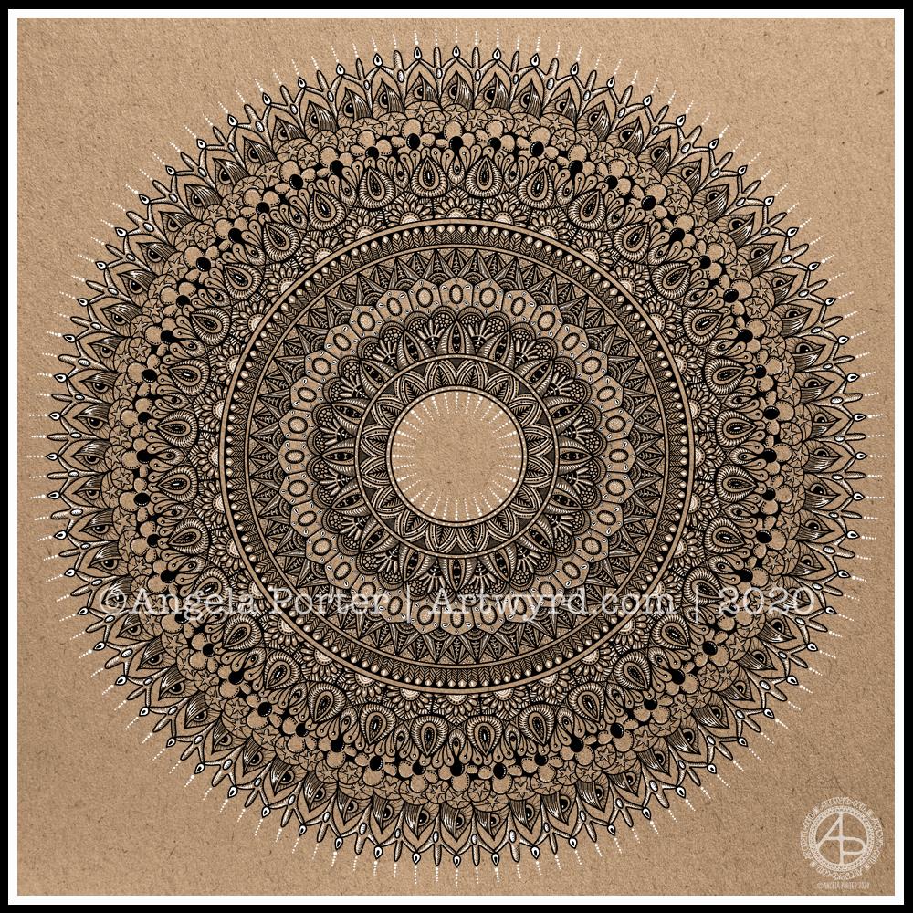
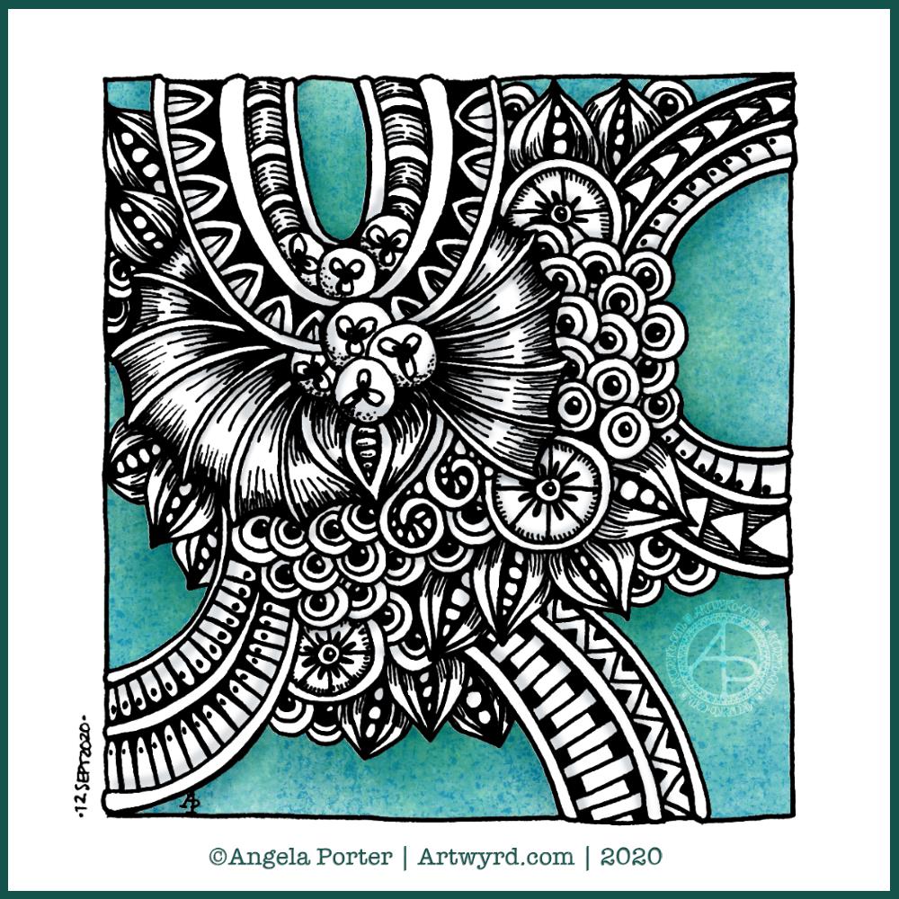
Today’s art is a selection of the small, detailed, intricate and fairly abstract drawings I’ve done over the past day or so, all in varying states of completeness.

Sometimes, just sometimes, I have a need to immerse myself in something that’s kind of familiar. Call it ‘comfort drawing’ if you like. But that’s what this has been; drawing to comfort and self-soothe.

My emotions are out of sorts. I’m dissatisfied with almost everything I do artistically at the moment, so I stepped back in time to do entangled zentangle-style drawings, with a twist here and there. Small projects. Pens and pencils on various paper. If something doesn’t work out, well it’s not great shakes, I just carry on and try to accept it for what it is, and learn a bit more about what works and what doesn’t.

I’m tired today. Not just physically but emotionally. The sun is shining and that is helping my mood somewhat. But I’m still tired.

Past experience tells me this will pass. It’s just emotional weather. I’m aware of the source of it, and I just need time to process, heal and learn from it.

I don’t really sit and think my way through things in the way people describe how they think. With me it’s all abstract and difficult to communicate in words. It happens on a more intuitive, subconscious level. When I’m ready, I’ll write about it, and give form to the abstract and symbolic processes of my inner self.

I’ve never really been able to express my emotions artistically. Sometimes they creep out in terms of colour choice. I do think my choice of more geometric, repetitive patterns in these artworks is an expression of my need to build a new structure in my emotional self.

My EMDR therapist was always saying I was too much in my head, not much in my body. A lot of the work we did was very somatic and a process of learning I did have emotions and recognising what these emotions are. It’s a troublesome realm, but an important one, even if it gets rather messy at times.

Messy. That’s something my art never is. Something my emotions rarely are. Everything so tightly controlled and precise; at least that’s how I seem to the outside world.

My older sister used to call me the ‘ice maiden’ as I never showed much enthusiasm or reactions to anything. I learned early in life that if I showed that I loved something or that it was valuable to me, then others would go out of their way to wreck it. I learned if I showed ambivalence, that things may not be wrecked by others.

The first time I can remember showing awe and wonder was on a trip to the British Museum, with my older sister and youngest brother. We went to see the mummies, but took a wrong turn and ended up at the Sutton Hoo treasures. I couldn’t help expressing the awe and wonder I felt on seeing them in person for the first time.

I feel a sense of awe and wonder often now, some thirty or more years on from that day. That day cracked open the seals on those emotions and I was able to share them with others through my teaching career and beyond. But not with everyone. Some in my life didn’t want me to be excited about anything. So I learned to choose how and when they were shown.

Now, I feel no embarrassment at showing awe and wonder. I’m able to lose myself in the beauty of nature, the grandeur of architecture, the magic of music, and more.

But other emotions are still a bit tricky for me. Messy. Confusing. Troubling.

And when I feel messy, confused and troubled emotionally, I fall back to comfort art. Often entangled style art, like these. And entangled is an apt way to describe emotions and life.

Just as one small drawing comes to a close, it being good enough for now, so will my confused and troubling emotions work their way to a good enough state of resolution, leading to contentment and peace.

Friday Art

Yesterday really didn’t go to plan. I ended up having a major emotional and stress episode and I was so tired afterwards that I didn’t have much in the way of focus. It also gave me a seriously upset stomach, as any emotional/stress event does.

I did, however, work on these two zentangle-style drawings.

The one on the left I did during the night and early this morning as my sleep was disturbed. I used a small square of Claire Fontaine Natural Paint On mixed media paper and a 03 Sakura Micron pen. The paper is 5″ square. The colour and shading was adding using a selection of Daler-Rowney artist’s sketching pencils and a white Sakura Gelly Roll pen. I left a blank space so I could add a quote at a later time.

The one on the right I started after I’d completed the line-art for Entangled Starry Skies. I used a 6″ Strathmore Artist’s Tile along with Unipin pens. To add colour and shading I used Stabilo Carbothello pastel pencils and Derwent Graphitint pencils with a light wash of water. I used this particular drawing as a way to try out different traditional media I’ve not used for a long time. I did mean to add gold to the white circular highlights, but it slipped my mind.

It was actually really nice to lose myself in the intricacy of these drawings. Intricacy, pattern, abstract, organic satisfy a large part of my arty heart.

I do feel a bit more settled today, but I am tired after yesterday’s stress and upset and a poor night’s sleep. But I do need to sort out my Christmas card design for this year!

Template Thursday

It’s that day again – Template Thursday!

Each Thursday throughout the pandemic I’ve designed a colouring template for the members of the Angela Porter’s Coloring Book Fans facebook group.

This week, the design has one big focal point motif of a zentangle-inspired Christmas Tree. It’s cute and whimsical, and is surrounded by holly, mistletoe, gifts, stars and baubles. Of course there’s some hearts there too.

Although the drawing is quite detailed, it’s split into smaller sections. This is great if you only have a bit of time or feel overwhelmed by the whole image. This way you can do one section at a time.

There’s a couple of reasons I usually only colour part of the template. One is a question of time when I have other things that have to be done. The other is that it shows the difference colour makes to the drawing, how it brings it to life.

I love to see how colourists bring my drawings to life with colour and how unique each person’s approach to colouring is. Every time I see one coloured it brings a smile to my face. I have so many colouring books published, so many templates drawn that I don’t have time to colour them all myself.

But when I see a template I wasn’t happy with all coloured in and how wonderful it looks, it not only makes me smile, but it gives me a little confidence boost that my drawings may be just good enough after all.

Yes, I suffer with imposter syndrome and a lack of self-confidence still.

For the rest of the day I really do need to get on with my Christmas card design for this year and get the moonpig ones sorted out and sent off.

WIP Wednesday

Up early for grocery delivery, so spent the time drawing and this is the result. It’s a work in progress as I now really do need to turn my attention to ‘Entangled Starry Skies’ for the rest of the day.

Unipin pens on Canson marker paper. The grid is a piece of quadrille paper behind the marker paper.

Strata

Arty musings

I’ve been awake since silly o’clock. I have a delivery due before midday, so while awaiting it I have been arting.

This started off as a simple line drawing of patterns from the strata of rock formations of Raplee Ridge, Utah. Then, I added some patterns between them, zentangle or entangled style. I used fineliner pens on paper to do this drawing (left image).

My next job was to scan the drawing in and tidy it up digitally. Then, I thought I’d colour the design in. I kept to fairly earthy tones for this (middle image).

Finally, I thought I’d do a pure colour study of the line art. And I really like this one. I’ve played with shadow and light to give a sense of dimension to the artwork (right image).

I’m really pleased with the pure colour image. Not just for choosing a fairly pleasing palette, but for finally discovering how to use textured brushes to draw, colour and texture the different areas.

I’ve done work like this with traditional media, but have never really had much success digitally. It seems I have found some confidence here.

It does remind me of work I did some 15 or so years ago while studying for A level art as an adult, and how much pleasure I got from that. Now, as back then, I used simple colour palettes.

I suspect I’ll be doing more work like this – line art of patterns, followed by a coloured interpretation of those patterns. My mind is ticking over whether I could include some typography in these kinds of artwork too.

Moody mutterings

My mood is better today, I’m pleased to say. I’m not sure if it’s rest, self-care, Star Wars, knitting, art, or a combination of all these things that has helped lift it.

I know that my mood has weather, just as the world does. And in Wales, the weather can be changeable and varied! But like all weather, the gloom passes and sunshine returns. Though I wouldn’t say I’m sunshiny, I am content with a soft glow within. That is good enough for me, and for today as it’s rather wet and gloomy outdoors.

Entangled Art WIP

A sunshiny, chill-nip-in-the-air, autumnal morning and starting work on a new entangled art drawing. Not much could be nicer start to the day.

I had a delivery of some new fude brush pens to try out, so this one is being drawn with a Zig Mangaka Flexible pen along with a 02 Unipin pen. I’m drawing on marker paper, so I dug out my cool grey Copic Ciao markers to add some shadow to the image in places.

The nice thing about using marker paper and markers is that the ink stays damp long enough for the blender pen to smooth the edges of the grey inks out a little.

I think I’ve worked on this drawing for around three hours so far, so there’s a lot more to go! I hope I can manage to leave some white space in the design, as well as being mindful of the use of contrast so that different sections feel separate to each other.

I started with the square motifs, which are based on Mayan glyphs, and just let the design flow out intuitively. It never ceases to amaze me how layers and dimension appears. It’s never something that’s planned; it just happens and I sometimes don’t see the effect until someone points it out to me.

No central big motif, such as a moth, with this one. Just pure entangled art.

Moth

Finally finished! The moth with mandala and entangled background. A4 in size.

It’s taken quite a few hours work to complete this one, but it’s nice that it is finally done.

Lots and lots of my favourite motifs/patterns used in the entangled background – flowers, seeds, seedpods, leaves, arches, spirals and geometric patterns.

Plenty of line work to add depth and volume to the design.

I like that the white area behind the moth means the moth isn’t lost in the background. There are some areas where the resulting values aren’t sufficiently different, but I can live with that.

No colour (other than my watermark). A very graphic design.

Entangled Mandala

I really enjoyed creating this mandala this morning! I used some of my favourite motifs in this one. it was lovely to use white on the kraft background, to bring out some highlights and add dimension here and there.

I love to use Autodesk Sketchbook Pro to draw my mandalas in. It streamlines the process and allows me to focus on creating the design rather than the mechanics/geometrics. Of course the design is drawn by hand, just as it would be on paper. That’s the beauty of having a Microsoft Surface Studio and Surface Slim Pen – I can draw with the pen on the screen just as I would with pen on paper. The advantages are that if I mess up, it’s easy to correct, and the symmetry tool saves time, allowing me to focus on the fiddly details that I love so much.

Entangled Drawing

Dimensions : 8cm x 8.5cm (3¼” x 3¾”)
Smooth cartridge paper (acid free)
Uniball Unipin pens (05 and 01)
Digital editing and colour in Autodesk Sketchbook Pro

I drew this little drawing yesterday, but spent some time this morning scanning, cleaning and adding colour and shading digitally.

I deliberately left some ‘white space’ so I could fill it with colour. This contrasts rather well with the graphic black and white entangled art design. The coloured background adds depth to the image, and the subtle shading by grey and textural lines adds volume to the design elements and layers.

I often think I struggle with colour, unless I use a limited palette. This is a way to make use of colour in a way that adds interest to the design without detracting from the line work.

Template Thursday

As it’s Thursday once again, it’s Template Thursday! That means I create a colouring template for members of the Angela Porter’s Coloring Book Fans facebook group.

This week, I have an entangled mandala design, with a zentangle-style background. It always seems a shame to waste the space around a mandala when it’s a page for breathing life into a design with colour.

I drew this design in Autodesk Sketchbook Pro using a brush that changed width with pressure. That allowed me to add some dimension to the lineart. But it is colour and shading that really brings a sense of volume to the design.