Monogram ‘Q’ dangle designs

Monogram ‘Q’ Dangle Designs – ©Angela Porter 2019

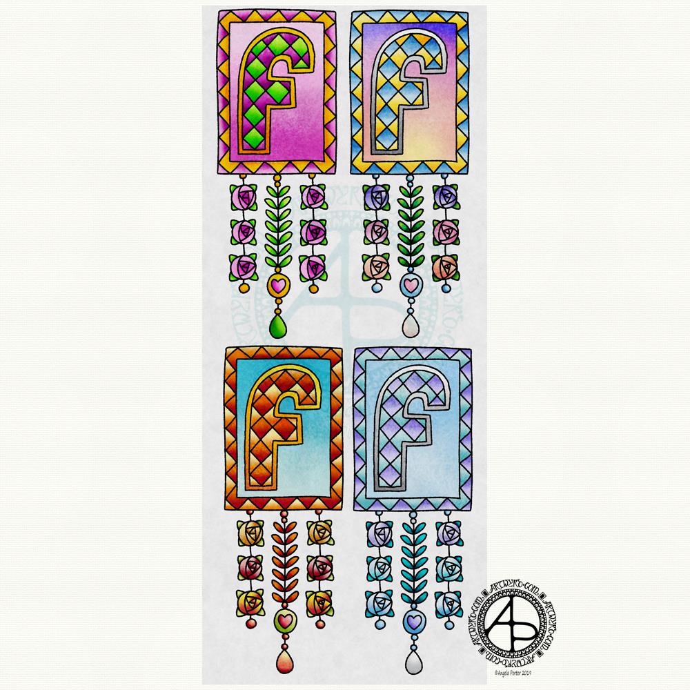
Following on from yesterday’s blog post (One dangle design, four colourways) I thought I’d do another monogram dangle design, but this time adding some embellishments.

The design for the Q monogram comes from my book ‘A Dangle A Day’ (published on 15 Jan 2019). I printed the design out on heavyweight printer paper and used a combination of Chameleon markers, Copic Markers and Chameleon pencils to colour the designs. The original drawing was hand drawn using a Microsoft Surface Pen on a Microsoft Surface Studio using Autodesk Sketchbook Pro.

Once I’d finished the colouring, I then added some embellishments. I’m not a good photographer and sparkly and shiny elements are not easy to photograph, and even worse to scan!

Here’s the details of the embellishments I added:

  1. Aqua coloured Nuvo Glitter drops can be seen dotted around and within the design. These really sparkle and catch the light; they also dry raised, like a sparkly water drop. I also used a Wink of Stella brush pen to add subtle sparkle to the hearts and flower. Then, I realised that the Q was lost in the blue background which was similar in tonal value to the letter. So, I used an extra fine fountain pen to add a pattern made of various sizes of tiny circles to the background.
  2. I just used gold Nuvo drops to embellish the design as well as Wink of Stella to add some subtle shimmer to the hearts and flower.
  3. I used a Spectrum Noir clear sparkle pen to add shimmer and shine to the letter and the hearts. Dots of silver Nuvo glitter drops were added around the design. I also used a gold glitter Uniball Signo pen to add dots to the letter and the centre of the flower. Finally, I used an extra fine fountain pen with black ink to add the patterns in the frame. This helps the letter to stand out in the design. I also used Sakura Stardust Gelly Roll pens to colour in the arrow feathers. These pens allow the underlying colour to show through in a subtle way.
  4. Orange-gold Nuvo glitter drops were added around the design. The clear Spectrum Noir sparkle pen was used to add shimmer and shine to the letter and the dark blue ‘bars’ in the frames around the Q. Finally, I used the extra fine fountain pen with black ink to add patterns to the bars and the letter as well as a solid drop shadow to the left and bottom of the design elements to help them stand out.

These designs could be used for note cards or greetings cards, bookmarks and more. However, they’d make a beautiful ‘drop capital’ at the start of a quote or message.

Of course, it would be easy to substitute the Q for another letter or numeral, or even a cute doodle drawing. Instead of a drawing, you could affix an object such as a dried flower, a metal charm, a dimensional sticker, an inchie, or anything else you can think of. You could even put a small photograph in the frame instead of the letter, and this would make a unique, charming card or feature on a scrapbook, journal or bujo page.

Your options are only limited by your imagination and creativity!

One dangle design, four colourways

One dangle design, four colourways © Angela Porter 2019

In my book, ‘A Dangle A Day’, I mention that just by changing the colour scheme you can easily change the appearance of a dangle design for an occasion or to match someone’s favourite colours. So, I thought it would be nice to show an example of this.

I chose a simple monogram dangle design from the book; you can see it in the top left corner. This dangle design has a very spring-like feel to it with the lovely bright pinks and greens of the new, fresh flowers and leaves that blossom and bloom at this time of year.

Taking my cue from this, I coloured in three versions of this design in the seasonal colours.

At the top right is a summery version, with a lovely warm sunrise as the background to the letter, blue summer skies, warm golden sun, and the bright and warm colours of the flowers. A golden summer glow could be achieved by using a hint of gold Wink of Stella brush pen from Kuretake, or by adding dots of gold glittery wonderfulness.

Autumn tones were used in the bottom left version. Fiery oranges, reds and yellows and clear autumnal sky blues were used. Enamel dots, glitter pens or stickles would add sparks of autumnal glory to this design.

The final design has a definitely cool wintry colour scheme – icy blues, cool purple and the blue-green tones of evergreens, along with silver. To this I could add white snowflakes or stars with a gel pen, or dots of silver glitter with Stickles from Ranger or Nuvo Drops or a glitter gel pen. Using a Wink of Stella brush pen from Kuretake to colour over the design would result in a lovely, sparkly, frosty finish.

Of course, there are many, many ways that the designs could be embellished to suit your taste, supplies or the recipient. So much fun can be had adding embellishments which also personalise the design even more.

I hand drew the original design on paper and then digitally for the book. My tools were Microsoft Surface Pen, Microsoft Surface Studio and Autodesk Sketchbook Pro, which I also used for the colour variations above. I set the ‘brush’ pens up for the book so they mimicked the shapes/patterns pens on paper create and left lines a little wobbly and imperfect, just as I would when drawing on paper. Indeed, I very much treat my Surface Pen and Surface Studio screen as if they’re pen and paper in the way that I draw (and colour).

I do hope you’ll give dangle designs a go, and that you’ll show me the results of your work. You can find me online here:

Seamless Tile Pattern

Seamless Tile Pattern © Angela Porter 2019

Today has been a bit of a busy day for me. I thought I’d spend a bit of time trying to reduce the level of anxiety I’m feeling at the moment by playing with my second mandala of yesterday in RepperPro. This is just one of twelve patterns I created quickly before dashing off out to a meeting this evening.

RepperPro is easy to use and has a variety of geometrical styles of seamless pattern that you can create. I sometimes like to do this with my artwork as it’s just another way of creating pretty art. Sometimes, the patterns/shapes that form inspire me for other art. Of course, if I choose to save the seamless tile, I can adjust colours and play with the patterns in it to create new tiles for seamless patterns if I choose to do so.

I’m absolutely sure it’s possible to create patterns like this in other ways, with pen and paper. I’ve tried to do so in the past, but my brain just doesn’t seem to understand the process. Software that does this for me is brilliant and a bit of fun for sure!

Don’t know what I’ll do with these patterns. Maybe use some of them for products in my Vida and Zippi shops – both of which need a serious overhaul and update.

Mandala – 7 Jan 2019

©Angela Porter 2019
©Angela Porter 2019

This evening, I needed a bit of quiet, therapeutic arty-creative time. I had quite an emotional time in EMDR therapy (or not EMDR this week, a lot to talk about in preparation for the next phase of EMDR) and felt very much the need for some self-soothing and self-care.

I thought I’d spend some time drawing in colour again, using my digital toolbox of Autodesk Sketchbook Pro paired with Microsoft’s Surface Pen and Surface Studio.

I’m really quite pleased with how this little experiment has turned out. I like the way the colours play against each other – teal and coral being almost complementary colours. I like my La Tene/Celtic kind of swirls and motifs. I like the way I’ve put areas of background colour behind some of them to help them stand out from the background ‘paper’ more.

I’m getting more and more of a ‘feel’ as to how this style of art works for me, and I’m really enjoying creating these mandalas as a way of exploration.

People have asked if I’d turn these mandalas into a coloring book. The answer is probably yes. However it may take a little while to get to doing it.

Carl Jung is credited with introducing the Eastern concept of the mandala to Western thought and he believed it is symbolic of the inner process by which individuals grow toward fulfilling their potential for wholeness.

I’m sure Carl Jung would have a lot to say about my mandala and how it reflects what is going on inside me on an unconscious level, even though I’m not quite capable of making sense of it myself at this time of night!

An ‘A’ Dangle Mandala…

©Angela Porter 2019

I’m definitely on a mandala kick at the moment! This one, though, includes some dangle designs!

A Dangle A Day’ is released on 15th January 2019, and I just wanted to get yet another dangle design out in the interwebs to inspire you.

While checking out the release date (which I’ve been getting a tad wrong, oops!) I noticed there were some reviews of the book. I’d like to say thank you to all the reviewers who wrote such lovely words about the book! It’s filled me with a bit more confidence and belief in myself as this is my very first art tutorial book.

There’s some hand lettering with the letter A. The letter A has dangles forming the inner part of the mandala. Then, the outer ring has simple and cutely whimsical doodle designs and yet another dangle forming it.

Of course, hearts and stars had to appear; they are my favourite design elements for many of my projects. I also like beads and gems too. Flowers and foliage are also favourite motifs, as are spirals.

I decided the ring of A’s need to be in a rainbow colour scheme and I chose a bright colour scheme for the design elements.

It looks complicated, but if you look at just one A and follow the dangle towards the centre and the design out to the outer rim you’ll see that it really isn’t all that complex.

Of course, drawing mandalas on paper can be time consuming. I usually draw mine digitally.

Autodesk Sketchbook Pro is now free and it’s my drawing software of choice. It has a symmetry tool that is really easy to use. You only draw one segment of the mandala which is then automatically repeated around the circle. I find Autodesk Sketchbook intuitive to use, and it’s easy to use almost straight away. It also has some rather sophisticated features on it and it does all that I need it to do, and more. I use a Microsoft Surface Pen along with Microsoft Surface Studio to draw and colour digitally, and they work wonderfully with Autodesk Sketchbook Pro.

I do colour my designs digitally. However, sometimes I will print out the black line art and then use traditional media (often Chameleon markers) to bring the line art to life with colour.

I do hope you will have a go at creating your own dangle designs. They look complicated, but they really aren’t! If you do have a go, then please share your designs with me on any of my social media homes – facebook, instagram, twitter or here!

Another cool-toned mandala

© Angela Porter 2019

I’ve spent another quiet, calm and contented few hours drawing this mandala. Admittedly some of the shapes look a bit weird around the edges. However, it’s all about me learning and embedding new skills when it comes to drawing digital art.

Microsoft Surface Pen, Microsoft Surface Studio and Autodesk Sketchbook Pro were my tools for this one.

Some of the areas have patterns in them that remind me of Celtic, La Tene art, or of illuminated manuscripts such as the Book of Kells. These are art forms I’ve loved for as long as I remember and I think there are times when those patterns bubble up to the surface of my mind and find their way out through the tip of my pen! It’s nice when that happens and it surprises me!

One Frosty Morning – a mandala design

©Angela Porter 2019

I’ve had a very pleasant two or three hours this afternoon creating this mandala.

It’s quite different to my usual styles of mandalas and I rather like it. I also rather like the monochrome colour scheme which inspired the title of this mandala.

Drawing in colour is a departure for me from the usual black line drawings which are then filled in with colour and/or pattern. I’m uncomfortable drawing other things in colour without that black line to define their shape/form. But mandalas are a whole different thing. They are a way for me to explore this way of working with colour.

What is exciting is that I carve into bold shapes, removing colour and adding more designs and interest. This is something that working digitally has allowed me to both discover and to begin to explore. The ability to add colour, remove colour, refine by adding more colour, and so on is what makes creating something like this a little easier than with traditional media, but it is what is allowing me to express my creativity in different ways.

I am really pleased with this design. It’s one of those that makes me smile for two main reasons. The first is I like it, lots. The second is the satisfaction of exploring something new and discovering a new, different and personally satisfying way to work.

My drawing tool was a Microsoft Surface Pen. My paper was the screen of my Microsoft Surface Studio. Autodesk Sketchbook Pro provided my colours and other tools so I could create this mandala design, which I think is lovely.

Monogram D entangled design (with some little dangles)

I had a day or two of subconscious reflection on how to pattern around a letter after not being all that happy with the lower case b design. So, I wanted to put my vague ideas into practice.

Yes, they were vague ideas, no clear idea of how I wanted things to look, but I just wanted to try them out and see where they led.

I started with a faint pencil outline of an uncial style letter d, and then used a fine nibbed Rotring Art Pen with black ink to draw the design with.

I used the pencil line as a guide to where the entangled designs would either butt up to the edge, spill over the edge or curl over it and I just let the designs flow and grow. I also left the design in an organic shape rather than working to a square or rectangular shape.

I did work on a piece of A4 paper, but the design is a little over a quarter of the size of the paper. I can’t believe I did such teeny-tiny drawings again! I really enjoyed it!

In some places I’ve made the edge too hard, too linear. In one place I tried to correct that (lower left of the d) by adding more bits to the pattern, but that linear line is still evident. However, it’s all learning.

After scanning in, I wanted to add some texture and a bit of colour to that letter to help it stand out more. I may try doing the reverse as in colouring the design in and leaving the letter plain later. I may even try using some watercolour brushes in Autodesk Sketchbook Pro, using my Microsoft Surface Pen and Microsoft Surface Studio.

I have designated friday as #dangleday, and I did add some tiny, fine danglesto the design. Dangles don’t always have to be big and fancy or a prominent feature of designs, like in my book ‘A Dangle A Day‘.

Monogram B Dangle Design

©Angela Porter 2019

Originally, I drew the original version of this design with pen and ink on paper. I wanted to edit the design and add a dangle to it, so decided to work digitally (Microsoft Surface Pen, Microsoft Surface Studio and Autodesk Sketchbook Pro).

By working digitally, I could edit and amend the design easily, using the original sketch as a guide. You can see that I made quite a few changes. I’m much, much happier with the blue version. The pink one is pretty and a good start, a way to experiment, but the blue one is the more polished, finished version, and not just because it’s been drawn digitally!

For the original sketch, I used a copic marker to draw out the basic letter shape and then used Unipin and Pigma Sensei pens to add the lie details. The copic is patchy, but that’s because it was a quick sketch.

I like the increased amount of white space in the new version – it does add a bit of a stained glass look to the design. I also like the stylised roses inside the ‘B’ in the revised version; adding the patterns inside the rose rather than on the edge helps the rose to stand out from the coloured section by giving a mostly white border.

Once I’d thickened the main beams of the letter, I added dots to carry the lines on. Then, I decided it could be fun to echo these dots by carving out dots in the flared ends of these lines. These dots have lightened those lines up, adding some airiness as well as interest.

Oddly, as I look at them I am minded of a very Old  Bridge here in my home town. The bridge was built by William Edwards in 1756. When it was built it was the longest single span bridge in the world. The addition of 3 holes at each end of the bridge allowed it to bear the weight of the stone and not collapse. It is these holes, the lightness they gave to the design that I recalled when I was thinking about those ‘holes’ in my blue B.

I really wanted to add a simple dangle to this monogram – the letter is ornate enough that it could be too fussy if I’d added more than one dangle, or made the dangle ornate. Of course one of the charms had to be a heart! Simple beads and a diamond charm complete the dangle. My dangles often remind me of jewellery!

It’s not very often I show any kind of editing or reworking of my artwork, that’s because I do tend to work very intuitively and don’t really draft my work. Sometimes, I may do a pencil or pen sketch for an illustration for one of my colouring books, especially if it’s a kind of ‘scene’.

Since I’ve been working digitally, however, I do seem to be doing a lot more of the sketching out or working more roughly and using this as the sketch for the digital art.

An added advantage is that this satisfies my need to work with traditional media. Also, by working on paper I get a better idea of the scale of the finished artwork.

I think I’ve said it before that I do struggle with a sense of scale when working on a screen due to the ease of zooming in and out. Paper is a fixed size so I can appreciate the scale far more, and it seems easier for my brain to get a better idea of the whole design.

It’s all part and parcel of my artsy journey, figuring out what is best for me and not trying to work like others or being worried about how others judge me and my process. More than anything though, it’s about me learning not to be such a harsh judge and critic of myself. One negative review, and my inner critic gives itself a rocket boost and any belief in myself is kicked to the outer edges of the known universe. That’s why I don’t read reviews – I struggle enough with my own inner critic without battling others’ opinions.

I’m learning it’s far more important that I appreciate my own work rather than looking to others for approval. It’s always wonderful when people tell me they love my work. It’s always valuable when people, particularly my editors, give me honest feedback on what needs to be changed to improve things – they see things I miss by working all too close to the artwork.

I’m learning that it’s more important for me recognise that what I create is mostly good enough, sometimes I’m really pleased with what I’ve done, sometimes I can see something is truly awful or that there is room for improvement.

Reflection on my work is important as it helps me to learn, grow and develop, and helpful input is always welcome.

When I look at this blue B monogram dangle design, I can honestly say I smile. It’s an example of a design I am pleased with. It’s intricate, but not overly so. There’s empty space within the design

Less than a week now until ‘A Dangle A Day’ is released – my book showing how you too can create dangle designs, one step at a time!

Hello 2019

©Angela Porter 2018
©Angela Porter 2018

Two colourful pictures to mark the changing of the calendars and dairies!

I created both for members of the Angela Porter’s Coloring Book Fans facebook group, and the colour explosion has already started over there! These coloured templates are set to be added to the group at midnight, so in around 40 minutes time as I tippy tap this blog post!

I drew the top one digitally using Autodesk Sketchbook Pro, Microsoft Surface pen and Microsoft Surface Studio. The bottom one I drew on dot grid paper, then coloured digitally using the same tools.

In both I went for a kind of psychedelic colour scheme – I needed a bit of brightening up today.

However you spend your New Year’s Eve and Day, May I wish you all the very best for each and every day ahead of you.