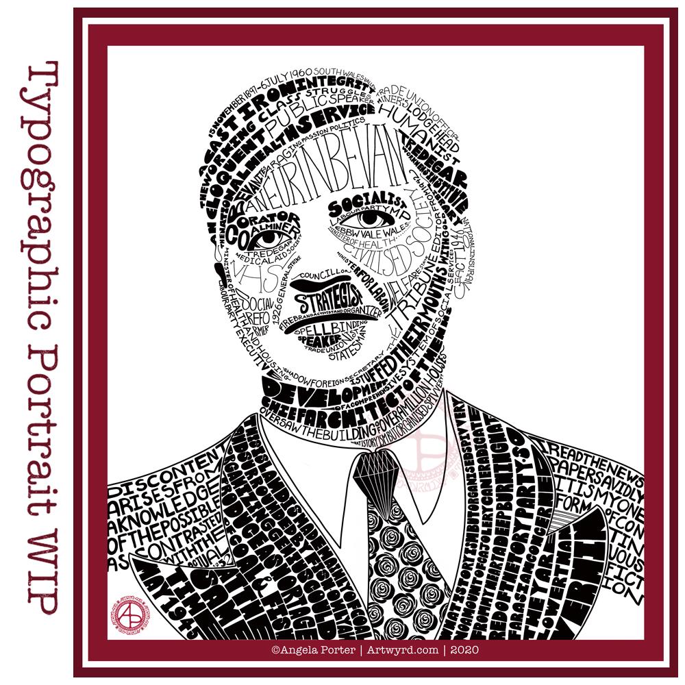
I did spend some time working on a second typographic portrait of Aneurin Bevan yesterday, using a photographic reference that had more detail in it in terms of grey scale.
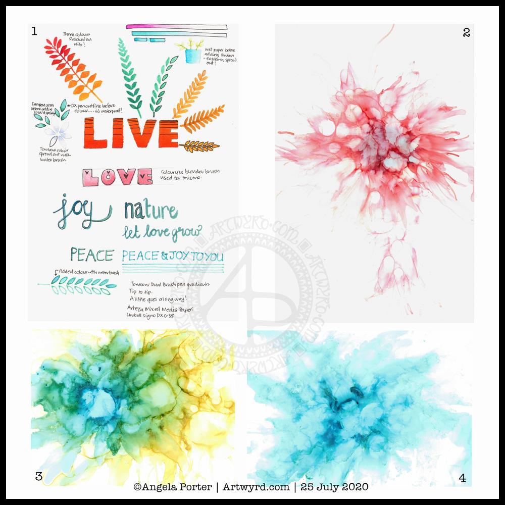
Before bed, I wanted to relax with some colour (1). For some reason, I pulled out my set of Tombow Dual Brush pens and tried working with them on an A5 piece of Arteza mixed media paper. Hand lettering with gradients, with and without black outlines resulted, and then I wanted to try drawing with colour gradients.
To create gradients, I held the tip of one pen on top of the tip of the other. I then used the lower pen to draw or write with. I used the bullet nib for the lower examples. I used the brush nib for the larger lettering and also the leaves and flowers and so on.
I made some notes as I went, to remind me what I did and what I liked about them. I used a Uniball Signo DX 0.38 pen to do this, which is also waterproof. So, I used it to add lines.
This morning, I wanted to start my arty day experimenting with alcohol inks, once again (2, 3 and 4). All because I’d watched a YouTube videos where people use a straw to blow the ink and alcohol blending solution/rubbing alcohol/isopropyl alcohol/propan-2-ol around the yupo paper.
One helpful piece of advice I heard along the way was it’s best to use only a small amount of alcohol ink. Which is what I did. One drop to start with and then add more ink of the same or different colour(s) as needed.
It took me a while to work out not to blow as hard as I could, and to try different angles to hold the straw at, as well as moving the ink in different directions.
I’m much happier with the results this time, though the scans have bleached the colours out a little. I really must work out the best settings on my scanner so that this doesn’t happen.
Anyway, I need to find a way to seal the alcohol ink so I can draw on top of it without wrecking the pens. I also want to do some better scans so I can make use of these alcohol ink backgrounds in digital art.
Today I want to continue work on the typographic portrait. This second one seems to be building up more quickly than the first one. I think that’s all due to me becoming familiar with the process and accepting that my hand lettering based on my handwriting is good enough. I’m also working out my own ways to fit letters to curves and the shapes at the ends of the sections.
So, all of these activities – using waterbased media, hand lettering, hand drawn typography, and alcohol ink backgrounds all have one thing in common – practice, practice, practice!
I’m not entirely sure that I’ve fully succeeded. I seem to have a lot of white space, and that is all to do with the photograph I used. I thought it had enough detail in terms of tones of light and dark. I guess not! Or maybe this is just part of my style.
There are areas on his jacket to the bottom left and right that need pattern or image put there. I have yet to work out what to do about the shirt. Also, I need to try removing the lines around the jacket and collar too.
Aneurin “Nye” Bevan was the main architect of the UK’s National Health Service after WWII. He’s also considered one of the best political orators of all time. There’s an Aneurin Bevan website if you’d like to know more.
While this is hand-drawn, I chose to work digitally. My Surface Studio allows me to work with a digital pen directly on the screen as if I was drawing on paper. This makes it easy to edit as I work.
I now need a break from this particular artwork, so I can look at it with fresh eyes (and any feedback people offer on it) and then return to it another day.
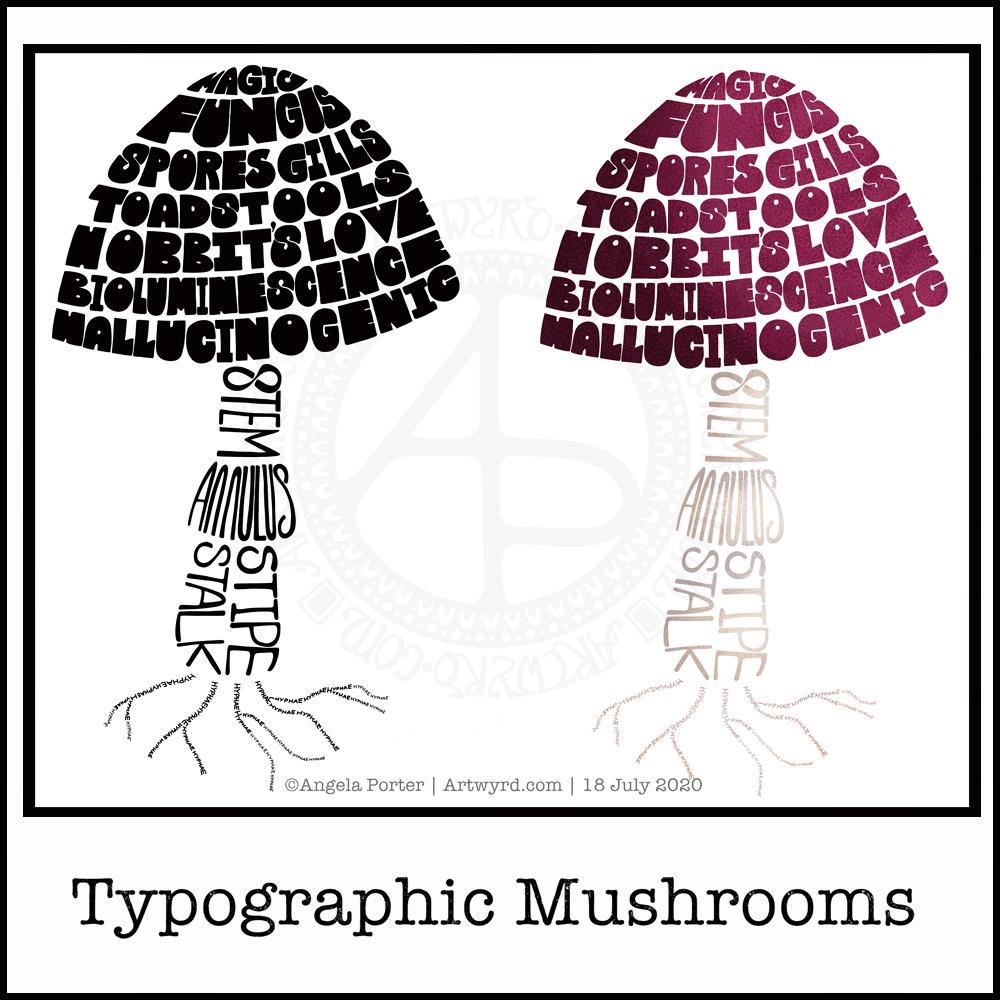
Just a little something I wanted to try out – using hand-drawn typography to create illustrations. I chose a mushroom, for no other reason than I like mushrooms.
It’s more about practising the hand-drawn typography or hand lettering than anything else.
What I realised, when I completed the black and white version, is that I could’ve varied the weight of the letters to produce highlights. That’s for another day, I think.
I also had to try adding colour, and in that way adding highlight and shadow.
I like both versions, but I think I like the coloured one a bit more.
I mentioned I’m following the Sarah King Domestika course – Hand-Drawn Typographic Portraits. I have started work on my first portrait, but it’s going to take me a while to do. In the meantime, little projects, like the mushroom, will give me plenty of practice as well as a chance to work out my process and way of working, as well as how I’d like to use it so it adds a note of harmony to my artistic song.
I started with a pencil sketch of the mushroom. Then, I added the words in rough with pencil. I scanned the sketch into Autodesk Sketchbook Pro. I then used my Microsoft Surface Slim Pen, to hand-draw the typography. Even though I’m using digital media. Autodesk Sketchbook Pro is a lot like working on paper, but it streamlines the process and allows me to skip a lot of the tedious steps. It also lets me take a black and white drawing and add colour quite easily.
I’ve done this while I’m waiting for a migraine-type headache to subside enough that I can return to bed and sleep the dregs of it away. I’m nearly at that point now as I’m beginning to feel tired and sleepy. So, I’ll get the rest of the social media postings done, and then crawl back into bed to sleep.
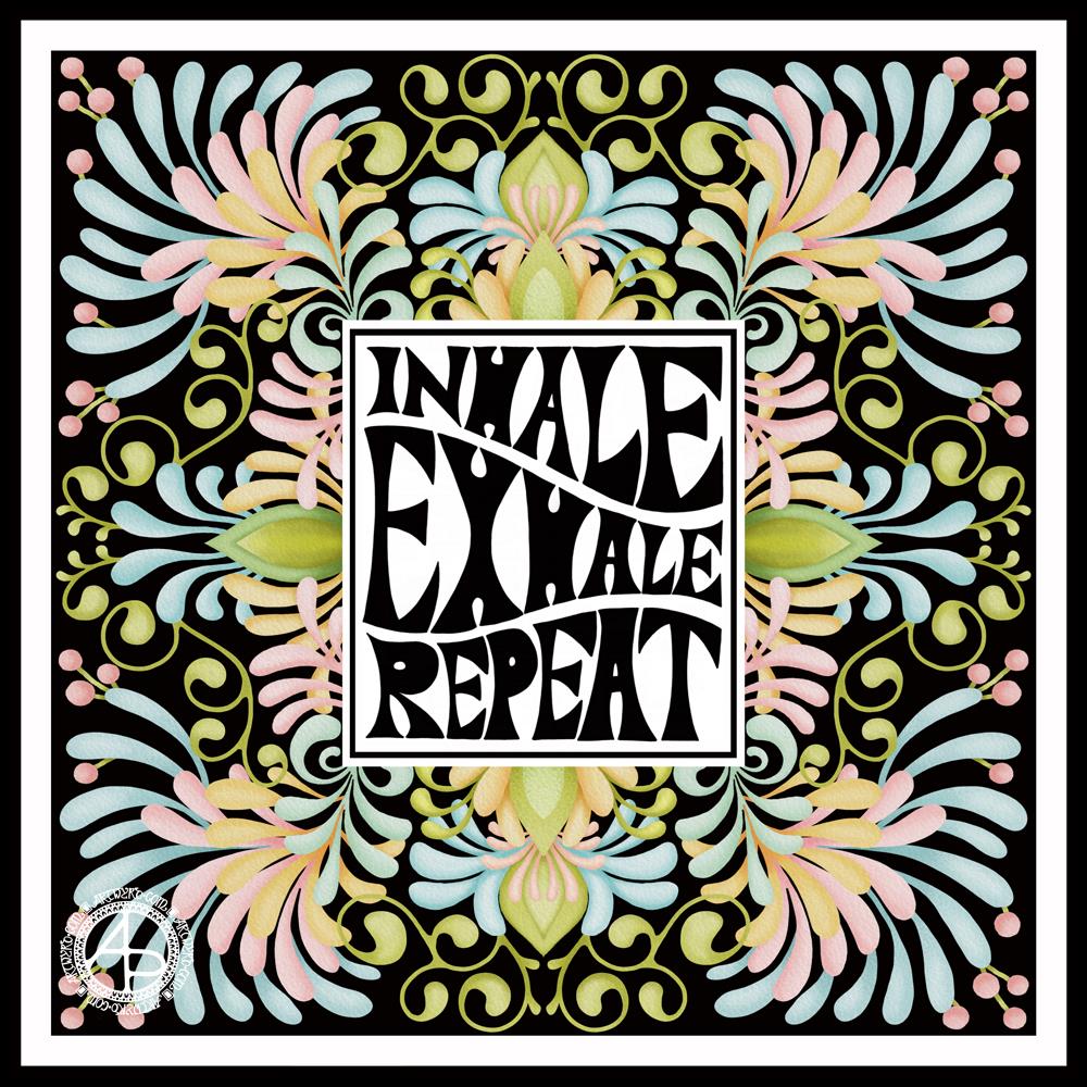
I started with the hand-drawn typography. I’ve just started another Domestika course — Hand-Drawn Typographic Portrait by Sarah King. The first exercise is to letter words boxes divided by wavy lines. Then, creating letters in different weights. And of course, practice is something that needs to be done.
There was just something about her approach to this that grabbed me, and so, I now have many boxes with words and quotes in.
The first lesson shows how to use Photoshop to edit your lettering outlines and fill them with black. I found the process rather clunky and long-winded. Perhaps that’s because I’m used to working in Autodesk Sketchbook Pro with a pen on a screen as if they were pen and paper, that I could do this in my own way.
So that’s what I did. I used one of my pencilled samples to create the typography for the centre panel.
Then, it was adding the background. I just went with the flow on that one. I made use of the symmetry tools in Sketchbook Pro, and just had fun with a limited colour palette and my favourite kinds of shapes.
The course is about portraits. However, I have zero interest in drawing people. However, the techniques shared will spark ideas for how I can use them.
I’ve long been trying to incorporate words, quotes into my artwork and struggling to find my own style. I’m not sure if this will help, but I’m really quite happy with this particular artwork.
This index card #ICAD2020 #DYICAD2020 was a bit of fun to create.
I used a mixture of Distress Oxide inks to colour the 6″ x 4″ index card. The colours I used were Old Paper, Bundlesd Sage, Dried Marigold and Chipped Sapphire. I built the background up in two layers, with chipped sapphire lightly dragged across the texture that the spray of water from the first background created. A final spray of water, a dab with some paper towel to leave some bleached areas and the background was done.
I decided I’d go with the typography theme today, so hand-lettered monograms for each letter. I used pieces of Canson XL Bristol paper coloured either with Distress Inks or Distress Oxide inks. After spraying the paper with water, I squished some cling film onto the surface to create abstract patterns in the colour.
Anyway, I used 06 and 03 Sakura Pigma Sensei pens to draw the monograms. Once I was happy with the designs, I edged the monograms with Ground Espresso Distress Ink. Then, I glued them to some brown-ish card, and cut them out with a border. I edged the brown paper mat with Ground Espresso Distress ink.
I then set to adding pattern and colour with Paul Rubens metallic watercolour set. Tiny dots and highlights were sparingly added to the monograms. Then, I used the same 01 brush to draw patterns around each monogram in colours that picked up the background colours of the monograms.
My final step was to edge the index card with Ground Espresso Distress Ink.
This was a perfect little project to practice my hand lettering as well as trying out the Paul Rubens paints. It was also good practice at using a fine brush to draw patterns. I do think a finer brush would’ve worked better.
The scan hasn’t picked up the sparkly, shimmery gorgeousness of the metallic paints.
This was a really nice way to come round after I’d slept off yesterday’s migraine-y stress-come-down headache. It was a small project that I didn’t feel overwhelmed by and there was no pressure on me for it to be perfect, as would be the case for my contracts for coloring books. So, it helped me calm and settle and find that sense of contentment, for a while at least.
I took an index card and used Dried Marigold and Bundled Sage Distress Oxide inks to colour it. I spattered on water to create some bleached spots. Then, I edged the card with Ground Espresso Distress Ink.
I knew I wanted to draw a marigold, which is what I did. In fact, I drew a few. The large one is a French Marigold (Tagetes sp.). The others are pot marigolds (Calendula sp.)
All the drawings are quick, loose, sketchy ones using an 04 Sakura Pigma Sensei pen. I did use a pencil to roughly sketch out the flowers.
As the theme for week one of the ICAD2020 challenge is typography, I added some hand lettering. I also looked for a couple of quotes about marigolds, which I hand lettered.
Finally, I added a wash of iridescent orange and yellow watercolours to the flowers, sage-y green to the leaves. I also added some graphic lines in iridescent orange to the letters. And I couldn’t resist spattering some of the iridescent paint on the card itself.
I think I may add the ICAD2020 creations into my journal, or maybe make one from them as time goes along. No need to make a decision today, I’m not really thinking straight at the moment.
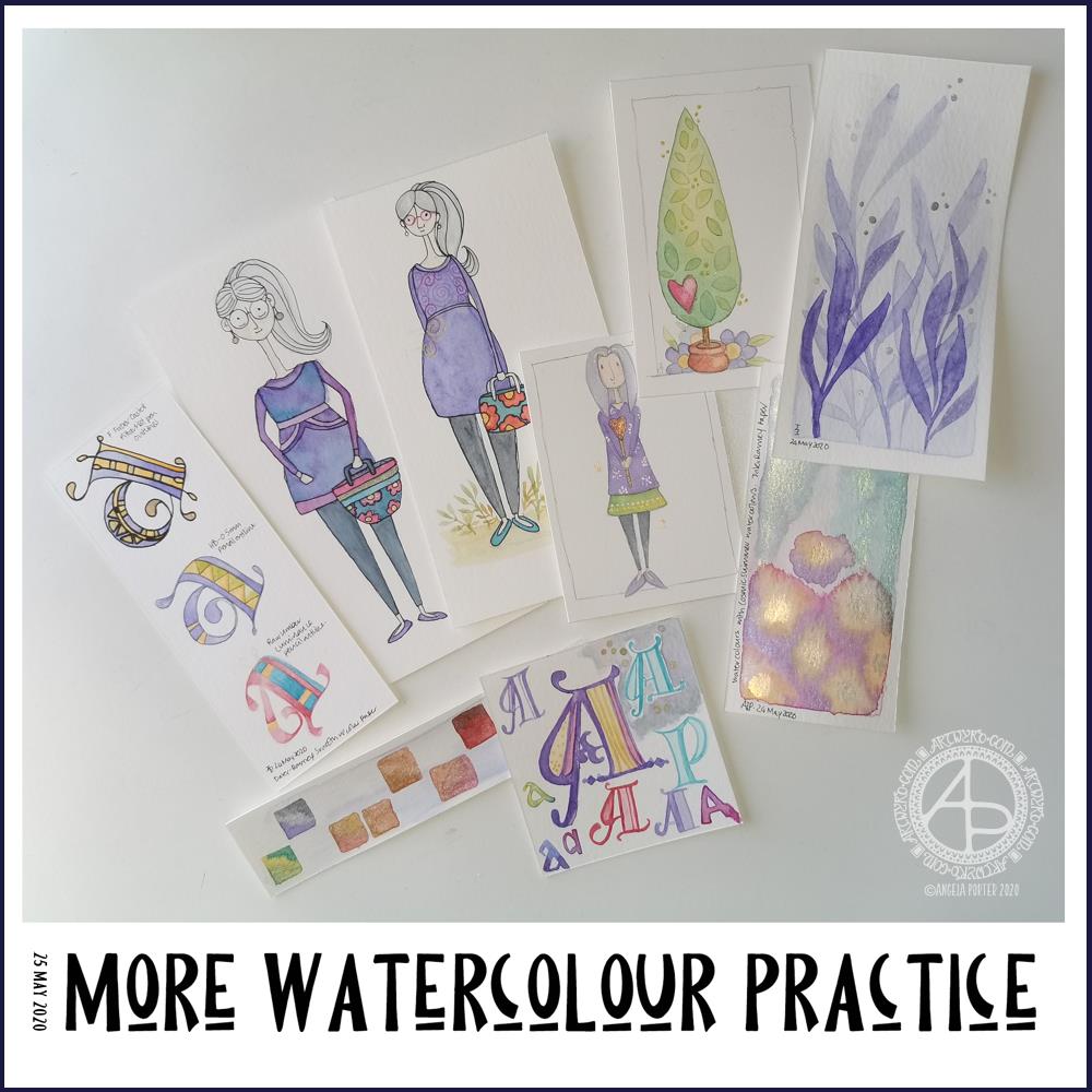
Experimenting with watercolours
I woke with another raging headache this morning. So, some art was in order until the pills kick in and I can sleep the dregs of it off.
I thought I’d try some ways of adding texture and interest to watercolour backgrounds.
Putting some clingfilm (saran wrap I think it’s called in the US) onto wet watercolour creates a lovely texture. It’s not easy to see but I used it on the pieces at the top middle and top right. This is something I will definitely be experimenting with going forward.
I also tried salt again, on fairly damp, less damp and almost dry. The darker pink tile under the Marigold ICAD was where I added salt to rather damp watercolour and the blooms are just beautiful.
I also tried using white gouache. I spattered it onto a couple of tiles, but I also used it mixed with water to paint into wet watercolour. It adds a really interesting effect, the opacity of gouache looking intriguing against the transparent watercolour.
Finally, I used a straw to blow drops of watercolour around. That was a lot of fun and really created random, abstract patterns.
I added these to my journal with notes on how I achieved the effects so I can reference them in future. Today, I may not remember much about what I’ve done, all thanks to the dratted headache. All due to stress/anxiety/worry yet again.
Two fairly quick, small projects this morning – small botanical cards. Simple, cute, whimsical, darling. Little treasures.
These were fun to make, relatively quick too. They’d be darling little cards to receive in the post or in person. They’d also work nicely as an addition to a journal – a place to journal or keep little memory making bits and bobs in the envelope too.
Each card is 3″ x 4″ in size and the panels are approx 3.5″ x 2″ in size. I made the envelopes to fit and decorated them with one of the motifs from the designs on each card. I did a tiny bit of hand lettering on one of them too.
Over the past couple of days I’ve been playing around with watercolours. Apart from fun, it’s trying to work out how I can get them to work for me, and here you can see some of my experiments.
As well as continuing with the Domestika course, I found a book on my Kindle called “The Art of Creating Watercolor : Inspiration & Techniques for Imaginative Drawing and Painting” by Danielle Donaldson.
I’d forgotten I’d bought this, but on rediscovering it and looking at it I found it inspired me, particularly when it comes to drawing people.
What was reassuring, is that Danielle Donaldson is someone else who likes to work on a small scale! She also uses a very fin (0.3mm) pencil to draw with, but also to add line and pattern to her drawings instead of pen. I wanted to try that out.
I also really like the whimsical nature of her art, and her people inspired me to have a go. The three people in the collection of images above are inspired by her work, one more than the others. The one that is most directly like Danielle’s work is the person to the right of the trio. I used a pencil to draw the design as well as outline it after it was painted.
With the other two, I used a very fine Pitt Artist pen to outline them once the paint was dry.
Looking at them all together, I quite like the softer quality of the pencil line.
Oh, these trio are also my way of developing a version of myself. Unfortunately I look pregnant in the middle one (I’m not!), though I rather like my hair in this one – I wish my own hair was as thick and long! I really need to work on feet and foot positions.
Watercolours have vexed me, and continue to do so though I will persevere with them. Drawing people has vexed me for longer!
I’m not entirely sure that watercolour will be the best medium for me to use…I’ll try others, including digital, to see what I can get to work for me and is in my style.
I also spent sometime experimenting with monograms and botanical themes. I really like the blue foliage, and the cute tree too.
Yesterday my art and other stuff was put on hold for much of the day; I woke with a migraine and couldn’t do much until painkillers had kicked in and I could sleep away the remnants of it. Once I woke, that’s when I found the book and did some art inspired by it.
I slept quite well last night, and woke just fine and dandy today.
All these bits of art will find my way into the journal I’m making, including notes and reflections on them.
I woke this morning with the desire to make a little box to store ephemera in. So I did.
I used a video from PootlesPaperCraft to help me make the box, which is 4″ square with a depth of 2″, so sizeable enough for some of my smaller ephemera such as inchies and little shrink plastic charms (you can just see them peeking out from under the envelopes to the left of the photo).
I used plain, white card for the box base, which I coloured with Tea Dye, Rusty Hinge and Vintage Photo Distress Inks. For the top, I used a piece of Tim Holtz card from my stash that I’ve had for a number of years. This I grunged up with Vintage Photo and Rusty Hinge Distress Inks.
Once I made the box up, I used Aged Mahogany to distress the edges of the box.
I coloured a square piece of white card with Aged Mahogany and Rusty Hinge Distress Inks and then used a light brown pen to draw a zentangle design on it. This panel was layered on a piece of the same Tim Holtz card I used to make the lid, and then I adhered it to the box.
The box really needed a label to identify it’s contents. Now, I could’ve printed the label out, but I thought this would be an opportunity to practice my hand lettering, which I did.
Then, I aged the label with Aged Mahogany Distress Ink, applied lightly over the face and a bit darker around the edges. Next, I layered the label on another piece of the Tim Holtz paper. Before adhering the label to the box lid, I edged the panel with some Rich Gold Starlights paint from Imagination Crafts.
It’s been a long time since I made any boxes, but they really are easy enough to do. I need to make a longer, thinner box to store tags and other bits and bobs in, once I work out the size I need to make.
I’ve become a bit obsessed with making art journal bits and bobs over the last couple of days. This morning has been no exception, other than the more I do and watch, the more ideas that come to me.
Inchies
Yesterday, I created some blank, printable, templates for inchies, twinches and tea cards. I printed them out on plain paper so I could draw in them. I also made a list of themes I could tackle for them too.
I spent an hour or two filling in a sheet of inches with various designs. Then, I printed them on plain paper and also vellum for calligraphy. The vellum has a rough texture, interesting colours and subtle patterns in them. I have a laser printer, so wasn’t sure if it would print on the vellum; it did, however the print does come off if I’m a bit rough with it.
Nevertheless, I coloured some of the inches with Distress Inks and then adhered them to some 1″ tiles of thick chipboard card. I edged them with tresure gold wax from Imagination Crafts. Then, I gently applied a thin layer of Ranger’s gloss multi-media medium, to see if it would seal the laser printing; it did! It also brought out the colours of the Distress Inks.
Seed packets/envelopes
These are simple enough to make. There are plenty of tutorials online for them. I made them from ordinary printer paper, then coloured them with Distress Inks.
Next, I added some dot embellishments using a small ball tool with Imagination Crafts’ Starlights metallic paint in rich gold. This is a beautiful, glittery, shiny paint that leaves some dimension when applied this way.
Finally, I adhered the inchies I’d made, along with some vintage book paper, to the envelopes.
I’m not sure if these envelopes are finished. I do want to use them to store either journaling notes in, or little pieces of art or mementos in them.
Tags
I haven’t been at all sure about tags and using them. However, I thought I’d see what I could do with them after yesterday’s mucking about with a tri-fold tag that turned into one single tag.
I wanted to make some templates for cutting the corners at the top of the tags, so I did that, using various widths of paper and slopes to remove the top corners.
I then realised I needed something to store them in, so I made an envelope for them.
The envelope has a more rectangular top flap and a plain front, perfect for embellishments.
Backgrounds
Something occurred to me this morning while watching someone make tags using background paper. I thought that I could use my colouring sheets and entangled designs as my own background paper. So, I thought I’d try to use some.
I found some old designs on my computer and printed a couple of them both as the black line originals and with a grey line.
I made a tag and cut out a piece of one of the designs. I coloured the design with Distress Inks and used them to subtly colour the tag.
I didn’t like the way the neatly cut out background pattern looked when I placed it on the tag. So, I tore the edges. I still wasn’t happy, so I tried tearing it into strips. That looked better, but I still wasn’t happy with it, but I stuck the pieces down.
I used a gold glitter gel pen to add lines and patterns between the torn pieces, which created some pattern and interest.
Finally, I added a distress ink coloured belly band along with a word, “creativity” to the tag. For now, I tucked one of the seed packets behind the belly band.
The background drawing may be just too busy, detailed, and varied to work well. I need to bear this in mind going forward.
Notebook
I am keeping notes of how I make tags, pockets, and other bits and bobs in an A5 dot grid notebook, along with ideas for other things to do or try. It’s turning out to be rather useful as a reference.
Acceptance
I’m struggling with accepting that what I’m creating for my art journal is “good enough”, “attractive enough”, “pretty”. It’s not like others I’ve seen, which is part of my problem.
I seem to like, mostly, neat edges, borders on work, very organised, neat, and carefully, geometrically arranged elements in my designs. I know I want to use my own artwork to create a journal, but I’m not sure it’s going to be successful in any kind of way. I have no idea if I’m on a wild goose chase.
I know I enjoy making these bits and bobs, I just don’t know if the overall end products actually work, so I’m doubting myself. I’m not sure I like what I’m creating. I mean, I really like individual elements such as the inchies and little panels on the envelopes. It’s when I start to actually combine them or put them into a journal that it all seems to go more than a bit skew-iffy.
I’m at that uncomfortable place I often find myself in when I’m creating a mandala or drawing or digital painting; partway through I want to give up as I think that what I’m creating is awful and not working. With the mandalas, drawings and digital art, I’ve learned to work through that point and, mostly, to complete the work. I’ve learned by experience and perseverance that I can produce art I’m happy with.
I’m not at all sure of that with this art journal type stuff. I’m not sure at all if I can find my own creative ‘voice’ with this, or whether I have to accept that as much as I’d like it to be one of my ‘things’ it’s not meant to be and that I can continue to watch and admire others for what they create.
Maybe, I’ll end up making digital elements for journals for others to use in their creations. Maybe, I’ll find that collections of inchies are my thing (along with twinchies and tea cards and other little designs).
For now, I’ll take a bit of a break from it all, and come back to it with fresh eyes and a fresh mind.