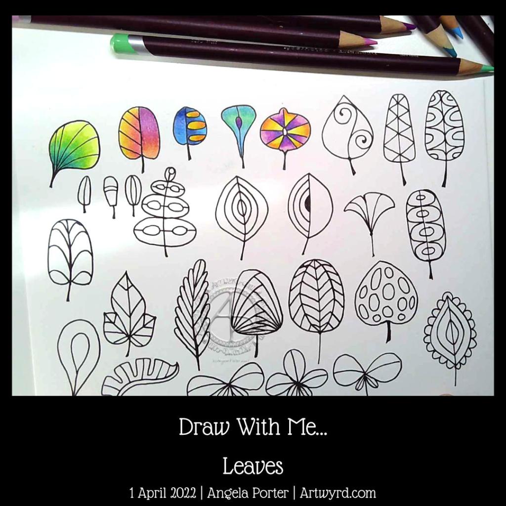
Draw With Me … Leaves

Click on this link to see today’s YouTube “Leaves” drawing tutorial.

This morning was one where all I wanted to do was draw leaves and experiment with colour. So I did. And I videoed it and I invited you to watch and draw and colour along with me.

Whimsy was definitely needed too. So, whimsical leaves were drawn with a brush pen. Bold lines. Simple shapes and patterns. Plenty of space to add colour to each leaf.

Adding colour is a frustrating thing for me. More so with traditional media where you’re stuck with your colour choices. Digital colouring lets me play with colour a lot more, without the fear of making poor colour combination choices; it’s easy to change.

However, I’m aware that there are times when I want to add colour to sketchbook work. Times when only traditional media will do. And it’s time for me to experiment with them more often.

Today, I chose to use Derwent Colorsoft pencils along with a Caran d’Ache All Blender. Telling myself, and those who watch my videos, that as I’m working in a sketchbook, in my own imaginary world, I can use any colours I like. Also, there are no mistakes, just experiments that had unexpected outcomes that are sometimes not pleasant. But a sketchbook is the place to experiment, to try things out, to work out how to get a medium to work for you.

A sketchbook gives me permission to play around, try things out, have things not work out how I expected them to, to discover new things. After 20 years of really exploring my artistic side, only now has this realisation dawned on me. Yes, I can be a bit dim at times! But I eventually get there. Perhaps I wasn’t ready to understand and accept this before now. It seems that I am now.

The breakthrough has been taking the lettering course on Domestika. Encouragement to try different things out, not to worry if something doesn’t work, it may be useful in the future. Just keep going until something is good enough. Recognising that sometimes the unexpected outcome is just what is needed.

As well as becoming a bit more confident with lettering, these insights into the true power of a sketchbook have been a powerful lesson to learn.

Exploring ways of adding shadow | 29 December 2021

Link to today’s video on YouTube.

I needed to add shadows to the drawing completed and given a colour wash yesterday. As I so often regret my choices of how I do this, I decided to make a test page of various methods for my sketchbook.

They all have their own charm and feel. However, putting them side by side so I can compare and contrast gave me a better idea of what I really like.

To add shadow/highlight to a drawing, I really like the hatching/contour lines created by a micron pen or a biro. The biro I particularly like as it is much softer and I’m able to get a tone variation with the lines.

I also worked out that for using gradations of colour, they just feel a bit … plain. So, like in the drawing of medieval flowers and leaves, the combination of lines and colour works for me.

I found when I was adding shadow below the drawings that using Distress Inks like watercolours just wasn’t going to work. The use of water results in weird boundary lines that I’m not fond of. Of course, if I’d not coloured the background in Distress Ink, a gradated wash of colour may have created a lovely shadow.

So, I think I’d prefer to use chalk pastels for adding shadow. The ability to blend them out gradually, with no harsh line, is a great advantage. It’s also easy to add more of the pastel if a darker colour is needed.

So, that’s what I chose to do. Not just with the drop shadows, but with darker areas on the leaves etc. I even found that the pastel can tint the gold I’d added in places, which is a really interesting twist.

Bit by bit, I’m working out colour, shadow, highlight and what works for me.

It’s also no bad thing to spend time trying out techniques with various media. Mixing and matching. Making a reference page for my sketchbook / zibaldone has proven to be a very valuable exercise.

When I’m quite happy with the drawing. I will do my best to take a good photograph of it. It’s worked out much better than I thought it could.

Weird Fish – Part 2

I’ve spent some time drawing a third weird fish and intensifying colour on the two original ones.

For the top fish, I used Derwent Colorsoft pencils to increase the colour. The watercolour underneath does add to the colour in a subtle way.

I used Derwent Inktense pencils and a damp brush to add colour to the central fish.

Finally, I’ve been adding colour to the bottom fish with Inktense pencils too.

As pretty as the watercolours were, they were a tad too subtle for my liking with not enough contrast. So, I used them as the underpainting and then added layers of more intense colour over them. It seemed to work out just fine and well.

I’ve kept the color palettes pretty similar for each of the fish.

Also, I’ve re-drawn them digitally as vectors and I’ve just started colouring one of them.

No matter how I add colour – digitally or using traditional media – it takes me a long time. I fuss around until I get things looking as I like.

This is very much a fun project, and I have no idea where it will lead, if anywhere. The important thing, however, is that I’m enjoying working with traditional media and I’m doing something a bit different too that I can learn from.

Here’s the video of today’s art. I’d appreciate it if you open it in youtube as then your views get counted.