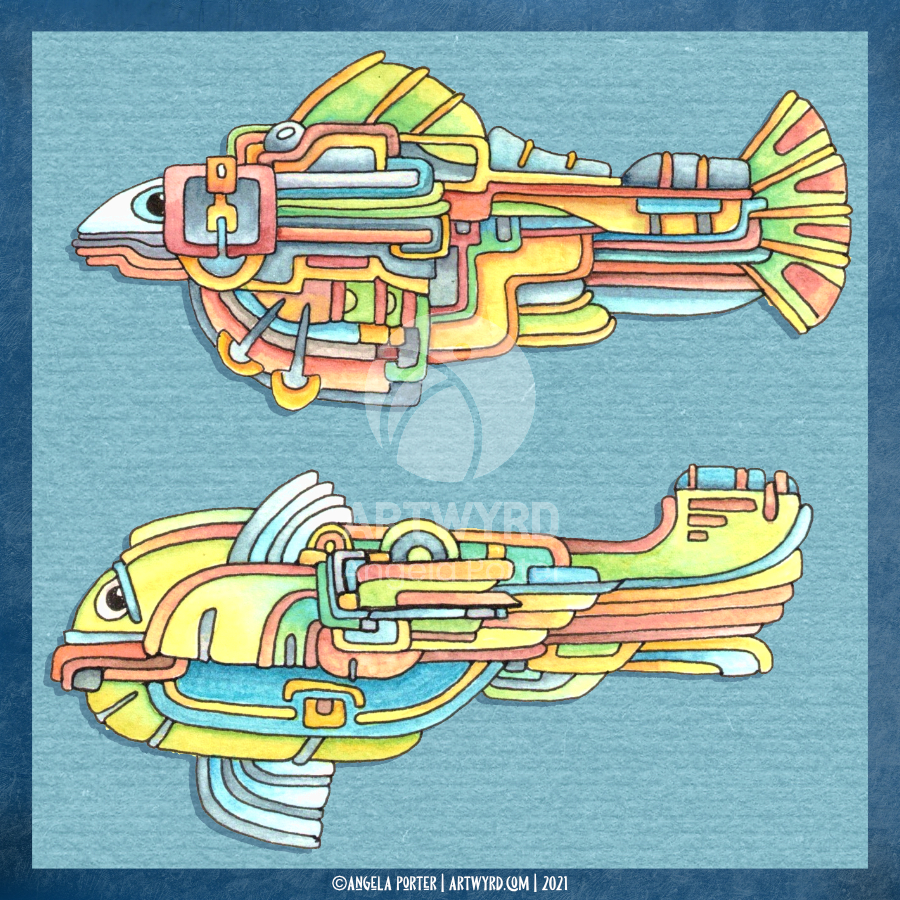
I’ve spent some time drawing a third weird fish and intensifying colour on the two original ones.
For the top fish, I used Derwent Colorsoft pencils to increase the colour. The watercolour underneath does add to the colour in a subtle way.
I used Derwent Inktense pencils and a damp brush to add colour to the central fish.
Finally, I’ve been adding colour to the bottom fish with Inktense pencils too.
As pretty as the watercolours were, they were a tad too subtle for my liking with not enough contrast. So, I used them as the underpainting and then added layers of more intense colour over them. It seemed to work out just fine and well.
I’ve kept the color palettes pretty similar for each of the fish.
Also, I’ve re-drawn them digitally as vectors and I’ve just started colouring one of them.
No matter how I add colour – digitally or using traditional media – it takes me a long time. I fuss around until I get things looking as I like.
This is very much a fun project, and I have no idea where it will lead, if anywhere. The important thing, however, is that I’m enjoying working with traditional media and I’m doing something a bit different too that I can learn from.
Here’s the video of today’s art. I’d appreciate it if you open it in youtube as then your views get counted.


