Monday Mandala

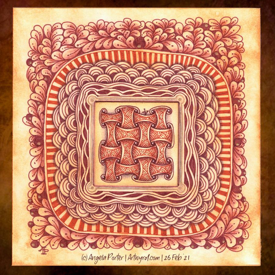
Yet again, a lovely way to start a Monday. Mandalas are always a pleasure to draw/paint/create. I particularly love creating them digitally for many reasons, not least is the opportunity to experiment and learn new skills. It removes the worry of making a ‘mistake’ on paper and either having to start again or try to make that ‘mistake’ a part of the work. Often, that ‘mistake’ will be worked into the drawing, but not always and if I know it’s there, it bothers me, even if no one else can see it. The perfectionist in me gets a tad upset at it.

Having said that, there are a couple of things I’m not happy with in this mandala, but I can live with them.

One thing I do like is the colour palette of copper/bronze colours and that steely blue-grey. Vintage colours seem to be my thing at the moment for sure.

Entangled Art

Just trying out new 05 fineliner pens in vintage tones.

The central motif/pattern was worked on a small square of cotton watercolour paper (2″ x 2″ or 5 cm x 5 cm) coloured with Tea Dye Distress Ink. The larger panel beneath is a piece of Bristol Board (6″ x 6″ or 15.5cm x 15.5cm) coloured with Rusty Hinge Distress Ink.

I used various shades of Carbothello chalk pastel pencils and a paper tortillion to add colour and shadow. Gold higlights and a border around the central motif were added with a metallic gold Gelly Roll pen.

I’ve just noticed I really didn’t do a good idea at adding my initials so they were oriented harmoniously! Still, this really was just a trying out something kind of thing. I’d seen a Zentangle video about the use of cartouches – frames around writing or an illustration. And thought I’d try it out, in my usual clumsy kind of way.

I do like the idea of creating frames around other small pieces of art or precious items. That may be something I do going forward.

Template Thursday

Thursday seems to come around both quickly and as if it’s been an age since last Thursday. As it’s Thursday, that means it’s time for a new colouring template /coloring page for the members of Angela Porter’s Coloring Book Fans facebook group.

This week’s template is a typically ‘Angela’ entangled style drawing. A stylised dragonfly floats above an entangled background containing arches and seed pods, flowers and foliage, along with various patterns and an intricate border.

I’ve chosen to part colour the template in a monochrome scheme of greens. I don’t really pay attention to light source much. mostly I use light and shadow as part of the patterns and a way to introduce a sense of depth and dimension to my art. This is something I realised only recently.

Sunday Work In Progress

This is one of a couple of drawings I have on the go at the moment. The scan has washed out and altered the colours a tad. The gradations of colour are a lot smoother too. But I think you get the idea.

This was was drawn with Copic Multiliners on heavy smooth cartridge paper by Daler Rowney. I’m using Staedtler and Chameleon fineliners to add texture/pattern to the drawing. The larger areas of colour were achieved with Carbothello pastel pencils and a paper tortillon.

I was going to stick to a monochrome colour scheme, but some of those tendrils, fronds and leaves just needed a touch of a muted green. And then that led me to including that central ‘orb’ of turquoise (which isn’t as pale or lacking gradient as it appears).

I’m getting to the point where I need to decide how much white space to leave in the design, and where I’m going to add colour and/or texture and pattern. I also need to think about whether some of those coloured spaces need either more shadow or lightening up a bit. That means it’s time for me to take a break from this particular artwork and go and do another or something else completely different!

Before that, there are elements in this design that I really like – the strange columns/antenna at the top and bottom left, the organic trellis of fronds in the largest part of the design. That horizontal bar towards the top. however, just jars with the rest of th design.

Entanglement – 19 Feb ’21

Yesterday’s coloring template for the Angela Porter’s Coloring Book Fans facebook group all coloured and shaded. I used Chameleon alcohol markers to add the colour and some shading. I also used a graphite pencil and a tortillon to darken the shading and add shadow to the lighter areas. It’s turned out OK.

Entanglement 17 Feb ’21

I’ve been working on this drawing for the past three or four days. I finally finished it this morning. Here’s a list of materials used:
A4 Daler-Rowney Bristol Board
Copic Multiliners (05, 025, 02)
Sakura Pigma Micron (01)
Various shades of brown Stabilo fineliners
Grey and sepia Uniball Unipin fineliners

I’m finally becoming comfortable with leaving open spaces in my art, though I still do like a clear border/edge. The spaces give a lighter, more airy feel to the design. I’m learning that I don’t have to fill every available space with pattern. I think that is a good thing.

I’m also really enjoying using shades of brown to add patterns to the design, and some grey too.

If you’d like to know where I started this drawing, it was with the small arrangement of boxes just above the blueberry-ish berries just above the left of centre. Everything else grew out from there.

I think this one is finished, though as I look at it now, I want to use a white Gelly Roll pen to add dots in places. Also, the shadows need to be tad intensified around the motifs to give the illusion of depth. I may use alcohol markers – Chameleons or Copics – to do this as the Copic Multiliners are alcohol ink safe.

Little art

More small pieces of artwork today. These are perfect for when I’m feeling overwhelmed by a large sheet of paper. Also, they are sources of ideas for patterns and motifs for future work. I do need to spend some time with all this art and add some of the newer motifs and patterns to my visual dictionary/zibladone. Or, just stick them all into a sketchbook. At least then I’d know where they are!

It’s snowing outside. It’s cold outside, and warming up inside as I put the heating on a couple of hours ago. I think I may curl up in bed today with Din Djarin and Grogu. I still have three episodes of Season 2 to watch, and that sounds like a good plan to me!

Entangled Monograms

I’ve enjoyed doing these! The squares are 3.25″ x 3.25, 3.5″ x 3.5″ or 4″ x 4″ in size. The circles are almost 3.5″ in diameter.

The tiles were cut from a variety of papers – watercolour, bristol vellum and heavyweight smooth cartridge paper. I used Distress Inks to colour the paper tiles before drawing on them.

I’ve used Sakura Pigma Micron pens (05 and 01), along with some brown and one blue-green Stabilio fineliner pens.

I like them all, But my favourites are the ones that are much more geometric in nature – my initials and the A in particular. My least favourite is the E; the background to the letter just feels disjointed. I think that’s why I like the more symmetrical, geometrical designs more.

I’ve enjoyed using one or two tones of colour to add variety, interest and ‘dimension’ to the tiles. I’ve not added any shadow or highlight to these. That’s when things tend to go wrong for me as far as traditional media is concerned!

It also occurred to me that if I were to draw these on a different shaped paper, I could add dangle designs to them. (My book “A Dangle A Day” is still available). Maybe I’ll try that out in a while. Of course, I’d like to get a full set of monograms done too.

Inking all done!

Waking at stupid o’clock meant drawing until I could go back to sleep. I got all the inking done for this particular drawing. Now, the colouring needs to be completed.

Materials:
21cm x 21 cm (8.25″ x 8.25″) piece of Claire Fontaine Paint-on mixed media paper – natural colour
Aged Mahogany Distress Ink and a piece of cut and dry foam to distress/grungify the paper
03 and brush Uniball Unipin fineliner pens
01 Sakura Pigma Micron pen
Staedtler Triplus fineliners
Chameleon fineliners
Water brush
White Sakura Gelly Roll pen

Art is …

…but dirtying the paper delicately” – Ruskin

Note to self : Use a paper size that fits the scanner bed, or leave slightly larger margins.

I found this delightful quote by Ruskin yesterday and knew I wanted to use it in a drawing. So I did. Some of my favourite motifs, and some I don’t often use.

For this one, I used Strathmore smooth Bristol paper and as I cut it down into a square shape, I forgot that the width was too big to fit my scanner.

Anyway, I used bundled sage Distress ink to colour the paper before setting to it with Uniball Unipin pens. I’ve not added any shadow/highlights yet.

I’m fairly pleased with the vast majority of this drawing. There are bits at the bottom right I’m not happy with. However, shadows and highlights may help to sort that out.