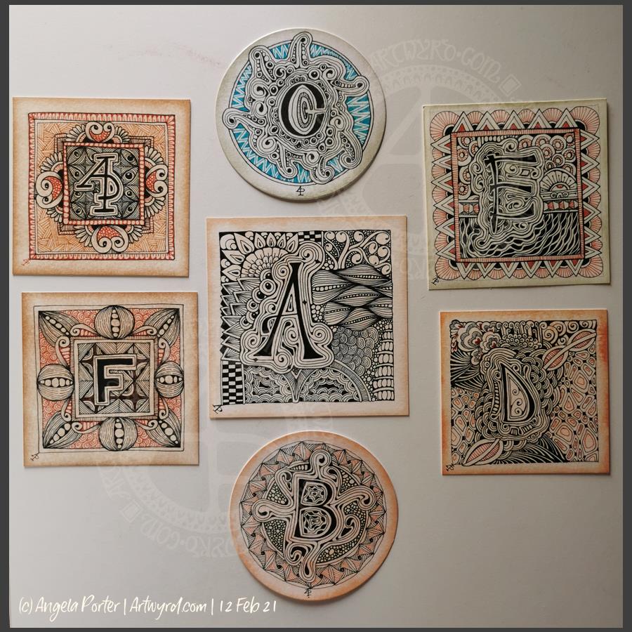
I’ve enjoyed doing these! The squares are 3.25″ x 3.25, 3.5″ x 3.5″ or 4″ x 4″ in size. The circles are almost 3.5″ in diameter.
The tiles were cut from a variety of papers – watercolour, bristol vellum and heavyweight smooth cartridge paper. I used Distress Inks to colour the paper tiles before drawing on them.
I’ve used Sakura Pigma Micron pens (05 and 01), along with some brown and one blue-green Stabilio fineliner pens.
I like them all, But my favourites are the ones that are much more geometric in nature – my initials and the A in particular. My least favourite is the E; the background to the letter just feels disjointed. I think that’s why I like the more symmetrical, geometrical designs more.
I’ve enjoyed using one or two tones of colour to add variety, interest and ‘dimension’ to the tiles. I’ve not added any shadow or highlight to these. That’s when things tend to go wrong for me as far as traditional media is concerned!
It also occurred to me that if I were to draw these on a different shaped paper, I could add dangle designs to them. (My book “A Dangle A Day” is still available). Maybe I’ll try that out in a while. Of course, I’d like to get a full set of monograms done too.
