One dangle design, four colourways

One dangle design, four colourways © Angela Porter 2019

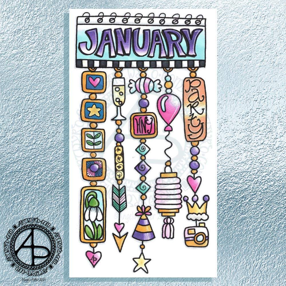
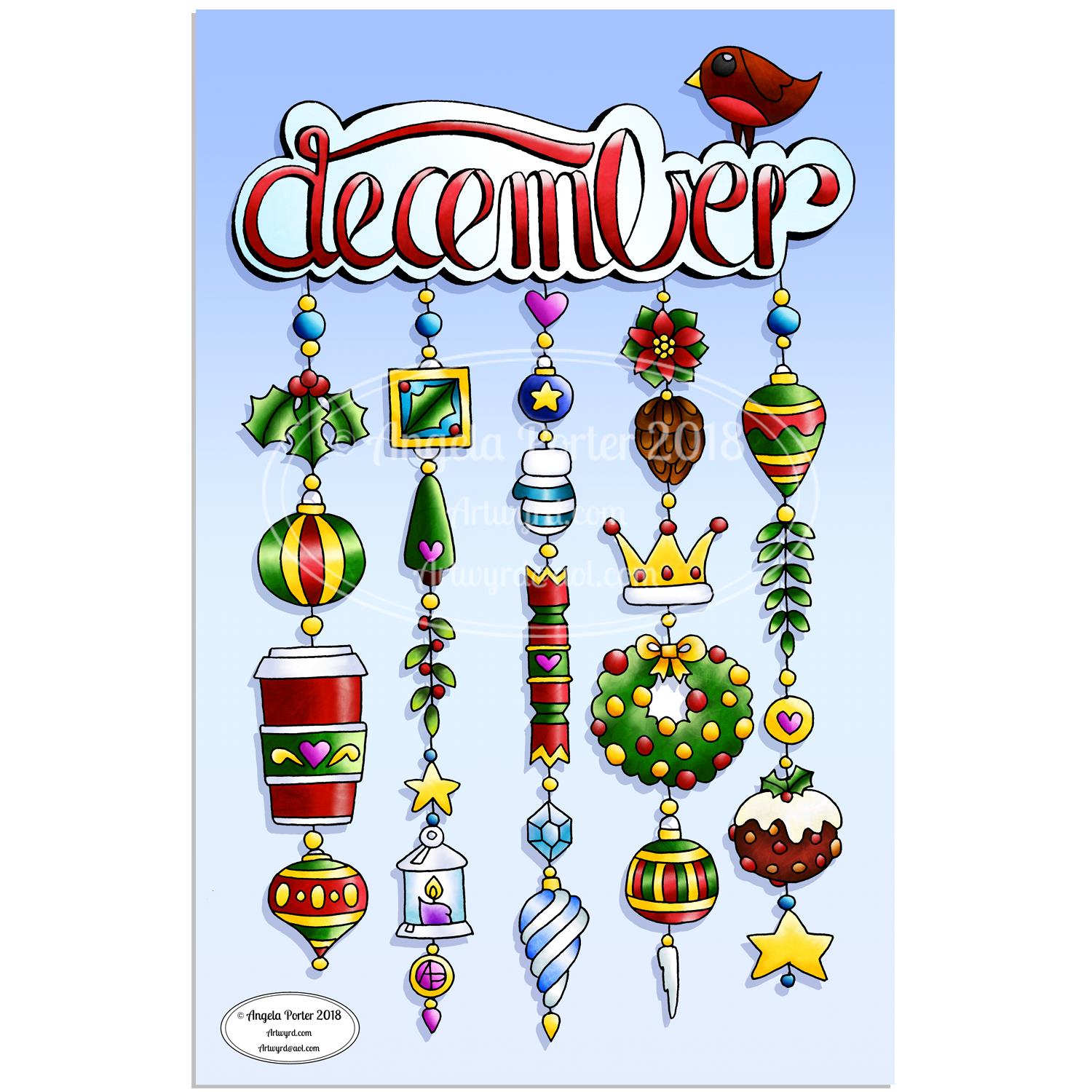
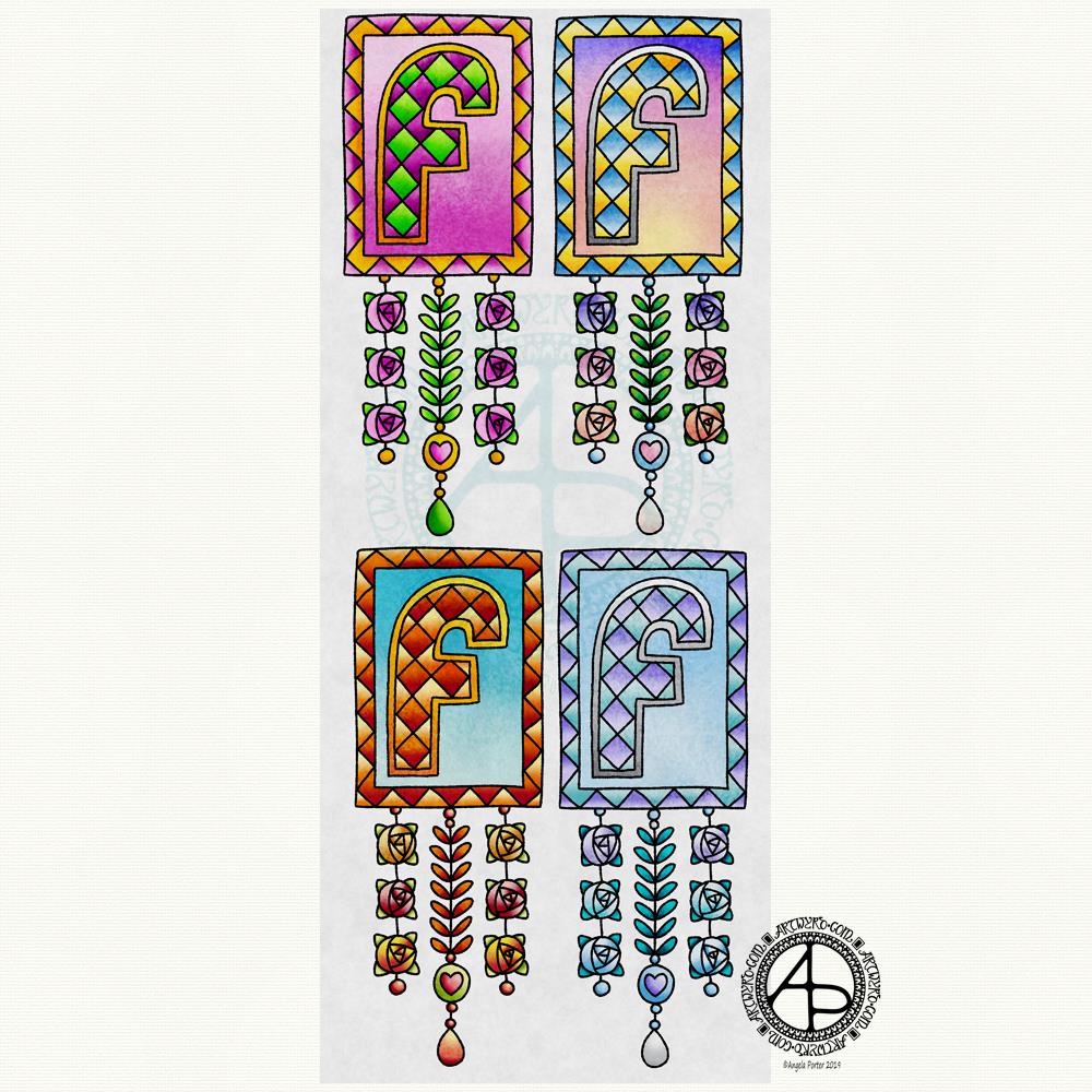
In my book, ‘A Dangle A Day’, I mention that just by changing the colour scheme you can easily change the appearance of a dangle design for an occasion or to match someone’s favourite colours. So, I thought it would be nice to show an example of this.

I chose a simple monogram dangle design from the book; you can see it in the top left corner. This dangle design has a very spring-like feel to it with the lovely bright pinks and greens of the new, fresh flowers and leaves that blossom and bloom at this time of year.

Taking my cue from this, I coloured in three versions of this design in the seasonal colours.

At the top right is a summery version, with a lovely warm sunrise as the background to the letter, blue summer skies, warm golden sun, and the bright and warm colours of the flowers. A golden summer glow could be achieved by using a hint of gold Wink of Stella brush pen from Kuretake, or by adding dots of gold glittery wonderfulness.

Autumn tones were used in the bottom left version. Fiery oranges, reds and yellows and clear autumnal sky blues were used. Enamel dots, glitter pens or stickles would add sparks of autumnal glory to this design.

The final design has a definitely cool wintry colour scheme – icy blues, cool purple and the blue-green tones of evergreens, along with silver. To this I could add white snowflakes or stars with a gel pen, or dots of silver glitter with Stickles from Ranger or Nuvo Drops or a glitter gel pen. Using a Wink of Stella brush pen from Kuretake to colour over the design would result in a lovely, sparkly, frosty finish.

Of course, there are many, many ways that the designs could be embellished to suit your taste, supplies or the recipient. So much fun can be had adding embellishments which also personalise the design even more.

I hand drew the original design on paper and then digitally for the book. My tools were Microsoft Surface Pen, Microsoft Surface Studio and Autodesk Sketchbook Pro, which I also used for the colour variations above. I set the ‘brush’ pens up for the book so they mimicked the shapes/patterns pens on paper create and left lines a little wobbly and imperfect, just as I would when drawing on paper. Indeed, I very much treat my Surface Pen and Surface Studio screen as if they’re pen and paper in the way that I draw (and colour).

I do hope you’ll give dangle designs a go, and that you’ll show me the results of your work. You can find me online here:

An ‘A’ Dangle Mandala…

©Angela Porter 2019

I’m definitely on a mandala kick at the moment! This one, though, includes some dangle designs!

A Dangle A Day’ is released on 15th January 2019, and I just wanted to get yet another dangle design out in the interwebs to inspire you.

While checking out the release date (which I’ve been getting a tad wrong, oops!) I noticed there were some reviews of the book. I’d like to say thank you to all the reviewers who wrote such lovely words about the book! It’s filled me with a bit more confidence and belief in myself as this is my very first art tutorial book.

There’s some hand lettering with the letter A. The letter A has dangles forming the inner part of the mandala. Then, the outer ring has simple and cutely whimsical doodle designs and yet another dangle forming it.

Of course, hearts and stars had to appear; they are my favourite design elements for many of my projects. I also like beads and gems too. Flowers and foliage are also favourite motifs, as are spirals.

I decided the ring of A’s need to be in a rainbow colour scheme and I chose a bright colour scheme for the design elements.

It looks complicated, but if you look at just one A and follow the dangle towards the centre and the design out to the outer rim you’ll see that it really isn’t all that complex.

Of course, drawing mandalas on paper can be time consuming. I usually draw mine digitally.

Autodesk Sketchbook Pro is now free and it’s my drawing software of choice. It has a symmetry tool that is really easy to use. You only draw one segment of the mandala which is then automatically repeated around the circle. I find Autodesk Sketchbook intuitive to use, and it’s easy to use almost straight away. It also has some rather sophisticated features on it and it does all that I need it to do, and more. I use a Microsoft Surface Pen along with Microsoft Surface Studio to draw and colour digitally, and they work wonderfully with Autodesk Sketchbook Pro.

I do colour my designs digitally. However, sometimes I will print out the black line art and then use traditional media (often Chameleon markers) to bring the line art to life with colour.

I do hope you will have a go at creating your own dangle designs. They look complicated, but they really aren’t! If you do have a go, then please share your designs with me on any of my social media homes – facebook, instagram, twitter or here!

Hello January! A Dangle Design

©Angela Porter 2019

What a bright, sunshiny morning it is here in South Wales in the UK. The first sunshine of the new calendar!

I’ve been up for around 3 hours and have had a fairly artsy time.

My first job was to print out the lineart for this dangle design, which is one of many in my book ‘A Dangle A Day’ which is due for release on 8 January 2019 – just a week away!

In the book, I take you through how to draw this design, one step at a time. Not only this design, but well over 100 more – designs for all seasons and many, many celebrations and occasions.

This design I drew in Autodesk Sketchbook Pro using a Microsoft Surface Pen and Microsoft Surface Book. For the book, I coloured it digitally. Today, I printed out my black and white lineart and then coloured it using Chameleon Color Tones and Color Tops marker pens. I also added some details to some elements of the design using a 08 Uniball Unipin pen and a white Sakura Gelly Roll Pen.

Yesterday, I said I need to to spelunking through my stash of mixed media and cardmaking supplies to find forgotten supplies I could use to embellish my designs.

This dangle design would make a lovely monthly cover page for a BuJo (bullet journal), planner, diary or journal. It would also make a pretty greetings card or notecard to drop a line to a friend wishing them a wonderful January. Change the words and colours to suit the occasion or recipient! It would also be a lovely, whimsical, cute design for a winter party invitation.

I realised then that my old watermark wouldn’t do for this year. So I hand lettered a new one. I made my symbol, the one I hide away in my artwork, part of the design, along with a little intricate but simple geometric pattern around it. A little touch of the uncials for my blog address, along with a typed copyright statement and it’s done and saved! I may end up changing it a little, or having variations on the theme, as time goes on. But I’m fairly happy with it.

So, I’ve already had a productive morning! It may be a Bank Holiday in the UK, but I really do need to focus on those templates that need colouring for Entangled Forests…and I may venture forth into the peopley world later on today, maybe.

Monogram B – another version

©Angela Porter 2018

This version is totally digital. I used the pen and ink drawn version to re-draw the design in Autodesk Sketchbook Pro, making use of a glitter texture.

I think I got my head around how to do this, and colour the images in and I’m kind of pleased with it, though I’d like a bit more of a highlight/shadow on the glitter bits. That will take some thought and experiments as to how to achieve that, but for now my head is overloaded with working in layers and with digital art techniques I’ve barely used before.

I’m pleased with how it looks rather medieval in style – medieval drawn using modern technology. This version doesn’t even exist in physical form, which is crazy!

I have no idea how this would print out as, say, a book mark or note card. As it’s a fairly high resolution file on my computer it would print as a photograph. Of course, there wouldn’t be any real glittery sparkle and shine.

Yes, I’m fairly pleased with this and for myself for figuring it out how to do it, though there’s lots of improvements that could be made.

I think I’d like finer ‘glitter’ on the texture background I used – that’s just a matter of creating another tiled image via GiMP. However, until I do something I never quite know how it’s going to work out, nor do I know if it’s going to be a good idea.

It certainly satisfies a part of me that likes glitter and sparkle and shiny things.

All I have to do now is try to remember how I did this so that I can repeat it in the future, if I’m so inclined.

I am waiting for some metallic inks to be delivered today, so no doubt I’ll be drawing with them on paper.

Monday – a dangle design

©Angela Porter 2018

A quiet start to Monday morning here with a spot of hand lettering and dangle drawing.

This is my first draft of a design, which is a bit wobbly in places and there are some ink smudges too.

I pencilled in the basic shapes of the letters, inked in the outlines and then added the inner decoration.

The dangles were drawn with pen directly on paper. The use of dot grid paper helps to keep things vaguely level usually, but this morning that’s not quite gone to plan. Of course as it’s December I’ve gone with December themed charms and a Moon for Moonday Monday!

I have a few tasks to do and then I may just re-draw this, or at least colour it in. Colour makes all the difference.

This could be a bit of a big dangle design to use in a BuJo, but just the word with one dangle to the left would make a charming header with dangle for a day. The beauty of dangles is that you can just add to them as you go through the day. If the charms are small enough you could even add ones that will go with your BuJo entries – event, note, task and so on.

I think that would work well for a big and busy day.

A Dangle A Day is released on 8th January 2019.

©Angela Porter 2018

I did go away and create this sample BuJo page showing the kind of thing I meant above. The hand lettering has worked out a lot better. I also like the blue gradient I’ve used to colour the letters with. A grey shadow was added to the left and bottom of the letters too. I also like the cute little date box. The ornate ends on the bar through it give it a ‘feel’ that goes with the lettering.

I did have fun doing this. It’s maybe not something I’d do everyday in my BuJo. My BuJo is very much a working one, with lots of mistakes and rubbishy writing going on as I scribble down things. However, I do enjoy hand lettering, especially more so as I’m beginning to accept that I have to accept my own way of forming letters is perfectly acceptable and that I can work with that.

I have to remember that others don’t see my hand lettering (or art) as I do. They see it with fresh eyes, without the close up work that goes into it, without the small flaws that I see and are magnified by my inner critic into hideous blemishes and fatal errors in the work.

I can quieten the crtiic when it comes to my drawings/art, mostly. Except on any bad days I have in terms of my mental and emotional health. Because hand lettering is something that is a new focus for me, the inner critic feels it’s empowered to be hypercritical of anything I do. It’s only by doing, by doing what I can not to ignore the critic, but to check what it’s telling me as being valid or invalid and learning what I can from the valid points to improve in the future.

Christmas Dangle Design

©Angela Porter
Design from ‘A Dangle A Day’, authored and illustrated by Angela Porter

It’s Friday so it’s #dangleday. Today, I wanted to share a Christmas Dangle with you from my book ‘A Dangle A Day’. In the book I show how this design was drawn, step by step.

When I created this design, I first drew it in pencil on dot grid paper. The next step for me was to scan it in to the computer and then re-draw it step-by-step, saving each step as I went. For the book, the final step was to colour the design and then write the instructions to go with the images. My tools for this were a Microsoft Surface Book, a Microsoft Surface Pen and Autodesk Sketchbook Pro.

I wanted to include as many Christmas-themed charms to create the dangles as I could and still keep the design balanced. I also kept the length of the dangles uneven. The waviness in the ends of the dangles echoes the waviness of the fairy lights above the hand lettered word ‘Christmas’.

What I did this morning was to print the black and white line art design on an A4 sheet of paper. Then I used Chameleon Duo Tones and Color Tops markers to colour it in.

These pens make it easy to create gradations of colour, such as on the hand lettering. These gradations add ‘dimension’ to the charms and dangles. I keep the darker shades to the left and bottom of the designs so that there’s a consistency across the whole image. I also used a pale grey marker to add drop shadows to the left and bottom of the design elements; again this helps to add dimension to the design.

Finally, I added some highlights with a white Sakura Gelly Roll pen. I also added some sparkles around the fairy lights and individual stars with a gold glitter Uniball Signo gel pen. After all, it wouldn’t be Christmas without some sparkle!

Used individually with a monogram or Christmassy image the dangles would make lovely book marks. Printed at A5 in size, the design would make a fabulous BuJo page for the big day itself. It would also make a lovely design for greetings cards or note cards.

Of course, it would be easy to change the word at the top to, perhaps, Winter or Yule and use fewer dangles to suit the length of the word. Personally, I like to use an odd number of dangles wherever possible – it gives a more balanced design.

Another December Dangle Design

As one of my current goals is to improve my hand lettering I thought it would be fun to practice it with another dangle design.

For this one, I used some dangles from my book ‘A Dangle A Day’ to build the dangle designs with a wintry, Christmassy vibe to the finished design, thanks to the traditional Christmas colours of red, green and gold, along with with some blues, purples and cool pinks thrown in.

Of course, I could’ve chosen a non-traditional series of colours too, for fun. For example, the baubles on the dangles and the wreath could be done in pink, purple and blue. Whatever your decor at this time of the year it can be reflected in your colour scheme for your dangle design.

From the initial sketch to posting it on this blog it’s taken me around 6 hours to complete. 

Yes, I started with a sketch and then inked it in traditionally, pen on paper. I scanned that drawing into GiMP so I could remove the dot grid and the faint echoes of erased pencil lines. This was followed by coloring the image. For this I used marker and blender brushes . The last steps were to add texture to the design, a coloured background, a drop shadow and then the watermarks.

I used a Microsoft Surface Pen, a Microsoft Surface Studio and Autodesk Sketchbook Pro to complete the digital colouring and so on.

The charms on the dangles are a lot easier to draw than they appear, it’s the colour that really brings them to life and gives them dimension.

It’s always fun to string charms together to make these dangles. I often tend towards more symmetrical designs, but ones like this are good to do too. They all have their own charm, pardon the dreadful pun there.

I take you designing dangles step by easy step in my book ‘A Dangle A Day‘. There are lots of examples of dangle designs in the book that are ready to use, but it’s easy to rearrange things to suit your particular needs. The release date is 8 January 2019, a new style of creativity to start in the New Year, and throughout the year as all the seasons and many different celebrations are covered in the book, along with suggestions for projects using dangle designs.

December Dangle Design for BuJo

It’s Friday, so that means it’s #dangleday! As it’s the last day of November it seems appropriate that I design a dangle design that would look fantastic as the monthly title page for a BuJO, journal, planner or just a fun design to color and frame or, printed out smaller, used on a greetings card.

As usual these days, I sketched the design out on dot grid paper and then scanned it in. I used Autodesk Sketchbook Pro and a technical drawing pen ‘brush’ to ink the design, as well as make adjustments to the design.

The final steps were to add a background colour and watermark it for sharing on the internet.

Naturally, I used my Microsoft Surface Pen along with my Microsoft Surface Studio to do the digital drawing. I think I’m going to print this design out so it will fit in my BuJo and colour it with traditional media.

I’m going to make this available as a coloring template in the Angela Porter’s Coloring Book Fans facebook group. So, if you’d like to download and print the template, pop along to the group and join in!

This is quite a complex dangle design to look at, but it’s not that complex to create. In my book ‘A Dangle A Day’, released on 8 January 2019, I take you step by step through the process with loads and loads of examples of monograms and dangle designs for all seasons and all occasions, along with ideas of how to use them. There’s also a fair number of tips and encouraging words within the book.

If you do download, print and colour this design, I’d love to see how you’ve coloured and used it! You can find me on twitter, Instagram and facebook.

C is for … dangle design

Angela Porter C is for 10 Nov 2018

I don’t know what’s occurring with WordPress, but the colours of this particular dangle design aren’t quite so grey and dull. I’ve noticed over the past couple of weeks that when I upload an image the colours change. Never used to do that…

Anyways, today’s dangle design was fun to draw and I chose to use a different color palette than is usually for me. It’s not more pastel, it’s more subdued perhaps. I actually quite like it, which has surprised me!

I do tend towards bright colour palettes, bright and vibrant. For me to choose a more subdued one is very unusual, but it’s something I think I may work with more now as I rather like this one.

Also, I’ve chosen just  7 colors that I’ve used tones/shades of – cool grey, cool violet, antique pink, a blue-green, a yellow-green, soft blue-grey and old gold tones.

Again, using just a few base colors rather than a whole host of different colours is not my usual way of working. What I’m beginning to realise about this is that it gives a much more cohesive look to the finished design. With the colours being more subtle, it also gives a much more grown-up even, dare I say it, more sophisticated look to what is a rather simple and whimsical kind of design. It particularly works well with the monogram ‘C’.

In fact, the cute kitty is really the only whimsical element of this design. The others are simple, yes, but not quite so cute and whimsical. However, I wouldn’t remove the kitty-cat as cats are the theme of this series of monogram dangle designs.

I’ve said it before that I really struggle with seeing my art as others see it. I often think my art, like this, is rather childish, simple, unsophisticated, naive with no real artistic value at all.

This is part of how I think of myself and it’s part of my CPTSD. I’m working on it. For me to recognise that I’ve done nice things, things I feel proud of is a step or two forwards. However, there’s that nasty inner critic that does its best to derail any positive thoughts I may have about myself or the things I do.

Anyways, onto the nitty gritty of how I created this dangle design.

The steps I took were:

  1. sketched out the design on dot grid paper
  2. scanned the sketch into Autodesk Sketchbook Pro
  3. used a technical pen ‘brush’ to ink in the design
  4. worked out the color palette I wanted to use
  5. coloured the design, in this case using gradient fills for speed
  6. added shadows to the design
  7. created a drop shadow
  8. created a coloured background
  9. added texture to both the design and background

I sketched the design out last night, and it took me between 2 and 3 hours to complete the steps above as this is a relatively small design.

If you’d like to learn how to create your own dangle designs, then my upcoming book ‘A Dangle A Day’ is a good place to start. You can pre-order it so it’s arrives on it’s release date in January 2019.