Work in progress

©Angela Porter |Artwyrd.com

I’ve spent this morning, around four or five hours, creating art to go with a quote by Rumi :

“There is a voice that doesn’t use words. Listen.”
Rumi

Art is one such voice, and the voice belongs to the artist that creates the art.

My style of art flows from my heart, my soul. I work intuitively, often with very little plan, and I just let it happen as it needs to.

Abstract and stylised are two other features of my art, along with line and pattern. I draw inspiration for these from all kinds of places – nature, architecture, jewellery, pottery to name but a few. Whatever pleases my soul inspires me.

And I recognise that I need to stand by my style, my art-voice as it a true expression of me, of how I absorb influences from around me and then find a way to combine them into a response that is uniquely mine – one rich in detail and colour.

My artistic voice tells you a lot about me, if you but listen to it. It tells a story about me, what fascinates and inspires me, what I’m curious about, what catches my attention, and what makes my heart sing with joy. Creativity gives me a way to share these things with others, with you. It allows me to speak one of my truths, a truth that doesn’t have words.

Zentangle ‘toppers’ for cards

©Angela Porter | Artwyrd.com

I’ve been awake way too long already today. I just couldn’t settle to get back to sleep when I woke around 4am. I gave up trying just before 6am and thought I’d do some drawing to see if it would settle me.

The soothing style of choice at the moment is zentangle, so I made use of some of the coloured ’tiles’ I made yesterday, and these are the result. I’ve yet to decide whether I will actually turn them into cards, or whether I’ll just keep them as references for the future.

I thought plain black line looked a bit ‘flat’. That may be a consequence of me working digitally so much and the way I achieve dimensionality in my art.

So, in the top design, I used brush, water and some colour from Zig Clean Colour Real Brush Pens by Kuretake. I enjoyed adding shading with colour, though it was hard work with the fine brush I’d chosen, especially when I turned my attention to the one on the bottom left. So, I used a Tombow Blender pen with the colour for the third card on the bottom right. I’m much happier with the smoothness of the gradients here, compared to the other two.

What I’m not happy with is the way the pigment from the black lines seems to move, particularly when I used the brush. I’m not sure whether this is a result of me drawing on top of the distress ink coloured paper, or whether it’s to do with the friction of brush on the lines. I did get a little bit of movement of the pigment with the Tombow blender pen, but not so much it seems.

As I’m digging into my stash of media from past times, I remembered I had some Nuvo Drops from Tonic. So, instead of using a metallic gel pen to add some embellishments, I added some of these drops.

I’m not entirely sure they work. I think I’ll have to look at these cards again after I’ve had a good sleep and a break from them

I am glad I tried adding more saturated colour to the designs to give that illusion of dimension, even though I had to rediscover the joys of using a blender pen. I do find pens so much easier to work with than brushes, that’s for sure. That may be a knock on effect of me using pen ‘brushes’ so much in digital art.

I’m exhausted now, but I won’t go back to bed until my grocery deliveries have arrived.

#Inktober52 Weeks 8, 9 & 10

#Inktober 52 weeks 8, 9 & 10 ©Angela Porter | Artwyrd.com

Today, I thought I’d tackle the last three weeks of #Inktober52 in the form of a digital sketchbook page.

I took it as an opportunity to try out the new techniques I’ve been learning in Autodesk Sketchbook Pro, and a chance to try out different ways of using them.

One of the prompts was for ‘spider’. You can see the basic sketch I started with for one spider, and the main steps I took. I drew a cuter, face-on spider as well, trying out some other techniques.

I’m really pleased with the cute spider; I really had to figure out how to lose the line art I drew to begin with and I kind of ‘dissolved’ it into the colours.

For wave I ended up drawing some simple waves and colouring them in ‘flat’.

Elf was the most troublesome prompt. I don’t like to draw people, so did a couple of elf hats, and then I thought I’d write the word elf in different styles, including an elvish script, runes, Star Wars alphabets and some hand-lettering too. This turned out to be a good idea as I got to practice my digital hand lettering!

I would like to revisit the lettering and add shadows/highlights to the letters to help them look less ‘flat’. Maybe I’ll do that after I’ve done my ‘adulting’ that I need to get done today.

Just in case you’re interested, this sheet took me over five hours to complete. I used Autodesk Sketchbook Pro, Microsoft Surface Studio and Microsoft Surface Slim Pen.

Mandala 26 Feb 2020

Mandala © Angela Porter | Artwyrd.com

About the mandala

This morning, after a couple of topsy turvy days, I managed to get some art done before I get sorted for the day.

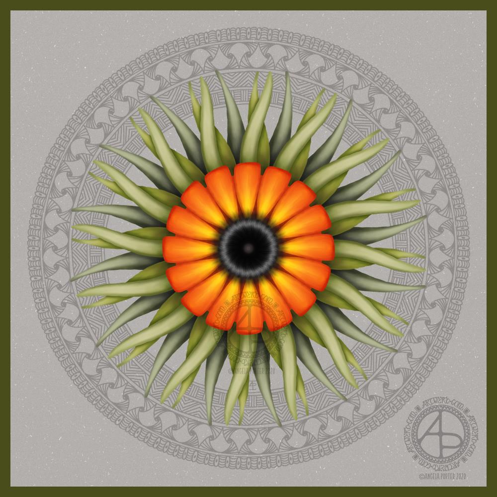
It’s always lovely to return to art after a little break from it. Today, I used a photograph I took last August while visiting the National Botanic Gardens of Wales. Gorgeously coloured flowers were blooming in the great glasshouse, and this stylised flower is based on some of them, including the colour palette.

A bright, sunshiny, warmly glowing flower is just what I needed to paint this morning. I think I’ve chosen a background colour/texture that allows those colours to shine too.

Digital art created with Autodesk Sketchbook Pro, Microsoft Surface Studio and Microsoft Surface Slim Pen.

Leaving therapy…

Monday was a crazy kind of day. In the morning I got sidetracked by a friend, all while I was trying to pack gifts up for my therapist before I headed to my last appointment, for the foreseeable future anyway.

That’s right. I’ve finished with EMDR therapy, for now. I feel I’m good enough learn to fly through life without the support net of my therapist. My wings haven’t spread much, and though weak, they’re strong enough for me to take my first bumbling, solo flights in life (solo as in not with therapy). I’m going to crash onto the ground, bump into trees and obstacles, even get tangled up from time to time in branches and brambles. I do feel, however, that I can cope with the bumps of my flight through my post-therapy life.

Getting tangled up may result in me needing help to untangle myself as something happens in life that triggers a part of the cPTSD that is still hidden and causes it to rise up to the conscious mind where it can be dealt with. This may mean a return to EMDR to deal with that particular set of traumas.

It was both a little sad and a fairly exciting and happy time too. My therapist and friends are proud of me for the work I’ve put in, as well as the perseverance and courage I’ve shown in facing some of the traumas that have resulted in the cPTSD.

New Camera!

I’ve had a need floating around my head for a little while – to buy a DSLR camera. I’ve looked at them, read about them, tried to decode the technical blurb, and finally found myself drawn to one particular model time and time again.

Rather than purchase it online, I steeled myself yesterday to take a trip into Cardiff to visit Cameraland. I’d looked at various shops where you can buy cameras, but this one really ‘felt’ right. And I have to say, it was the right choice.

So, after breakfast, I headed off to Cardiff, parked up, and walked from the Museum to Cameraland through the town. For many years I’ve not been able to go into Cardiff. Loud voices, noises and the high number of people ramp anxiety in me up to a level of startle and hyper-vigilance. So, I used noise-cancelling earphones and upbeat music to help me cope.

And I did! This wouldn’t be possible to do if I was with someone or people, but on my own it’s completely do-able.

Anyways, the chap I talked to in Cameraland was very helpful, knowledgeable. I explained what I’d like a camera for, my experience with SLRs in the past, and the model I’d had my eyes on. He did say there were other options, but none as good as the one I’d chosen.

He showed me around the camera, let me hold it, use it, and then when I’d decided it was the one for me helped me with a uv lens filter, memory card and a camera bag that is spacious enough for me to use as a handbag too.

This camera is a celebration gift to myself for completing therapy, to mark a kind of rite of passage for me. It’s also a way for me to encourage myself to explore the world a bit more. I’ve invested a fair bit of money in the camera and I really don’t want to see it sitting in the bag, being unused.

I still can’t just go out because I’d like to go out. I still need a reason to leave my home. Going out to use my camera is a good reason in my mind.

It also means that when I’m with Liz, or others, on days out, I can record things that catch my attention that I’d usually sit and draw. Yes, I can use the camera on my phone, which is a good phone camera. However, the images aren’t as clear or colour-faithful as I’d like.

So, I may be sharing particularly nice photos I’ve taken too, of all kinds of things that I find interesting, fascinating.

Mandala WIP 13/02/20

Mandala WIP 13/02/20 © Angela Porter | Artwyrd.com

Yesterday turned out to be a weirdly busy kind of day that meant I had no time for social media, nor much in the way of art. I did make a start on this mandala, however, and have continued to do a couple more hours work on it this morning.

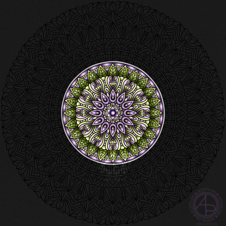
I’m using just green and a pinky-purple for this mandala, but with a couple of pearly-grey rings. the main colours remind me purple spring crocuses. I like crocuses of all colours, but the purple ones just make me smile that little bit more.

I think I’ve done about 4 or 5 hours work on colouring it so far.

On another note, I’ve added a couple of designs to my Redbubble shop that you can purchase on a range of quality products including t-shirts, sweatshirts, phone cases, art prints, and more. #findmything

It’s time to make art.

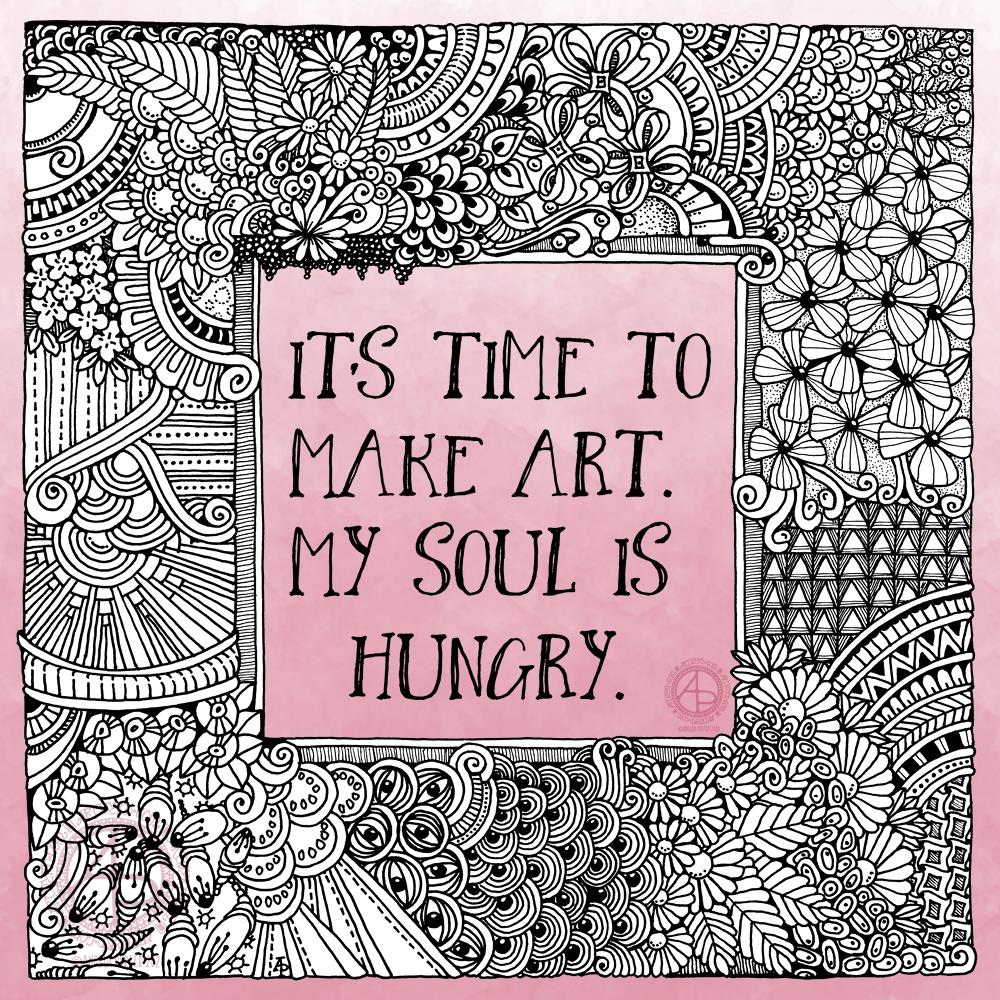
I had the need to draw, just for the pleasure, comfort, and soothing that creating art brings. This quote perfectly expresses that need in me.

I drew the artwork with a Pigma Sensei 04 and Pigma Micron 005 pens from Sakura on ClaireFontaine dot grid paper. Pure intuitive art. I didn’t think about it, I just let it flow as it needed to do so. Working this way always soothes my soul, but it also usually works out really well. It’s when I over-think my art that things go wrong.

I digitally removed the dot grid and cleaned up a couple of smudges. I also make the centre and edge or the artwork transparent so that a pink ombre background would show through.

I have an introvert ‘hangover’ today after a get together last night. It’s not as bad as I expected it to be, but I still need a quiet, soothing time today.

Art Quote

Artwork © Angela Porter | Artwyrd.com

After doing some statistics for a friend, I turned my attention to art. I noticed I had the desktop version of Repper pro and thought I’d have a play around with one of my Entangled Gardens drawings.

Repper pro is an app that allows me to make repeating patterns from my own artwork quite easily. I made a few, including the border above, in a short time. It’s now available online, for a monthly subscription.

I like to use a border of my art against a favourite quote, I thought I’d do that today, though I did take some liberties with the quote and replace “his” with the gender non-specific “their” as not all artists are male!

I do like repeating patterns, and I particularly like this border. I also like that I can make use of my artwork in different ways.

I know that my art reflects my soul, my heart, what gives me pleasure in drawing and in seeing too. Even this border makes me smile gently, both on my lips and eyes and in my heart too. I think I may give more of myself away than I realise when I create art. I think all artists and creatives do.

As I grow and develop my artistic voice, there’s still that quality of line, colour, composition that is distinctly me. Others may work in a similar way, but there’s still something unique about each of us, things about our art that set us apart from each other. These differences can be obvious or subtle, but each is a unique calling card for each artist or creative.

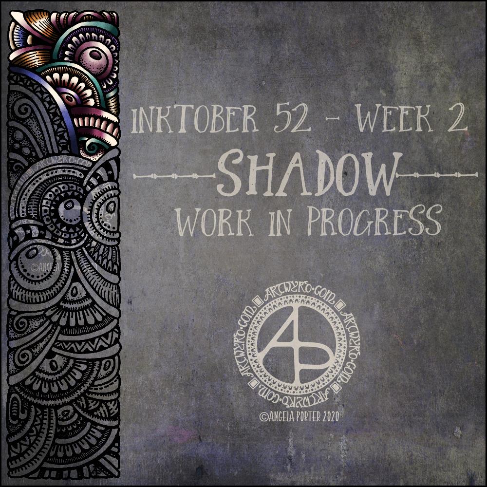
Inktober52 Week 2 “Shadow” WIP

Inktober52 “Shadow” WIP ©Angela Porter | Artwyrd.com

I like this week’s prompt for #Inktober52 – Shadow. I like to work with quite high contrast colours/shades to give the illusion of dimension. So, I thought I’d take one of my borders, add it to a very shadowy background, add colour, light and shadow, and finally I’ll put a quote about shadow on to it. My only problem with adding a quote is which one to choose! There are so many fine quotes about shadow and light.

It’s nice to have a whole week to work on the prompt. I’ve already spent over two hours adding colour to that little section of the border design, just to give you an idea of how long it takes me to work in colour.

What this means is that I can use my Inktober52 project as ‘warm up’ or ‘comfort’ art over the next few days if I wish.

The colours I’m choosing are quite ‘dull’ for me – they are hues that have a lot of black/ in them and they do give a quite vintage or grungy feel. However, against the dark background they glow.

They’re not my usual choice of bright, pure colour. I think that’s simply because it’s taken me a long time to work with them and become comfortable with them too. That’s another reason why Inktober52, and Inktober, are so good – I end up trying things out that I wouldn’t necessarily do for my publishers.

We have hope.

Artwork © Angela Porter | Artwyrd.com

About the quote

I love Star Wars. It’s one of my go-to self-soothing, self-care kinds of series of films to watch. I’m also steadily working my way through the books related to the films, that fill in the gaps and build a rich galaxy of tales, myths, and great deeds. I can lose myself in them, and escape from everyday life into realms where good eventually overcomes evil.

The same is true for Lord of the Rings and Harry Potter for me too, amongst others. Worlds where there seems so little hope of overthrowing evil, yet hope remains kindled and the underdogs overcome an overbearing, cruel order.

There are so many wonderful quotes from these books and films.

Of course, I’m on the side of the rebels, the underdogs. The Jedi, wizards and witches, the fellowship and all the free peoples of Middle Earth.

I can apply the metaphor to my own journey to recovery from cPTSD. I’m rebelling against all the programming I had from a young age that made me believe I was stupid, useless, weak, a failure, unlovable, ugly, friendless, worthless and more.

For a long time, I held on to the hope that EMDR would help me overthrow the dominion of my past. Now, that hope has turned int a trust that I have done that and will overthrow the last vestiges of the erroneous and harmful views and beliefs I have of myself.

I’ve been a rebellion of my own, rebelling against my past and becoming the person I was always meant to be and not limited by the self-serving beliefs of others who sought to control and manipulate me.

About the art

I used one of the borders from yesterday’s collection to decorate the background for the quote, which I typeset in Affinity Publisher.

I do like a dark, grungy background, and this one just felt ‘right’ to use. I chose colours from the background to add colour to the border design. I used Autodesk Sketchbook Pro to add the colour and highlights/shadows to the text and border. The border was drawn with Uniball Unipin pens on ClaireFontaine dot grid paper.

I made sure I had plenty of places where light was being gathered and reflected, representing the hope that is always there if we look for it, even when everything is covered in shadow.

I’m actually quite pleased with the border and the depth and dimension I’ve achieved. I could’ve made the highlights even brighter, but I wanted it to look like hope was being kindled, gently gathering in the shadow.

I do have to say I also like the limited colour palette I used for the border. I used white and four other colours (dark shades of green, raspberry, blue and purple). This isn’t something I do easily, but I think it’s really worked out well here.

Happy New Year! Welcome to 2020

©Angela Porter | Artwyrd.com

Wishing each and everyone of you the most wonderful wishes for 2020!