Yesterday, I said I’d like to make simple pockets for my sketchbook-journal to hold my artwork rather than gluing it to the pages. So, this morning, I started my day looking on YouTube for some ideas and this video by joie de fi was the top of the list.
While I was watching it, I thought I’d make an instruction sheet to go in my sketchbook (or my virtual one I’m making in One Note).
I picked up some quadrille paper and wrote and drew as I watched the method for the first pocket. I worked in ink without pencil sketches and I made quite a few mistakes. A Tipp-Ex mini pocket mouse was my friend.
When I’d finished the instruction sheet, I scanned it in and used Autodesk Sketchbook Pro to remove the square grid from the paper, clean up some smudges, and correct minor errors.
Then, I added some colour to help bring out the drawings, but also to help with the instructions.
I’ve yet to make this kind of pocket, but I’m sure I’ll be able to do so quite easily now.
Reflecting on the artwork/illustration
This was a lot of fun for me to do. It’s something I’ve not done much since my days as a science teacher, or a learner in school and university myself. I’d forgotten how much I enjoy creating instruction sheets with my own drawings on them.
Back in those days, I would’ve used a ruler to draw straight lines, pencil for the diagrams, pen for the words, and little or no colour. Here, I free-handed the drawings, wobbly lines and all. The colour also adds life and dimension to the diagrams/drawings/illustrations.
The layout of the instructions may not be the best and easiest to follow through. That’s because I did this as I was watching the first part of the video. I think that for the next one, I need to sketch out the steps and notes first, and then work on organising them more clearly.
Yes, I’m going to do some more instruction sheets like this!
I also really need to do more hand lettering! I’ve lapsed in my writing practice, that’s for sure.
I’ve been awake since stupid o’clock, which roughly translates to 3:30am BST. While I was trying to get back to sleep I watched a youtube video about making pockets and tuck-ins for an altered book journal.
I thought that could be something good for my sketchbook-journal. I have worried a little about gluing my little artworks into it, but pockets, tuck-ins, see-through envelopes could be a good way to both show the work and store it in a non-permanent way.
So, with my mind now working and sleep eluding me, I decided to have a go at making my own pockets. You can see the result at the top right, with a journalling card popped in one of them for now.
How I made the pockets
I used some ordinary white card, cut it into what I thought would be good sizes to make a set of stacked pockets for the ATC sized cards I’ve been working on.
I then coloured the cards with Distress Oxide Inks. For one of them, I used a brayer to add ink to a gelli plate. Before pulling a print, I spritzed the gelli plate with water that had some white perfect pearls added to it.
For another panel, I used the brayer to add ink directly to the paper. It did that unevenly. So, I used a ball-tool to carve some texture into the black side of a piece of cut and try foam and used that to add colour. That worked really well! Dabbing the foam added a lovely textured layer of colour. A spritz of water activated the dusty, chalky, soft nature of the Distress Oxides.
I enjoyed the look I achieved with the distressed foam that I coloured the remaining pair of paper panels in the same way.
I then tore the top edge of each panel, for added interest, then used a piece of foam and Rich Mahogany Distress Ink to add grunginess to the edges of each panel.
I wanted to add some embellishments to each panel, so I used a copper sparkle Gelli pen to draw patterns on them.
Finally, I used Tombow Mono adhesive to stick the panels together.
When I put the panels on the page in my sketchbook-journal, I thought a panel behind them. So, I coloured a panel of the same card with Distress Oxide inks and the distressed piece of foam and used the same gelly roll pen to add some sparkly patterns. Then, I adhered the back panel and pockets to my sketchbook.
When I tested some ATC cards in the pockets, I realised I need to work out a way for some more ‘give’ in the pockets as they’re too tightly put together to slip more than one ATC card in them. Also, I placed them just low enough down the page so the ATC card doesn’t stick out of the sides of my sketchbook.
I’m not well known for my fore-planning projects like this, though I do try to learn as I go along.
Inchies and Twinchies
My mind was working in weird ways this morning. As I was making the pockets, my mind strayed to inchies and twinchies. I’ve not made any of these for a long, long time. I thought it could be fun to do so and add them to my sketchbook-journal.
I cut two 1″ wide, and one 2″ wide strips of card. I used the distressed foam to apply Distress Oxide inks to them, spritzing with water to add to the distressed look. Then, after drying with a heat tool, I cut them into squares – 1″ x 1″ inches and 2″ x 2″ twinchies.
I decided to use metallic watercolours from Cosmic Shimmer to add a sparkly, shimmery border to each tile. I used rich gold, pale gold or copper on each tile.
Then, I got to draw on the tiles. Teeny, tiny zentangle-style drawings. That was fun to do!
After adding some dots using a white Sakura Soufflé pen, I adhered the inchies into my sketchbook-journal. I’ve left the twinchies for decoration later.
Journaling cards
I realised that I could stored journalling cards in the pockets. All I needed to do was to colour the back of one of the ATC cards I coloured a few days ago. I also just realised that I could have added a layer of squared, dot grid or lined paper to write on too. That’s an idea for another time, maybe.
After drying the ink, I used a rollerball pen to add what notes I wanted to about this mornings creative sessions.
In fact, I’ve just created another journaling card to jot down ideas and notes to self as a result of reflecting on my pre-dawn arty activities!
This morning started early and I played around with metallic paints along with Distress Oxide inks in my sketchbook / art journal. I have some interesting backgrounds as a result.
I also created a background for today’s artwork. I have tweaked the colours a little, digitally. I don’t know what WordPress does to the colours, but they look different in Autodesk Sketchbook Pro. I used Distress Oxide inks and have ended up with a rusted, weathered, kind of distressed/grungy texture.
Of course, I can always alter the background later on, if I wish.
I used the symmetry tool to reflect my drawing. You can see I’ve laid out the bare bones of the design and have started to fill the sections in with texture and pattern. I have a lot more work to do to complete the drawing. Then, I’ll think about shadow and highlight to help to bring the design to life some more. Or perhaps I’ll make it look like a stencilled design on the background, one that has some dimension to it.
Over the week I’ve been adding to my sketchbook- notes and images, ideas and reflections.
Each page has been coloured with combinations of Distress Inks, applied using the black side of a piece of Cut and Dry foam, followed with a spritz of water to bring out some water-staining grungy loveliness.
All the little drawings have been done on either Daler-Rowney Smooth watercolour paper (300gsm) or mixed media paper, either from Claire Fontaine or Daler-Rowney. The papers have been coloured with Distress Oxide Inks, Distress Inks, or a combination of them. Most of the pieces have had the inks applied with the foam, but some were made by brayering Distress Oxide inks onto a gelli plate and taking a print of them.
The reflection about what I like, what I don’t like, and ideas that arise is important to me in my sketchbook/journal. I do reflect on my art, a bit too much in my head. When I write it down, it forces my sometimes abstract and swirling thoughts into some kind of order. When I make these thoughts a material manifestation by writing them down, it helps me to recognise the thoughts, sift through that which is useful, and still record those that are not particularly useful at this moment but may be in the future.
I think I need to find a way to do this with my digital art. My mind goes to using One Note to do this. I shall think on this one, and make a note of it in my physical sketchbook/journal.
I wonder how many are trying to keep busy, busy, busy during the lockdown? And how many are learning how to just ‘be’, relaxing and taking time for self-care?
Self-care has been a long, difficult series of lessons for me. It’s a practice and not a perfect situation. However, self-care is important.
I don’t mean personal grooming, which is important, but it means taking care of your emotional and mental needs as much as your physical needs.
Today is a day where I’ll need to practice a lot of self-care. Migraine-style headache woke me up way too early and although the pain has gone it has left me exhausted, unfocused, and needing sleep. So, I’ll soon be returning to bed to sleep the lingering effects of the migraine away.
To help me cope with the migraine, I spend a few hours working on my mosaic crochet blanket/throw, and then created the above. Both very self-soothing activities for me.
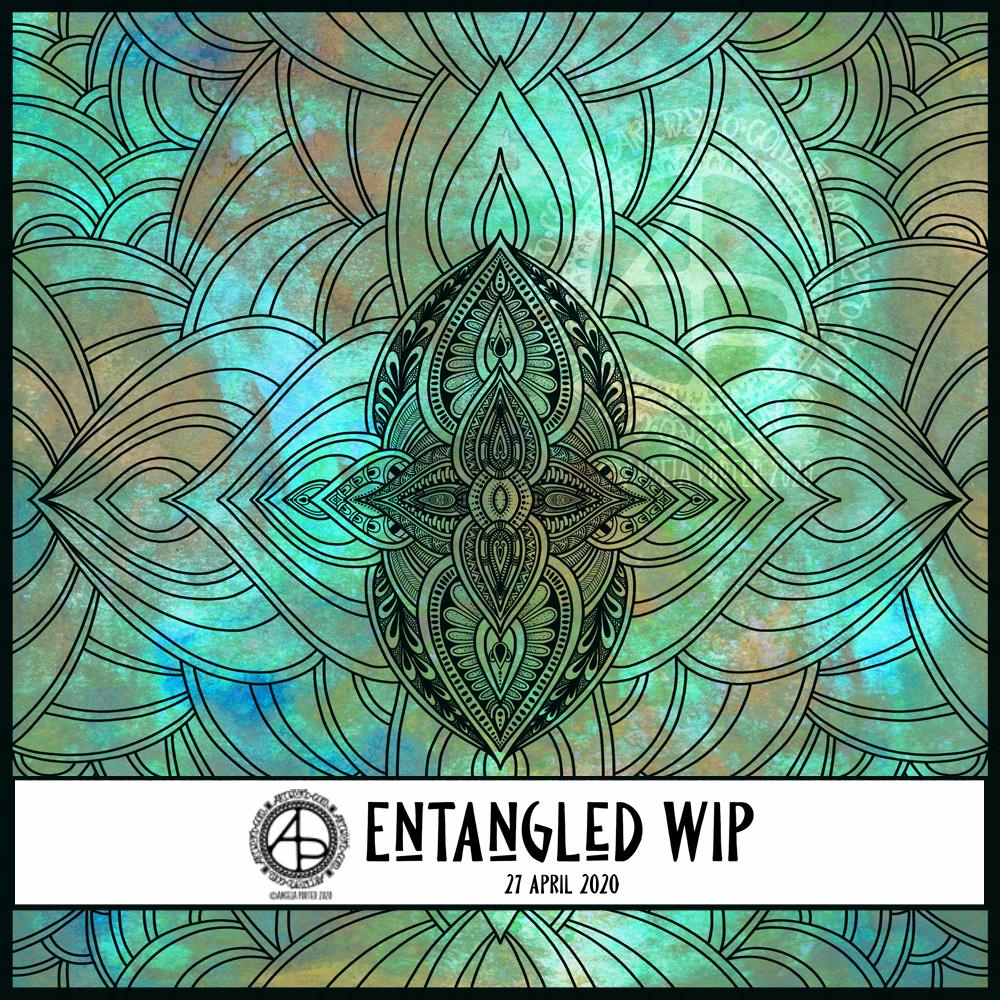
Floral designs, an entangled garden was my fancy this morning and this is the result, not fully coloured though.
Coloring is a great way to find some calm and peace during troubled times, such as the times we find ourselves in. Scientific studies have shown it has a similar effect on the brain as meditation.
I have a number of templates available for free in the facebook group, including this one.
As I’m pretty much an introvert, I’m usually happy in my own company and happy at home. There are times when even I get and a huge desire to visit somewhere else, where the feeling of wanderlust becomes so strong I have to act on it, even if it’s just a drive in my car.
I, like us all, have no idea when I’ll be able to do this again, just like us all. The Covid19 crisis has changed everything and liberties I took for granted are not not available now and shows how much I enjoyed them even if I didn’t use them all the time. I had the choice.
Yesterday was one of those days where wanderlust overwhelmed me. With it came a huge dose of frustration and sadness, as well as a loneliness I rarely feel.
Also, I was over-tired. I know that when I’m over-tired, my emotional resilience is low. So, all of these things bubbled up and I ended up in bed in the afternoon. I felt a bit better on waking, and my attention went to creating some art.
As I couldn’t indulge my wanderlust physically, I thought I’d try to find a way to express it artistically, and the above is the result.
Words always interest me, and their meanings and origins too. So, I wanted to include the definition of wanderlust in my art. I wanted to make it look like torn paper, or a rip in the background, so I created a messy edge for the typography panel. I actually like how this turned out; I felt like I was being torn apart, emotionally, by the feeling of wanderlust, and a darkness was welling up from that tear.
I used one of my Distress Oxide background textures and drew an entangled art design on a layer above it.
Once I was happy with the design, I coloured the line art, created a copy of it, and applied various effects to these two layers.
I’m really happy with this artwork. It made me smile inwardly and helped to lift my mood some more.
I’m still tired today, over-tired, exhausted. I woke up, however, with the idea of creating some ATC card backgrounds using Distress Oxide inks, and these are the results.
Except for the middle and right cards in the bottom row. I wanted to try out using Distress Microglaze to see if it brings out the colours and layers of colour and texture. It does, though it’s not easy to see on the scan. I do need to do before and after scans. I also need to see if I can draw on the panels treated this way too.
So, ATC cards are 2½” x 3½” in size and were started as a collaborative art project where artists and crafters could swap the cards with others, sharing inspiration and creativity in the process.
I just think they could be a lovely size to work on and mount on greeting cards.
All of these cards were cut from 300gsm watercolour paper, which is very thick and sturdy.
I’m still playing around with Distress Oxide Inks to get a feel of how I can get them to work for me as well as creating backgrounds for my traditional and digital art.
My mind is ticking over various things I’d like to do with these, both traditionally and digitally.
If you have any suggestions what I could do, leave a comment!
Gosh, Thursdays seem to come around so quickly these days! Thursday is the day I post a new colouring template for the members of the Angela Porter’s Coloring Book Fans facebook group, and above is this weeks offering.
I drew the line art on mixed media paper from Claire Fontaine with Tombow Fudenosuke flexible nib brush pens. I like to use variable line widths in my art from time to time. They give instant depth to the drawing and increase the graphic nature of the design.
I’ve used some really weird colours, for me, in my sample coloration. They’re really quite muted. That’s a hint to me that something is awry with my emotions/mood. I feel quite subdued and ‘meh’ at the moment, which is reflected in my colour choices.
Anyway, if you’d like to colour this, or any of many others in the archives, please pop along and join the Angela Porter’s Coloring Book Fans facebook group. I create these exclusive templates as a way of saying thank you to those who like my coloring books.