Visual Dictionary

©Angela Porter | Artwyrd.com

I’ve often mentioned my ‘visual dictionary’, so today I thought I’d show you a two-page spread from it.

I’ve kept a visual dictionary for a few years now. It’s where I keep a record of my favourite patterns, motifs, lettering styles and anything else of use to me when I need a little inspiration or to add something a little different to my art.

My original one is now just about full, and I thought it was time for a bit of a cull of patterns and motifs I wouldn’t use as I start a new dictionary. At the moment I’m working my way through zentangle patterns before I add my patterns and motifs. TanglePatterns.com is a fantastic online resource for zentangle patterns.

I’ve been drawing zentangle-style patterns since long before Rick Roberts and Maria Thomas developed Zentangle. I still like to dip into the resources for new ideas for patterns and motifs.

I’m using an A5 notebook with 5mm squared paper from WHSmith. It has quite a lot more pages in it than a Leuchtturm, Midori, or other A5 dot grid or squared notebooks, which is why I went with it. The paper seems to be pretty bleed-proof, and any ghosting is relatively minimal.

The past few days have had me needing some quiet time doing comforting, soothing art. I’ve had a very ‘people-y’ time of late, and it has left me quite drained. So, sifting through and drawing patterns and motifs and adding them to my new visual dictionary was just what my arty soul and overwrought emotions needed.

Doing this has the bonus of refreshing my creativity. Not only am I being reminded of patterns I like that I’ve not used for a very long time, but I’m also creating my own variations, either deliberately or as the result of some ‘happy accidents’.

Even though I’m trying to keep the pages neat and ordered and the patterns mistake-free, I find I’m not stressing if I make any mistakes. I find a way to either create a new pattern or to incorporate it into the design in some way. This is good for me as I tend to be hyper-perfectionistic if I’m not too careful.

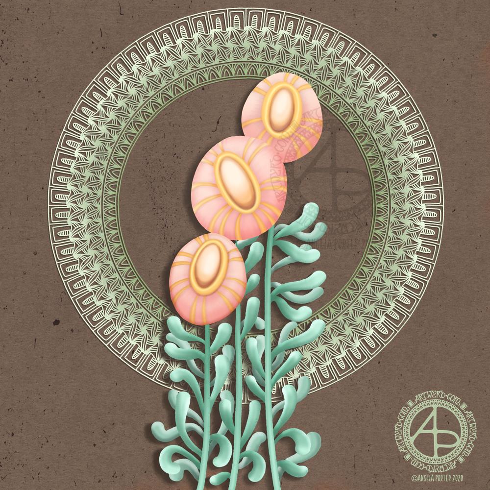
Pretty flowers

Pretty flowers © Angela Porter | Artwyrd.com

This was a nice one to do. There seems to be a bit of a theme with my colour palettes lately though. Another theme is stylised, abstract flowers. Overall, I am pretty happy with this particular design.

Flowers, foliage, mandalas, geometric repeating patterns – all my favourite things!

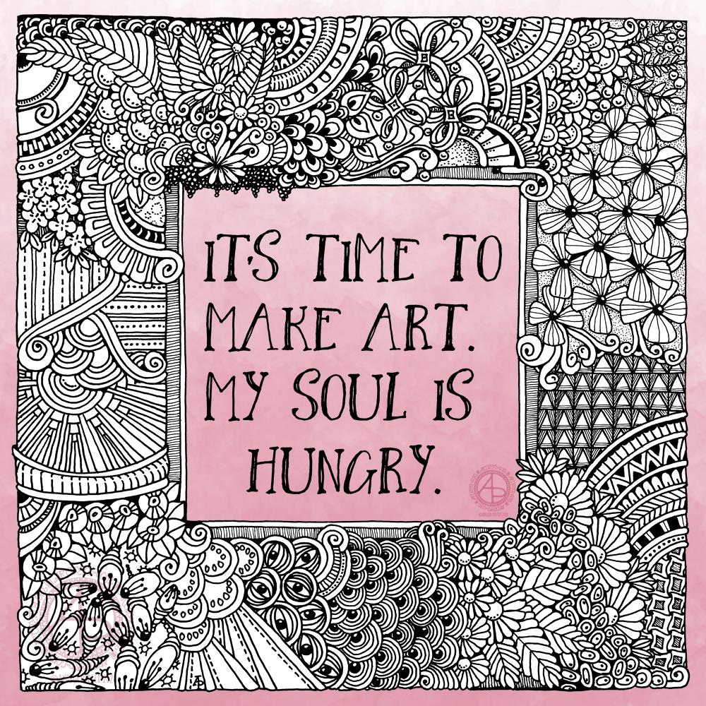
It’s time to make art.

I had the need to draw, just for the pleasure, comfort, and soothing that creating art brings. This quote perfectly expresses that need in me.

I drew the artwork with a Pigma Sensei 04 and Pigma Micron 005 pens from Sakura on ClaireFontaine dot grid paper. Pure intuitive art. I didn’t think about it, I just let it flow as it needed to do so. Working this way always soothes my soul, but it also usually works out really well. It’s when I over-think my art that things go wrong.

I digitally removed the dot grid and cleaned up a couple of smudges. I also make the centre and edge or the artwork transparent so that a pink ombre background would show through.

I have an introvert ‘hangover’ today after a get together last night. It’s not as bad as I expected it to be, but I still need a quiet, soothing time today.

“Shadow” – Inktober52

“Shadow” #Inktober 52, week 2
Artwork © Angela Porter | Artwyrd.com

I finished this artwork off this morning, finding a perfect quote about shadow, this week’s prompt for #inktober52.

Border design drawn using Unipin pens on dot grid paper. Typography was done using Affinity Publisher. Colour, background and composition were achieved in Autodesk Sketchbook Pro using a Surface Pen and Surface Studio by Microsoft.

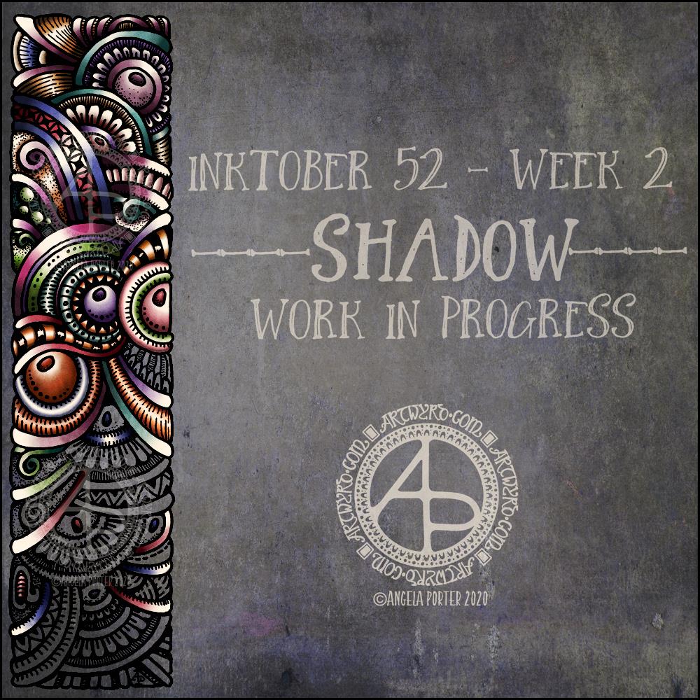
Inktober52 – “Shadow” – WIP

Inktober52 “Shadow” WIP ©Angela Porter | Artwyrd.com

I managed to get a fair bit of colouring done yesterday and this morning. It never ceases to amaze me how colour can add so much dimension to the design, particularly as I use quite high contrast. It’s possible to see the dimension in the line art, but colour really brings it out.

There are areas that look a little flat, but I can sort those out later on by adding more shadow and highlight.

So far, I am pleased with how it’s working out. I’m also enjoying the hybrid art that results from traditional drawing and then the application of colour digitally.

A favourite pattern

A favourite pattern ©Angela Porter | Artwyrd.com

Today, I thought I’d share one of my favourite geometrical patterns. You may have noticed it often appears in my entangled art, as well as in dangle designs.

I’ve included the steps I use to draw the pattern, along with some variations and different ways I use the patterns.

I used a 05 Unipin pen, a pencil, a couple of coloured pencils and dot grid paper.

Entangled Borders 02

Entangled Borders 02 ©Angela Porter | Artwyrd.com

Another day and another set of entangled borders! I’m enjoying drawing these. There’s something pleasing about creating small designs. Whether it’s the speed at which I can draw them, or their cuteness, different shapes and sizes to my usual art, or something else, I don’t know. All I know is that I’m enjoying it!

The pens I used to draw the designs were Uniball Unipins and Tombow Fudenosuke pens. I used dot grid paper by ClaireFontaine.

To remove the dot grid, edit some smudges and errors, add a background colour and some colour, I used Autodesk Sketchbook Pro.

Entangled Borders

Entangled Borders ©Angela Porter | Artwyrd.com

I’ve enjoyed creating this sketchbook sampler page. I drew the designs with a mixture of Uniball Unipin pens, Faber-Castell Pitt Artist pens, a medium nib Schaeffer fountain pen, and an extra-fine nib Faber Castell fountain pen. I used dot grid paper from Claire Fontaine.

After scanning the page in, I removed the dot grid and added a grungy paper background. I then decided I’d like to add some colour and shadow/light to the designs. To do this, I used a messy chalk brush, so my colouring isn’t as precise as I usually like it. However, it’s loosened up my expectations of myself as I went with it.

Pastel colours were my palette of choice as I like the way they seem to almost glow against the grungy kraft background. I also like the way they help to enhance the 3-D appearance of the designs. I do enjoy playing with shadow and light.

Some of the designs are examples of my organic, entangled style of drawing. Others are repeating, geometric zentangle-style patterns. And then there’s some inspired by Medieval illuminated manuscripts.

I also enjoy working within a clear border. I like the sense of structure it brings to my work. It also satisfies some kind of aesthetic need within me. Every now and then I try work without a border, but the artwork I produce just never feels quite right to me. So, it’s time for me to accept the need for borders is part of my artistic voice.

There is a purpose for me creating these borders. I’m building up a library of them that I can use to embellish quotes and other projects.

Some of these borders would look fab as greeting cards note cards, bookmarks, and to use in other paper craft projects. They’d also work well as embellishments for BuJo, planner, diary, scrapbook and journal pages.

Others would be a great foundation for dangle designs (my book “A Dangle A Day” is a good place to start drawing dangle designs).

What I do know, is that I find drawing soothing and relaxing. So, I’m going to be spending the rest of my Sunday drawing more borders.

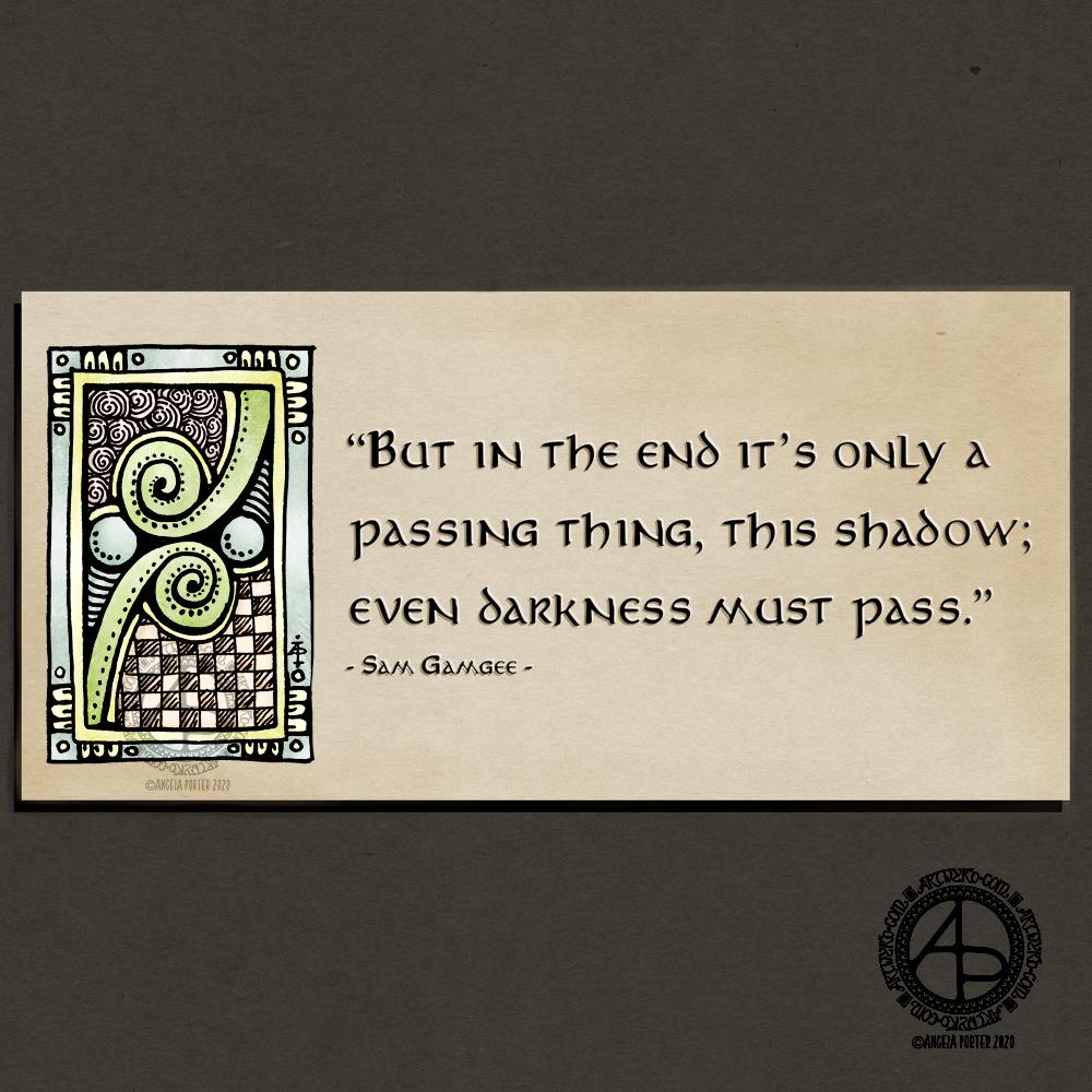
Even darkness must pass…

Quote by Sam Gamgee from Lord of the Rings by JRR Tolkein
Artwork ©Angela Porter | Artwyrd.com

I’ve been listening to the audiobook of Lord of the Rings this week, as well as watching the film adaptations. They contain so many fantastic quotes, many of which are relevant to our lives and the time we live in too.

Personally, I’ve lived through dark times in terms of my mental and emotional well-being. I still have my bad days, sometimes weeks, but I’ve learned that they pass, given time and self-care, and sometimes EMDR therapy too. But they do pass.

Earlier this week, I drew a collection of designs that could be used as decorative borders and motifs for quotes. I felt that this motif would go well with a quote from a hobbit, a gardener no less.

I used Uniball Unipin pens to draw the motif, and coloured it digitally, after adding a kraft paper background, which gives it an aged, antiqued kind of feeling. I thought soft colours would work well against the brown background, and also wouldn’t detract too much from the quote.

I’d like to revisit this sometime and make the edges of the paper aged, torn, damaged. Or maybe add a border around the quote. I’d also consider adding a shadow to the entangled drawing, the illuminated part of this design.

It’s been a nice way to spend a Saturday morning. It’s also nice for me to do something with the art I create.

World Introvert Day 2020

World Introvert Day 2020 | Artwork ©Angela Porter – Artwyrd.com

Introversion and me

Yes, we introverts have a world introvert day, every year, on 2 January. A quite appropriate date as it falls right after the hustle and bustle of a busy Christmas/New Year/Holiday season.

In a society that values extroversion, introverts are often misunderstood and their own set of personality traits overlooked. We’re judged as shy, anti-social, aloof, even arrogant, and just plain weird.

Introversion is not the same as shyness, social anxiety nor depression, though both introverts and extroverts can experience these conditions.

If you’d like to know more about introverts, here are links to two good articles:
IntrovertDear.com – What is an Introvert?
VeryWellMind.com – How you can tell you’re an introvert.

I was brought up in a family of rampant extroverts, where extrovert traits were very much valued. So, to try to fit in, I developed an extrovert mask. This mask still slips on when I’m in situations and circumstances that require me to interact with people I don’t know, or where I feel vulnerable emotionally. People often think I’m an extrovert because of this mask.

However, the real me, the vulnerable me, is quite introverted.

I like people, but in small numbers. I much prefer spending time with just one or two people where the conversation can be less social fluff and more meaningful.

Yes, I do tend to sit at the back or at the edge of meeting or gathering. I like to observe and listen and become comfortable before I engage (if I ever do). Even with regular meetings with people I become familiar with it can still take me a long time to interact. It can take me even longer to drop the extrovert mask so they can glimpse the real me.

After social interaction, especially with large groups of people, I can be completely drained of energy and need plenty of alone time to recharge my batteries.

Indeed, if I have a lot of social interaction in a short space of time I can end up with an ‘introvert hangover’ – deeply tired, headachy, emotionally drained. If that happens, I need an extended period of time to recover, which often includes copious naps and binge watching Star Wars, Harry Potter or Lord of the Rings/Hobbit! In serious cases a healthy dose of Ben and Jerry’s Karamel Sutra is required!

You see, interaction with my own inner life, my creativity, with books and music energises me. Social events, particularly noisy and crowded ones, will drain me of energy and become torture for me.

One-to-one interaction, or being with a small group of people in a calm environment can, however, be energising as well as tiring, especially when the conversation is about life, the universe and everything.

Us introverts do need, and value, people in our lives, just not all at once! Social interaction is just as important for us as for the extroverts, though our preferences for social interaction are different – less small chat, more meaningful conversations. And those of us who are self-aware recognise the need for the right balance between social interaction and alone time.

Extroversion-introversion is a continuum, a spectrum, and we all show aspects of each archetype. However, I know my introvert traits outweigh my extrovert traits fairly considerably.

Just as a fun-fact, it’s estimated that extroverts outweigh introverts by six or seven to one across the world.

About the artwork

Yesterday, I had a lovely time drawing entangled borders to use for quote projects, just like this one. Today, I kept the drawing in black and white and added a pretty background to the drawing and typography.

I used Uniball Unipin pens and ClaireFontaine dot grid paper to draw the designs. To put the artwork together I used Affinity Publisher to do the typography, and Autodesk Sketchbook Pro to put the artwork, typography and background together.