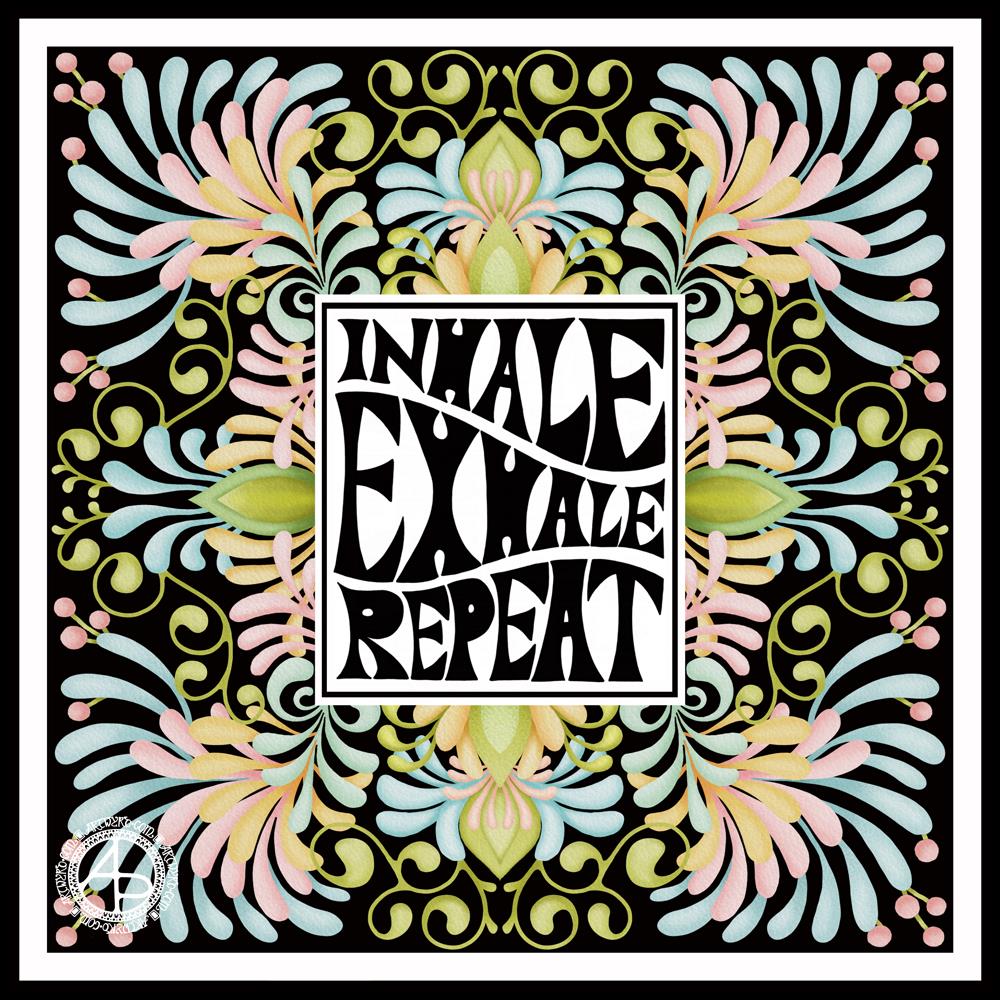
I started with the hand-drawn typography. I’ve just started another Domestika course — Hand-Drawn Typographic Portrait by Sarah King. The first exercise is to letter words boxes divided by wavy lines. Then, creating letters in different weights. And of course, practice is something that needs to be done.
There was just something about her approach to this that grabbed me, and so, I now have many boxes with words and quotes in.
The first lesson shows how to use Photoshop to edit your lettering outlines and fill them with black. I found the process rather clunky and long-winded. Perhaps that’s because I’m used to working in Autodesk Sketchbook Pro with a pen on a screen as if they were pen and paper, that I could do this in my own way.
So that’s what I did. I used one of my pencilled samples to create the typography for the centre panel.
Then, it was adding the background. I just went with the flow on that one. I made use of the symmetry tools in Sketchbook Pro, and just had fun with a limited colour palette and my favourite kinds of shapes.
The course is about portraits. However, I have zero interest in drawing people. However, the techniques shared will spark ideas for how I can use them.
I’ve long been trying to incorporate words, quotes into my artwork and struggling to find my own style. I’m not sure if this will help, but I’m really quite happy with this particular artwork.
Last weekend, I made a small sketchbook that would hold approx 4″ x 4″ pieces of paper that was held together by book binding rings. I thought this would be a good idea as I like to work on small pieces of paper.
Then, last night I tried taking some prints from alcohol ink designs on A5 paper. I really didn’t want to cut them up to fit into the smaller custom sketchbook. I also didn’t want to use the metal binding rings again.
I woke this morning with the idea to use a disc binding system to create a custom sketchbook-come-art-journal.
I have been using an A5 Arteza mixed-media sketchbook for this, but it has rapidly become very, very wedge-shaped. I also realised that I want something where I can add a variety of sizes and types of paper, as well as move them around to suit my needs. A disc bound system seems to be the best way for me to do this.
I’ve yet to work out a way to make a hard cover for the sketchbook. For now, I made each cover from two sheets of A4 pearlescent card glued together. They’ll be sturdy enough until I work out how to reinforce them in some way.
I decided to place the disc binding on the landscape edge, just for a bit of a change, no other reason. I’ll be able to take the paper out of the binding to work on. This actually suits me just fine as the spines of sketchbooks really irk me when I work in them, be they sewn or spiral bound.
What I also like about the disc binding system compared to the book binding ring is that the holes in the paper are much closer to the edge. It’ll be much easier to leave a ‘margin’ on the paper.
Of course, there’ll be plenty of times when I’ll work in a commercially produced sketchbook still, especially as I’ve now rediscovered the joy of using one again. However, the ability to colour paper, use different kinds of paper and sizes of paper really appeals to me as a variation on the sketchbook theme.
The different sizes of papers also add a bit of intrigue to the sketchbook. There are glimpses of other designs and backgrounds further on that add to curiosity.
I can choose to add notes either to the back of the work or on sheets of dot-grid or squared paper I’ve added.
Nor am I precluded from adding journaling elements such as envelopes and pages with pockets, for instance.
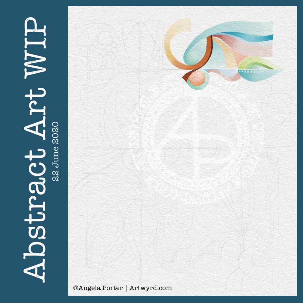
Abstract art
The top page is an abstract drawing I completed this morning. The colour and pattern on the paper (a piece of ClaireFontaine Paint-On mixed media paper) was added by taking a print from alcohol inks on Yupo paper.
I spent some time yesterday evening experimenting with alcohol inks on Yupo paper (a synthetic paper). Once I was happy with what I’d made, I added some Alcohol Lift-Ink and used a brayer to spread it over the design. Quickly, I placed a sheet of mixed-media paper on top and allowed the alcohol inks to be transferred. If you’d like to know more about this technique, pop over to the Lavinia Stamps YouTube channel; they have lots of videos showing how this is done.
The inks lose their vibrance and become more muted when this is done, but it means it’s much easier to draw on the design without wrecking pens in the process.
I used Pitt Artist Pens by Faber-Castell to draw the abstract design on the paper. Once I was happy with the design, I added some metallic/pearlescent paints in shades of orange and yellow to some of the white/pale circles in the design. Sadly, the photograph hasn’t picked this up.
I decided to not to cover the whole paper with the drawn design. I wanted to leave some areas of the background as they were.
I really enjoy working like this – creating a colourful, textured background which I then use as inspiration for the line-work. It is, for me, a very meditative process. Of course, patterns and forms appear that I can then use in future artwork.
Of course, I could choose to intensify the colours in select places using any variety of media. Today, I have chosen to leave this as it is. I may scan it in and try this out digitally at another time.
Digital or Traditional Art?
Both! For me anyway. I do love working in both ways, and using them in concert too.
I love the portability and smaller scale of paper and pen/pencil, as well as using other traditional art and craft media.
I also love creating art digitally, sometimes using backgrounds I’ve created using traditional media or pen and ink drawings.
Each has their pros and cons. Each allows me to do things that the other can’t.
One thing I do know, however, is it takes time to become skillful in each and also to find your own artistic voice (or voices) for each medium used.
Which I use at any given time depends on the style of art I need to do, what kind of ‘finish’ I want with it, and also what my arty heart and soul requires at the time to be content and happy.
No matter which I use, I’m constantly trying new things out, or revisiting old techniques with fresh eyes and ideas. Of course, changing media and methods also freshens up my art and recharges my motivation when it’s in ebb rather than flow.
Stress, motivation and inspiration
This week has been dominated by stress from venturing forth from my home for the first time since March. When I’m anxious/stressed it can be incredibly difficult to settle to anything. Also, I can easily feel overwhelmed by even the simplest tasks. Activities that usually soothe me can irritate me. My ability to focus on anything approaches a vanishing point rather rapidly.
Working in a sketchbook has helped; there is then no pressure to create a finished piece of work, or even to finish any sketch or artwork. It’s just about doing and enjoying and exploring. I let go of my expectations of artistic success and replace them with expectations of finding some peace and contentment in the whirl of emotions I experience at times like this.
I find it hard to be motivated to create, and even more difficult to find inspiration. I tend to slip back into old, familiar and self-comforting styles of creating art.
Hence this style of abstract art.
Even when I do slip into a familiar style, the art produced may be familiar, but it’s moved along, altered either subtly or more noticeably showing the progress I’m making artistically. It also reflects the current variations in the particular fugue that my artistic voice wants to sing to satisfy it. My artistic voice, song, doesn’t have one tune, it has many, plenty of which are yet to be discovered.
It all began with a drawing in my A5 sketchbook. I then wanted to use it for digital art, and this is the result.
I’m really happy with the flower design. The black lines work in this instance; they give a stained-glass feel to the design.
I’m not at all sure about the background, however.I think I’ve just gone over the top, again. I just can’t seem to leave ‘white space’ in my art.
As a result, I tried some gold patterns on a rich, dark colour. Whatever I tried, just didn’t seem to work. Perhaps I could’ve created the line art in gold instead of black before adding colour. That may have worked out OK.
I’ve left it as it is, for now, as I’m tired and hungry. I’ll look at it with fresh eyes at some point. For now it’ll do, even as an example of art to remind me to work out when enough is enough!
Even though I’ve ended up a bit frustrated with my efforts on the background, I still enjoyed the process of creating this morning. It does make my inner light shine that bit brighter, and we all really need that extra bit of shine at this time of pandemics and more going on in the world.
I wanted a quote that went with the art, so I chose one about blooming and that sums up how I feel when I create, be it art or crafty pursuits. Even when the art goes in a direction I’m not happy with, there’s still a happiness inside that comes from just creating. There’s also a positive feeling about things not working as I want them to, artistically. It’s an opportunity to learn something, either artistically or personally. Today, the lesson is a reminder that I need to learn to leave ‘white space’ in my art.
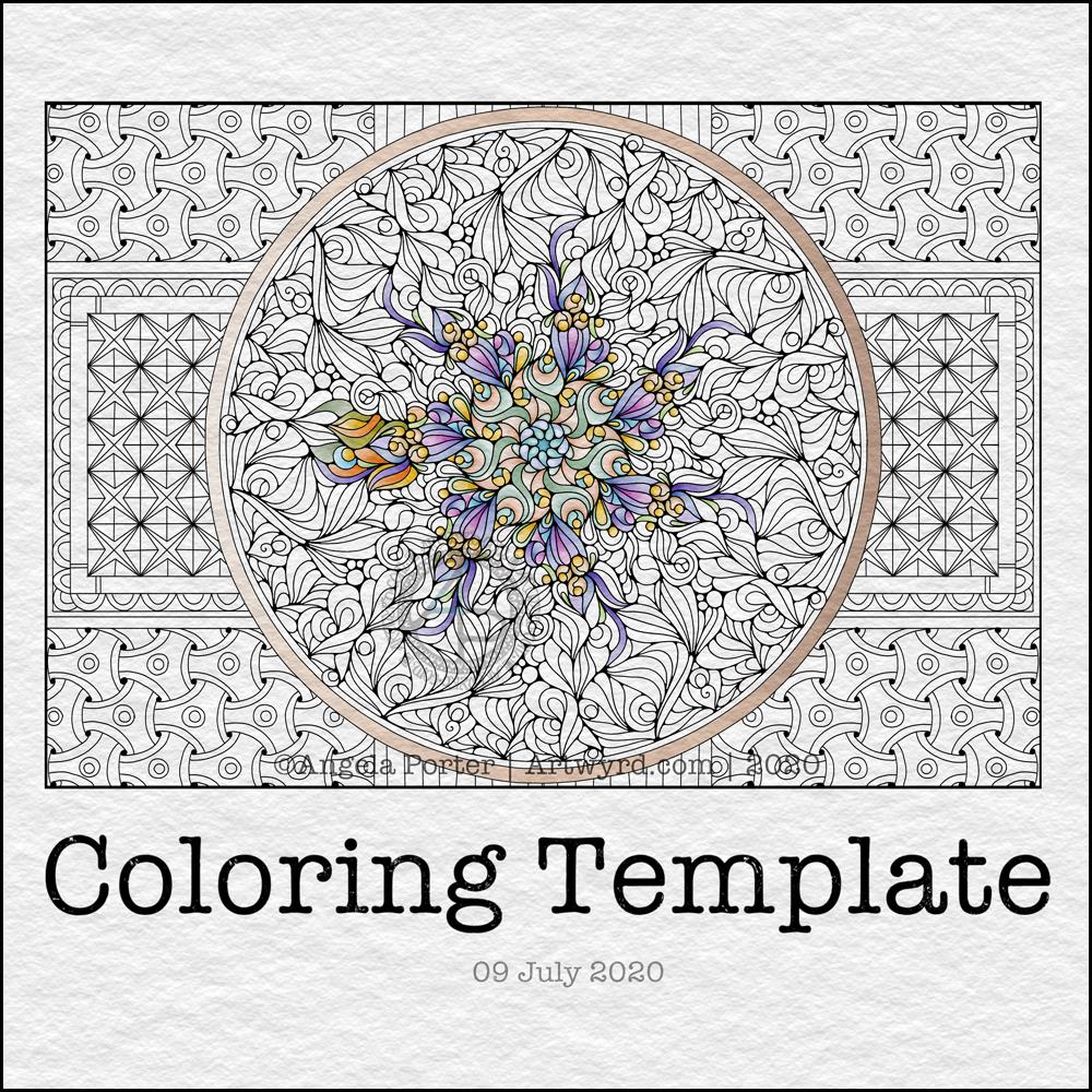
It’s free to join the group, and the template is a freebie for members of the group.
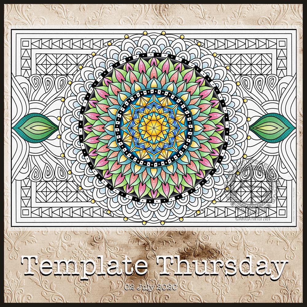
This week, I created a mandala design with a background of geometric, repeating patterns.
I’m still recovering from the stress of my first trip out since March 2020. Drawing (and colouring) mandalas is an incredibly peaceful, relaxing and mindful activity. So, it was natural that I drew one.
The mandala design is based on some of the abstract art I’ve been doing of late. It’s a bit unusual for my mandalas, but I really do like the organic flow of the lines.
Even though the design is abstract, the repeating symmetry of a mandala bring some structure to the design. I am looking forward to seeing how members of the group add colour to the design.
The geometric patterns in the background also result in a soothing, repetitive rhythm for colouring; a rhythm that results in soothing and calming ones mind and emotions.
De-stressing
I have been totally shaken by the level of anxiety/stress that resulted from my trip out on Tuesday. I am beginning to feel more my contented and calm self. However, I find I’m still irritable and grumpy and have withdrawn from social media and the like for most of the day.
It was a sobering thought when I realised I’d lived most of my life constantly at elevated stress levels, often as higher than what I experienced in the past couple of days.
It’s also a wonderful realisation that I can recognise this now, and I also am able to allow myself self-care time to let all the stress hormones leach from my body. It’s been a long time since they peaked in this way.
It makes me extremely grateful to my therapist for her years of patient work with me. Experiences like the Tuesday Trip remind me of how I used to be and show me how far I have come in recovery from cPTSD.
Yesterday, after my social media post, I binged watched the Harry Potter films from The Order of the Phoenix. I found I was irritated by crochet. I tried cross-stitch, which irritated me too. Eventually, I settled on knitting, which, oddly, soothed me. I think it’s because I could knit and watch the film. Knitting allowed me to channel my irritability into something creative. As I can knit without looking at the knitting, I could also watch and immerse myself in the films at the same time.
My fingers are itching to knit again, now I’ve thought about it.
Even though I slept well last night, I’m still feeling really tired today. This happens as part of the post-stress come-down. It can last a few days. I’ll not be rushing to nap, however. Napping has a knock-on effect on my ability to sleep at night when I’m like this. My naps tend to end up as periods of deep sleep, so I try not to take them unless it’s absolutely necessary.
This week, I’ve decided to do a mandala. Mainly because I find mandalas incredibly soothing and calming to draw. I have drawn and coloured the mandala digitally in Autodesk Sketchbook Pro.
As always, the template is only available to members of the group. It’s free to join the group, and free to download the template. All I ask in return is that you follow the terms and conditions, don’t share the uncoloured template, and credit me with the artwork when you post your wonderful colourations online.
This week, I’ve created a rather abstract but typically entangled ‘Angela’ kind of template.
If you’d like to download the template to colour, you do need to be a member of the facebook group – it’s free to join and free to download the template (terms and conditions of use apply).
I’ve had some time this morning to do some more to this abstract art piece. I’m still learning about digital art and how it can work for me, but I’m feeling quite pleased with how this is growing, bit by bit.
As I work on it, I’m changing it from the sketch, which is often the case; the sketch is just a suggestion, and outline, a whisper of an idea.
The crisp, clean lines of digital art really appeal to me in this piece, as do the more muted colours.
Plenty more left to do on it, so daily updates will continue.
I’ve had a lovely couple of hours working on this particular piece of art. It is an abstract pattern, but the emphasis will be on shape and colour.
I drew the design out on paper and scanned it in to complete the artwork digitally in Autodesk Sketchbook Pro.
I was inspired by the work of Shell Rummel, and it reminded me of the type of art I did in my early arty exploratory days.
I wanted a watercolour feel to the art, so I’ve chosen to use rather soft colours and to try to keep the palette relatively limited. I also want to keep the extra patterns/lines to a minimum, though I do want some more detailed interest in places, such as the dots along the centre line of a leaf motif. This is going to be hard for me to do; I usually insist on filling every space with pattern and colour.
It’s also odd for me to work from a pencil sketch, usually I’m straight to pen on paper (or pen on screen). I do find it a lot easier to get my ideas/outlines onto paper than I do on the screen, and my lines flow. I think it’s because I get a better idea of the overall design as I do have a habit of zooming into whatever area I’m working on.
Overlaying a watercolour paper texture takes the art from the rather mechanical feel of digital art to something more textured and interesting, warmer and ‘human’ in feel.
This will take me a long time to complete, most probably over several days as I do have to do other stuff at this time. But it’ll be a nice thing to do as my ‘warm up’ art in the morning.
Tonight, at 10:43 BST, the Sun appears to enter Cancer, as viewed from the Earth. Of course, it’s the Earth that is moving around the Sun. Today, marks the official start of summer, but it also marks the time when we have the days of most light here in the Northern Hemisphere, and we’ll soon notice there’s not quite so much daylight at the end of our days.
This year, English Heritage are live-streaming the solstice sunrise tomorrow morning on their facebook page. You’ll have to be up early (or just not go to bed!) as they start streaming from 04:07BST, with sunrise at 04:52BST. I’m certainly going to do my best to watch it. This is one of the good things to come out of the pandemic. The live stream hasn’t been done before. I would never go to Stonehenge on either Solstice as there would be too many people and far too much noise and bustle for me, but this is a nice way to see it as it happens, not recorded and shown after the fact.
I’ve always felt an affinity with the cycle of the seasons and marking the solstices and equinoxes has felt far more natural to me than any religious celebrations. The scientist in me appreciates the facts around these dates in the calendar, my heart and soul appreciate them in different ways that are personal to me.
I found this quote about the solstices, and it sums up a little bit about how I feel about them.
The artwork shows a lot more about how I’m feeling today – not quite with it, spaced out, emotional and well out of sorts. I had an idea in mind, but I just couldn’t execute it to my satisfaction today. It looks like I need another self-care day. Which is fine. I’ve learned that sometimes it’s best to go slow in order to go fast. By taking time out from commitments, I return to them in a better frame of mind and emotional state and I’m more able to fulfil them to my satisfaction for sure.
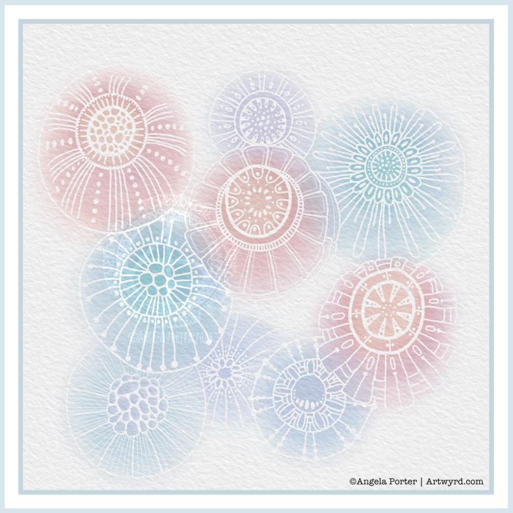
Another morning, another play around with watercolours, this time digitally.
Soft balls of watercolour, fuzzy edges, with white ink details added on top. Layers of transparent colour.
I overlaid a watercolour paper texture, which helps give the right ‘feel’.
This is my favourite attempt at digital ‘watercolours’ so far. I definitely like using white ink in this instance; black ink was just too harsh, hard and jarred uncomfortably with the softness of the watercolours.
I tried lots of ways of adding colour; not just brushes, but different brush effects. In the end I was happiest with white ink.
A nice way to spend a couple of hours as I wake up.