Mixed media cards – shells and fish

AngelaPorter_Cards1_10June2017AngelaPorter_Cards2_10June2017AngelaPorter_Cards3_10June2017AngelaPorter_Cards4_10June2017

Over the past few days I’ve been drawing shells, flowers, fish and fungi and sorting them out to be digi-stamps, work all done on my Microsoft Surface Book.  Some have been printed, coloured using my Chameleon Color Tones and Color Tops pens, cut out and mounted on mixed media backgrounds.  The photos above show the fruits of my labours.

Apart from the Chameleon markers, the media I have used are:

  • Distress and Distress Oxide inks
  • Iridescent and metallic paints from Liquitex and Pebeo.
  • Perfect pearls sprays
  • Stencils
  • Stamps
  • Black Archival Ink
  • Inktense pencils
  • 3D Crystal Lacquer
  • Alchemy Wax

I think that’s the complete list of media.  I used mixed media paper for the backgrounds, and the paper was cut out using rectangular dies.  Behind the backgrounds, I used silver mirriboard as a mat.

I’m quite pleased with them.  No so sure about the kraft card bases (which are 5¾” x 4″ in size), but they were what I had.

Now, all I have to do is work out a price for them and pop them into my Etsy shop, though I think I will have to take better photos for that!

Shell Drawings and Chameleon Pens

AngelaPorter_6June_2017_ColouredShells

Between counselling and errands today, I’ve managed to create over 30 shell ‘digi stamps’ or individual images I can re-size and print out as needed by me, though I am considering putting them together as sets of digi-stamps, though I do need to add line detail to quite a few; that’s a job for another day.

I printed out a few of them on A4 paper, and used my Chameleon Pens to colour them in, and here’s the result – very brightly coloured.

My only problem is to work out what to do with them!  Do I use them in some mixed media index cards or bigger work?  Do I use them to make greetings cards?  Is there something else I could do with them?

At the moment I don’t quite know, but I’ll work it.  First I need to cut them all out.  Hopefully, my scissor skills will improve …

Oh, I drew the shells on my Microsoft Surface book in Autodesk Sketchbook Pro.

Mixed media index cards – 3 June 2016

AngelaPorter_3June2017_MixedMediaIndexCard1

Two more index card done!

I drew the fungi then coloured them with the Chameleon Color Tones and Color Tops pens.  Cogs have appeared in the background once again – gotta have a lil bit of steampunkishness!

I’ve used 3D Crystal Lacquer on the fungi caps and on the stars in the background.

I’m liking the slightly bigger format of the index cards compared to ATCs.

Chameleon Color Tones, Color Tops and a Coloured Mandala

SixColoured_AngelaPorter_3June2017

Yesterday, I recieved a big box filled with goodies – a full set of the Chameleon Color Tops to go with my Chameleon Color Tones markers, as well as a full set of ink refils for them

I couldn’t wait to try them out, and did on a couple of small fungi I’d drawn, which you’ll see in another blog post as I want to use them on some mixed media index cards.  I loved using them, and so wanted to do something a bit bigger, and the mandala above was the result.

What I love is the ability to create smooth gradations between one colour and another, with out the fuss of using two color tone pens to achieve this.  Of course, I still love the original colourless to full colour color gradation, and have used this in the mandala on parts of the butterflies.

However, I love strong, bright colours, and the Chameleon Color Tops are fab for doing this!

Now, I do have a full set of Copic Ciao markers, which are great.  However, achieving a smooth colour blend is quite difficult, especially with colours that are far apart in intensity or colour.  You can use the tip to tip method of transferring colour from one pen to another and use the pen to blend the colour a bit better, but I still struggle, even on specialist marker paper.

Not any more!

What I haven’t done is to look at how the pens blend when the colours are from different colour groups, such as blending a green to a red, but you can guarantee I’m going to try them out.  Apart from them maybe creating some mud where the colours overlap (which would happen anyway), I have confidence they’ll do this just fine and dandy.

Mandalas a-plenty

Colorist app update

Doodleworlds1

I was pleased to be told by Shelly and Kelly at Faction Apps that there’s been an update to the Colorist app.  That means I had to have another play!

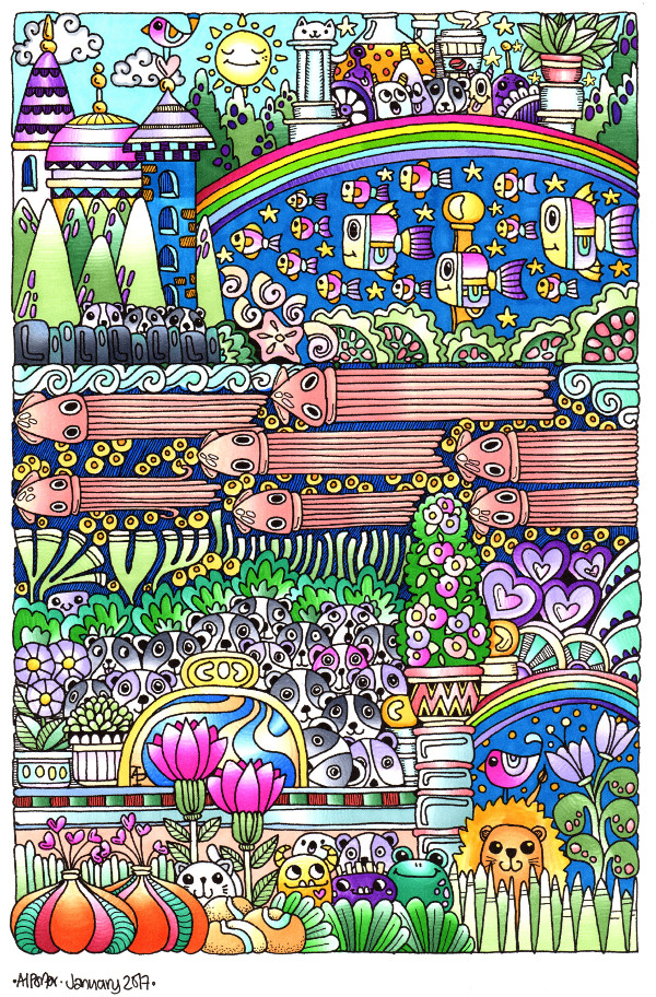
The image above is one from my first book for the Colorist app – Doodle Worlds.  Many areas have been filled in using the original pencil tool, which is great as it allows for overlaying of colours as well as being pressure sensitive if your device allows for that (my Microsoft Surface Book certainly does!).

It took me a while to get used to how the pencil works in the app, but that’s not a problem as either the undo or eraser tools allow you to completely remove anything you’re not happy with.  (The eraser is also useful for removing colour to create a highlight!).

Bucket Tool

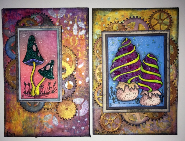
One of the new tools is a bucket-fill, which is great for filling areas with flat, solid colour.  I used this tool for the pink monster.  The pencil tool can then be used to add shading/highlights over the base colour.

A useful tool is the bucket tool as it allows for quickly filling areas with a solid colour, even teeny-tiny areas thanks to the ability to zoom in on the image! This saves some time and effort, which can then be spent on carefully adding the shading and highlights to the area.

Marker Tool

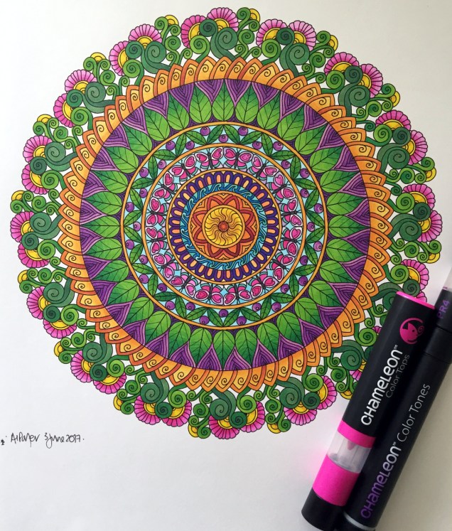
This is my favourite addition to the tool box in the Colorist app!  I love the solid colour it lays down. The colours aren’t transparent, however, so blending isn’t yet possible with them ( perhaps that’ll appear in a future update of the app).  Markers (especially Chameleon pens) are my favourite way of adding colour to drawings like this on paper, so I look forward to this tool being developed more in the future (fingers crossed and maybe a bit of pleading from me!).

What I love most about this tool is that I can draw and doodle and add texture and pattern to the image with the solid lines that I prefer in my art. I did this with ease on the flower next to the orange and white stripey twisty thing.

The wide range of colours available in the colour palette mean that highlights and shadows can be achieved, so long as a subtle blend from one colour to another isn’t required.  However, I’ve just thought that a clever use of the pencil tool may allow this to happen.  I’ll have to try that out!

Eyedropper tool

I didn’t make any use of this tool, but I’m likely to in the future as it means that you can easily select a colour you’ve previously used in the image being coloured without going to the palette and ttrying to remember just which shade of, say, blue it was you used.

Sketching in the Colorist App

Angela one

The ability to sketch within the app, and save the drawings too, is the fab new feature.  I really like this, especially with the marker pen tool.

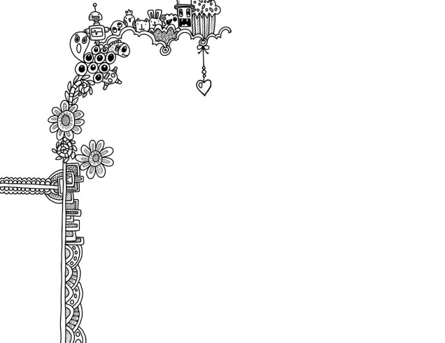
Usually, I use Autodesk Sketchbook  for drawing on my Surface book.  One of the weird things about drawing on the Surface with the pen is that there always seems to be some wobble in the line, even if the line drawn is smooth.  Autodesk has a smoothing tool, which in the Pro version you can set to a level that suits the art  you are doing at the time.

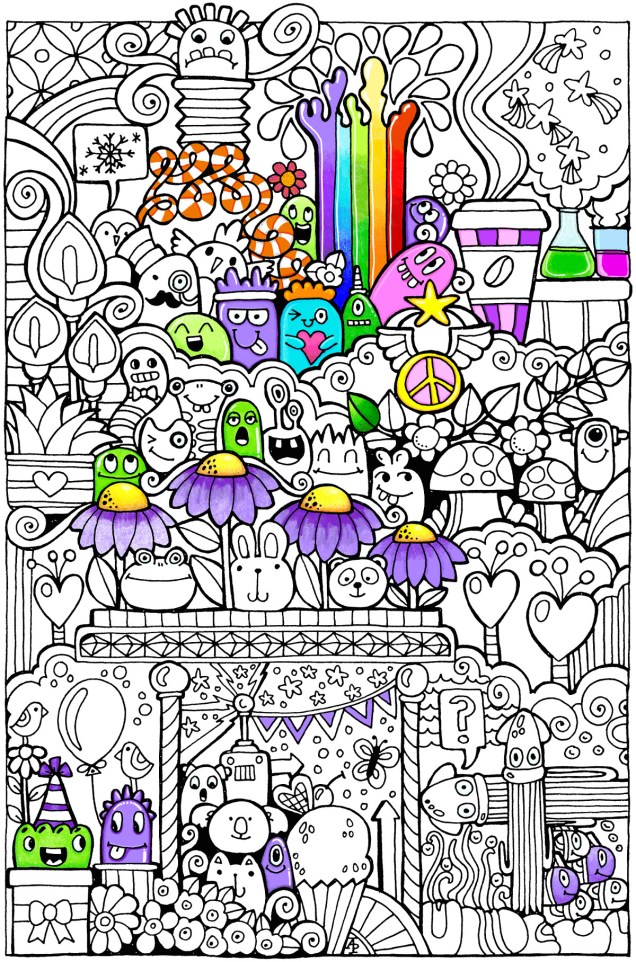
Although the Sketch function in Colorist doesn’t have the smoothing tool (yet?) it works just as well as Sketchbook for the kind of doodly, abstract, whimsical art I do.  The image above is a drawing I did in Colorist last night, it took an hour or so to achieve.

I enjoyed using this function, though not being able to rotate the digi-paper meant it was a tad awkward for me to draw certain things.  However, Colorist isn’t designed as a  dedicated drawing/art app, but I do wonder if a ‘pro’ version could be developed where a small fee is paid for such a functionality. The latest updates certainly suggest to me that there’s a possibility that this could be a direction the app could take in the future.

My verdict

I really like the updates, especially the marker and the sketch function. Congratulations to all at Faction Apps!

The suggestions I’ve made above for extending the additions in the future are not criticisms of the great updates made, but they would take this app beyond that of being just a colouring app, so I’m well aware they may not happen.

However, I do believe this app could evolve from being a colouring app into something more…

February’s First Doodle

This is a work in progress.  The line art is done and I’m starting to colour it in. I’ve used Chameleon pens so far, though as I progress I may use Copics or Promarkers to fill in some areas.

angela-porter20170201_001small

This mornings doodle all coloured.

Coloured using Chameleon Pens.

angela-porter20170121_008small

More things from Hampton Art and coloured doodle art

I had a bit of a surprise package today.  Inside were some more stamps and dies that I designed and have now been produced by Hampton Art.  They’re perfect for card making, paper crafts, planners, journals and scrapbooks!

I’ve also coloured in the doodle art from yesterday. I used a mixture of Copic Ciao markers, Chameleon markers and some coloured pencils. I’m quite pleased with the colouring, learned some new tricks with the Chameleon markers, which means I’d do things a little differently if I coloured it again.

angela-porter20170119_002

Spectrum Noir Illustrator pens – Review

Today, I popped into my local craft shop – Dandie Crafts (Dandie Crafts Facebook Page)- in their new premises in Caerphilly.

The shop is larger, smells fresh and new, has more space for stock and much more space for classes and demos.  The warm welcome was very much the same.

I had gone there to stock up on paper for my printer; I like their own range of acid-free heavy-weight paper (usually 160g/m²) and found the Spectrum Noir Illustrator  twin-tip alcohol markers in stock.

I bought the six packs of pens, which cost £12.99, so the pens work out a little over £2 each, which is about half the price of a Copic Sketch marker, Promarkers you can get for a little over £1 each at the moment.

Debbie, the lovely lady in charge today, told me they’re supposed to be a new formulation of ink that blends more easily with quality Japanese nibs.  One of the nibs is a bullet nib, the other a brush nib.

On the Illustrator marker packaging it says:

For smooth, natural linework and detailed colouring.  Fully blendable, streak-free coverage.  Perfect for drawing and illustration.

So, I just had to buy and try them out!

I drew the design using the True Black marker and the bullet tip.

The bullet tip isn’t as fine as I thought it would be.  The tip is softer than the bullet tips found on the Promarker pens.  Personally, I’d prefer the bullet nibs to be firmer.

The pen drew nicely with plenty of ink in the new pen (something that hasn’t always happened with my experience of Spectrum Noir pens in the past).  Also, the ink seems jucier in a different way that I can’t describe.  It does seem to be a different formulation.

The black lines are thicker than I’d usually draw, but I’m hoping they’ll give a stained-glass kind of feel to the art.

Once I’d inked out the design on 160gsm smooth white card, I started to colour in the design using just two colour blending.  That was going to be a bit of a challenge as I have eight of the six pen sets which aren’t the full range of colours in the Illustrator pens.

What I did notice is that the colours do blend much more easily than the original Spectrum Noir markers, and also the Promarkers and the Copics!  The ink in the Illustrator pens is definitely different to the others.

Also, where I coloured fairly large areas with one colour, there was no streaking!  Admittedly I didn’t colour a huge area, but so far so good.  The lack of streaks was the case with both the bullet nib and the brush nib.

For the green leaves, I also used a tip-to-tip method to transfer a little of the darker colour on to the lighter colour to help blending with two quite different shades of green. That worked well.

The brush nib is made up of fibres that do spread out – more like the Chameleon pen nibs than Copics.  I don’t now how that will affect their ability to get into small nooks and crannies as they are used over time.

I also noticed that the inks are a lot more vibrant and ‘cleaner’ in colour than the original Spectrum Noir pens, which is a huge plus for them.

The only downside is that as I was colouring, the inks would blend out the black ink, so some of the lines have bled where I don’t want them to bleed.

I do need to test them out with the usual pens I use for drawing and also with the Epson Ultra-brite ink I favour, which hasn’t been affected by alcohol markers previously.

Overall, I’m happy with the pens.  I most probably will get the full set of 96 and will use them along with my other alcohol markers as I’m sure they’ll work well with them.