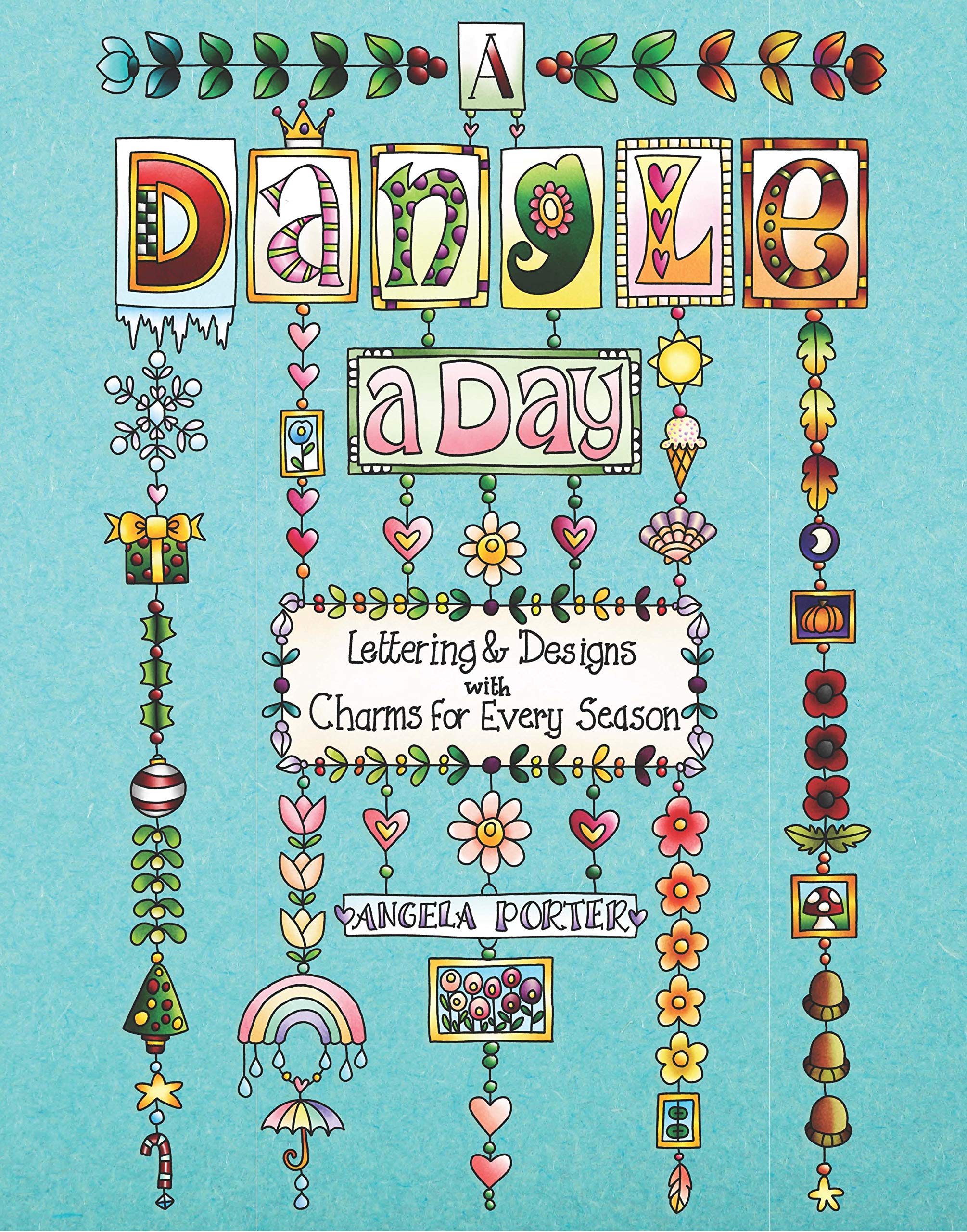
Today’s the day! A Dangle A Day is published in the US. Thursday is the day for the UK. It’s my very first tutorial book and the reviews I’ve seen so far are lovely!
Well over 100 dangle designs in the book with step by step instructions for each. Simple steps leading to even quite complex designs. Whimsical, cute charms. Funky monogram dangles. Plenty for each season and most occasions. I’ve also written encouraging words as everyone can draw dangles and they are perfectly imperfect which is what makes them personal and unique!
I’d love to see what dangles you create and how you use them – in your bujo, planner, journal, diary, scrapbook, or as greeting cards, note cards, book marks, gift bags, envelopes, framed art, or any other way you can think of! Tag me on twitter, instagram or facebook!
Naturally, I have a stinking, streaming cold and I feel rough as anything. I don’t think I’ll get much in the way of art done today. Coughing, sneezing, runny eyes and a thumping headache don’t do much for focus.
A couple of days ago I was musing about using a photograph instead of a monogram in a dangle design. That idea stuck with me and so I set out to make a card.
I had seen somewhere the Photobooth Ephemera by Tim Holtz and I was able to source a set at a sensible price. This pack contains thirty strips of three passport-sized, vintage, copyright free photos. Perfect for me as I have very few photos and none are a small enough size to be used in this way. Also, the photos are printed on fairly sturdy card.
I first started by trimming the photo and then tracing around it on a sheet of thick white printer paper. It was then easy to draw pencil lines to give a border or two around the photo as well as a pencil guide line for a central dangle.
My next job was to draw the flowers at the top of the design. I started with the big central blue flower and worked my way out, adding leaves and swirls as I went. The design here is symmetrical, but not perfectly so. I had to add some butterflies to finish this part of the design off.
My next steps involved drawing the borders. I wanted a black and white chequerboard pattern around the photo. I also added a thinner border around it.
My next step was to create a ribbon for the hand lettered sentiment ‘Hello friend’. I drew a pencil box, added some pencil guidelines for the height of the letters, then wrote the greeting in pencil so I could get the placement of the letters good enough.
My next step was to ink in the letters using a black Sakura Pigma PN pen, which I used for the rest of the drawing. I wasn’t concerned about perfection here. I wanted a kind of cutely whimsical feel to the lettering. For some reason, I always think adding wonky and uneven serifs to the letters helps a little with this. The final job was to draw the ribbon box with the cute ends.
I then needed to decide on the charms I’d use to build the dangle. Hearts are a foregone conclusion. When I think of time I spend with friends, tea and cake are often involved, so adding a coffee/tea cup along with a cupcake (or fairy cake as we used to call them here in the UK) was perfect. I joined the charms with small beads and a circular charm containing another heart.
To colour the dangle design I used copic markers. I did use two shades of pink for the greeting and the cupcake case. Everywhere else I used just one flat colour.
I used a fine brush and some black ink to fill in the square at the centre of the design. Next, I trimmed the paper around the design. I then used a foam ink applicator with Vintage Photo Distress Ink to edge the paper. I always feel that edging paper in this way not only gives a little bit of a vintage feel to it, which is in keeping with the photo, but it also gives a finished edge to the paper.
To mount the photo here I used some adhesive foam squares. These lift the photo above the paper, adding a little bit of dimension to the card. The photo was a little bit smaller than the square I’d drawn and so the black background gave black border around the photo. I then used a golden yellow copic marker to colour some clear adhesive gems and I attached three of them to the photo, just to add a bit more sparkle.
I used Chameleon duotone pencils to add shadow to the design elements. I also used a dip pen and gold FW ink to add some little dots here and there around the design as well as on the photo. Not sure that on the photo was such a great idea though. But once the dots were there, they had to stay there. The gold dots, however, did match the gold gems I’d added to the photo.
The final step was to affix the design to a blank card. I didn’t think to cut my paper to the size of blank cards I had in my stash before I started to work on the dangle design. I found that my design was too long. So, I just took a piece of A4 bristol board, folded it in half along the short edge. I burnished the fold and then attached the dangle design to the paper using strong double sided sticky tape.
To add a bit more dimension to the card, I could’ve used foam squares or a piece of fun foam cut to a little smaller than the paper the design is on. Fun foam would support the paper better, especially as I had a relatively weighty photo adhered to the paper already.
Instead of foam, I could’ve cut a piece of metallic card a little bigger than the design to give a metallic edge to it.
I decided, though, that there was enough dimension on the card with the photo.
I also could have used a Wink of Stella brush pen or a Spectrum Noir sparkle pen to add some shimmer to the design elements, but I decided that the gold dots were enough. However, I may go back and add some to the butterfly wings; butterflies should always shimmer and shine wherever possible as far as I’m concerned!
The only other thing I’d need to do is to make a custom envelope to fit the card.
I enjoyed making the card. My card making skills aren’t brilliant, but I kept it fairly simple, as I did for the dangle design itself and the colouring.
Oh, the patterned background for the photo is one I created from one of my mandala designs using Repper Pro, just in case you were curious! I thought it’s vintage feel would go nicely with the card.
On the whole, I’m quite happy with this card. I had serious doubts that it wouldn’t work out. It has, better than I thought it would. I think I need to make more of these in the future!
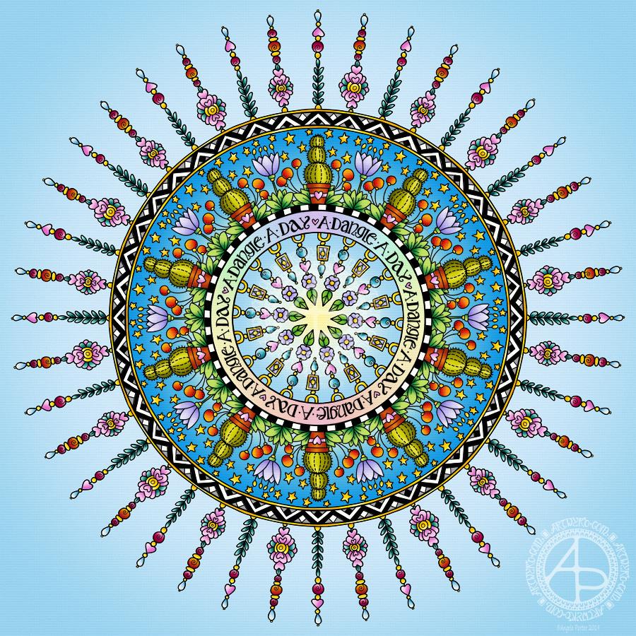
Dangles can be turned into mandalas! And ‘dangle-dalas’ satisfy my love of symmetry in an unusual way.
In this one, I have two rings to which dangles are attached. In the centre ring, they point towards the centre of the mandala. On the outer ring, they point out into space.
Then, there’s two central rings. One, I coloured in a pastel rainbow and added ‘A Dangle A Day’ in my weird take on hand-lettered uncials. The lettering isn’t perfect, but then neither am I, and neither were celtic/anglo-saxon/medieval manuscripts.
Ok, the manuscripts are more perfect than my hand lettering, but it’ll do. It’s perfectly imperfect. That is an idea I’m becoming to embrace more and more easily as time goes on, and an idea that I encourage you to adopt in my book ‘A Dangle A Day’.
I used rather graphic black and white geometric designs to separate the three main rings of the design. This contrasts nicely with the brightly colourful design elements.
I felt the need to draw cacti, flowers and some weird seeds today, so that’s what I did. Of course it goes without saying that I’d have to include stars and hearts in my design! There’s some beads in there too, particularly those teardrop shaped ones that remind me so much of medieval jewellery.
Mind you, medieval in character this design is not. It is rather cute and whimsical, which is one of my signature styles – the other is intricacy.
For this design, I hand drew and coloured it digitally using a Microsoft Surface Pen on the screen of my Microsoft Surface Studio. As always, my chosen art software was Autodesk Sketchbook Pro.
Yes, I really do draw on my Surface Studio with the Surface Pen as if I’m drawing with, say, a fountain pen on paper. Colouring I often do as if I’m colouring with traditional media, though sometimes I do use gradient fills. It just depends on the feel I want in the final artwork.
Being able to work in layers means I can do things that would be very difficult or time-consuming working traditionally. It also means that I can play with colour combinations – I love colour, but I don’t always make good choices of colour palettes, see yesterday’s Q monograms for evidence of that!
Of course, there’s so much more to digital art than this, and I’ve not discovered everything yet. But over time my experience is that I discover, workout or learn how to do what I need to do at that time when I’m ready to do that.
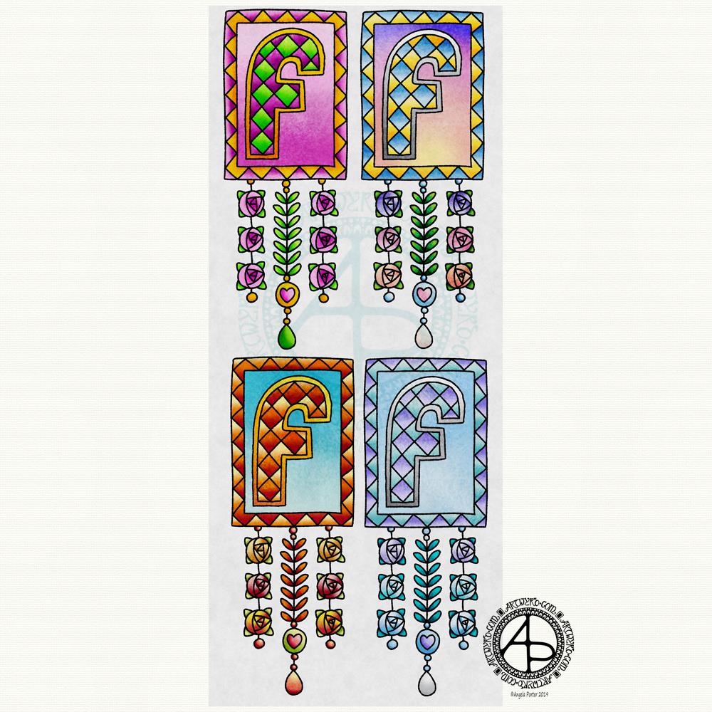
Following on from yesterday’s blog post (One dangle design, four colourways) I thought I’d do another monogram dangle design, but this time adding some embellishments.
The design for the Q monogram comes from my book ‘A Dangle A Day’ (published on 15 Jan 2019). I printed the design out on heavyweight printer paper and used a combination of Chameleon markers, Copic Markers and Chameleon pencils to colour the designs. The original drawing was hand drawn using a Microsoft Surface Pen on a Microsoft Surface Studio using Autodesk Sketchbook Pro.
Once I’d finished the colouring, I then added some embellishments. I’m not a good photographer and sparkly and shiny elements are not easy to photograph, and even worse to scan!
Here’s the details of the embellishments I added:
Aqua coloured Nuvo Glitter drops can be seen dotted around and within the design. These really sparkle and catch the light; they also dry raised, like a sparkly water drop. I also used a Wink of Stella brush pen to add subtle sparkle to the hearts and flower. Then, I realised that the Q was lost in the blue background which was similar in tonal value to the letter. So, I used an extra fine fountain pen to add a pattern made of various sizes of tiny circles to the background.
I just used gold Nuvo drops to embellish the design as well as Wink of Stella to add some subtle shimmer to the hearts and flower.
I used a Spectrum Noir clear sparkle pen to add shimmer and shine to the letter and the hearts. Dots of silver Nuvo glitter drops were added around the design. I also used a gold glitter Uniball Signo pen to add dots to the letter and the centre of the flower. Finally, I used an extra fine fountain pen with black ink to add the patterns in the frame. This helps the letter to stand out in the design. I also used Sakura Stardust Gelly Roll pens to colour in the arrow feathers. These pens allow the underlying colour to show through in a subtle way.
Orange-gold Nuvo glitter drops were added around the design. The clear Spectrum Noir sparkle pen was used to add shimmer and shine to the letter and the dark blue ‘bars’ in the frames around the Q. Finally, I used the extra fine fountain pen with black ink to add patterns to the bars and the letter as well as a solid drop shadow to the left and bottom of the design elements to help them stand out.
These designs could be used for note cards or greetings cards, bookmarks and more. However, they’d make a beautiful ‘drop capital’ at the start of a quote or message.
Of course, it would be easy to substitute the Q for another letter or numeral, or even a cute doodle drawing. Instead of a drawing, you could affix an object such as a dried flower, a metal charm, a dimensional sticker, an inchie, or anything else you can think of. You could even put a small photograph in the frame instead of the letter, and this would make a unique, charming card or feature on a scrapbook, journal or bujo page.
Your options are only limited by your imagination and creativity!
In my book, ‘A Dangle A Day’, I mention that just by changing the colour scheme you can easily change the appearance of a dangle design for an occasion or to match someone’s favourite colours. So, I thought it would be nice to show an example of this.
I chose a simple monogram dangle design from the book; you can see it in the top left corner. This dangle design has a very spring-like feel to it with the lovely bright pinks and greens of the new, fresh flowers and leaves that blossom and bloom at this time of year.
Taking my cue from this, I coloured in three versions of this design in the seasonal colours.
At the top right is a summery version, with a lovely warm sunrise as the background to the letter, blue summer skies, warm golden sun, and the bright and warm colours of the flowers. A golden summer glow could be achieved by using a hint of gold Wink of Stella brush pen from Kuretake, or by adding dots of gold glittery wonderfulness.
Autumn tones were used in the bottom left version. Fiery oranges, reds and yellows and clear autumnal sky blues were used. Enamel dots, glitter pens or stickles would add sparks of autumnal glory to this design.
The final design has a definitely cool wintry colour scheme – icy blues, cool purple and the blue-green tones of evergreens, along with silver. To this I could add white snowflakes or stars with a gel pen, or dots of silver glitter with Stickles from Ranger or Nuvo Drops or a glitter gel pen. Using a Wink of Stella brush pen from Kuretake to colour over the design would result in a lovely, sparkly, frosty finish.
Of course, there are many, many ways that the designs could be embellished to suit your taste, supplies or the recipient. So much fun can be had adding embellishments which also personalise the design even more.
I hand drew the original design on paper and then digitally for the book. My tools were Microsoft Surface Pen, Microsoft Surface Studio and Autodesk Sketchbook Pro, which I also used for the colour variations above. I set the ‘brush’ pens up for the book so they mimicked the shapes/patterns pens on paper create and left lines a little wobbly and imperfect, just as I would when drawing on paper. Indeed, I very much treat my Surface Pen and Surface Studio screen as if they’re pen and paper in the way that I draw (and colour).
I do hope you’ll give dangle designs a go, and that you’ll show me the results of your work. You can find me online here:
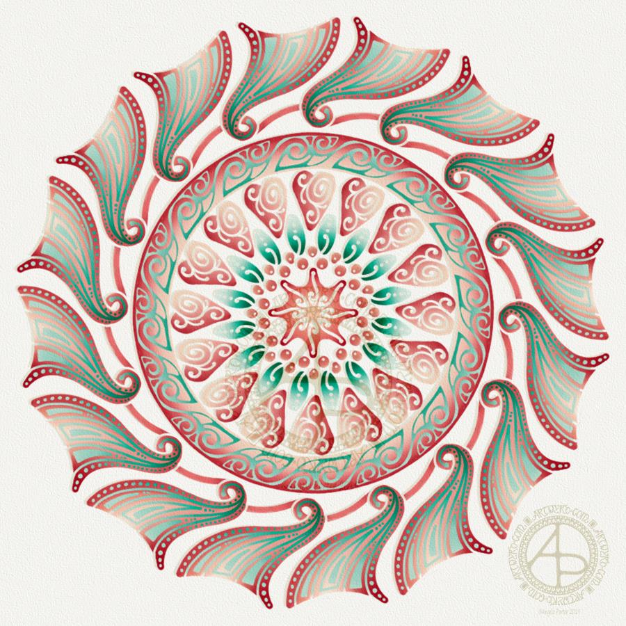
Today has been a bit of a busy day for me. I thought I’d spend a bit of time trying to reduce the level of anxiety I’m feeling at the moment by playing with my second mandala of yesterday in RepperPro. This is just one of twelve patterns I created quickly before dashing off out to a meeting this evening.
RepperPro is easy to use and has a variety of geometrical styles of seamless pattern that you can create. I sometimes like to do this with my artwork as it’s just another way of creating pretty art. Sometimes, the patterns/shapes that form inspire me for other art. Of course, if I choose to save the seamless tile, I can adjust colours and play with the patterns in it to create new tiles for seamless patterns if I choose to do so.
I’m absolutely sure it’s possible to create patterns like this in other ways, with pen and paper. I’ve tried to do so in the past, but my brain just doesn’t seem to understand the process. Software that does this for me is brilliant and a bit of fun for sure!
Don’t know what I’ll do with these patterns. Maybe use some of them for products in my Vida and Zippi shops – both of which need a serious overhaul and update.
This evening, I needed a bit of quiet, therapeutic arty-creative time. I had quite an emotional time in EMDR therapy (or not EMDR this week, a lot to talk about in preparation for the next phase of EMDR) and felt very much the need for some self-soothing and self-care.
I thought I’d spend some time drawing in colour again, using my digital toolbox of Autodesk Sketchbook Pro paired with Microsoft’s Surface Pen and Surface Studio.
I’m really quite pleased with how this little experiment has turned out. I like the way the colours play against each other – teal and coral being almost complementary colours. I like my La Tene/Celtic kind of swirls and motifs. I like the way I’ve put areas of background colour behind some of them to help them stand out from the background ‘paper’ more.
I’m getting more and more of a ‘feel’ as to how this style of art works for me, and I’m really enjoying creating these mandalas as a way of exploration.
People have asked if I’d turn these mandalas into a coloring book. The answer is probably yes. However it may take a little while to get to doing it.
Carl Jung is credited with introducing the Eastern concept of the mandala to Western thought and he believed it is symbolic of the inner process by which individuals grow toward fulfilling their potential for wholeness.
I’m sure Carl Jung would have a lot to say about my mandala and how it reflects what is going on inside me on an unconscious level, even though I’m not quite capable of making sense of it myself at this time of night!
While checking out the release date (which I’ve been getting a tad wrong, oops!) I noticed there were some reviews of the book. I’d like to say thank you to all the reviewers who wrote such lovely words about the book! It’s filled me with a bit more confidence and belief in myself as this is my very first art tutorial book.
There’s some hand lettering with the letter A. The letter A has dangles forming the inner part of the mandala. Then, the outer ring has simple and cutely whimsical doodle designs and yet another dangle forming it.
Of course, hearts and stars had to appear; they are my favourite design elements for many of my projects. I also like beads and gems too. Flowers and foliage are also favourite motifs, as are spirals.
I decided the ring of A’s need to be in a rainbow colour scheme and I chose a bright colour scheme for the design elements.
It looks complicated, but if you look at just one A and follow the dangle towards the centre and the design out to the outer rim you’ll see that it really isn’t all that complex.
Of course, drawing mandalas on paper can be time consuming. I usually draw mine digitally.
Autodesk Sketchbook Pro is now free and it’s my drawing software of choice. It has a symmetry tool that is really easy to use. You only draw one segment of the mandala which is then automatically repeated around the circle. I find Autodesk Sketchbook intuitive to use, and it’s easy to use almost straight away. It also has some rather sophisticated features on it and it does all that I need it to do, and more. I use a Microsoft Surface Pen along with Microsoft Surface Studio to draw and colour digitally, and they work wonderfully with Autodesk Sketchbook Pro.
I do colour my designs digitally. However, sometimes I will print out the black line art and then use traditional media (often Chameleon markers) to bring the line art to life with colour.
I do hope you will have a go at creating your own dangle designs. They look complicated, but they really aren’t! If you do have a go, then please share your designs with me on any of my social media homes – facebook, instagram, twitter or here!
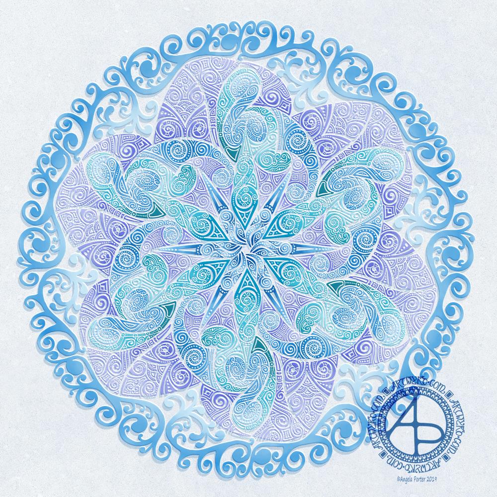
I’ve spent another quiet, calm and contented few hours drawing this mandala. Admittedly some of the shapes look a bit weird around the edges. However, it’s all about me learning and embedding new skills when it comes to drawing digital art.
Microsoft Surface Pen, Microsoft Surface Studio and Autodesk Sketchbook Pro were my tools for this one.
Some of the areas have patterns in them that remind me of Celtic, La Tene art, or of illuminated manuscripts such as the Book of Kells. These are art forms I’ve loved for as long as I remember and I think there are times when those patterns bubble up to the surface of my mind and find their way out through the tip of my pen! It’s nice when that happens and it surprises me!
I’ve had a very pleasant two or three hours this afternoon creating this mandala.
It’s quite different to my usual styles of mandalas and I rather like it. I also rather like the monochrome colour scheme which inspired the title of this mandala.
Drawing in colour is a departure for me from the usual black line drawings which are then filled in with colour and/or pattern. I’m uncomfortable drawing other things in colour without that black line to define their shape/form. But mandalas are a whole different thing. They are a way for me to explore this way of working with colour.
What is exciting is that I carve into bold shapes, removing colour and adding more designs and interest. This is something that working digitally has allowed me to both discover and to begin to explore. The ability to add colour, remove colour, refine by adding more colour, and so on is what makes creating something like this a little easier than with traditional media, but it is what is allowing me to express my creativity in different ways.
I am really pleased with this design. It’s one of those that makes me smile for two main reasons. The first is I like it, lots. The second is the satisfaction of exploring something new and discovering a new, different and personally satisfying way to work.
My drawing tool was a Microsoft Surface Pen. My paper was the screen of my Microsoft Surface Studio. Autodesk Sketchbook Pro provided my colours and other tools so I could create this mandala design, which I think is lovely.