Lavender Mandala

Mandala © Angela Porter | Artwyrd.com

I’ve been busy this morning, working out how to video record the screen of my computer as I draw digitally.

I found a YouTube video about using OBS Studio to do this. I followed the instructions, problem solved, and after three attempts I had a poor quality video that I wasn’t happy with.

So, I went to Movavi, a video editor I’ve used previously. It has an app that will record the screen, easily. It’s a one button click to launch. A simple, small, and minimalist control panel sits in the bottom right corner of the screen. I can record, pause, start again easily.

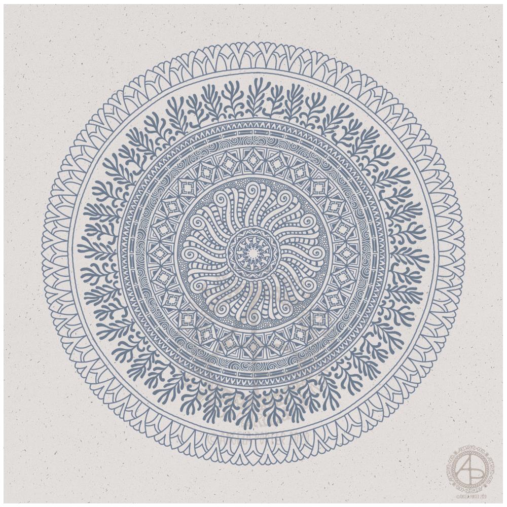
I recorded myself drawing the mandala above. The video is currently processing and being saved. I’ll then need to edit it. The still of the video I can see while this is happening is of a fab quality it seems. So fingers crossed the video will be too!

I didn’t think to look at Movavi before Googling for advice on recording the screen. I did have to buy the software, but it wasn’t extortionately expensive and I’m sure that it will meet my needs.

So, once the video is saved, I can spend sometime today editing it and I hope to upload it tomorrow, as long as the recording is of a good quality.

Yesterday, I had a day out with my friend Liz. We visited Hay On Wye for a walk around and lunch. It was one of those glorious winter days where the sun shines warmly and the air is crisp and cool. It was mild enough for me to walk around without a bulky coat.

Art Quote

Artwork (c) Angela Porter | Artwyrd.com

This is a drawing I did late last night as I settled down to sleep. It feels quite disjointed in places, which was how my mind felt in it’s state of tiredness. Even though I was tired, I wasn’t ready to sleep.

I thought I’d work with it, adding a background and colour to it. I wonder if adding colour will resolve the disjointed areas as it breathes life into the design.

I’ve only taken a short time this morning to ad some colour. I do have to do other things today. The colour certainly helps to lift it from the background, as well as adding dimension to the design.

I’ve chosen fairly dusky, dusty, pastel colours which seem to glow against the darker background. The pinks remind me of faded Victorian velvets.

I drew the design traditionally, using a Tombow Fudenosuke pen and ClaireFontaine dot grid paper. The flexible nib of the fudenosuke pen results in lines of varying thicknesses, and a drawing that reminds me of linocuts or woodcuts.

After scanning the drawing, I removed the dot grids and cleaned up the drawing digitally before adding a background.

I felt this needed quote to go with it, and this one spoke to me today. For the typography, I used Affinity Publisher. The rest of the digital work is being done in Autodesk Sketchbook Pro, using a Surface Pen and Surface Studio from Microsoft.

My art is always ‘pretty’, it’s how I express myself artistically. Some of my inspiration for patterns and motifs comes from things that other smay not consider ‘pretty’, such as rust, run down old industrial machines, ruined buildings.

My art does, I think, speak of who I am. It shows what I’m interested in, what patterns, motifs, shapes, textures, colours, and so on that I find aesthetically pleasing. It also shows, to those who look and think a bit deeper, what things interest me, from prehistoric art to Romanesque architecture to La Tene and Celtic art to Illuminated Manuscripts to flora, foliage, fungi, and lichen to fossils and shells to nature in general, and more besides.

I work very intuitively. It’s when I think too hard about what I want to do that things go to wrack and ruin.

By letting my intuition flow, then drawings have a way of coming together in a way that expresses how I’m feeling and what is fascinating me or soothing me at that time.

This drawing is an example of how my feelings come out. It’s only now I can recognise how disjointed I was feeling within myself last night, how I was out of sorts. I think that’s why the art jars with me today as that feeling has now passed by, like clouds in the wind. It’s a drawing that shows the weather my emotions were experiencing yesterday, weather that just happened and has no real source for it.

Abstract Flowers

Abstract Flowers © Angela Porter | Artwyrd.com

Abstract flowers with a simple mandala/wreath in the background. Created digitally using Autodesk Sketchbook Pro, Microsoft Surface Studio and Microsoft Surface Pen. Simple. Stylised. Satisfying to create.

“Shadow” – Inktober52

“Shadow” #Inktober 52, week 2
Artwork © Angela Porter | Artwyrd.com

I finished this artwork off this morning, finding a perfect quote about shadow, this week’s prompt for #inktober52.

Border design drawn using Unipin pens on dot grid paper. Typography was done using Affinity Publisher. Colour, background and composition were achieved in Autodesk Sketchbook Pro using a Surface Pen and Surface Studio by Microsoft.

Inktober52 – “Shadow” – WIP

Inktober52 “Shadow” WIP ©Angela Porter | Artwyrd.com

I managed to get a fair bit of colouring done yesterday and this morning. It never ceases to amaze me how colour can add so much dimension to the design, particularly as I use quite high contrast. It’s possible to see the dimension in the line art, but colour really brings it out.

There are areas that look a little flat, but I can sort those out later on by adding more shadow and highlight.

So far, I am pleased with how it’s working out. I’m also enjoying the hybrid art that results from traditional drawing and then the application of colour digitally.

Entangled Garden drawing

©Angela Porter | Artwyrd.com

Today, I have another entangled drawing for you to enjoy. I worked on it over the past couple of days. I think it’s taken me around six or seven hours to complete.

Because of all the floral and botanical motifs I’ve called it an Entangled Garden. A garden that has grown from my intuition and imagination.

I’m enjoying drawing these kind of illustrations at the moment. I really do have a fondness for botanical motifs, but also for arches and patterns inspired by Romanesque and Gothic architecture. There’s also some influence from Zentangle patterns too.

I’ve not added any shading to increase depth and dimension. There are places in the design that could benefit from a hint of shadow. However, I’m happy with it as it is.

As a drawing, it is a bit too fussy with intricate details to work as a coloring page as far as traditional media are concerned. However, I do know some colourists who would love the challenge of colouring a design like this!

Having said that, this kind of design, with less details, would be perfect for my next coloring book which I do need to start work on soon. I need the cover done for the publishers by the end of this month. So, I can take inspiration from the drawings I’ve been doing recently, though I do have some other ideas rattling around my brainbox too.

I used Uniball Unipin pens, along with ClaireFontaine dot grid paper. The size of the drawing is approx. 7.5″ x 10″.

I added the background colour and texture digitally, after removing the dots from the dot grid paper.

Entangled flora

©Angela Porter | Artwyrd.com

One of the nice things about being between contracts is being able to indulge myself in art. It’s also a chance for me to do ‘comfort art’, art that is in a familiar style that I don’t often do.

This is an example of ‘comfort art’. Art that is soothing to do, is intuitive and surprising in how it turns out. I start with pen and paper (dot grid in this case), and just start with a single motif. I then let the design grow from that point, organically and intuitively.

There are always sticking points where I want to give up as it doesn’t look right, or I’m not happy with what I’ve just drawn. However, I’ve learned to persevere past these points and the end design is usually one I’m happy enough with.

There were many sticking points in this one, some of which I thought were going to be shatter points.

Although I’ve deemed this illustration ‘done’, as I reflect on it now, I can see places where some added line texture would help the design be less homogeneous in places and would add some contrast.

Also, some shadows would help add dimension to the illustration. Having said that, colour would really bring the drawing to life too.

For now, though, this design is finished. Whether I work some more on it remains to be seen.

I used Uniball Unipin pens to draw this design, along with ClaireFontaine Sketch dotgrid paper. The only things I did digitally were to scan the design in, remove the dots of the dot grid, and add the background colour and texture and watermarks.

Entangled Lines – a video

©Angela Porter | Artwyrd.com

Here’s my video of my entangled design I showed yesterday. I really do have a lot to learn about making and editing videos. Still, I hope you enjoy having a look at it.

The drawing took over 55 minutes, though I’ve sped it up so it lasts around 17 minutes.

I used Faber-Castell Pitt Artist pens to draw the design on a 6″ x 6″ piece of Strathmore Vellum Bristol Paper that I had previously coloured with Tim Holtz’s Distress Inks by Ranger.

Never give up on hope

Artwork ©Angela Porter | Artwyrd.com

I woke earlier with the need for some self-caring, self-soothing art and a mandala is the only thing that does that at times.

I created a background using various shades of pink and red Distress Inks (Worn Lipstick, Abandoned Coral and Candied Apple). I scanned it in and then drew the mandala digitally.

I needed pink as a soothing colour, so I chose a monochrome (more or less) colour scheme for the mandala.

I knew I wanted a Star Wars quote, and I chose this one from The Clone Wars. I feel a Star Wars marathon coming on later today; something else that I find soothing.

First, though, I want to get some work done on colouring another illustration for the Spectacular Sea-life coloring book. This is yet more self-soothing.

Mandala 4 Dec 2019

Mandala 4 Dec 2019 ©Angela Porter | Artwyrd

I thought I’d use the coloured paper from yesterday in some digital art.