Be gentle to yourself

I often say to myself, “Angela, what on earth were you thinking?” This is one of those times.

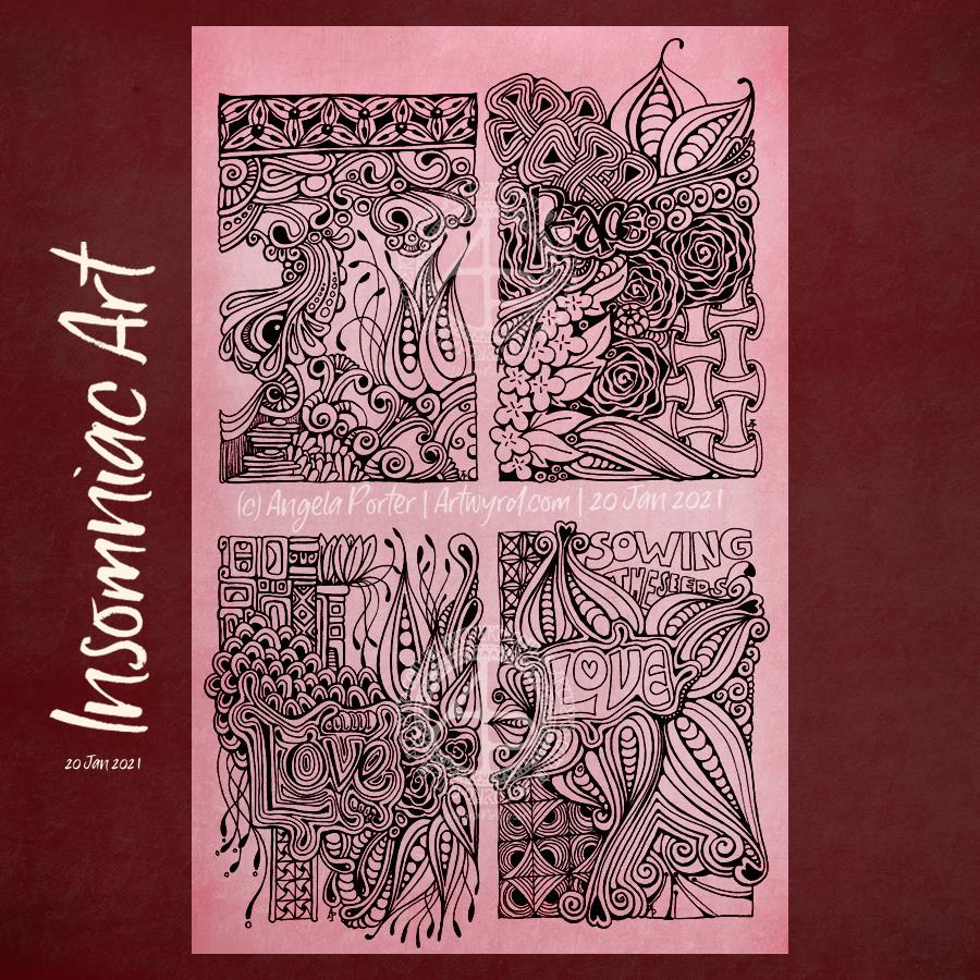
I started with hand lettering the words. Ok-ish Good enough to mess around with. And mess around them I did – with an “aura” and pattern, then more patterns and repeated motifs … until I’d mostly filled a square sketchbook page.

The drawing was OK. I liked some bits, others I didn’t.

Then, I thought, “What would it look like with colour? Let’s try Inktense and water!”

How often have I mused here about how I struggle with colour? All was going OK-ish with just pinks and greens … and then I added blues and browns…

The geometric pattern at the bottom were colours that didn’t fit well. So, I added watercolours to glaze the colours. Big mistake. I lost any sense of shadow and highlight …

So, I used a white graphite/chalk pencil to try to add the highlights back in …

YEUCH!

So, I put it to one side while I did some other stuff and had lunch.

Then, it caught my eye and with fresh eyes I thought that maybe it’s not as bad as I thought it was .. maybe.

I constantly do this – try to add colour with traditional media and fail. Monochrome seems to work best for me. Monochrome where I can play with shadow and light. Monochrome colours that are added digitally seems to work the best of all.

No matter how often I tell myself this, put notes up to remind me of this, I still insist on trying to use traditional coloured media.

I just think that I hope one day that something will just ‘click’ with me. Today wasn’t that day it seems!

So, back to either white or simple coloured backgrounds, and adding monochrome colours for the sense of dimensionality I like. And I have no hopes that I’ll remember this in a day, a week, or a month or two and I’ll end up asking myself the exact same question; “Angela, what were you thinking?”

The end result may be something I’m unhappy with, but adding colour was enjoyable. I just seem unable to stick to just one or two colours, with variations in their intensity and tone. Then, I descend, bit by bit, into insecurity and self-doubt and incredulity that I did it again!

Ho hum! Not to worry, it’s only pen, paper and some other media. It’s yet another experience to help me, hopefully, learn more and be more comfortable with my artistic style. If we did everything perfectly every time we’d never learn and grow.

So, back to a blank piece of paper with pens I go, and may make some art to remind me, “Angela, monochrome is best!”

Template Thursday

It’s Thursday again, and that makes it #TemplateThursday.

Each Thursday throughout the pandemic, I’ve created a coloring page / coloring template for the members of the Angela Porter’s Coloring Book Fans facebook group.

This week’s offering, is a geometric pattern, which reflects how drawing more geometric, structured work this week has helped me be contented with my artistic efforts. Something in my heart and soul needed the comfort of the repetition and the delight of symmetry. That led me to really feel the touchstone of contentment within me once again.

So, I thought that others might like such a geometric design.

And there’s so much that can be done with it. Color it as it is. Divide some of the smaller spaces with doodles or zentangle patterns. Look for what hidden patterns you can bring out. Play with light and shadow to add dimension to the design.

I’ve deliberately coloured my version in flat, spring-like colours. Maybe I’ll find time over the week to add more detail to it, and to play with shadow and light as I love to do!

Oh, I drew this on dot grid paper with an 05 Sakura Pigma Micron Pen before scanning in, cleaning up and coloring digitally.

Small, entangled drawings.

I really needed some structure to my artwork yesterday and early this morning. This kind of work has really hit the mark. The smaller size also meant I wasn’t feeling overwhelmed by the task. The symmetrical nature of the patterns/designs really soothed me. All these things let me find that sense of peace and contentment that I needed from art.

Making square ’tiles’.

I cut some 100% cotton watercolour paper into squares of different sizes, trying to get the most out of each sheet. These squares are either 4½” x 4½” or 3½ x 3½” in size (approx 11.5 cm x 11.5 cm or 9 cm x 9 cm).

Next, I used Tea Dye, Old Paper, Vintage Photo, Rusty Hinge, Gathered Twigs, and Old Burlap Distress Inks to colour the tiles. I used one colour only on each tile. On the watercolour paper the colour wasn’t even, and I really like the aged, distressed look that gives, along with the darker edge.

I set out a net of pencil lines to help keep my designs fairly symmetrical. I did draw the lines free hand rather than using a ruler. The result is perfectly imperfect symmetry. I then set to creating patterns/designs with 05 and 01 black Pigma Micron pens.

Other materials used.

In the bottom left tile, I used Carbothello pencils and a Prismacolor Ebony pencil to add colour and shadow to the design, smoothing them with a paper tortillon.

In some of the other tiles, I used Chameleon and Triplus fineliners to add detailed patterns to the design. A happy accident resulted in me using a waterbrush to see what I could do with it. The ink flowed to colour the space, but the pattern was still visible, but more subtle. I liked the effect! So, I made use of it in the designs.

That led to me experimenting with Inktense pencils and a waterbrush. These pencils are great for adding intense, waterproof colour to areas.

A white gelly roll pen was used to add highlights to all the designs. Also, a gold gelly roll pen was used to add metallic highlights to a couple of the designs.

Reflections

I like all of these tiles for different reasons. But I can see how I could add more shadow and highlight to the designs to bring out an illusion of depth and dimension. I may turn my attention to that in a short while.

There’s an antique feel to all the tiles, which is an unusual thing for me. But I do like it! Working on a coloured background really prompts me to play with shadow and highlight.

I do want to scan in the blank, coloured tiles to use as backgrounds in digital art. It’s the distressed nature of the colour along with the darker border that really appeals to me.

Now, I need to work out what to do with these little works of art. Also, my mind is trying to work out how I can convert these designs to coloring pages/templates. But, these will have to be looked at later on today. I’m really needing to sleep. I was up at stupid o’clock again, and I’m now beginning to flag, a lot.

Out of sorts art…

I’ve been feeling out of sorts for the last day or so. It’s gradually intensified. A broken night’s sleep really hasn’t helped. House freezing cold (deliberately so!), Angela boiling hot in waves (not illness, just age).

I did draw in the darkest parts of the night when I couldn’t sleep, but what I produced was just a reflection of my ‘out of sorts’ mood. I added words and reflections to the drawings to try to elucidate where this has come from. And then that went to how I could use art in a journal, could I create journal pages, little areas for thoughts/words of meaning, and so on. So I jotted those ideas down.

The larger drawings I was doing in the night just overwhelmed me. The more work I did, the more overwhelmed and dissatisfied I felt. So, in an attempt to create some art that would soothe rather than disturb, I decided to create some small pieces of art and some borders seemed the right thing to do. This quartet of drawings is the result of that solution I sought to help me with my mood and my attitude to my efforts at drawing.

Monday Mandala

Today’s mandala includes a couple of Zentangle patterns – Taiga by Tomas Padros and a variation on Fescue, an original Zentangle pattern. Plus some ‘orbs’.

This was fun to do. It’s not often I use such a large area of a pattern, but Taiga is such a lovely pattern and it’s taken me a long time to work out how to do it well. I didn’t think I’d managed it this time, until I added shadow and highlight. Then, it just became so dimensional and, to use the crafty vernacular, ‘popped’.

Today, I just wanted a mossy, spring-like green. There’s still snow lying on roofs and hilltops, cars and shaded pavements. The days are noticeably growing longer, and the bright sunlight today is most welcome after the fog of yesterday.

It won’t be long until I see brave snowdrops and crocuses breaking the winter-hard ground. They herald that the return of spring is nigh!

I’ll be waiting until the snow has mostly disappeared before I go and take a walk.

Sketchbook Page

These are two drawings I’ve been working on over the past three or so days. The whole page is A4 in size.

To draw them, I’ve been using Pilot Kakuno fountain pens with black ink. To add shadow and colour I’m using a mixture of Stabilo Carbothello, Daler-Rowney Artist’s Drawing and Prismacolor Ebony pencils. Along with some paper tortillons to blend the colour out. I’m also keeping the colour palette pretty limited – graphite black, two green Carbothello and Sanguine and Sepia Drawing pencils.

It’s fun to draw with a fountain pen. It’s also a lot of fun to use graphite and colour to bring depth and dimension to the drawing on paper rather than digitally for a change. I like to work both digitally and traditionally. Art is art!

I suspect the rest of the day is going to be filled with artsy pursuits, including finishing adding colour to these drawings.

We had snow overnight and the air is filled with a white fog too. Even though the layer of snow is just a couple of centimetres thick, it’s enough for me to want to stay inside. Snow is pretty to look at, but my sense of balance means it’s safest for me to stay cwtched up in the warm!

Template Thursday (…on a Saturday?)

I was without broadband from early Thursday morning until late yesterday afternoon. Hence the reason why this is late and I’ve not posted for a couple of days.

I did have internet access via my mobile phone and I used a mobile-hotspot so I could get online on my ‘puter. But, even on 4G, it was a tad slow on uploading and I have no idea if it would have coped with Zoom.

So, after a couple of meetings since it has been fixed, I’ve been able to finally scan and partly colour and post this week’s coloring template for the Angela Porter’s Coloring Book Fans facebook group.

This week it’s another typically ‘Angela’ entangled style of drawing. I used a Sakura Pigma Sensei 04 pen and A4 Bristol paper to draw this. After scanning, I added the background and some shadow and highlight.

Insomniac Art 20 Jan 2021

It was one of those nights. I woke way too early feeling way too hot, even though the windows were open in the Welsh Winter. Hot flashes, again. So, the only thing to do was to draw until I was cool enough to get back to sleep. That took until nearly 8 am, GMT.

These are the little drawings I completed during my insomniac hours. My Sakura Pigma Sensei 04 pen is nearly done – either the nib is too worn to work properly or the ink is mostly gone, I’m not entirely sure which. I know I have a heavy hand with pens and tend to wreck them before all the ink has gone.

Anyway, I witter. I’m still trying to figure out how to add words into my drawings. I’m not entirely sure I’m being successful in this. No doubt I’ll keep on trying though!

These were drawn on A4 acid-free cartridge paper in one of my current sketchbooks. I added the background colour digitally.

A page of small drawings

This is a page from one of my A4 sketchbooks. Six small drawings, a couple I’ve shown before, the rest are new. Some tweaks here and there as well.

All drawn with Sakura Pigma Micron or Sensei pens on white acid-free cartridge paper. The background has been added digitally.

No shadow or highlight on these, yet.

Monday Mandala

After doing some admin work this morning, I felt the need to create a mandala.

I decided to use one of the stylised bird heads from my recent drawings as a starting point, and, well, the design just grew from that.

There’s some zentangle-style patterns, and some that seem to be inspired by Meso-American architecture.

I think the drawing is done, just the shadow/highlight work to be continued with and completed. The small area I’ve done really lifts the design. It’s just working out how to get the digital brush settings just right!

I’m quietly pleased with it, so far, but I need to put it to one side for a while. This afternoon I need to work on the cover for my next colouring book for Creative Haven. The one thing both projects have in common is that they make me smile. And that is a good thing, a very good thing!