
Last two of the six Distress Oxide coloured 14 x 10 cm sheets of paper.


I really need to learn to take better photos! This doesn’t do the artwork justice at all, neither does the curled paper. If I manage to take a better photo I’ll update it.
*Update* The image on the left is a scanned image – the iridescence and metallic sheen are lost in the scan, but the image is clearer.
There are patches of textures ‘verdigris’ which has a rainbow iridescence on them, as well as similar colours and patterns elsewhere.
The background shimmers with copper and other iridescent colours, over a soft, chalky coloured surface achieved by using Distress Oxide inks.
I loved the background so much that I really didn’t want to work over it. However, this morning I decided to be brave and to wield a Pebeo Posca black pen to draw circle patterns on it, with the aim of adding colours that would be reminiscent of verdigris on copper.
I think I’ve achieved that in some small measure, and perhaps in a different way.
I learned a lot of things along the way, not least of which is to paint the circle BEFORE I add patterns to them with a pen! What I may do is prepare sheets of paper with the colours on I want in the circles, draw the patterns on them, cut them out and then collage them on the background to give a more 3D look to the art.
Art is all about experimentation, learning when things don’t work out as you’d like. However, when things don’t turn out or you think you’ve made a mistake, learn to accept it as a ‘creative opportunity’ and work with it. There are many ‘creative opportunities’ in this mixed media piece!
Media used:
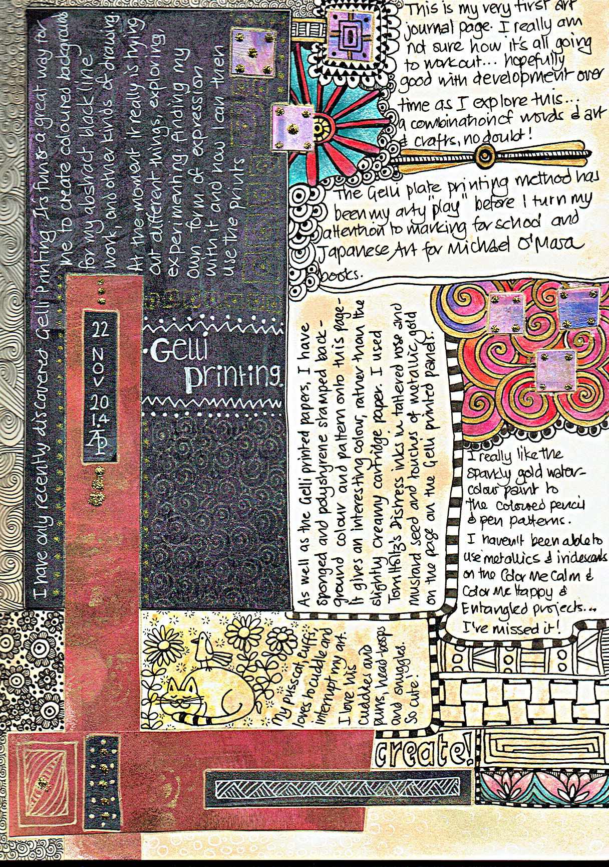
For a long, long while I’ve wanted to keep an art journal. However, I’ve been puzzled and confused and not sure what to do with it.
Yesterday, I decided the only way to find out how to do it or what to do with it was to just do it, and to use it as a way to experiment with media/techniques I don’t usually use (certainly when I’m doing the black and white line art for the various publishers I’ve done/doing work for).
It’s actually quite fun. I’ve found a way to make use of the sheets of Gelli printed patterns which aren’t much use for anything else as I’m playing with the Gelli plate(s). I’m using Tim Holtz’s Distress inks with sponges and home-made stamps/texture plates too.
It’s also a way for me to combine words and art, something I’ve never really been happy with.


Approx. 5″ square. Unipin pens and Zig Art and Graphic Twin pens with water as a wash. Metallic highlights.
I’ve been a little busy with some monograms. They’re either 7.5cm x 12cm or 10cm x 10cm in size. The rectangular ones are on watercolour paper, the square on bristol board.


This is approx. 7″ in diameter. It’s worked using UniBall Unipin pens, Caran D’Ache watersoluble coloured pencils and tiny amounts of gold paint and ink on heavy cartridge paper.
I’m not entirely sure that it works. I think I’ll have to step away from it for a while before evaluating it with fresh eyes.
In it’s defence, I must say I lost myself in the creativity of the process and it relaxed and soothed me and has let me practice some ideas.

This design started with the kind of infinity loop towards the top left. The loops coming from it eventually were seen as a letter ‘B’ and the word believe seemed to be the right one to put on this. Everything else grew, quite literally in some cases, from this point.
There are golden stars to wish upon and golden seeds and flowers and growth and sun and rain … and hope.
Approx. 6″ x 8″. The black lines were worked using Uni-Ball UniPin pens. Colour was applied using watercolours and gold watercolour paint. The paper is heavyweight cartridge.
As always, I am the owner of this creation and it may not be used, shared, distributed or altered in any kind of way without permission from me. Thank you.


