It’s Template Thursday once again. This week’s template is an entangled sampler kind of thing. Sometimes, the whole image is overwhelming, or perhaps there’s just not enough time to do a large area. These kinds of samplers have lots of smaller designs within them. Choose one of a size you can manage or for the time you have. Complete it one motif at a time, just as a stitcher would complete a sampler one stitch or motif at a time.
If you’d like to access this template, for free, then you need to be a member of the Angela Porter’s Coloring Book Fans facebook group. The group is free to join and the members are lovely. There’s a monthly color palette challenge and I’m trying to get my head around time zones to organise some get togethers on zoom.
The template was drawn with pen on paper. I’ve added colour digitally.
Well, I pushed on yesterday and finished this particular drawing. Lots of texture/patterning has been added. I’ve also temporarily added a pale grey-blue background until I decide how I want to add shadow/highlight/colour to this particular drawing.
I won’t be doing that today, however. I’m still feeling all out of sorts and I really don’t trust myself with colour, shadow and highlight. I’ll get frustrated and irritated with myself. I also woke with a headache that isn’t clearing up anytime soon it seems.
So, today is likely to be another day of binge watching stuff. Yesterday it was The Killing on Disney+. A dark tale of murder and the crazy awful ways humans tangle their lives with others it seems.
It’s an American version of a Danish noir murder/mystery series. I started watching the Danish version, with subtitles, quite a few years ago, but mislaid the DVDs. It’s full of twists and turns in the story line, and a surprising ending to the first story line – the murder of Rosie Larsen. And it’s nice to be surprised by such a tale for a change.
So, I think I’ll spend a fair amount of today finishing watching season 3 and making a start on season 4, the final season.
Once the headache clears, I may turn my attention to some arty stuff. I’ll see how it goes. Self-care is important, not just physically but emotionally too. I know from bitter past experiences that if I push myself to do things when I’m not up to it, whatever I do usually ends up disastrously. I still feel the guilt of giving myself time and space to return back to a point of balance, but I know that when I do return to that point the guilt will fade away and be replaced with relief and a sense of gratitude that I didn’t give into to the guilt. There’ll also be a touch of pride that I’m strong enough, now, to recognise when I need this time to just lose myself in fiction, do nothing else, and let whatever is the cause of the imbalance work itself through.
I suspect the headache is an expression of that imbalance and is the way my mind, body and soul have of telling me, “Woah there Angela! You have to stop and take a break from this, now! You’ve pushed yourself too far, so I’m going to get you to stop and do other things for a while.”
I am learning to listen to what I need, rather than what I think I should be doing. So, today, I will listen to them.
At the start of March, along with the weekly template, I set a color palette challenge for members of the Angela Porter’s Coloring Book fans. I asked for all of you who took part to hold off sharing your wonderful colorations until the last Wednesday of the month, which happens to be tomorrow!
I’ve finished colour the template using the rather spring-like colour palette, and here is a fragment, a snippet of my completed template.
It’s the Vernal Equinox here in the Northern Hemisphere – Autumnal Equinox to those of you south of the equator, so hello autumn to you!
And, typically of me, my arty offering today isn’t really all that springline, apart from the nesting birdies that is!
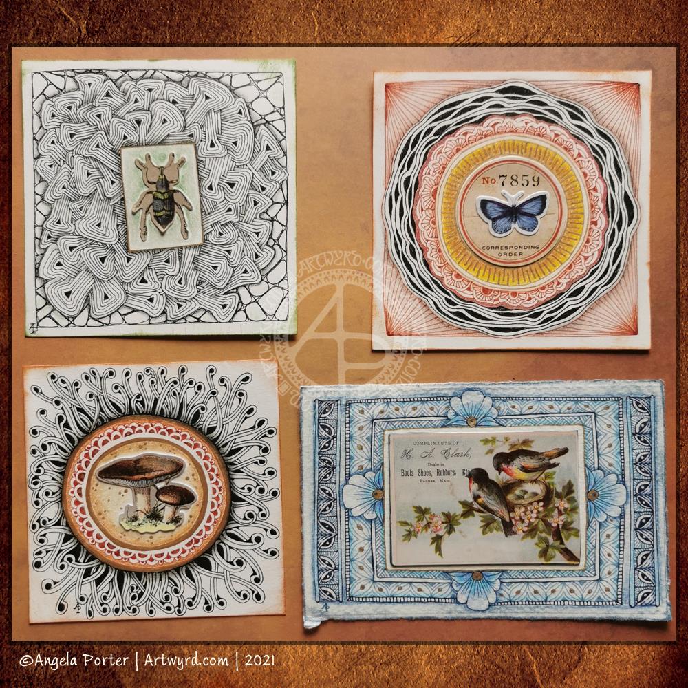
Some more Zentangle cartouches have been done by me. The central images are all from packs of Tim Holtz’s ephemera – Field Notes or Botanicals. I gave these a bit of a shiny glaze with some gloss medium; it helps to bring out the colours.
I’ve used a variety of media and paper for these. The squares are either 3.75″ x3.75″ or 4″ x 4″ in size. The rectangular cartouche is 3.3″ x 5.2″ in size.
I quite like all of them, though part of me is irked by the lopsided box around the beetle!
These take a surprisingly long amount of time to complete. It’s very pleasurable time, especially as I lose myself in the process.
I always relax, feel my whole body let out a sigh of relief as I work on drawings like this one. Purely abstract, line and pattern being the focus, with healthy doses of black giving a very graphic feel to the design.
Playing with line width and pattern to bring layers and depth to the design is always something I’ve enjoyed.
I start with one single line, shape or motif and go from there instead of having an overall plan for the design all sketched out and ready to go. I like this organic, intuitive way of letting the design grow, developing it one pen stroke at a time.
I’m learning, slowly but surely, that areas of white space can be a powerful part of the overall design. It’s been a long journey to realise I don’t have to fill the whole sheet of paper with line and pattern.
I need to have a lot of trust in the whole of this process; that something pleasing will be created after hours of work with very fine nibbed pens.
What next when I’ve finished the pen-work? Do I add shadows, colour, highlights with traditional media or digitally? Do I just add a background coloured/textured paper? Do I leave it in it’s very graphic black and white?
Working digitally with a scan of the finished drawing allows me to experiment, though I’ve yet to work out how to add shadows in the way a blended graphite or pastel pencil would do. And I do have a tendency to use much brighter, saturated colours than I would with traditional media.
Perhaps it’s time I sorted out my own digital colour palettes from my traditional media. That is something for another day, however. For the rest of the day, I’m going to lose myself in completing this drawing.
A mandala in my entangled assemblage style. I really enjoyed drawing this, not least because I proved to myself I can transfer this way of drawing to digital art.
Unusually, there’s not a single botanical element in this artwork. Not one leaf, not one flower, nor any seed pods. It’s purely abstract.
I think I may have used up too much of my time this morning (a deadline is about to go whoosh past me), but it has given me ideas for some of the remaining templates I need to complete.
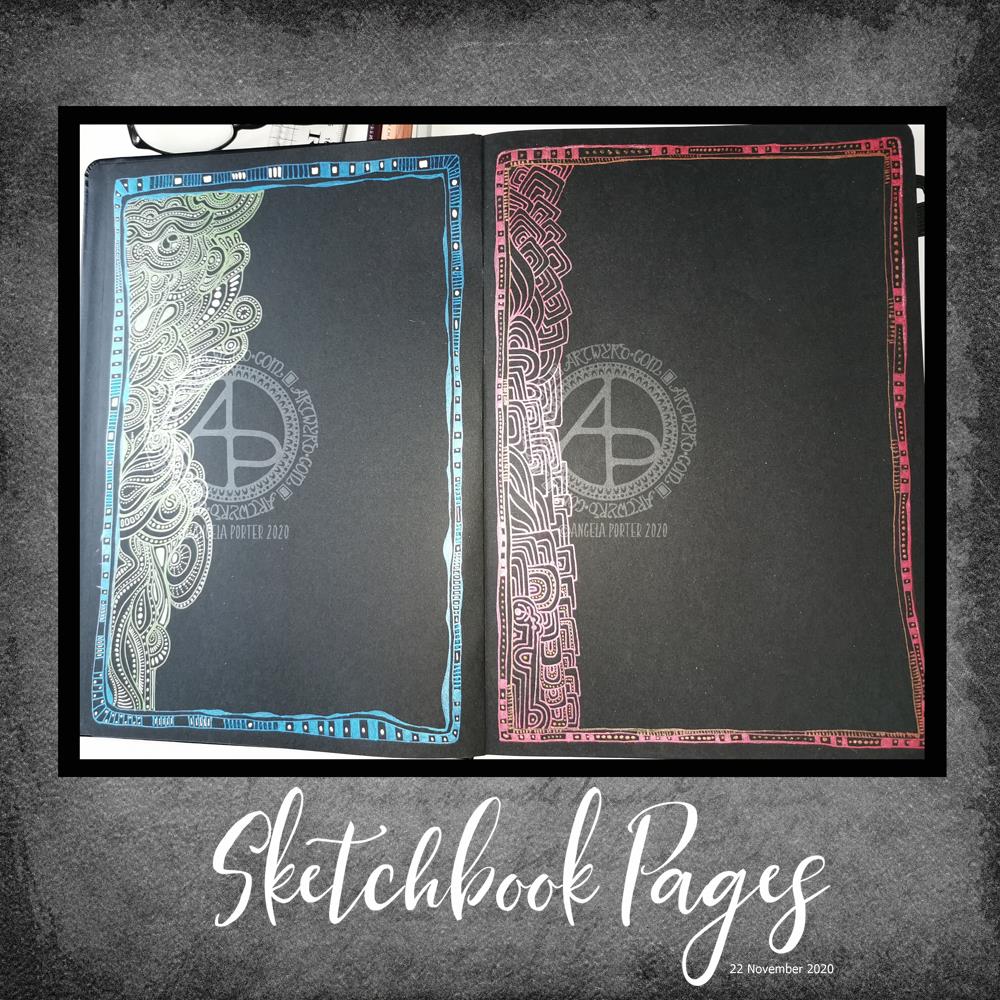
Sakura white, metallic and starlight gelly roll pens in a black Sakura journal/sketchbook. I had a lovely few hours last night, sat in bed, settling down for a good sleep.
What you can’t see in the photos is how the matt white and shiny blue/green inks create interesting weirdness visually. By weirdness, I mean a strange kind of 3D effect that I can’t put into words. That was totally unexpected.
I haven’t decided what to do with these pages yet. Will I fill them in completely with colour/pattern, or will I leave the pages as they are. If I leave them as they are then they can be used for journaling, writing, and I quite like that idea to be honest. As the writing is likely to be very personal, I’m not likely to share that, but maybe I’ll mock something up digitally, see for myself what it’s like and then decide.
And with that last sentence, I may scan these in and use them as templates for a digital journal, which would then take away my worries about making a mess of the page by writing on it!
Of course, they’d work quite nicely as frames for quotes too.
Too many possibilities!
Whatever I decide to do – and it may be all of these things – there is something satisfying about working with shimmer and shine and the contrast with the matt white ink on black. The sparkle and shine makes my arty soul rather happy.
Just a note on the black Sakura sketchbook / notebook /journal. I like it! It has a LOT of pages in it of acid-free, sturdy enough, smooth paper.
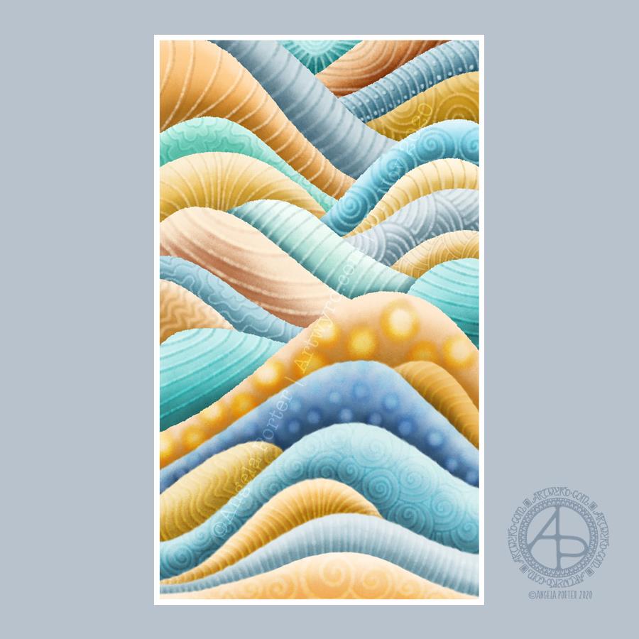
This was a lovely way to spend the first three hours or so of Sunday morning. Abstract digital painting. Chilled out music playing on Spotify. A slow sunrise behind the grey, rain-dropping clouds.
Again, the pattern was inspired by rocks and geology. Some of the patterns I’ve added remind me of rocks and shells, others are a bit too geometric.
It’s always nice to play around with pattern, texture and colour. And when I limit my palette to just a couple of colour families I get much better results. Today, I used the B and YR Copic colour families from the Copic palette included with Autodesk Sketchbook Pro.
While not reminiscent of rocks, the colours remind me of sea and sand. This year, I’ve not been able to get to the coast, other than once way back in February. The colour choice is a subconscious desire for the sea and shore, a liminal place, a boundary between one element and another.
The coast is a place where I feel my whole body exhale and relax. Sadly, it’s not possible to visit at this time, maybe not for a long while. However, the pandemic won’t last forever and the coastline will still be there.
Anyways, creating this artwork was a lovely way of spending some time on a Sunday morning. I can see where I’ve been clumsy with the patterns, making the layers look flatter than I wanted them to.
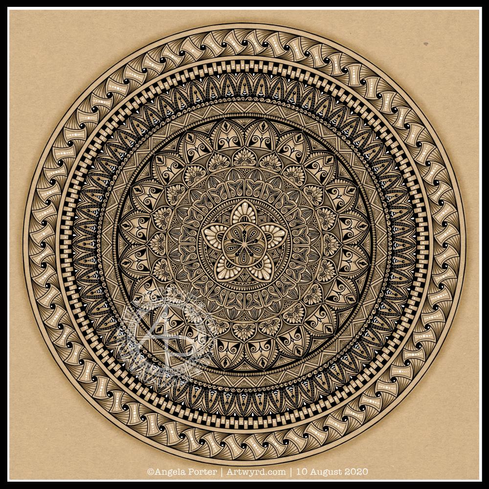
I actually started this mandala yesterday morning, but I did most of the work on it this morning.
Black, white and craft paper, with some warm grey shading to help to bring out a sense of volume to areas of pattern.
The number five.
I chose, to start with, five-fold symmetry.
The number five symbolises balance and harmony. It also can represent freedom, independence, adventure, curiosity, intelligence, individualism, courage, and important life lessons to be learned from your experiences.
Five can also be symbolic of a problem, but there are solutions to the problem. As five also symbolises inner wisdom, the solution comes from our own inner wisdom. Once a solution is identified, then a plan of action needs to be developed through passion, emotions, ideas or work. Then it needs to be followed through.
Star symbolism
The central motif of the mandala is reminiscent of a five-pointed star.
Stars are symbols of guidance and are often considered protective symbols. They are also associated with wishes, mysteries and magic. Most often, they represent something that is good, beautiful or positive. They are symbols of hope, truth and spirit.
The colour brown
Brown is a natural colour that evokes a sense of strength, approachabilityapproachability and reliability. It is often associated with resilience, dependability, security and safety.
Feelings of loneliness, sadness and isolation can also arise with brown, especially when used in large amounts, like a vast, expansive rocky landscape or desert. But it also can bring to mind feelings of warmth, comfort and security as brown also represents a hearth, the heart of a home, and so it represents a deep connection to one’s home.
Of course, brown also represents connections with the earth and so nature. It is a wholesome colour.
Symbolism and my art
I’m finding looking into the symbolism of numbers, colours and motifs quite interesting. I don’t often think overly hard about the colours I use when I create art, especially my daily ‘warm up’ art practice.
However, it is interesting to look at the meanings of colours, motifs I choose and how they relate to what I am currently experiencing on a personal level.
Wibbly-wobbly sculptural columns and arches surrounded by layers and layers of abstract bubbles, ripples and swirls of thoughts, wishes, blessings. Well, that’s what came to my mind as I added the architectural details.
No highlights, no sparkle, limited pattern and texture. Just flowing line work, for the most part. I’ve even left some ‘white space’ in the design, which is becoming less unusual for me.
Rounded arches with patterns reminiscent of Romanesque architecture. The columns are, however, more delicate, which is more reminiscent of the move towards Gothic architecture. Both forms or architecture have long been a source of artistic inspiration for me.
Soothing, relaxing and meditative to draw. Circles and spirals, arches and patterns are always comforting and endlessly fascinating to me.
Drawn using Faber-Castell Pitt artist pens on paper coloured by PaperArtsy Fresco paints. The drawing is approx. 2½” x 6¾”.