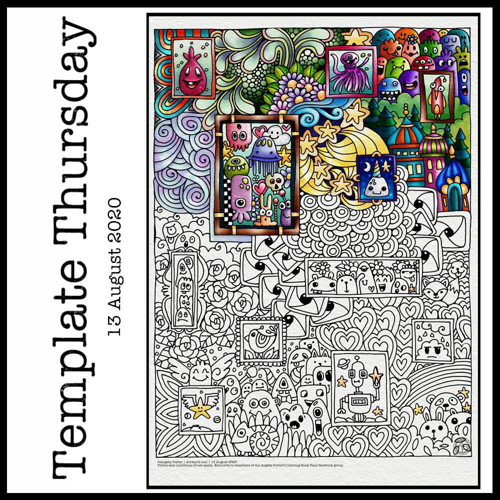
This week, I’ve harked back to my Doodleworlds book with cute monsters and critters. I’ve included some family portraits which hang above a background of more monsters and critters and my signature entangled style drawing for coloring books.
I got lost in colouring this template this morning. It was fun to use different styles of digital brushes and colour combinations in this one. Sometimes it’s just nice to do art with no expectations other than enjoyment, relaxation and comfort.
I drew the template with a Pentel 07 Energel pen on Rhodia dot grid paper. I scanned it in to the Surface Studio and cleaned the image up digitally. Then, I partially coloured it digitally in Autodesk Sketchbook Pro, adding a background texture that isn’t present in the downloadable image.
Lightning storm
Last night, there was the most amazing lightning storm I think I’ve ever seen. It lasted for more than an hour and there were multiple flashes of lighting most minutes. I really need to learn how to use my camera to take photos of lightning – natures very own fireworks.
Sadly, I haven’t been able to see the Perseid meteor shower this year, and I missed the Neowise comet too. I have seen amazing photos of both, though, and of course the lightning storms of the past few days that have coruscated over the UK.
Heatwave
It’s a little cooler in the house today thanks to the clouds shrouding the sun. It’s humid though as the couple of brief showers last night have been evaporating slowly.
The heat meant I didn’t sleep well again last night. But, waking early meant I had plenty of time to edit the coloring template and add colour to a section of it.
I’m not sure if it’s cool enough to take a walk this afternoon. There seems to be a bit of a breeze picking up from time to time. I really don’t do well in the heat; I wilt very quickly. But I’ll see once I shower what it’s like outside.
I woke this morning knowing I needed to draw a mandala and dragonflies. Sometimes I have no idea why, but this is what flowed from my pen.
Soft teals and lavenders colour the dragonflies and mandala. Calming, restful, meditative. The bodies of the dragonflies are ornate, but the wings are not so, which is unusual for me. Perhaps because I feel I’ve lost my ability to fly at this time, I’m doubting myself an awful lot.
Carl Jung used mandala drawing to help inform him, and his clients, about what was going on in the unconscious and needed to be brought into the conscious mind to be processed. The unconscious mind works through symbols and metaphors. So, what do dragonflies (four in number), teal and lavender symbolise?
Dragonflies are said to symbolise wisdom, change, transformation, light and adaptability in life. They are also a symbol of the realm of emotions and so invite you to dive deeper into your feelings. They also symbolise a change in perspective of oneself by removing the doubts that we cast on our own sense of identity in order to reveal our authentic self.
When they appear to you, they are a reminder that there is a need for lightness and joy in your life.
As I’m delving into the realms of symbolism, what about the colours?
Teals are calming and emotionally healing. They also represent self-awareness. This colour promotes an open communication between the heart and spoken word, in both directions.
Lavender represents gracefulness, calmness and creativity. There is also a sense of fragility, sensitivity and vulnerability connected to this colour. It is also considered a grown-up pink.
The teals and lavenders I’ve used in this artwork are both quite subdued, which actually does describe how I am feeling at this time.
And what about my choice of four dragonflies? What does the number four symbolise?
Four symbolises what is solid, what can be touched and felt. It also represents the justice and stability that you need in your life. It also resonates with loyalty, trust, wisdom, determination and patience. It is a reminder not to give up on your goals and to reflect on your passions and aspirations. Believe in yourself, your abilities, your talents and show them to the world. It is also a number that symbolises the protection and guidance of angels.
It seems my mandala has drawn concerns from my unconscious mind into the light of day. I find it interesting how the symbols and colours I used relate to what I am working with on a personal level at this time.
It is said that all artists reveal a lot about themselves in their artwork. I think I do that a lot more than I realise.
Over the past couple of days I’ve been doing some work in a new Arteza Watercolour Sketchbook, slightly larger than A4 in size.
I am really happy with Arteza’s professional watercolour paper, though I do wish it was whiter in colour. So, I thought I’d try out their watercolour sketchbooks. They’re sturdier than my custom discbound sketchbook, so easier to cart around with me as I need.
I rarely do huge works of art, unless it’s digital work, so I like to work in little boxes on the page. I have drawn all the designs with Faber-Castell Pitt Artist pens as they are waterproof. Like all watercolour papers, there’s a texture to them and this does wear the fibre-tip of the pen away. I can live with that as I tend to wreck them quickly as I am a bit heavy handed when it comes to pens.
Talking of texture, this paper is less textured than the cotton professional watercolour paper. It is also double sided, with the other side being smooth in texture. This smoother texture is much more to my liking.
Although this paper isn’t 100% cotton, I find it so much easier to work on than the other pulp watercolour papers I have. The paint doesn’t dry too quickly so I can work wet in wet. The pigments also stick to the paper so that successive glazes don’t shift the underlying layers, something I’m only just discovering the magic of working with.
As I don’t really wet huge areas of paper, there is no warping. Also, though I’ve worked in layers of colour in some areas, there is no breakdown of the paper surface.
All in all, as a watercolour beginner, I like the paper. It works with me and the way I like to apply watercolours, whereas other papers I’ve tried definitely work against me!
It’s also quite affordable, with two 64 page sketchbooks come in at £26.99 on Amazon. This means I can experiment with watercolour to my hearts content without feeling I’m destroying the lovely 100% cotton watercolour paper.
Black lines, or no black lines? That is the question…
I keep switching between black line-art that I colour with watercolour and using light pencil outlines so my designs are worked in pure colour. I can’t seem to settle on one way of working. I like both, but my mood changes from day to day it seems.
At the moment, it seems I need that clear, firm structure in my designs, clear boundaries within which I lay down colour. This is, I think, a reflection of my inner self and the issues I’m working through at this time. Issues that I have no words for.
Even though my art is usually rather controlled with clear structure in it, it still allows me to work through emotions and thoughts that are troubling me.
My mind is ever active, but not with self-talk most of the time. Art allows me to express things I can’t in words. It may be choices of colours, the style of art I gravitate to, the media I choose to use at any time.
On this page, some words have appeared, and those are like bullet points from what I’m working through. Other words are noted in my journal and aren’t shared with others.
Rusty, corroded colours.
There is one design that I have filled with colours that remind me of rust. When I get the right consistency of wet into wet colours, I get these delicious, spiky blooms of colour that really do remind me of rusty textures.
Taking time to look closely at rust, there are lots and lots of beautiful colours, some of which sparkle as they catch the light. It never ceases to amaze me how interesting it is, when examined closely.
Nice, shiny, pristine metallic structures and sculptures are lovely, but how much more interesting they become as they weather and corrosion subtly changes them, adds interest and a different kind of beauty to them.
I can’t tell you how happy I am that I have discovered how to create these rusty colours and textures. They are a completely different colour palette to what I would usually use, but I actually love it! Now I know what I’m doing, I can work on understanding the exact consistency of wet on wet I need, and how to get all the various colours I’d like to incorporate.
As I write this, raku glazes come to mind too. All those glorious colours that various copper oxides produce – magenta, rusty orange, purples, greens, blues, and more. I think I’ll be spending time looking at raku again and working out colour palettes to use in my work going forward.
Typographic portraits update
I’m quietly working at the third iteration of my Nye Bevan portrait. My mind is ticking away with what I need to do, and taking a break allows me to return to it with fresh eyes and a fresh mind.
This morning was a morning that I needed to do some art that was familiar, calming, soothing and intricate enough that I could lose myself in it. A mandala always fits that bill. Always. It doesn’t matter if it’s drawn with pen and ink on paper or digitally. The mindful, calming effect is the same. It’s the process that matters, the repetitive shapes and patterns that are drawn that contribute greatly to the soothing effect.
I do tend to gravitate towards digital art, and I find the symmetry tool in Autodesk Sketchbook Pro helps to save a lot of time. The ability to erase ink removes the frustration that a mistake creates for the hyperperfectionist part of me.
Other than those time-saving (and frustration-saving) tools, the process of mandala drawing is the same for me.
It starts by using a compass, protractor and ruler to set out the circular grid. Then, it’s digital pen on screen to draw the mandala in exactly the same way as I would on paper, just without so much repetition of sections.
However this was created, it has served it’s purpose – given me some time and space for inner peace and contentment.
Drawing done with Faber-Castell Pitt Artist Pens. Arteza Mixed Media Paper coloured with Distress Oxide Inks (Stormy Skies, Chipped Sapphire, Dusty Concord, edged with Hickory Smoke). Paper measures 3″ x 8.25″ (8.3cm x 21cm).
“I make art to show my soul I am listening.” “This, too, shall pass.”
Art is my solace, my form of expressing my soul, my inner self.
The calendar page turns over and we’re into a new month.
August always heralds the end of summer and start of autumn, my favourite season. It is the last full month of summer here in the Valleys of South Wales. The evenings come noticeably earlier, always a sign that the year is continuing on its endless cycle of seasons.
We have a grey, damp and blustery start to the first day of the month. There are shafts of sunlight finding their way through gaps in the clouds, but there’s a deliciously refreshing snap to the cool and fresh air after the night-time rain.
I thought I’d create a really simple mandala design for the start of this month, one that is full of warm colours, but that hint of autumnal tones in the background.
I kept things simply stylised in the design. If nothing else, working on it made me smile, inwardly as well as on my lips.
I woke early-ish today and did some work on one of the typographic portraits I’ve been doing. Then, in my rush to get to the shower, I clicked the wrong button and lost my work. Thankfully, it’ll be easy enough to do it again. I also think that with the version I’m working on, I’m finding my way with the process. I have a lot of the portrait left to do, but I feel less frustrated with it and have a clearer idea of what I’d like to achieve now I’ve taken a few days break from this kind of work.
Before I settle back to the typography, I am going to take a walk in the fresh air of the morning. Well, after I’ve done my social media posts!
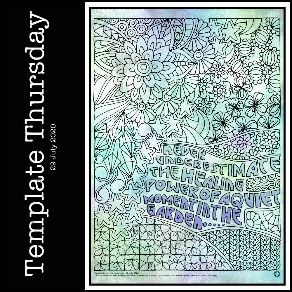
It’s Thursday again, so that means it’s time for a new coloring template for the members of the Angela Porter’s Coloring Book Fans facebook group. I said that during the pandemic, I’d create a template a week for group, free of charge, to help people relax, calm and take their mind off all the awful things that are happening in the world for a short time.
This week, I’ve combined some typography my familiar entangled style of drawing. Botanicals, crystals and stars along with some repeated ‘zentangle’ style patterns. Some of my favourite things to draw.
To draw this template, I used Faber-Castell Pitt Artist pens (F and S), Copic Fineliner SP pens (05 and 025) and a Uniball Signo DX 0.38 pen with Rhodia dot grid paper.
Although lockdown has largely lifted in the UK, we still need to practice social distancing and wear face coverings when it’s not possible to do that, or in enclosed spaces. The Covid-19 virus has not gone away, and though the number of cases are falling, as are deaths, that’s due to people being sensible and following the guidelines for limiting the spread of the virus.
I’m very, very anxious about going out and about, and I know I am far from the only one. I mostly stay safe at home. Mind you, that’s not unusual for me. Even before the pandemic I wasn’t someone who was out and about all the time. I did pop out and about more often than I realised, however. But I’m still usually quite happy to stay at home and focus on my arty, creative activities. But, I know that’s not the case for everyone, and not everyone is able to work from home either, nor wants to.
This was a perfect, small and quick project to do this morning as I was waiting for my weekly delivery from Able & Cole.
Some practice of hand-lettering /hand-drawn typography practice, starting with roughing the design out in pencil on dot grid paper. Then, inking it in digitally in Autodesk Sketchbook Pro.
The addition of a rainbow background was the perfect way to bring a smile to my face this morning. When don’t rainbow colours cheer a person up? The bold, black letters on top of it really make the colours glow bright.
The quote is a perfect bit of wisdom for Wednesday, not that it’s a bad day for me at all. Apart from me suffering from a lack of sleep once again. The morning sunshine has lifted my mood, and the cool air flowing in through the open window is both beautifully fresh and wonderfully refreshing. I have bright and happy music on as I work, just to add to the upbeat start to the day.