Monday Morning Mandala

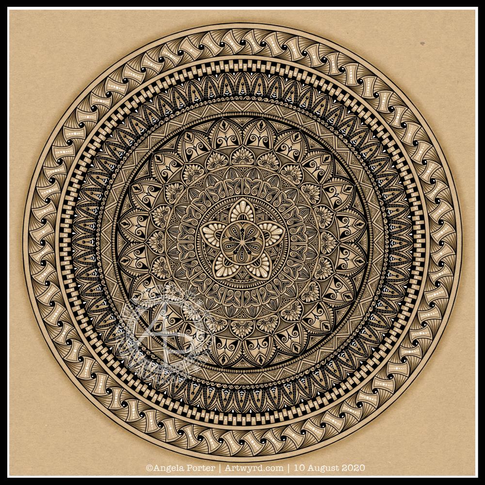
I actually started this mandala yesterday morning, but I did most of the work on it this morning.

Black, white and craft paper, with some warm grey shading to help to bring out a sense of volume to areas of pattern.

The number five.

I chose, to start with, five-fold symmetry.

The number five symbolises balance and harmony. It also can represent freedom, independence, adventure, curiosity, intelligence, individualism, courage, and important life lessons to be learned from your experiences.

Five can also be symbolic of a problem, but there are solutions to the problem. As five also symbolises inner wisdom, the solution comes from our own inner wisdom. Once a solution is identified, then a plan of action needs to be developed through passion, emotions, ideas or work. Then it needs to be followed through.

Star symbolism

The central motif of the mandala is reminiscent of a five-pointed star.

Stars are symbols of guidance and are often considered protective symbols. They are also associated with wishes, mysteries and magic. Most often, they represent something that is good, beautiful or positive. They are symbols of hope, truth and spirit.

The colour brown

Brown is a natural colour that evokes a sense of strength, approachabilityapproachability and reliability. It is often associated with resilience, dependability, security and safety.

Feelings of loneliness, sadness and isolation can also arise with brown, especially when used in large amounts, like a vast, expansive rocky landscape or desert. But it also can bring to mind feelings of warmth, comfort and security as brown also represents a hearth, the heart of a home, and so it represents a deep connection to one’s home.

Of course, brown also represents connections with the earth and so nature. It is a wholesome colour.

Symbolism and my art

I’m finding looking into the symbolism of numbers, colours and motifs quite interesting. I don’t often think overly hard about the colours I use when I create art, especially my daily ‘warm up’ art practice.

However, it is interesting to look at the meanings of colours, motifs I choose and how they relate to what I am currently experiencing on a personal level.

Mandala

Black and white mandala.

This morning was a morning that I needed to do some art that was familiar, calming, soothing and intricate enough that I could lose myself in it. A mandala always fits that bill. Always. It doesn’t matter if it’s drawn with pen and ink on paper or digitally. The mindful, calming effect is the same. It’s the process that matters, the repetitive shapes and patterns that are drawn that contribute greatly to the soothing effect.

I do tend to gravitate towards digital art, and I find the symmetry tool in Autodesk Sketchbook Pro helps to save a lot of time. The ability to erase ink removes the frustration that a mistake creates for the hyperperfectionist part of me.

Other than those time-saving (and frustration-saving) tools, the process of mandala drawing is the same for me.

It starts by using a compass, protractor and ruler to set out the circular grid. Then, it’s digital pen on screen to draw the mandala in exactly the same way as I would on paper, just without so much repetition of sections.

However this was created, it has served it’s purpose – given me some time and space for inner peace and contentment.

Monday Mood

Drawing done with Faber-Castell Pitt Artist Pens.
Arteza Mixed Media Paper coloured with Distress Oxide Inks (Stormy Skies, Chipped Sapphire, Dusty Concord, edged with Hickory Smoke).
Paper measures 3″ x 8.25″ (8.3cm x 21cm).

“I make art to show my soul I am listening.”
“This, too, shall pass.”

Art is my solace, my form of expressing my soul, my inner self.

Template Thursday

It’s Thursday again, so that means it’s time for a new coloring template for the members of the Angela Porter’s Coloring Book Fans facebook group. I said that during the pandemic, I’d create a template a week for group, free of charge, to help people relax, calm and take their mind off all the awful things that are happening in the world for a short time.

This week, I’ve combined some typography my familiar entangled style of drawing. Botanicals, crystals and stars along with some repeated ‘zentangle’ style patterns. Some of my favourite things to draw.

To draw this template, I used Faber-Castell Pitt Artist pens (F and S), Copic Fineliner SP pens (05 and 025) and a Uniball Signo DX 0.38 pen with Rhodia dot grid paper.

Although lockdown has largely lifted in the UK, we still need to practice social distancing and wear face coverings when it’s not possible to do that, or in enclosed spaces. The Covid-19 virus has not gone away, and though the number of cases are falling, as are deaths, that’s due to people being sensible and following the guidelines for limiting the spread of the virus.

I’m very, very anxious about going out and about, and I know I am far from the only one. I mostly stay safe at home. Mind you, that’s not unusual for me. Even before the pandemic I wasn’t someone who was out and about all the time. I did pop out and about more often than I realised, however. But I’m still usually quite happy to stay at home and focus on my arty, creative activities. But, I know that’s not the case for everyone, and not everyone is able to work from home either, nor wants to.

Typographic Portraits WIP

I’ve been working on another portrait of Nye Bevan while I take a break from the first one. I really think I’ve gone over the top with detail in this one. I wanted to do one of him in one of his typical oration-giving stances, but I really do feel I’m messing it all up. I really think that’s because I am trying to get too much in the way of quotes into the portrait.

So, I’ll be going back to the drawing board (or in my case, the Surface Studio screen) to try this one again.

Having said that, I’ve had a lot of hand lettering /hand drawn typography practice and have played around with the brush settings to find one that will work for me!

I also have just noticed that there’s not much differentiation between the different weights of text in the second version, and that adds, I think, to the more confusing appearance of it.

I was struggling with the values of the gesturing fist in the second image. So, I put the photo into Affinity Photo and used the Posterise tool to simplify the areas of shade for me. There’s still a personal interpretation to be done on how I translate these areas into spaces of text.

Hands, feet and faces. These were always the parts of humans I struggled with when doing life drawing.

Drawing typographic portraits is a new endeavour for me. I’m learning, experimenting. One of the main lessons I have to take away today is to not over complicate such a portrait! But there is a fine balance betwixt having enough detail to capture the essence of the person, and having too much so that the essence of who they are is lost.

The first portrait I did, on the left, does look better, but I do think it lacks a bit of detail in the face.

The second one, on the right, is way too busy!

So, my task is to find that point where less really is more.

So, I’ll take a break from them, again, and regroup and try once more!

Practice, practice, practice!

I did spend some time working on a second typographic portrait of Aneurin Bevan yesterday, using a photographic reference that had more detail in it in terms of grey scale.

Before bed, I wanted to relax with some colour (1). For some reason, I pulled out my set of Tombow Dual Brush pens and tried working with them on an A5 piece of Arteza mixed media paper. Hand lettering with gradients, with and without black outlines resulted, and then I wanted to try drawing with colour gradients.

To create gradients, I held the tip of one pen on top of the tip of the other. I then used the lower pen to draw or write with. I used the bullet nib for the lower examples. I used the brush nib for the larger lettering and also the leaves and flowers and so on.

I made some notes as I went, to remind me what I did and what I liked about them. I used a Uniball Signo DX 0.38 pen to do this, which is also waterproof. So, I used it to add lines.

This morning, I wanted to start my arty day experimenting with alcohol inks, once again (2, 3 and 4). All because I’d watched a YouTube videos where people use a straw to blow the ink and alcohol blending solution/rubbing alcohol/isopropyl alcohol/propan-2-ol around the yupo paper.

One helpful piece of advice I heard along the way was it’s best to use only a small amount of alcohol ink. Which is what I did. One drop to start with and then add more ink of the same or different colour(s) as needed.

It took me a while to work out not to blow as hard as I could, and to try different angles to hold the straw at, as well as moving the ink in different directions.

I’m much happier with the results this time, though the scans have bleached the colours out a little. I really must work out the best settings on my scanner so that this doesn’t happen.

Anyway, I need to find a way to seal the alcohol ink so I can draw on top of it without wrecking the pens. I also want to do some better scans so I can make use of these alcohol ink backgrounds in digital art.

Today I want to continue work on the typographic portrait. This second one seems to be building up more quickly than the first one. I think that’s all due to me becoming familiar with the process and accepting that my hand lettering based on my handwriting is good enough. I’m also working out my own ways to fit letters to curves and the shapes at the ends of the sections.

So, all of these activities – using waterbased media, hand lettering, hand drawn typography, and alcohol ink backgrounds all have one thing in common – practice, practice, practice!

Watercolour Practice

Yesterday, after taking a walk and getting a few bits and bobs done, I settled down to spend some time with watercolours.

Each piece of paper is approx 4″ square. The top ones were just playing around with foliage, wet into wet, and adding some details with metallic ink, a gold glitter gel pen and a white Souffle pen. I just wanted to see how the different details could add to, or mess up, the watercolours.

I do like the one on the top left. It satisfies my inner need to not leave much in the way of white space.

The bottom image was me trying out painting plants in pots – the top row with very faint pencil guidelines and the middle with Pitt Artist pen outlines in black. The bottom two were comparing like ot like with black outline and pencil outline.

I had trouble with the details in the first two plants in pots on the top row. That was when I thought I’d try the black outlines.

I’m really not sure which I like most, or if either of them really work out.

I’m rather tired and headachy, again, today. I think that I’ll soon be going out for a walk. It’s another overcast and cooler day with a breeze. I love to walk on days like this.

Template Thursday

It’s Thursday, so that means it’s time for a new coloring template for the members of the Angela Porter’s Coloring Book Fans facebook group.

One of the members suggested a Christmas in July template, so that’s what I did. A page full of iconic Christmas motifs, admittedly not all of them, but a fair selection.

If you fancy printing this template off, all you need to do is join the group! It’s completely free, as are all the templates I design for the group. All I ask is that you follow the terms and condtions of use.

I drew these little designs on Rhodia dot grid paper with a Tombow Fudenosuke (hard) pen. I cleaned the drawing up in Autodesk Sketchbook Pro, then digitally added colour. Some are in the more traditional Christmas colours, others are less so. No rules for colouring! Whatever makes you happy or peaceful is fine! The most important thing is to have fun and enjoy what you do.

As for me, today I’m taking a break from the typographic portrait of Nye Bevan that I shared yesterday. My artistic intuition needs some time to work out what to do with it, both to complete the blank areas and to edit places that aren’t working.

I need to pop out for a walk too. I’ve been sat down, focused on art too much over the past couple of days. It’s overcast and there’s a stiff breeze, so it’s perfect for me!

Typographic Portrait WIP

Phew! This has taken me many, many hours to do, along with a lot of frustration and alterations. However, it’s getting there, possibly.

This is both the first portrait I’ve done, as well as the first large typographical project.

I’m following a Domestika course – “Hand-Drawn Typographic Portrait” by Sara King.

I’m not entirely sure that I’ve fully succeeded. I seem to have a lot of white space, and that is all to do with the photograph I used. I thought it had enough detail in terms of tones of light and dark. I guess not! Or maybe this is just part of my style.

There are areas on his jacket to the bottom left and right that need pattern or image put there. I have yet to work out what to do about the shirt. Also, I need to try removing the lines around the jacket and collar too.

Aneurin “Nye” Bevan was the main architect of the UK’s National Health Service after WWII. He’s also considered one of the best political orators of all time. There’s an Aneurin Bevan website if you’d like to know more.

While this is hand-drawn, I chose to work digitally. My Surface Studio allows me to work with a digital pen directly on the screen as if I was drawing on paper. This makes it easy to edit as I work.

I now need a break from this particular artwork, so I can look at it with fresh eyes (and any feedback people offer on it) and then return to it another day.

Watercolour practice

Good news – the headache has gone! Yay! The sun is shining, I have uplifting music playing, and I’ve spent some of the morning practicing watercolour skills and working out how to subtly draw/paint on top with white.

The little tiles at the bottom have designs painted on them with white gouache. There’s a lot more variability in line width with these.

The book marks have had the designs drawn using a white Soufflé pen by Sakura. The ink goes on clear but dries a matt and opaque white.

I used som Molin du Roy watercolour paper from Canson for these. The tiles are approx 2″ x 2″, the book marks are approx 2″ x 7″.

I may mount the tiles on greeting card blanks. The bookmarks need a hole punching in the top and then some string/ribbon threaded through.

I did try out the Sakura Quickie Glue pen and embossing powder yesterday, but really wasn’t happy with it. I also tried using a variety of Sakura pens to draw the outlines before watercolouring – black Glaze, metallic siver Gelly Roll and silver Stardust. They were waterproof, but just didn’t give me the borders for the patterns that I wanted. The black was very bold and gave a rather stained-glass feel to the tile. But, white turns out to be my favourite.

It’s been nice to spend quite a few hours working with watercolours and trying out ideas without any pressure to create anything that is finished. Sometimes making art for the fun of making art is enough and much needed to soothe some rather battered emotions.