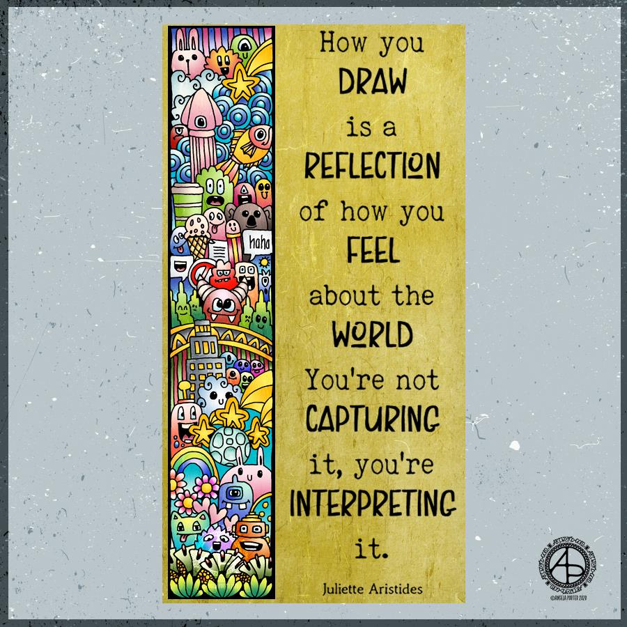
If the quote applies, I have no idea what my morning drawing says about what my art says about the world! Perhaps it says more about my inner world – imagination and emotions. I’ll let you decide that one.
All I know is that my Tuesday morning art has been influenced by the drawing I’ve been doing for the coloring book I’m currently working on. Cute. Doodle-y. Fun. Using colour for the sake of colour. Lots of colour.
I drew the design with an 0.5 Rotring Rapidograph pen on Rhodia dot grid paper. Next, I scanned it in, cleaned the drawing up and added colour digitally. Finally, background, texture and quote were added.
A nice way to spend the first three hours or so of my day before I turn to other things, like breakfast, shower and maybe even a walk if the weather keeps dry.
In Flanders fields the poppies blow Between the crosses, row on row, That mark our place; and in the sky The larks, still bravely singing, fly Scarce heard amid the guns below.
We are the Dead. Short days ago We lived, felt dawn, saw sunset glow, Loved and were loved, and now we lie In Flanders fields.
Take up our quarrel with the foe: To you from failing hands we throw The torch; be yours to hold it high. If ye break faith with us who die We shall not sleep, though poppies grow In Flanders fields.
Today is Remembrance Sunday, the closest Sunday to Armistice Day, 11 November 1918.
Armistice Day marks the end of World War I, at eleven minutes of the eleventh hour of the eleventh day of the eleventh month, 1918.
In the UK it is held to commemorate the contributions of British and Commonwealth military and civilian service men and women during both World Wars, as well as in later conflicts.
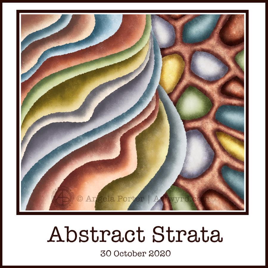
This morning’s warm-up art is another abstract digital painting inspired by patterns in rocks and strata.
It’s a very soothing process for me to create art like this, even though it lacks the intricacy and detail of my more usual ‘entangled’ style. Simplifying and stylisation is a feature of my entangled art; this artwork takes those processes a few steps further along.
I started the day sketching some simplified patterns taken from geology in general. I scanned them in and chose one to turn into a painting.
Layer by layer, I added colour and texture, choosing earthy colours. I paid attention to shadow and highlight making sure that there’s an illusion of dimesion in the painting.
I’m still experimenting with this style of digital painting. In this one, I think I’ve chosen one or two colours too many, and a couple of them are a bit brighter than the others which makes them stand out more.
I also need to work with different color palettes, limiting the colours to produce a cohesive design.
The ragged edges created by the brush texture I used make the layers look a bit like torn paper. However, I would like to try a smoother edge in future experiments.
It’s been a nice way to spend three or so hours this morning. It’s now time for me to breakfast!
I’ve been awake since silly o’clock. I have a delivery due before midday, so while awaiting it I have been arting.
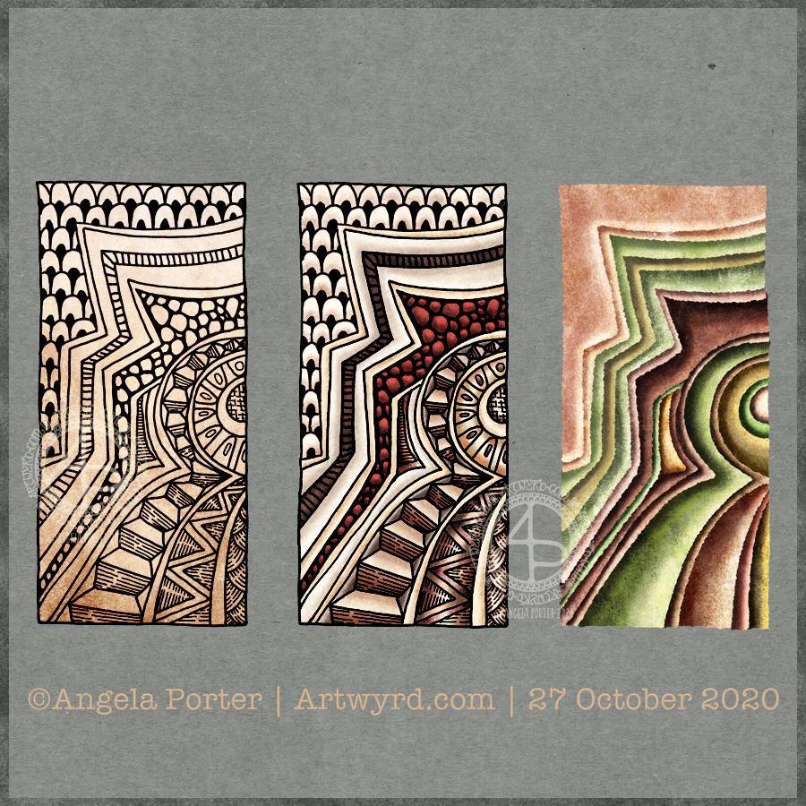
This started off as a simple line drawing of patterns from the strata of rock formations of Raplee Ridge, Utah. Then, I added some patterns between them, zentangle or entangled style. I used fineliner pens on paper to do this drawing (left image).
My next job was to scan the drawing in and tidy it up digitally. Then, I thought I’d colour the design in. I kept to fairly earthy tones for this (middle image).
Finally, I thought I’d do a pure colour study of the line art. And I really like this one. I’ve played with shadow and light to give a sense of dimension to the artwork (right image).
I’m really pleased with the pure colour image. Not just for choosing a fairly pleasing palette, but for finally discovering how to use textured brushes to draw, colour and texture the different areas.
I’ve done work like this with traditional media, but have never really had much success digitally. It seems I have found some confidence here.
It does remind me of work I did some 15 or so years ago while studying for A level art as an adult, and how much pleasure I got from that. Now, as back then, I used simple colour palettes.
I suspect I’ll be doing more work like this – line art of patterns, followed by a coloured interpretation of those patterns. My mind is ticking over whether I could include some typography in these kinds of artwork too.
Moody mutterings
My mood is better today, I’m pleased to say. I’m not sure if it’s rest, self-care, Star Wars, knitting, art, or a combination of all these things that has helped lift it.
I know that my mood has weather, just as the world does. And in Wales, the weather can be changeable and varied! But like all weather, the gloom passes and sunshine returns. Though I wouldn’t say I’m sunshiny, I am content with a soft glow within. That is good enough for me, and for today as it’s rather wet and gloomy outdoors.
I’ve been working on this drawing for a few days now and I finally managed to finish it this morning. That means I scan the drawing in, tidy it up digitally and then start to add highlight and shadow to bring out the design against a fairly dark background.
Today, I chose a lovely purple-magenta colour for the background. It seems to go with my mood today. I’m tired. I had a stressed-out day yesterday as my cental heating boiler was repaired and serviced. That meant letting someone into my home, something I’ve not done for months and months.
My ever present social anxiety has been ramped up during the pandemic, and yesterday it was given a huge boost. I know what the repercussions of this are for me – tiredness, upset digestive system and heightened startle response. These symptoms can persist for days, depending on the intensity of the experience.
So, today will be more of a self-care day than anything else. I’m now flagging after four or so hours focus on art.
I want to get my focus and oompf back. I am expecting a delivery of Sculpey polymer clay along with tools and accessories.
I’ve been watching videos on YouTube of makers using polymer clay to cover books. The videos have remined me of how much I liked to work with clay when I was doing my AS/A level art many years ago. So, I thought I’d give it a go, using polymer clay to sculpt my style of drawings in 3D and then paint them.
I don’t know if it’ll work out for me, but there’s no harm in trying it out that’s for sure. I have used polymer clay in the past for making jewellery and it wasn’t all that successful in many ways. Perhaps working on a bit larger scale and being able to add plenty of detail and texture will make it a better experience for me. As well as using a polymer clay that is softer than the Fimo I used way back then. Conditioning that stuff was murder on my joints!
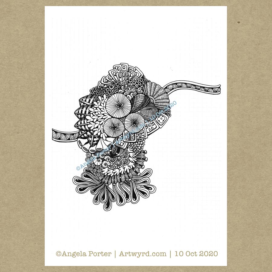
This drawing is very much a work in progress. It’s being worked with black Unipin and Sakura Micron pens. When it’s complete, I will scan it in again, add a background, along with shading and highlights.
There’s some motifs in here inspired by fossils, others by flora and nature, and others that are purely abstract in nature.
Art is one of my self-care activities that help me manage my mental and emotional wellbeing. I mention this as it is World Mental Health Day #WMHD #WMHD2020 and, ironically, I need to do a fair amount of self-care today.
There’s plenty of information and advice out there on the internet. If you are struggling with your mental or emotional wellbeing, or if you just want to learn more about good mental and emotional health, ideas for how to look after it, then I’d encourage you to do a google and/or seek professional help.
We all have physical health and if something goes wrong with us physically, we don’t think twice about seeking out medical help and advice.
We all have mental and emotional health too. Yet too few of us will seek out help and advice when we need it due to the stigma and/or discrimination that cloud mental and emotional health.
It is high time that seeking help and advice for mental and emotional ill health was as natural and normal as seeking help for physical ill-health.
I had to take a totally different approach to completing this piece of typographic art – pencil drawing the design and letter outlines on paper before inking and scanning into the computer.
Once scanned in, I could clean the image up, fill the shapes with black. I learned how I could use some of the tools in Autodesk Sketchbook Pro to do this. However, in black and white the artwork looked just so flat and dull.
So, I added a chalkboard background in a lovely sea blue (ammonites were denizens of the oceans after all!), and added a colour gradient to the typography.
It then looked a bit better. But I thought I’d try adding highlights and some shadows. And that just did the trick and I was finally happy with what I’d produced. It was good enough for another step on my typographic art apprenticeship.
That doesn’t mean there are things I wouldn’t do differently the next time I try something like this. My hand lettering needs a lot of work on, as does my attention to the letter weights too. I’ve just realised that I meant to draw tiny ammonites in the dark blocks between words as spacers. Also, I could’ve spent a lot of time tidying up the lettering digitally.
I also learned that working on paper gives me a much better overall view of the design and how things sit together. For some reason I struggle with this when working digitally. It may be that digitally I can zoom in and out and often work unaware of what is around the design. With paper, that overall perspective is ever present.
Digital art is something I love to work with, but I’m realising that I do need to work on paper too, even if it’s a sketch or drawing that can then be enhanced, edited and completed digitally.
This morning, I wanted to start a new entangled drawing. But what to draw? I wasn’t in the mood to do another monogram, especially as there are some ideas on the periphery of my conscious mind about monograms. I thought about drawing a skull, something I find interesting, but that didn’t feel right either. But the idea of a moth flittered into my mind, so that’s what I went with.
I drew the moth digitally, in Autodesk Sketchbook Pro, simply because I wasn’t quite sure how my pen work would work on a moth, and I also like to use the symmetry tool. I’m fairly happy with the results. I started to add my entangled style motifs around the moth, and came up against two issues.
The first issue was that I would lose the detail around the head and antennae and I needed to come up with a way to preserve that. I came up with the idea of a simple circular border below the moth. This will also give me the option of adding colour to the central circle when I’ve finished the artwork.
The second was more of a problem – the sense of proportion. I have no idea why it’s so hard for me to work digitally on entangled drawings like this with a proper sense of proportion compared to the main motif or the printed size.
It has to do, I think, with the ability to zoom in to draw small details, which results in me adding too much detail. The only solution was for me to print the moth and circular border out and then for me to draw on that.
The only thing I wasn’t happy about in doing this is that I have a laser printer. That affects the surface of the paper in a way that my Unipin pens don’t like it. Also, I can’t print on marker paper.
So, I’ve started to add entangled artwork to the design. I can now see that leaving edges of the upper wings white would help them to stand out. That is something I can adjust digitally when the design is finished.
I feel so much happier working on the printed image. I do need to consider changing my printer, however. Though the laser printer is quick and economical, the print quality of line art isn’t the best. There’s also the issue of the way the surface of the paper is changed once it’s been printed on. I shall think on this in the coming weeks and before the toner needs replacing.
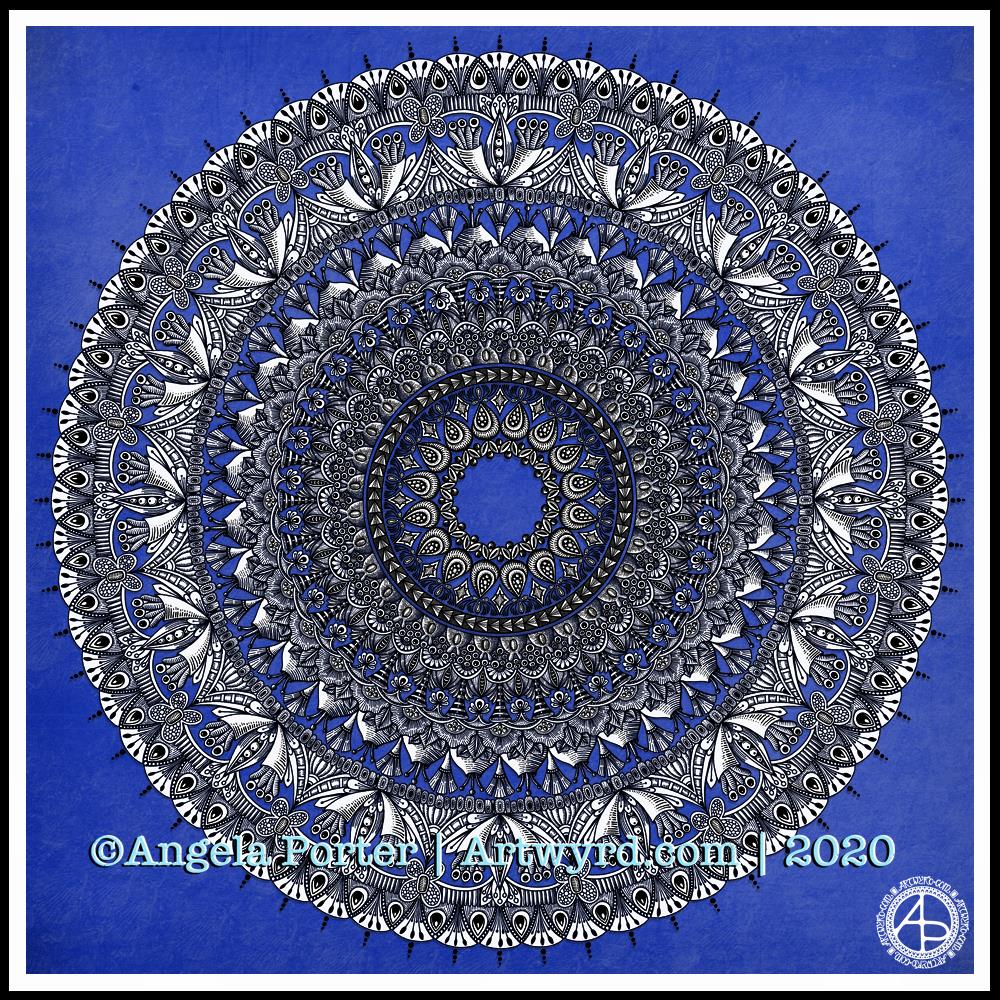
I have been awake since stupid o’clock, so rather than toss and turn for hours I decided to do some art. And another mandala appeared from the tip of my pen.
For this one, I thought I’d make the ‘white space’ areas in the design transparent so that the vibrant blue background could show through.
I’m not sure how well this works; I’m now too tired to think clearly. I do think it has potential for future mandalas, maybe.
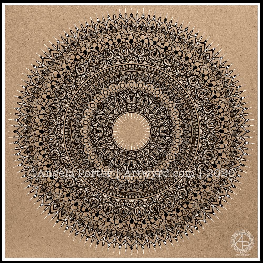
I really enjoyed creating this mandala this morning! I used some of my favourite motifs in this one. it was lovely to use white on the kraft background, to bring out some highlights and add dimension here and there.
I love to use Autodesk Sketchbook Pro to draw my mandalas in. It streamlines the process and allows me to focus on creating the design rather than the mechanics/geometrics. Of course the design is drawn by hand, just as it would be on paper. That’s the beauty of having a Microsoft Surface Studio and Surface Slim Pen – I can draw with the pen on the screen just as I would with pen on paper. The advantages are that if I mess up, it’s easy to correct, and the symmetry tool saves time, allowing me to focus on the fiddly details that I love so much.