Practice, practice, practice!

I did spend some time working on a second typographic portrait of Aneurin Bevan yesterday, using a photographic reference that had more detail in it in terms of grey scale.

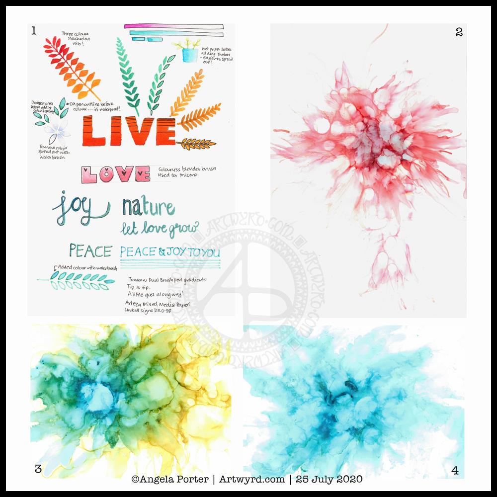
Before bed, I wanted to relax with some colour (1). For some reason, I pulled out my set of Tombow Dual Brush pens and tried working with them on an A5 piece of Arteza mixed media paper. Hand lettering with gradients, with and without black outlines resulted, and then I wanted to try drawing with colour gradients.

To create gradients, I held the tip of one pen on top of the tip of the other. I then used the lower pen to draw or write with. I used the bullet nib for the lower examples. I used the brush nib for the larger lettering and also the leaves and flowers and so on.

I made some notes as I went, to remind me what I did and what I liked about them. I used a Uniball Signo DX 0.38 pen to do this, which is also waterproof. So, I used it to add lines.

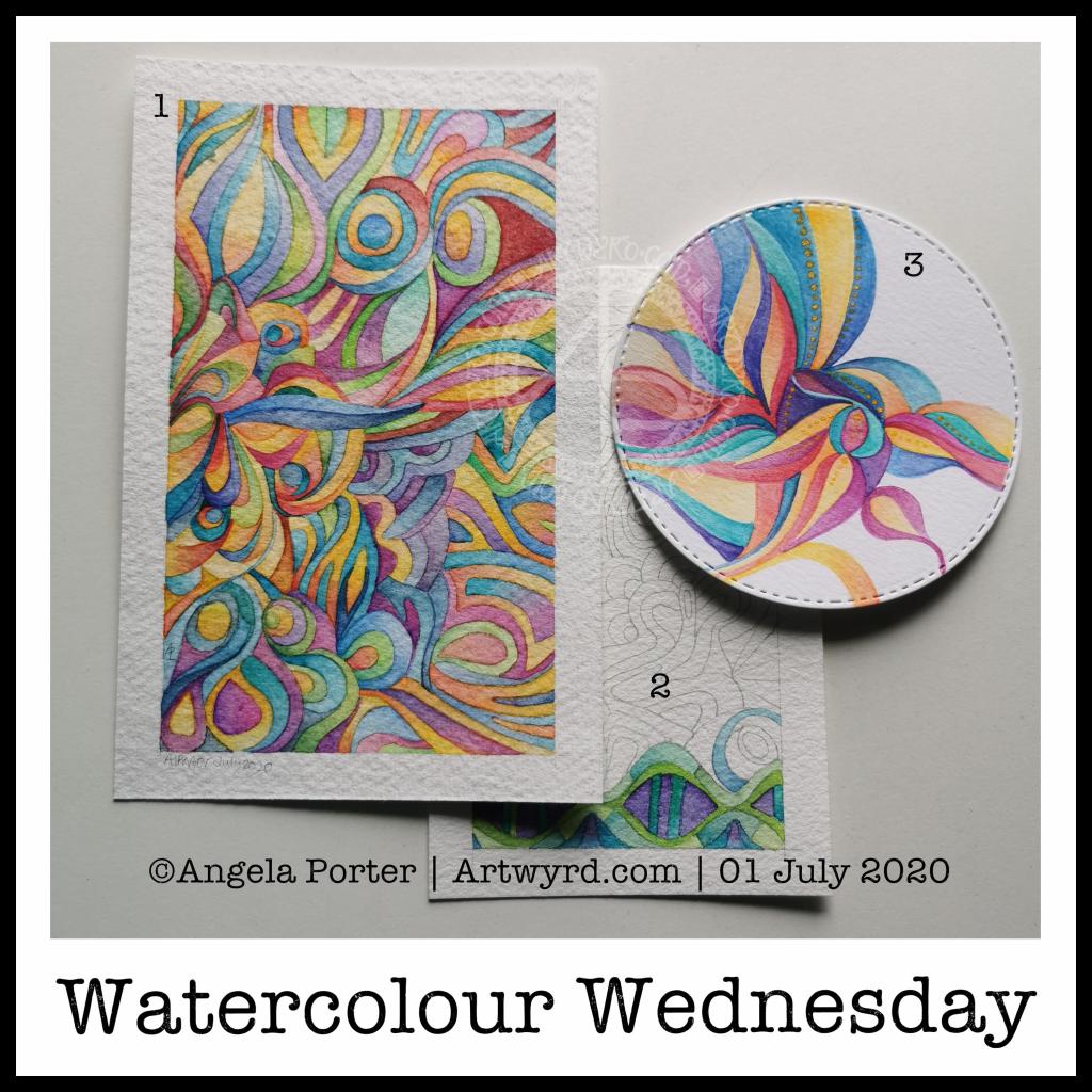
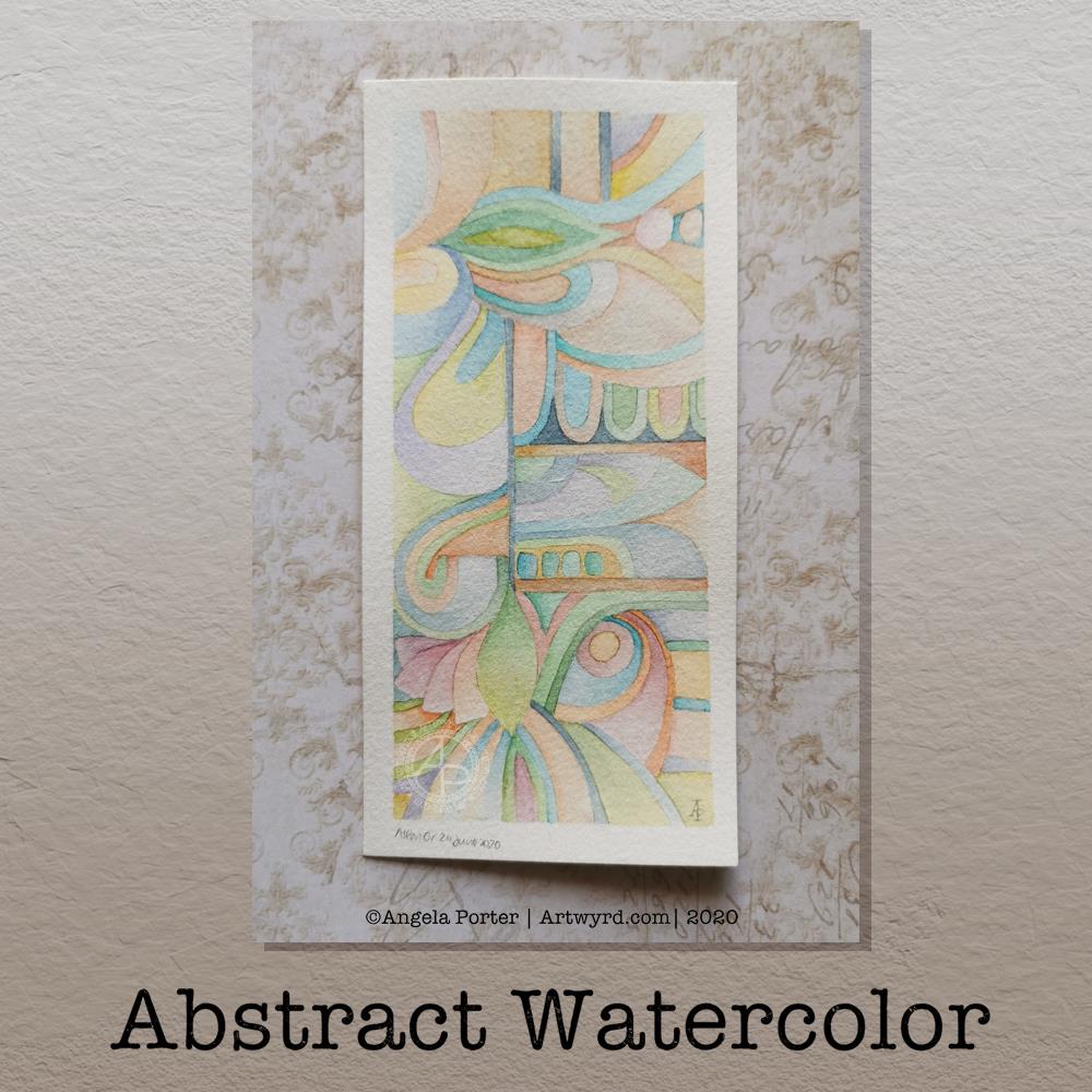
This morning, I wanted to start my arty day experimenting with alcohol inks, once again (2, 3 and 4). All because I’d watched a YouTube videos where people use a straw to blow the ink and alcohol blending solution/rubbing alcohol/isopropyl alcohol/propan-2-ol around the yupo paper.

One helpful piece of advice I heard along the way was it’s best to use only a small amount of alcohol ink. Which is what I did. One drop to start with and then add more ink of the same or different colour(s) as needed.

It took me a while to work out not to blow as hard as I could, and to try different angles to hold the straw at, as well as moving the ink in different directions.

I’m much happier with the results this time, though the scans have bleached the colours out a little. I really must work out the best settings on my scanner so that this doesn’t happen.

Anyway, I need to find a way to seal the alcohol ink so I can draw on top of it without wrecking the pens. I also want to do some better scans so I can make use of these alcohol ink backgrounds in digital art.

Today I want to continue work on the typographic portrait. This second one seems to be building up more quickly than the first one. I think that’s all due to me becoming familiar with the process and accepting that my hand lettering based on my handwriting is good enough. I’m also working out my own ways to fit letters to curves and the shapes at the ends of the sections.

So, all of these activities – using waterbased media, hand lettering, hand drawn typography, and alcohol ink backgrounds all have one thing in common – practice, practice, practice!

Inhale, Exhale, Repeat

This was so very enjoyable!

I started with the hand-drawn typography. I’ve just started another Domestika course — Hand-Drawn Typographic Portrait by Sarah King. The first exercise is to letter words boxes divided by wavy lines. Then, creating letters in different weights. And of course, practice is something that needs to be done.

There was just something about her approach to this that grabbed me, and so, I now have many boxes with words and quotes in.

The first lesson shows how to use Photoshop to edit your lettering outlines and fill them with black. I found the process rather clunky and long-winded. Perhaps that’s because I’m used to working in Autodesk Sketchbook Pro with a pen on a screen as if they were pen and paper, that I could do this in my own way.

So that’s what I did. I used one of my pencilled samples to create the typography for the centre panel.

Then, it was adding the background. I just went with the flow on that one. I made use of the symmetry tools in Sketchbook Pro, and just had fun with a limited colour palette and my favourite kinds of shapes.

The course is about portraits. However, I have zero interest in drawing people. However, the techniques shared will spark ideas for how I can use them.

I’ve long been trying to incorporate words, quotes into my artwork and struggling to find my own style. I’m not sure if this will help, but I’m really quite happy with this particular artwork.

Watercolour Wednesday

I know, it’s been a watercolour day nearly every day for the past week or so. However, I do like alliteration. As did the Anglo-Saxons, who used alliteration in their poetry rather than rhymes.

Anyway, a fair amount of watercolour being done here in the past day.

Painting (1)
This one is now finished. It was an unusual one to do as I didn’t start with a sketch, but just added shapes as the painting grew. It’s colourful, for sure, which is my usual way of working with colour. I know I needed some colour to brighten my heart up yesterday.

Painting (2)
A work in progress, this one is on a piece of Arteza Premium watercolour paper, which is 100% cotton. It works in much the same way as the other 100% cotton paper I have, but it’s slightly more offwhite, with a yellow-ish tone, than the Khadi paper. It also has a different texture that is finer and not quite so bumpy. I’ve yet to work out which I prefer.

I’ve decided to complete this painting in shades of blue, green and purple, mostly. I’m sure I’ll end up changing that idea, or sneaking in other colours here and there.

With the 100% cotton paper, I am starting to become comfortable with dropping wet into wet and letting the colours spread and blend with each other. Judging the quantity to get the depth of colour and a smooth gradient is still a tricky task for me.

Painting (3)
I don’t know what got into my head this morning, but I felt the need to paint a mandala in much the same way that Carl Jung would to start his day with an idea of what is going on mentally and emotionally on a subconcious level.

I also had a kind of bright idea to use a diecutting machine to cut out circles of paper, in this case Daler-Rowney Mixed media paper.

With the first circles I tried watercolour and had really unsatisfactory results. This surprised me given the fairly pleasing experience I had with the ClaireFontaine mixed media paper.

So, rather than use watercolours, I thought I’d try Inktense pencils, using a damp brush to pick colour up from the pencil nib. I also used a solution of gum arabic to help keep the colour wet for longer. Gum arabic also increases the translucency of the pigments, and can add a glossiness to the colour too. This helped the Inktense colours to work more like watercolours.

I also added dots of gold Daler-Rowney FW Pearlescent acrylic inks to the design here and there. To finish the design off. I had thought of adding patterns in gold to the blank areas, but that just didn’t feel the right thing to do. It felt finished, white space and all.


The aim of this painting wasn’t to create a work of art, but to give an insight into what is going on within me at this time. I’ll keep my observations on this to myself. What I will say is I’m feeling out of sorts and rather sad and low today. I have a lot of confusion, anxiety, fear and despair surrounding various things going on and I’m just feeling a bit overwhelmed by it today. It’s all just emotional weather – just as the clouds cover the sun, they will move along by and the sun (or moon) will shine bright and clear once again, so it is with emotions.

Watercolour WIP

I’ve finished the editing for a colouring book due out later this year, and coloured the cover design for the next one. So, I turned my attention to a bit of watercolouring this morning, and this is how far I’ve got.

I actually started this one last night, and it’s taken me around 6 hours to complete so far. Oh, the paper I’m working on is 100% cotton rag and is approx 5″ x 4″ size, but the design is around quarter of an inch smaller on each side. I’m using White Knights watercolours from St Petersburg. I’m also using a grey watercolour pencil to draw the design. This way, the lines will disappear, mostly, as I paint over them.

Nothing much else to say today. The rest of the day is going to be some self-care time.

Template Thursday

Another week has gone by with the pandemic still occurring. That means it’s time for another template for members of the Angela Porter’s Coloring Book Fans facebook group.

This week, I’ve created a rather abstract but typically entangled ‘Angela’ kind of template.

If you’d like to download the template to colour, you do need to be a member of the facebook group – it’s free to join and free to download the template (terms and conditions of use apply).

Abstract Watercolor

Last night, I was tired and emotionally drained, again. So, some self-soothing activities were in order. I thought I’d try to create an abstract watercolour painting in the same kind of style as the abstract digital art I’m working on.

Before bed, I got a small part of this done. I finished it this morning. I woke around 4am, with a headache. The usual kind of stress-comedown headache I’m prone too. Migraine-y in nature. I also was due to get up early for my weekly delivery of organic vittles from Able & Cole; they deliver to me just after 6am.

Oddly, the headache lifted as I started to work on the watercolour, which was a huge relief to me. A couple of hours later, and the watercolour was finished.

The paper is Bockingford cold pressed and it measures approx 5¾” x 2¾”, the artwork being approx. 5¼” x 2¼” in size. I used my set of White Knights watercolours and a Daler Rowney Aquafine brush (size 0, round). I did lightly pencil in the design before painting.

I love working digitally, but I also love to work with traditional media, watercolours becoming one of my favourites as I work out how I can get them to work for me.

I’ve said before that I love to create small works of art – precious little treasures that need to be the centre of attention in a huge frame.
The precision of this abstract watercolour painting really pleased my artistic heart. I worked with watercolours on paper in a way that is analogous to how I work with colour and shape digitally.

The realisation of this has been a ‘ta-da’ moment for me. As much as I love to see the way watercolour does magic when it’s worked wet in wet, my sensibilities tend towards having much greater control over the way the colours mix and blend. I even break the rules; I’m happy to mix colours on paper, while the watercolour paint is still wet or damp. I’m also happy to use glazes to intensify the colour or alter the tone.

What is a change for me, in terms of traditional art, is the lack of black line-art. In the past, that would have been something that really troubled me; the work didn’t look right without black lines.

Working digitally, with pure colour and no black outlines has certainly made me more confident in working traditionally this way.

In this painting, you can see influences from nature and architecture. Shapes that I love appear – rounded and pointy arches, curves, leafy and petal forms, circles, but no spirals this time.

Straight lines and rectangles add a counterpoint to the curvilinear forms, giving a sense of sections and also support in various places in the design.
The colours I chose are a lot more muted than is typical of me in the past, and I actually really like them.

Yet another piece of artwork that marks a development in my artistic voice. Actually, I think it’s more like a note in my artistic song. I seem to have a number of notes (styles) that are characteristically ‘Angela’ and this is very likely to become another of them.

Summer Solstice 2020

Tonight, at 10:43 BST, the Sun appears to enter Cancer, as viewed from the Earth. Of course, it’s the Earth that is moving around the Sun. Today, marks the official start of summer, but it also marks the time when we have the days of most light here in the Northern Hemisphere, and we’ll soon notice there’s not quite so much daylight at the end of our days.

This year, English Heritage are live-streaming the solstice sunrise tomorrow morning on their facebook page. You’ll have to be up early (or just not go to bed!) as they start streaming from 04:07BST, with sunrise at 04:52BST. I’m certainly going to do my best to watch it. This is one of the good things to come out of the pandemic. The live stream hasn’t been done before. I would never go to Stonehenge on either Solstice as there would be too many people and far too much noise and bustle for me, but this is a nice way to see it as it happens, not recorded and shown after the fact.

I’ve always felt an affinity with the cycle of the seasons and marking the solstices and equinoxes has felt far more natural to me than any religious celebrations. The scientist in me appreciates the facts around these dates in the calendar, my heart and soul appreciate them in different ways that are personal to me.

I found this quote about the solstices, and it sums up a little bit about how I feel about them.

The artwork shows a lot more about how I’m feeling today – not quite with it, spaced out, emotional and well out of sorts. I had an idea in mind, but I just couldn’t execute it to my satisfaction today. It looks like I need another self-care day. Which is fine. I’ve learned that sometimes it’s best to go slow in order to go fast. By taking time out from commitments, I return to them in a better frame of mind and emotional state and I’m more able to fulfil them to my satisfaction for sure.

Watercolor Greeting Cards

About the artwork

I needed a quiet morning, again, today. So, I thought I’d dig out my Caran D’Ache Supracolor Soft watercolour pencils and try some stuff with them.

I wanted to use them to draw a flower, or two, and then use water to create a watercolour effect. The result you can see on the left-hand side card. I’ve left loads of white space on this card, which is unusual for me. I couldn’t resist, however, adding some gold dots around the flowers. The colour of the petals was so delicate that I used a 2H 3mm pencil to outline them and the leaves. Just for info, the piece of watercolour paper measures 4″ x 4″.

For the other cards, I just wanted to work with the pencils to create gradients and abstract patterns in colour. I drew on the little panels using a 0.25 Copic Multiliner SP pen and added some lines and details with metallic gold watercolour. These cards are approx 3″ x 4″ in size.

Watercolor pencils are nice to use when it comes to drawing in colour with them, then activiating the colour with water. They really glow on 100% cotton rag paper (bottom right) compared to the other cellulose papers.

Cute and whimsical cards, some very detailed, one not quite so. But a nice way to spend my morning.

Self-care time, again.

There’s a situation going on around me that is draining my emotions greatly at this time. I’m doing my best to not become overly emotionally involved in it, but it’s difficult when it’s to do with people you care about.

It all has a knock on effect with me. I’m anxious, tired verging on exhausted, really grumpy, irritable, and lacking patience at this time. I’m also not able to concentrate too well. These are all behaviours I could do without in dealing with this situation. Yet I’m exhausted by it.

I have been meditating, making sure I take time to do self-calming and self-soothing activities, such as my morning art, Though I have work to do for contracts, I need to take a day away from everything, if I can.

I know there are lessons for me to learn about myself in how I’m reacting ot the situation, stuff from my past that wasn’t processed during my EMDR therapy. If I can work out what it is, I can work through it myself now. Organising EMDR therapy isn’t possible at this time, with lockdown still very much in operation and me being very nervous of going out into the world as well.

So, I’m going to make time today to drink tea, meditate, journal and try to get to the bottom of my own issues and start doing what I can to work through them and heal the past traumas that are causing my reactions at this time.

I think I’ll also take time to crochet (I started a mosaic blanket earlier this week) and watch films or crafting shows on the TV. Eat healthily – I have a yearning for brussel sprouts, of all things! And take time away from social media and news. I may even pick up my flute and play it, for the first time in months and months.

Flower?

I’ve spent several hours exploring and trying ideas out in the realms of both digital and abstract art, and this is the result.

I’m really not at all sure about it in any shape or form. I think I was influenced by watching a few YouTube videos about mixed media and abstract art.

It’s been an “interesting” time, as well as a frustrating time in some ways. I also have a bit issue with choice of colours.

I’m pleased to say that I’ve calmed down an awful lot from the stresses of the last week or so. I actually slept for nearly 12 hours last night, which happens once all the adrenaline/cortisol have left my body. It’s nice to be back to my ‘normal’ state of contentment.

Adventures in Watercolor

I’ve had a stressful couple of days to say the least and all my plans to edit templates and create new ones went out of the window. It was like I had ‘ants in my pants’ and I just couldn’t settle to anything that required concentration and focus.

Last night I was beginning to settle a bit. I’d had some news that had helped to calm me a little, but not enough. While I was attending an online talk, I drew this design on watercolour paper. I used a 05 Sakura Pigma Micron pen. I also scanned the finished drawing into the ‘puter. I really like this drawing, I have to say.

This morning, I wanted to start the day with something relaxing and meditative, so I broke out the watercolour pencils. I have a collection of Derwent Aquatone and Faber-Castell Albrecht Durer. I used them to colour the trios of large flowers at the bottom left and bottom right. For the small flowers, leaves, tendrils and the large flowers at the top I used White Knight watercolours.

I found the watercolour perncils slow and laborious on such a large scale, and I had to lay down layers to get the intensity of colour I like. However, they did mean I could control the gradients a lot more.

On larger flowers, watercolours frustrate me a bit. I can’t seem to get to the right amount of dampness so that colours will flow one into another.

I also found that by drawing the flowers to begin with, I felt compelled to paint each petal one at a time, and I found that may work against me in terms of making the most of watercolour.

Watercolour has always been a medium that vexes and frustrates me, and it’s continuing to do so at times, even as I explore adding colour. I think I’m realising that the best way for me to work with watercolor is by using it for backgrounds which I then draw upon and add more colour to the drawings.

Or, its where I make use of the randomness of loose watercolour, droping colours into a damp surface where they can bloom, flow and blend as they will, without me trying to make them anything in particular. Then, I can draw on this, picking out shapes and colours, bringing structure to where there is none, and I can get intricate with the details too.

Anyway, with the flowery drawing above, I tried to add details using some Paul Rubens metallic watercolours to add patterns of dots, as well as drawing more black or white lines onto the drawing. I really don’t feel they worked out at all well.

I knew this was going to be a bit of an experiment, and I have plenty of flowers to try out different media, such as Inktense pencils, and maybe adding more lines to to add more detail before I start coloring.

It’s been a nice way for me to spend Saturday morning, lost in art whilst listening/watching season 1 of The Clone Wars. I think I’ll continue to watch that this afternoon as I turn my attention to drawing.