Mandala – 7 Jan 2019

©Angela Porter 2019
©Angela Porter 2019

This evening, I needed a bit of quiet, therapeutic arty-creative time. I had quite an emotional time in EMDR therapy (or not EMDR this week, a lot to talk about in preparation for the next phase of EMDR) and felt very much the need for some self-soothing and self-care.

I thought I’d spend some time drawing in colour again, using my digital toolbox of Autodesk Sketchbook Pro paired with Microsoft’s Surface Pen and Surface Studio.

I’m really quite pleased with how this little experiment has turned out. I like the way the colours play against each other – teal and coral being almost complementary colours. I like my La Tene/Celtic kind of swirls and motifs. I like the way I’ve put areas of background colour behind some of them to help them stand out from the background ‘paper’ more.

I’m getting more and more of a ‘feel’ as to how this style of art works for me, and I’m really enjoying creating these mandalas as a way of exploration.

People have asked if I’d turn these mandalas into a coloring book. The answer is probably yes. However it may take a little while to get to doing it.

Carl Jung is credited with introducing the Eastern concept of the mandala to Western thought and he believed it is symbolic of the inner process by which individuals grow toward fulfilling their potential for wholeness.

I’m sure Carl Jung would have a lot to say about my mandala and how it reflects what is going on inside me on an unconscious level, even though I’m not quite capable of making sense of it myself at this time of night!

An ‘A’ Dangle Mandala…

©Angela Porter 2019

I’m definitely on a mandala kick at the moment! This one, though, includes some dangle designs!

A Dangle A Day’ is released on 15th January 2019, and I just wanted to get yet another dangle design out in the interwebs to inspire you.

While checking out the release date (which I’ve been getting a tad wrong, oops!) I noticed there were some reviews of the book. I’d like to say thank you to all the reviewers who wrote such lovely words about the book! It’s filled me with a bit more confidence and belief in myself as this is my very first art tutorial book.

There’s some hand lettering with the letter A. The letter A has dangles forming the inner part of the mandala. Then, the outer ring has simple and cutely whimsical doodle designs and yet another dangle forming it.

Of course, hearts and stars had to appear; they are my favourite design elements for many of my projects. I also like beads and gems too. Flowers and foliage are also favourite motifs, as are spirals.

I decided the ring of A’s need to be in a rainbow colour scheme and I chose a bright colour scheme for the design elements.

It looks complicated, but if you look at just one A and follow the dangle towards the centre and the design out to the outer rim you’ll see that it really isn’t all that complex.

Of course, drawing mandalas on paper can be time consuming. I usually draw mine digitally.

Autodesk Sketchbook Pro is now free and it’s my drawing software of choice. It has a symmetry tool that is really easy to use. You only draw one segment of the mandala which is then automatically repeated around the circle. I find Autodesk Sketchbook intuitive to use, and it’s easy to use almost straight away. It also has some rather sophisticated features on it and it does all that I need it to do, and more. I use a Microsoft Surface Pen along with Microsoft Surface Studio to draw and colour digitally, and they work wonderfully with Autodesk Sketchbook Pro.

I do colour my designs digitally. However, sometimes I will print out the black line art and then use traditional media (often Chameleon markers) to bring the line art to life with colour.

I do hope you will have a go at creating your own dangle designs. They look complicated, but they really aren’t! If you do have a go, then please share your designs with me on any of my social media homes – facebook, instagram, twitter or here!

Another cool-toned mandala

© Angela Porter 2019

I’ve spent another quiet, calm and contented few hours drawing this mandala. Admittedly some of the shapes look a bit weird around the edges. However, it’s all about me learning and embedding new skills when it comes to drawing digital art.

Microsoft Surface Pen, Microsoft Surface Studio and Autodesk Sketchbook Pro were my tools for this one.

Some of the areas have patterns in them that remind me of Celtic, La Tene art, or of illuminated manuscripts such as the Book of Kells. These are art forms I’ve loved for as long as I remember and I think there are times when those patterns bubble up to the surface of my mind and find their way out through the tip of my pen! It’s nice when that happens and it surprises me!

One Frosty Morning – a mandala design

©Angela Porter 2019

I’ve had a very pleasant two or three hours this afternoon creating this mandala.

It’s quite different to my usual styles of mandalas and I rather like it. I also rather like the monochrome colour scheme which inspired the title of this mandala.

Drawing in colour is a departure for me from the usual black line drawings which are then filled in with colour and/or pattern. I’m uncomfortable drawing other things in colour without that black line to define their shape/form. But mandalas are a whole different thing. They are a way for me to explore this way of working with colour.

What is exciting is that I carve into bold shapes, removing colour and adding more designs and interest. This is something that working digitally has allowed me to both discover and to begin to explore. The ability to add colour, remove colour, refine by adding more colour, and so on is what makes creating something like this a little easier than with traditional media, but it is what is allowing me to express my creativity in different ways.

I am really pleased with this design. It’s one of those that makes me smile for two main reasons. The first is I like it, lots. The second is the satisfaction of exploring something new and discovering a new, different and personally satisfying way to work.

My drawing tool was a Microsoft Surface Pen. My paper was the screen of my Microsoft Surface Studio. Autodesk Sketchbook Pro provided my colours and other tools so I could create this mandala design, which I think is lovely.

Merry and Bright

©Angela Porter 2018

A Christmas Greeting

Wishing everyone who visits this little space on the interwebs all the very best blessings and wishes of the season.

I also wish to thank you for visiting, for sharing my posts.

However you spend this day, whether with friends, family, at work, or by yourself, I wish you well and the best.

About this image

I woke early-ish this morning and had an idea that involved creating this mandala/wreath design, so I had to do it!

Unusually, I drew the motifs in colour! Yup. No black line, just colour.

They’re all very simple with simple colour gradations. The black lines were created by removing colour so the dark background would show through.

I think the outer ring of leaves could be a little lighter, but then it does give a sense of the outer ring bending away, with the hearts and mistletoe on the high point of the ‘wreath’.

Adding texture to the design helped to scuff up the perfection of the colours.

I really enjoyed doing this, as simple as it is.

I am really grateful that I used an insulated mug for my gingerbread mocha latte this morning – I forgot all about it for over 3 hours, so engrossed in my art as I was, and it’s now just the perfect temperature for drinking!

My tools were Microsoft Surface Pen, Microsoft Surface Studio and Autodesk Sketchbook Pro. Yes, this is a digital piece of art.

The rest of the day I intend to spend in arty/creative pursuits, including finishing off my knitted cuddly triceratops (yes, I know yesterday I incorrectly said it was a stegosaurus).

Holly Mandala

© Angela Porter 2018

Holly is the major motif in this mandala, along with stars and geometric patterns.

Again, it’s a mandala I’m pleased with. The green metallic designworks quite nicely with the stark black background. I like the simplicity of the motifs too; they remind me of lino cuts just a little.

This one was, too, created with a Microsoft Surface Pen and Surface Studio along with Autodesk Sketchbook Pro.

Medieval Monogram Dangle Design ‘C’ – 18 December 2018

©Angela Porter 2019

I’ve spent around two and a half hours on this monogram. I’m still playing with metallic/glitter textures rather than black line work.

I still haven’t ‘cracked’ how to achieve a more dimensional look to the gold lines/beads. No doubt I’ll have a bright idea to try sometime soon.

Medieval, Anglo-Saxon, Celtic and Romanesque art and architecture has long been an inspiration for me, though it’s not often I express it in such an obvious way. This definitely has a medieval ‘feel’ about it, but there’s also a more modern take with the rectangular dangle charms and the very  contrasting gradient colours that fill the patchwork pattern inside of the letter.

I was thinking of adding more complex patterns inside some of these patchwork sections. However, I decided that could be way too busy and went with the dots.

Dots are  a very common embellishment in Anglo-Saxon and Celtic manuscripts. After adding dots to those patchwork panels, I had to go and add them elsewhere. Such a simple thing, the humble dot, but how much it can add to a design.

I love the plain blue panel behind the C, so the letter doesn’t get entirely lost in the background pattern – my favourite little spirals. I like the thicker lines around the letter too, but they’re too ‘flat’ for my liking at the moment. The little square-ish gems in the main outline help to break that thick gold line up, adding a bit more opulence in the process.

I love the dimension in those rectangular panels, particularly the lower one. The high contrast gradations in colour really give it some dimension. I wasn’t at all sure about using the pale yellow to orange color gradations anywhere in the design, but once I’d completed this particular ‘charm’ I absolutely loved it!

Although I don’t show such complex monogram dangle designs in my book ‘A Dangle A Day‘, this design really isn’t all the complex to do. 

Talking of ‘A Dangle A Day’, Lydia at #quartocreates sent me a link to a nice review of the book by Funky Frugal Mommy.

This is a piece of digital art using my Microsoft Surface Pen and Surface Studio along with Autodesk Sketchbook Pro and some texture files purchased via Creative Market.  I did start with a pencil sketch of the monogram and dangle design which was then redrawn digitally.

Golden Mandala 16 Dec 2018

© Angela Porter 2018

A little bit of playing around with textures and so on and I created this fun mandala, more like a concentric series of ‘wreaths’, but it was fun to do and I’m quite happy with the result. It’s fun, whimsical and just a bit shiny.

I used simple foliage and floral motifs, with the odd berry and heart thrown in for good measure, not to forget dots and stars! It’s amazing how simple motifs can result in a fairly complex looking design.

Instead of a black background for the design I went with midnight blues, with some texture added, though it’s rather subtle. Blue and gold is a classic colour combination – rich and opulent. Mind you, I rather like a rich burgundy with gold.

I have no idea how this would look when printed out, however it’s pretty to look at on the screen.

However, the main purpose of me creating these kinds of mandalas is to have fun and to explore more in the way of digital art and how I can make it work for me.

My tools for this were Microsoft Surface Pen and Studio, Autodesk Sketchbook Pro and a gold texture that I acquired in a set from Creative Market.

Yesterday I didn’t do that much in the way of art. I did get a template done for New Year, but I’m not at all sure about it. My mood was ‘off’ yesterday so I just spent a fair amount of the day relaxing and resting up. Sometimes that’s what is needed.

I’m feeling a bit more upbeat today, but I have a case of the sniffles. I know I have things to do later on in the day, but this morning, now I’ve tidied up the house a bit, I’m going to relax and maybe do some arty stuff.

Snowflake Mandala – WIP

This one is very much a work in progress. Drawn using a Microsoft Surface Pen on the screen of a Microsoft Surface Studio, I made good use of the symmetry tools in Autodesk Sketchbook Pro.

When ice crystals form they have a symmetry based on hexagonal shapes, so my mandala is separated into 12 sections, though I’m choosing to bring out the six-pointed patterns in different colour schemes.

I’m not sure if that makes sense – I know what I mean!

Of course, there’s only so much pointy-ness I can have in anything I draw, so curves have to make an appearance. And this is very much apparent in the fine detailed patterns within each section. Here I’ve used simple line patterns to more complex pattern fills using spirals and swirls. I’ve played around with adding a drop shadow and a highlight to these patterns to add a sense of dimension, not that it’s easy to see in a low-resolution image for the web.

I do like my colour choices of cool purples, blues and aquas so far. I think I’ll go with a more blue-purple to complement the purple in the design so far.

I do have an idea or two as to what I can do about the black lines as well, though they may not work out. As I’ve said often before, I do like black lines in my art; I like the way they define spaces and patterns and often give that feel of ‘stained glass’ to my work. However, sometimes I think they look a tad childish too, but that’s mostly on days where I doubt myself an awful lot, rather than the usual little to a lot.

The design isn’t quite as open as perhaps a snowflake is considered to be, but I rather like filling spaces in, though I may leave some of these spaces open so the background, when I add one, can shine through. That means I may end up erasing some of the colour I’ve added already to created a more open feel to the design.

It’s a lovely way to spend a Sunday morning, especially now I’ve finished downloading all the Amazon invoiced for the last financial year in preparation to getting my accounts to my lovely accountant, Leah.

Joy – hand lettering

Angela Porter Joy 13 August 2018

I did hand-letter this one, though I did do it digitally using a Surface Pen on my new Surface Studio.

I love my Surface Book, which was a joy to use most of the time. However I was beginning to become a little frustrated with turning the screen around and losing the use of the keyboard and not being able to see the whole image I was working on at the actual size it would be printed.

So, as I officially take my teacher’s pension early today as I reach the illustrious age of 55, I decided to invest some of the lump sum in a shiny new Surface Studio for my business of art, illustration and writing.

The Surface Studio isn’t without it’s frustrations, not least of which were the hours and hours it took to download and install all the upgrades for Windows and the Surface system, and then installing the software I used (not done all of it quite yet).

I did get a Surface Dial with the Surface Studio, and it works interestingly with the free Autodesk Sketchbook, but it doesn’t work at all with the Autodesk Sketchbook Pro version, which is the one I prefer, perhaps because I’m familiar with it and find it easier to access the functions I make use of.

These are minor things, the Surface Studio is a joy to use (though I do need to remember to change the tip on the surface pen to one that glides more easily on the screen!)

So, it seemed appropriate that today, the day I turn 55 and become a semi-pensioner, that I hand letter the word Joy, in my own inimitable style.

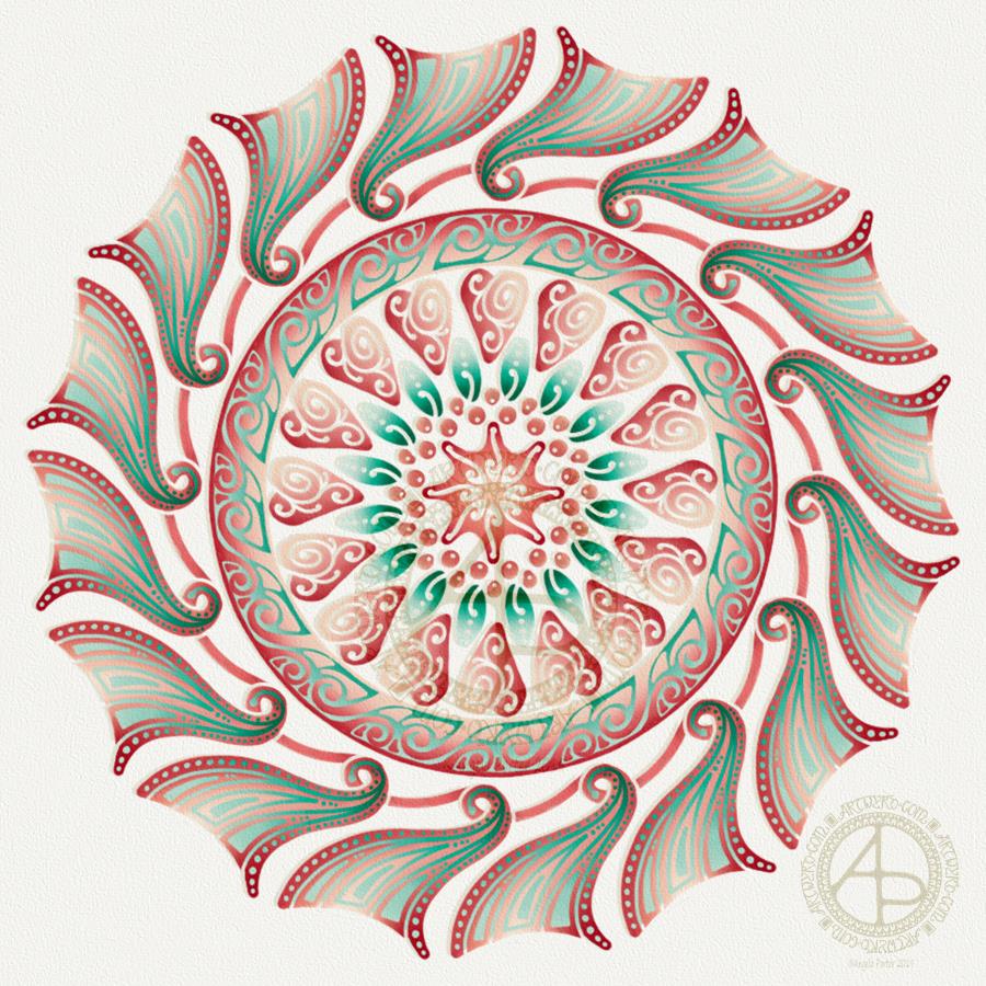
I actually quite like the neon colours on the black background. I have a feeling I’ll be doing more like this now my mind has worked out that I can do stuff like this digitally.

Will I be turning my back on more traditional art? Not at all! If anything, I treat digital art as if it is traditional art – the pen means I draw like I would on paper.  All it means is I have access to tools that make some styles a little easier, the ability to use colours and textures that would be difficult for me in traditional media possible, and the ability to edit without frustrating use of white inks a dream!

Don’t forget, I do tend to work directly in ink on paper, often with no pencil lines at all.

Joy is also an appropriate word as I share my artwork because I share my joy in creating it with others, and I trust that viewing it (and hopefully my witterings like this one) joy for you.

What doesn’t bring me joy is when I find my artwork is shared or used without my permission, particularly when people use it to make money for themselves without any regard for the creator of the work. I try to protect my work by watermarking it, signing it, sharing at a low resolution, but still I find people steal my work.

That is not joy. Not joyful at all.

It is stealing too. I don’t know where people get the idea that artwork shared by artists on the interwebs means the artists give up their copyrights.

We DO NOT give up our copyrights in any way.

I sometimes create ‘freebies’, but even then there are limits to how they can be used – personal use, not for resale either coloured or uncoloured, not for inclusion in publications, and so on.

People who steal work like this, and let me be clear it is stealing, make me feel very un-joyful and on the point of removing all my accounts where I share art so people can view it and enjoy it, sometimes even buy it, or prints of it or products with it on, but not to steal it and use it without my permission.

I’m sure those of you who read this will agree with me on this and don’t need to read it, but if my words reach just one person who takes the work of others for their own personal gain in someway, without asking permission of the artist, without even crediting them or providing a link back to where they got it from, stop to think about the harm and upset they are causing to those of us who want to share our joy in our vocation with others, then my words will have done some good. Pricked a conscience or two maybe.

Perhaps then the days of me getting upset and writing emails that go unanswered to websites where I find my artwork offered to others will stop, and there will be more joy.

I can hope this will happen.

Returning to the theme of joy rather than not-joy, I do hope you find my little artwork of today brings you some joy too. Do let me know if you’d like to see more like this, or if you have suggestions of words that you’d like to see in this kind of style!

Finally, do have a joyful day yourselves. Do something that brings you peace and joy, be it art, coloring, baking, reading, dancing, playing music, a sunset walk in nature … whatever it may be, do something joyful every day.