Sunday morning mandala

Mandala © Angela Porter | Artwyrd.com

It’s a sunshiny morning in South Wales. A welcome respite from the rain we’ve experienced most of the week. The cleanup and return to ‘normal’ continue after the flooding that occurred just one week ago.

I had no idea what I would create this morning, other it would be a mandala.

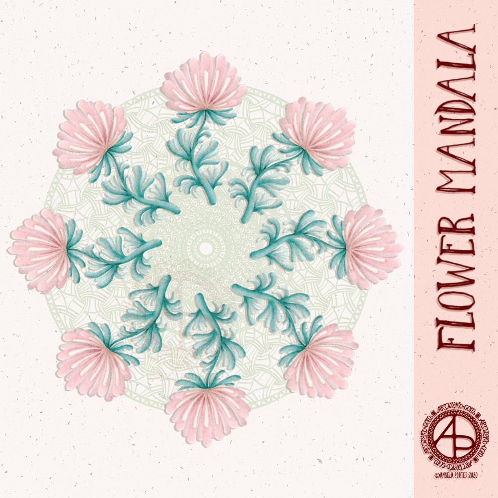
I drew and painted the design digitally using Autodesk Sketchbook Pro along with a Surface Slim Pen and Surface Studio, both from Microsoft.

This one has the floral centrepiece with a zentangle-style background. The flower is an unusual colour choice for me; I tend not to use corals and red tones much. It’s easy enough to change colours digitally, but I went with it, knowing that my colour choice reflects how I’m feeling at this point in time.

Yes, I do tend to create rather intuitively. This design didn’t start with a sketch, but with the first shape to be drawn, which was reminiscent of a petal. The rest of the design grew from there.

I’m surprising myself with how I’m able to ‘paint’ digitally. I enjoy creating more stylised forms, but with added texture and contrast to bring them to life. I know I’m not an expert at this; however, each time I work in this way, I learn more.

Today’s big lesson was how to save a brush style I’d edited and liked as a new brush for my brush library.

I’m glad I’m learning and developing my digital art voices and styles and that it’s happening slowly over time and as my needs demand. I know if I watched videos or followed tutorials on how all this worked, I would become incredibly overwhelmed and frustrated.

I also know that by watching what others do, I would likely be tempted to emulate their style and way of working.

I need to work out my own style/voice and be comfortable with it.
So, I’m not putting any pressure on myself to do something that I’m not yet ready for or haven’t had an awareness of what I could do.

Poppy Pods WIP

Poppy Pods WIP ©Angela Porter | Artwyrd.com

I’ve had a lovely, soothing, creative Saturday morning drawing, and this is the result so far.

I’m working digitally as I really wanted to give my new Microsoft Surface Slim Pen a workout. I have to say that I love it as it is so much lighter than the original Surface pen. It also has a different shape, which surprisingly sits well between my fingers. The lightness of the pen really does make it a pleasure to hold and use.

I am also in love with the way the nib glides across the screen. That’s one of hte issues I have with the interchangeable nibs that come with the original Surface pen – all but the ‘2H’ one is just too sticky for me to find pleasurable to use. I also don’t like the way the wear down relatively quickly either.

The Slim Pen is as responsive as the original Surface Pen and just as accurate.

All in all, it gives me a drawing experience that is very much akin to drawing on paper with a Sakura Micron, Uniball Unipin or Faber Castell Pitt artist pen. Having said that, the Surface pen does so too, except that it is much heaver than these pens and I prefer a lighter weight pen. Indeed, my arthritic-y joints seem to be happier with the Slim pen.

So, I’m a happy bunny with the purchase.

Unusually, I did a quick sketch to lay out where I wanted the pods and stems. And by quick sketch I mean the basic shapes using a digital brush.

Once I inked in the basic outlines of the poppy seed pods, I deleted the sketch layer and started to add detail with a flexible nib digital brush/pen. I still have a lot to add to this, but I’m quite happy with how it’s progressing.

Monochrome Monday Mandala

Monochrome Monday Mandala © Angela Porter | Artwyrd.com

This mandala took an unexpected turn as I was adding colour. I was experimenting with brush settings in Autodesk Sketchbook Pro, particularly the ‘colour’ setting. This will change the colour of any area, but preserves the shadow/light values. I thought I’d see what happened when I used grey as the colour, and I liked the monochrome that resulted. So, I completed the mandala in a similar way.

So, quite a different kind of mandala from me, and very different from my usual bold use of colour.

Lavender Mandala – a slow time video.

It took me some time, but I got the video edited and uploaded to YouTube. I’ve left it in real-time with the hopes that people will find it relaxing to watch.

I do have some things to learn about editing still. Not so much the mechanics but the aesthetics and flow of the video. I’m trusting that as time goes on and I make more videos that I’ll get to understand this a bit more.

I also need to try to control how I move the image around as I draw, and also placement of it on the screen. I created this mandala digitally, using Autodesk Sketchbook Pro, Microsoft Surface Pen and Microsoft Surface Studio.

One advantage of recording the screen, is that my hands and pen don’t get in the way of seeing what I’m doing.

I have to say that Movavi is quite simple to use, yet has plenty of features that are quite powerful. Cutting the video, adding music, intro and outro screens, as well as fades are really easy. I can also add transitions, which will help when I can focus long enough to edit out the crazy whirling bits of the video!

As with everything in life, learning to create videos is a work in progress.

I am hoping to get one video done a week. Well, that’s my aim. Life really can get in the way at times.

Lavender Mandala

Mandala © Angela Porter | Artwyrd.com

I’ve been busy this morning, working out how to video record the screen of my computer as I draw digitally.

I found a YouTube video about using OBS Studio to do this. I followed the instructions, problem solved, and after three attempts I had a poor quality video that I wasn’t happy with.

So, I went to Movavi, a video editor I’ve used previously. It has an app that will record the screen, easily. It’s a one button click to launch. A simple, small, and minimalist control panel sits in the bottom right corner of the screen. I can record, pause, start again easily.

I recorded myself drawing the mandala above. The video is currently processing and being saved. I’ll then need to edit it. The still of the video I can see while this is happening is of a fab quality it seems. So fingers crossed the video will be too!

I didn’t think to look at Movavi before Googling for advice on recording the screen. I did have to buy the software, but it wasn’t extortionately expensive and I’m sure that it will meet my needs.

So, once the video is saved, I can spend sometime today editing it and I hope to upload it tomorrow, as long as the recording is of a good quality.

Yesterday, I had a day out with my friend Liz. We visited Hay On Wye for a walk around and lunch. It was one of those glorious winter days where the sun shines warmly and the air is crisp and cool. It was mild enough for me to walk around without a bulky coat.

Art Quote

Artwork (c) Angela Porter | Artwyrd.com

This is a drawing I did late last night as I settled down to sleep. It feels quite disjointed in places, which was how my mind felt in it’s state of tiredness. Even though I was tired, I wasn’t ready to sleep.

I thought I’d work with it, adding a background and colour to it. I wonder if adding colour will resolve the disjointed areas as it breathes life into the design.

I’ve only taken a short time this morning to ad some colour. I do have to do other things today. The colour certainly helps to lift it from the background, as well as adding dimension to the design.

I’ve chosen fairly dusky, dusty, pastel colours which seem to glow against the darker background. The pinks remind me of faded Victorian velvets.

I drew the design traditionally, using a Tombow Fudenosuke pen and ClaireFontaine dot grid paper. The flexible nib of the fudenosuke pen results in lines of varying thicknesses, and a drawing that reminds me of linocuts or woodcuts.

After scanning the drawing, I removed the dot grids and cleaned up the drawing digitally before adding a background.

I felt this needed quote to go with it, and this one spoke to me today. For the typography, I used Affinity Publisher. The rest of the digital work is being done in Autodesk Sketchbook Pro, using a Surface Pen and Surface Studio from Microsoft.

My art is always ‘pretty’, it’s how I express myself artistically. Some of my inspiration for patterns and motifs comes from things that other smay not consider ‘pretty’, such as rust, run down old industrial machines, ruined buildings.

My art does, I think, speak of who I am. It shows what I’m interested in, what patterns, motifs, shapes, textures, colours, and so on that I find aesthetically pleasing. It also shows, to those who look and think a bit deeper, what things interest me, from prehistoric art to Romanesque architecture to La Tene and Celtic art to Illuminated Manuscripts to flora, foliage, fungi, and lichen to fossils and shells to nature in general, and more besides.

I work very intuitively. It’s when I think too hard about what I want to do that things go to wrack and ruin.

By letting my intuition flow, then drawings have a way of coming together in a way that expresses how I’m feeling and what is fascinating me or soothing me at that time.

This drawing is an example of how my feelings come out. It’s only now I can recognise how disjointed I was feeling within myself last night, how I was out of sorts. I think that’s why the art jars with me today as that feeling has now passed by, like clouds in the wind. It’s a drawing that shows the weather my emotions were experiencing yesterday, weather that just happened and has no real source for it.

Flower Mandala

Flower Mandala © Angela Porter | Artwyrd.com

This morning’s warm up art is this mandala featuring some flowers as well as some zentangle and geometric patterns.

I’m not entirely sure this works, but sometimes an idea just has to be tried out. The flowers are a bit ‘flat’. The zendala/mandala background may be a bit too busy or just not the right colour. I’m really not at all sure.

However, whether it’s worked out or not, it’s been a relaxing process. It’s always pleasant to create for the sake of creating, and also working digitally too.

I used Autodesk Sketchbook Pro, Microsoft Surface Pen and Microsoft Surface Studio to create this design.

Hello February!

©Angela Porter | Artwyrd.com

A new month and a new coloring template, exclusive to members of the Angela Porter’s Coloring Book Fans facebook group. If you’d like to download and print this template for your personal use, then pop along to the group.

The days are slowly lengthening here in the Northern Hemisphere. The first signs of nature waking up can be seen in the form of snowdrops and crocuses. It can also be heard in the raucous and beautiful birdsong.

To the template. I drew this on Rhodia dot grid paper using a Sakura Pigma PN pen. For my partially coloured version, I added a coloured background and colour digitally.

Inktober52 – Weeks 3, 4 and 5

Inktober52-Weeks 3, 4 & 5 © Angela Porter | Artwyrd.com

I managed to miss #Inktober52 weeks 3 and 4 so I thought I’d combine them into a sketchbook page along with week 5.

The prompts were
*week 3 – brick
*week 4 – snake, and
*week 5 – balloon.

I’ve not been imaginative with those prompts. I’ve included some sinuous snake borders and bricks. Some classic brick patterns. I’ve only added a smattering of balloons, and a repeating balloon pattern.

Of course, I’ve also practised my hand lettering.

I hand lettered and drew this page on ClaireFontaine dot grid paper and I used Uniball Unipin pens to do so.

I added the kraft paper background and colour digitally. It never ceases to amaze me that, as much as I love my line art, colour really brings it to life. I especially like the way the colours seem to glow against the kraft paper.

I’ve just had a giggle. I realised I coloured the balloon that is hanging down in leaden greys, almost like it’s filled with mercury. That was a totally unconscious decision of mine!

Visual Dictionary

©Angela Porter | Artwyrd.com

I’ve often mentioned my ‘visual dictionary’, so today I thought I’d show you a two-page spread from it.

I’ve kept a visual dictionary for a few years now. It’s where I keep a record of my favourite patterns, motifs, lettering styles and anything else of use to me when I need a little inspiration or to add something a little different to my art.

My original one is now just about full, and I thought it was time for a bit of a cull of patterns and motifs I wouldn’t use as I start a new dictionary. At the moment I’m working my way through zentangle patterns before I add my patterns and motifs. TanglePatterns.com is a fantastic online resource for zentangle patterns.

I’ve been drawing zentangle-style patterns since long before Rick Roberts and Maria Thomas developed Zentangle. I still like to dip into the resources for new ideas for patterns and motifs.

I’m using an A5 notebook with 5mm squared paper from WHSmith. It has quite a lot more pages in it than a Leuchtturm, Midori, or other A5 dot grid or squared notebooks, which is why I went with it. The paper seems to be pretty bleed-proof, and any ghosting is relatively minimal.

The past few days have had me needing some quiet time doing comforting, soothing art. I’ve had a very ‘people-y’ time of late, and it has left me quite drained. So, sifting through and drawing patterns and motifs and adding them to my new visual dictionary was just what my arty soul and overwrought emotions needed.

Doing this has the bonus of refreshing my creativity. Not only am I being reminded of patterns I like that I’ve not used for a very long time, but I’m also creating my own variations, either deliberately or as the result of some ‘happy accidents’.

Even though I’m trying to keep the pages neat and ordered and the patterns mistake-free, I find I’m not stressing if I make any mistakes. I find a way to either create a new pattern or to incorporate it into the design in some way. This is good for me as I tend to be hyper-perfectionistic if I’m not too careful.