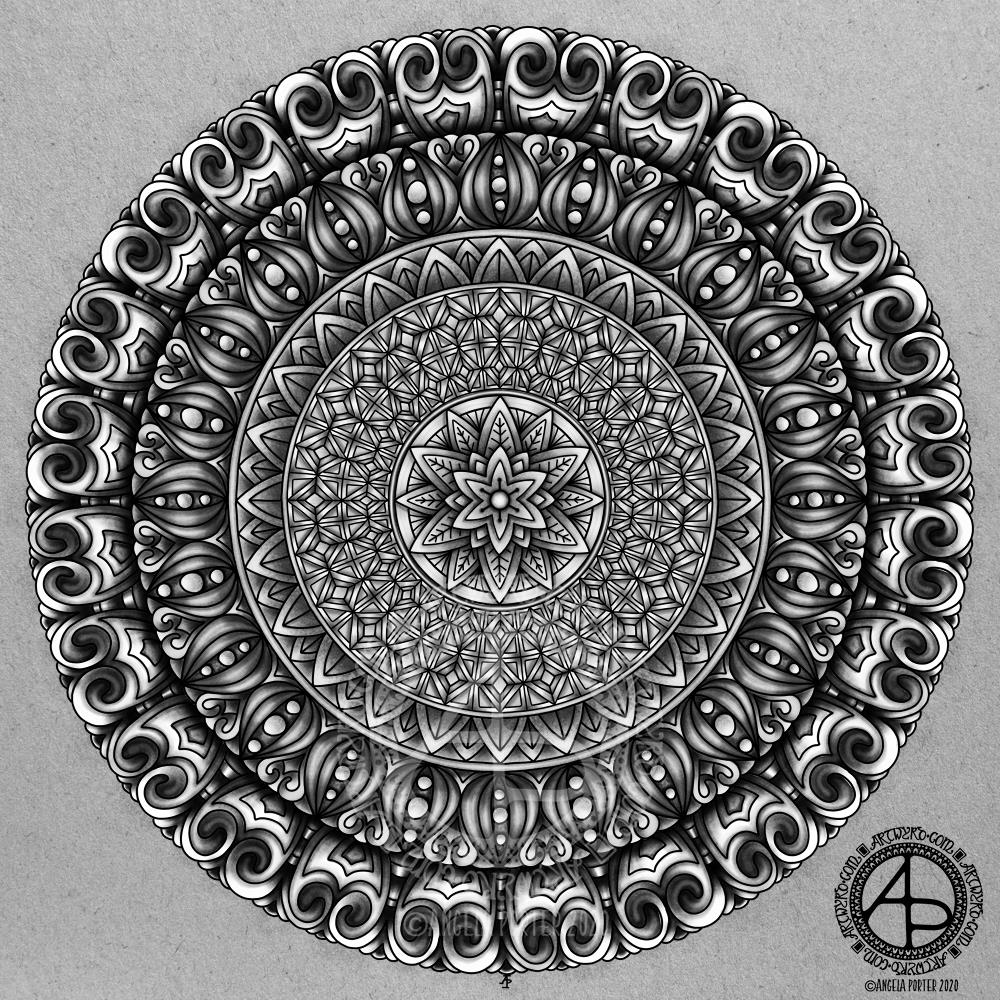
This mandala took an unexpected turn as I was adding colour. I was experimenting with brush settings in Autodesk Sketchbook Pro, particularly the ‘colour’ setting. This will change the colour of any area, but preserves the shadow/light values. I thought I’d see what happened when I used grey as the colour, and I liked the monochrome that resulted. So, I completed the mandala in a similar way.
So, quite a different kind of mandala from me, and very different from my usual bold use of colour.

I love it. The gray tones make it look like it is going to rise off the page! It looks almost like a carving not a drawing. It has so much depth and sculptedness ( if that’s a word).
I love opening this email most every morning. I don’t always comment on them but I so look forward to seeing your creations!
Kimberly
LikeLike
Thank you for your kind words. I’m glad you like it. I’m rather fond of this one myself 🙂 Trying to get depth and dimension into my art is something I love to do.
Thank you for letting me know you like getting alerted to my posts and enjoy seeing what I create. Your appreciation is very much appreciated.
Take care and have a wonderful day,
Angela
LikeLike