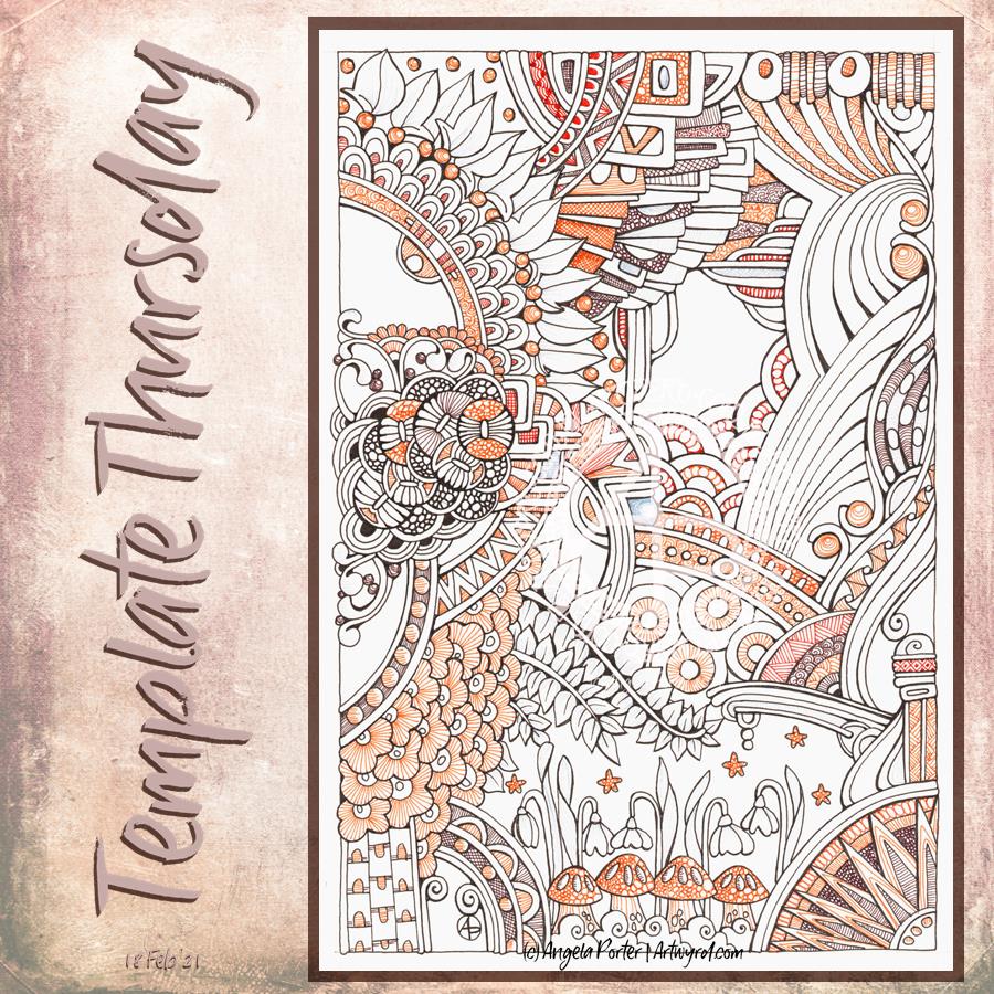
This week, I decided to create a coloring page / template that is in the ‘Angela’ Entangled style, similar to yesterday’s artwork.
I made the motifs bigger and less patterned for the coloring template, however. To add colour to my version of the template I used a mixture of brown fineliners by Staedtler and Stabilo. Instead of solid colour, I used patterns and textures to add colour and complexity. I did use a pale grey fineliner to add details to the snowdrops and leaves, but the scanner didn’t pick it up. Ho hum.
After I’ve had lunch, I may return to the drawing to add shadows to bring out some dimension and depth. I’m not sure what medium I’ll use, though alcohol makers may be the best option, perhaps. I’ll see how I feel when I get to it.
Of course this is the template of the week for the members of the Angela Porter’s coloring book fans facebook group. And this week there’s a challenge to colour this template, or another of their choice, in a monochrome colour scheme.
If you’d like to print the template and join in with the challenge then just pop along to the group!
I’ve been working on this drawing for the past three or four days. I finally finished it this morning. Here’s a list of materials used: A4 Daler-Rowney Bristol Board Copic Multiliners (05, 025, 02) Sakura Pigma Micron (01) Various shades of brown Stabilo fineliners Grey and sepia Uniball Unipin fineliners
I’m finally becoming comfortable with leaving open spaces in my art, though I still do like a clear border/edge. The spaces give a lighter, more airy feel to the design. I’m learning that I don’t have to fill every available space with pattern. I think that is a good thing.
I’m also really enjoying using shades of brown to add patterns to the design, and some grey too.
If you’d like to know where I started this drawing, it was with the small arrangement of boxes just above the blueberry-ish berries just above the left of centre. Everything else grew out from there.
I think this one is finished, though as I look at it now, I want to use a white Gelly Roll pen to add dots in places. Also, the shadows need to be tad intensified around the motifs to give the illusion of depth. I may use alcohol markers – Chameleons or Copics – to do this as the Copic Multiliners are alcohol ink safe.
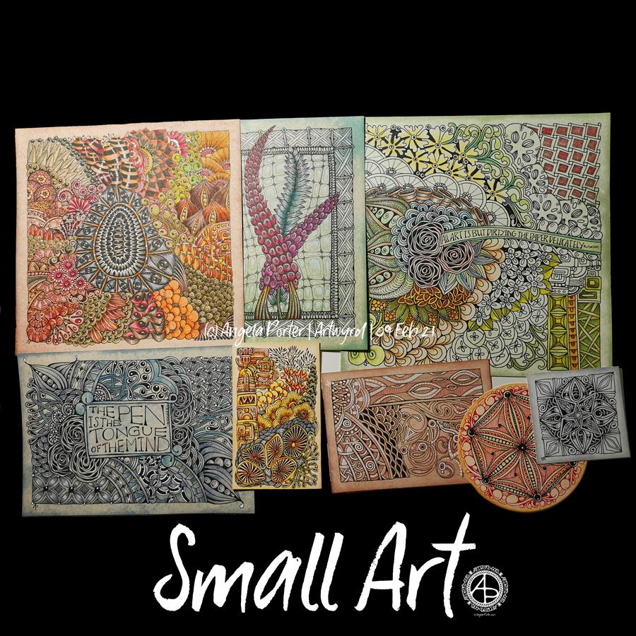
More small pieces of artwork today. These are perfect for when I’m feeling overwhelmed by a large sheet of paper. Also, they are sources of ideas for patterns and motifs for future work. I do need to spend some time with all this art and add some of the newer motifs and patterns to my visual dictionary/zibladone. Or, just stick them all into a sketchbook. At least then I’d know where they are!
It’s snowing outside. It’s cold outside, and warming up inside as I put the heating on a couple of hours ago. I think I may curl up in bed today with Din Djarin and Grogu. I still have three episodes of Season 2 to watch, and that sounds like a good plan to me!
I’ve enjoyed doing these! The squares are 3.25″ x 3.25, 3.5″ x 3.5″ or 4″ x 4″ in size. The circles are almost 3.5″ in diameter.
The tiles were cut from a variety of papers – watercolour, bristol vellum and heavyweight smooth cartridge paper. I used Distress Inks to colour the paper tiles before drawing on them.
I’ve used Sakura Pigma Micron pens (05 and 01), along with some brown and one blue-green Stabilio fineliner pens.
I like them all, But my favourites are the ones that are much more geometric in nature – my initials and the A in particular. My least favourite is the E; the background to the letter just feels disjointed. I think that’s why I like the more symmetrical, geometrical designs more.
I’ve enjoyed using one or two tones of colour to add variety, interest and ‘dimension’ to the tiles. I’ve not added any shadow or highlight to these. That’s when things tend to go wrong for me as far as traditional media is concerned!
It also occurred to me that if I were to draw these on a different shaped paper, I could add dangle designs to them. (My book “A Dangle A Day” is still available). Maybe I’ll try that out in a while. Of course, I’d like to get a full set of monograms done too.
I had a wee bit of trouble doing this week’s template for the Angela Porter’s Coloring Book Fans facebook group. This is either the third or fourth I drew, and the only one I think is just about good enough. I think that’s a reflection of the stress-comedown I’m experiencing after a week of trying to make a decision, which is actually more like months. I finally did it, and now I have to find that sense of inner balance and peace again.
Anyway. I drew this design on Bristol board with a 05 Sakura Pigma Micron pen. The colours have been added digitally. And after my messing around with Chameleon markers yesterday, I really enjoyed adding colour digitally.
I think it may be more or less time for me to abandon traditional coloring media! I always get so frustrated in using them very quickly.
Pen and paper is still something I love to use for drawing, so that’s not going to change!
Here’s just some of the smaller pieces of art I’ve done over the past week or so. They’re all entangled, zentangle, zentangle inspired. The biggest is 9″x9″, the smallest around 3.5″x3.5″ in size.
All have been fun to created, but I’m really not sure about colour choices, the backgrounds colours of the papers I used and so on.
I have yet more in the pile created over the past two or three weeks! They’ve been comforting to do, even if I’ve doubted myself with them and what I was doing. That’s often the case when my emotions are all over the place, as they still are to some extent.
All I know is that though it is bitterly cold outside, the sun is shining and I really do need to go for a walk, take in some fresh air, and blow some cobwebs from my mind. Well, that’s my plan. It may change once I’ve showered and so on!
Waking at stupid o’clock meant drawing until I could go back to sleep. I got all the inking done for this particular drawing. Now, the colouring needs to be completed.
Materials: 21cm x 21 cm (8.25″ x 8.25″) piece of Claire Fontaine Paint-on mixed media paper – natural colour Aged Mahogany Distress Ink and a piece of cut and dry foam to distress/grungify the paper 03 and brush Uniball Unipin fineliner pens 01 Sakura Pigma Micron pen Staedtler Triplus fineliners Chameleon fineliners Water brush White Sakura Gelly Roll pen
Started yesterday evening, worked on during my hours of mid-night waking, and on waking this morning, this measures 21 cm x 21 cm (approx 8.25″ x 8.25″) The paper is natural coloured Claire Fontaine Paint-On mixed media paper coloured with Aged Mahogany Distress Ink. The design is being drawn with a mix of 03 Unipin and 01 Sakura Micron pens.
I’m using a mixture of Stadedtler Triplus and Chameleon Fineliner pens to add colour to the design, along with a barely damp waterbrush to spread the colour out. Interestingly, some of the colour lines added remain visible, to a greater or lesser extent, depending on how much I work the colour with the waterbrush. Also, I’m finding that I really enjoy adding colour and texture like this.
The finishing bright white highlights are added using a Sakura Gelly Roll pen.
I find the fineliners used in this way give me much greater control over how much the colour spreads in the small areas in my drawing. They also don’t spread as much as, say, Tombow Dual Brush pens or Inktense pencils. That helps to control the spread of colour too.
I rather like the vintage-y look that the palette of browns and olive greens confers on the design, helped along by the background colour and texture of the paper.
Oh, I do intend to leave a ‘hole’ in this first layer of designs. I’m not sure I’ll do inside the space; a quote, more layers of design. For now I’m not sure. But once this first layer is done, I can scan it in and use it in different ways digitally.
There are lots of my favourite motifs appearing in this one, rather organic ones for the most part. What will appear from the tip of my pen in the rest of the design? I don’t know yet! It could be more of the same, or not. All I know is that the intricacy, detail and revisiting old favourite motifs is making my arty crafty heart smile.
Cognitive dissonance
“The state of having inconsistent thoughts, beliefs, or attitudes, especially as relating to behavioural decisions and attitude change.”
Finally, the penny dropped as to why I’m feeling so out of sorts. Oddly, it was while I was listening to a documentary about the cult NXIVM as I was drawing during the stupid o’clock hours of drawing. Don’t worry, I’m not a member of a cult! However cognitive dissonance was mentioned and that was the ‘ta-da!’ moment for me.
Cognitive dissonance causes emotional distress related to holding contradictory beliefs or values. I’ve experienced this before during breakthrough moments in therapy where I’ve had to accept that I was a victim of trauma, that I really do have CPTSD and I’m not (as my mother would tell me) making it up, for example.
I’m poised on a knife edge, wanting to make a decision to leave something, but feeling guilty about thinking that way. I need to find a way to find some clarity to help me make that decision, and it has to do with my core values and beliefs.
Recognising this doesn’t make me feel any better, but it helps me understand what is going on, and that understanding will help me work my way through it! Making a decision won’t make it any easier for me to act upon it as there’ll be a lot of guilt and the old reactive feeling of believing I’m letting other people down.
However, I can’t put other people ahead of my own mental and emotional well-being. It’s never been easy for me to say ‘no’ to people, to leave organisations or people who are contributing to emotional and mental distress in myself. But I have done so occasionally, more so in the last year or two. And I will do so this time if it’s what I need to do to find that sense of balance, harmony, peace in myself once again.
Note to self : Use a paper size that fits the scanner bed, or leave slightly larger margins.
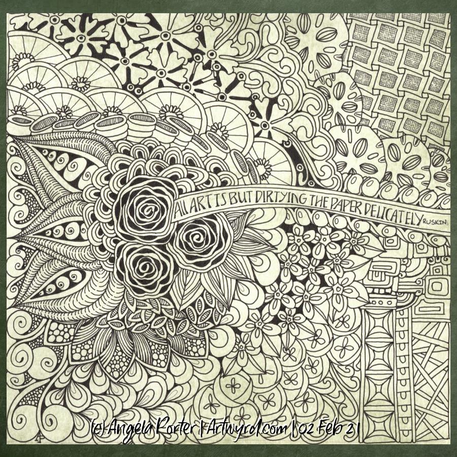
I found this delightful quote by Ruskin yesterday and knew I wanted to use it in a drawing. So I did. Some of my favourite motifs, and some I don’t often use.
For this one, I used Strathmore smooth Bristol paper and as I cut it down into a square shape, I forgot that the width was too big to fit my scanner.
Anyway, I used bundled sage Distress ink to colour the paper before setting to it with Uniball Unipin pens. I’ve not added any shadow/highlights yet.
I’m fairly pleased with the vast majority of this drawing. There are bits at the bottom right I’m not happy with. However, shadows and highlights may help to sort that out.