I felt the need to create a mandala today. Indeed I’ve not drawn a mandala for two or three weeks or so. A nice change for me, not just with the mandala, but working digitally after a while of working with traditional media.
Adding colour digitally makes me wonder why on earth I’m spending so much time struggling with traditional media – watercolours, coloured pencils, Inktense, and so on.
I think it’s the challenge, to work out how to make these media work for me. And to prove to myself I can work with them.
Still, I really do find working digitally a dream, but with it’s own challenges too. I know I have a lot to learn still, but in my own time. And I need to apply that to working with traditional media, though you’d think after 20 odd years of really focusing on arty pursuits I would’ve worked it out, wouldn’t you? Obviously not yet!
It may be that I have to work out which type of medium I work in depends on the purpose of the art. I think traditional media are more just for fun for me, for a change of pace, for a bit of a challenge, to use in sketchbooks and explorations of drawing/art, preparation for digital artwork even.
And that there, traditional media for fun, relaxation and preparation for digital work may be the function of traditional media in my artistic journey.
I’ve worked out that I enjoy drawing with pen, or pencil, on paper, though I do enjoy inking in sketches digitally too. Adding colour digitally to these drawings seems to work well for me.
I may come to a realisation that I really need to discard traditional colouring mediums in favour of digital colouring at some point in the near future, maybe reserving a couple for sketching trips out, perhaps. Only time will tell.
Except, I keep saying that, yet I keep on going back to the warring pleasure and frustration that comes with traditional media.
I may eventually work this out, or it may be a tug-of-war that I experience for the rest of my life.
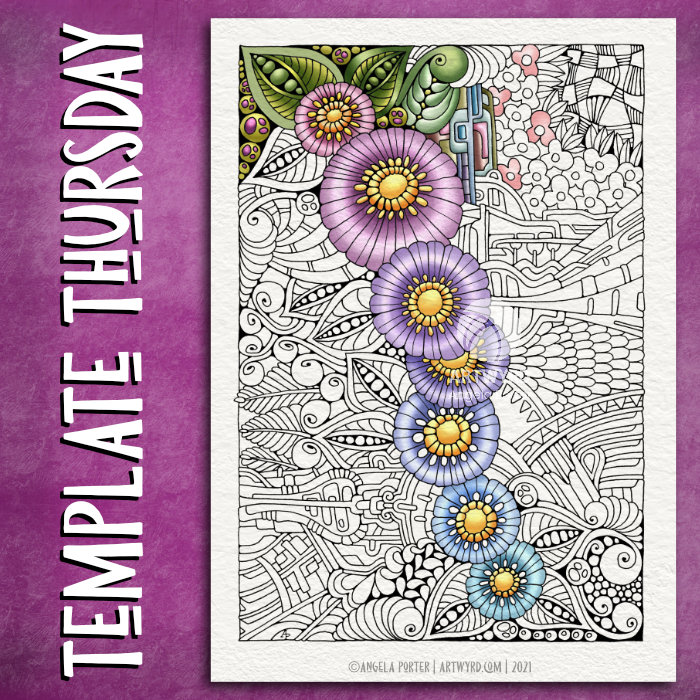
This week, the design is botanical, entangled and a tad on the abstract ‘mechanical’. As is my want, I’ve partly coloured the template to start to breathe life into it.
Drawn with Unipin pens on Claire Fontaine Paint On mixed media paper. Digitally coloured in Clip Studio Paint Pro.
I’ve also created a video. The drawing and colouring took me over 3 hours this morning, so I’ve sped the video up so it takes just a few seconds over 20 minutes.
Still not too well…
I’m feeling better today, but I’m still not right. My stomach/digestive system is still delicate and I have a headache on and off. I did get a bit more sleep last night, but not enough really.
Still, I’m on the mend and taking it easy again today.
Having said that, while this video was processing and then uploading and processing again in YouTube, I managed to edit two templates I drew on Tuesday and then ink in the one I wanted to use a symmetry tool to draw it. So, I’ve got some more templates done for the book I’m working on. The total is now 13 out of 31.
I don’t know if I’ll get any more done today. I’m flagging badly now and feel the need to sleep. I may have another mug of tea before I take a nap and see if that perks me up a tad.
Today, I finished drawing this entangled, zentangle inspired kind of floral/botanical design. I did start this yesterday afternoon, but continued it this morning before I settled back to sleep. I’ve had a poor night’s sleep thanks to yet another upset stomach, so after my Wednesday delivery from Abel & Cole, I drew and then settled back to sleep.
I’m still feeling very tired, my digestive system is still uncomfortable, delicate, upset. But I have to run an errand today. I’ll get to that soon enough and then I’ll see how I feel and how that dictates how I look after myself for the rest of the day. I suspect more sleep will be needed.
Anyways, this drawing is on an A5 piece of Canson Imagine mixed media paper. I used a 0.3 Unipin pen to draw the design, and I’m now adding colour using a fairly limited palette of Zig Clean Colour Real Brush pens: *green gray *pale dawn gray *olive green *deep green *ochre *bright yellow *pale rose *lilac *english lavender
I’m considering adding a couple of browns to this palette, as well as using some olive green over the grays.
These pens do move easily with a barely damp brush on this paper making it so easy to get a colour gradient. It’s also easy to add more colour to intensify the dark area.
In the vlog I talk about how the pressures of being constantly productive turned me into a workaholic when I was a teacher, and then fed negatively into my self-image which ultimately led to my burn-outs/breakdowns. I have learned that taking time for myself, to just be, to relax, to do things I enjoy, to look at ‘goals’ in a realistic kind of way to limit the pressure I put on myself.
I no longer have the external pressures of my career as a teacher, and one of the many hard lessons I’ve had to learn as part of my healing is how to value self-care time, and how that time can change from day to day. It’s so important for me, otherwise life’s own stresses and strains can take their toll on me and leads to physical, emotional and/or mental exhaustion or even ill-health.
Taking time to rest, to relax, is being ‘productive’, but in an important way. The productivity is investing time in one’s self and one’s own well being. And that is so very important.
This is why I take time nearly every day to create art just for myself, for the pleasure of creating, of exploring and experimenting, with no pressure on myself to create a completed work of art or for commercial gain. Just for the simple joy it brings.
Admittedly, I can fixate on art and forget about doing other things I enjoy, such as playing my flute, or learning to play my harp or tongue drum, or reading, or journalling, or even getting out for a walk, or combining my walk with sketching.
I know this is something I do need to work on for sure. But, like everything else, it comes together in it’s own way, in it’s own time, when I am ready to do so.
Today’s vlog is all about me trying out various media on different papers, particularly the Zig Clean Colour brush pens on Fabriano Toned paper.
Exploring different ways of working is important to me; it’s how I learn and work out what works for me. Often, I’ll return to media and techniques I may have tried in the past that didn’t work for me then, but now I can see how they could work for me, particularly in the context of a sketchbook.
In my disc-bound sketchbook, I’ve assembled various kinds of paper, mostly toned. Now, I’m working out what media would be good to have in a pencil case for sketching while out and about (when I finally become comfortable with out and about again!).
The Zig brushes and Tombow markers work really nicely on the Fabriano paper.
Late yesterday evening, my new set of watercolours arrived. I’m now the proud owner of a set of 36 tubes of Mijello Mission Gold Class watercolour paints, and a pretty neat palette too.
It was too late last night for me to think about adding the paints to the palette and setting up some colour swatches,. So I set to that this morning with a big mug of tea and a headache.
I used them to continue adding colour to this drawing, and I can easily tell the difference between the Mission Gold and Cotman Watercolours, not just because I know where I added each colour, but from the intensity and vibrance of the colours.
I know I got more vibrance from the Cotman colours when I was adding colour to this by adding water to the pans and letting them sit for a while to soften the pigments. But, it was so much easier with the Mission Gold to do this. Indeed, I had to be careful that I didn’t use colour that was too intense!
Some insight into watercolour and me
It was, and will continue to be, an absolute joy and pleasure to use watercolour paint tubes. I’m so glad I splurged out on them after I had a memory of using tube watercolours years and years ago.
They were such a pleasure to use, both to create the swatches and in adding colour to this drawing. Bear in mind that this drawing wasn’t done on watercolour paper, but on creamy coloured Arteza mixed media paper! Also, I created the swatches on SeaWhite all media cartridge paper, which is a lovely bright white colour.
Now, I realise that a lot of my frustration with pan watercolours is with getting colours intense enough for my taste. That won’t be a problem with the Mission Gold set I’m sure.
I also feel that exploring and learning more about watercolour and colour mixing is something that I’d like to do now, and that I may not be quite so frustrated as I have in the past.
Coloring Template doubts and frustrations
Yesterday, I got a couple more templates drawn and edited, so I now have ten out of the thirty-one I need completed, editorial team’s feedback allowing that is.
However, I was really doubting whether what I’d done would work, was good enough. So, I thought I’d try colouring the template I was least happy with to see if that made a difference to how I viewed it, and hopefully the others.
That really did the trick! Just by adding a background colour/texture first, I started to feel better about it. Once I’d added colour and the line-art started to come to life, I started to feel even more confident.
This is something I need to remember going forward, when I doubt my ability to create colouring templates. All I need to do is see if they work with colour!
A bonus was that I really enjoyed adding colour.
Vlogging along …
I touch on all these things in today’s vlog, as well as showing the swatches and adding colour to the drawing.
I’ve also decided that I’m going to mostly keep my vlogs to no more than around 20 minutes, whether that’s real time or a time lapse version. I think they may work the best, though I may still record longer ones if there’s a need to do so.
This morning, I started to add watercolour to the abstract drawing I started yesterday.
I spent over 45 minutes doing this, but I’ve sped it up and added music.
I’m not at all sure about the colours used. It may be the Distress Ink from the background interfering, or it may be that the Arteza mixed media paper is a creamy colour rather than white.
It led to me experimenting with colour, working out how to get more intense colours from the pans. Knowing that is what I’ve done is likely to mean I will put this to one side as a learning experience, some time to relax and enjoy being creative and not worrying too much about mistakes.
Still, I may persevere with this. Though it is yet another artwork that isn’t finished. I seem to be collecting art that I’ve not finished adding colour to.
I may have to question myself as to why I start but never follow through with so many pieces of artwork when it comes to adding colour. I never have a problem working on drawings that may take several sessions and many hours to complete.
Is it that I fear failure? Or is it that I loose the oomph if I don’t finish it in one session. Or is it that I worry I won’t remember what colours I used and how I mixed them? Perhaps it’s that I doubt my colour palette? Maybe it’s that I doubt my ability to work with colour? Or maybe it’s a combination of some or all of these.
For now, I don’t know for sure. But I do persevere, even in the face of the bleedin’ obvious yeuchy colours!
Other things
Yesterday, I managed to focus and get plenty of art done for the book I’m working on. Not only did I scan in and clean up the drawings I’d already done, but I have two new ones almost completed. I just have to finish inking in the second, then I’ll scan them in and clean them up and get them sent over to my editor for the team to critique/approve.
I really enjoyed the work I got done yesterday. It was easier to settle into it now I’ve decided that I’m going to work with pen on paper and use digital tools to clean up and edit the images. Except when mandalas are concerned, I’m still going to draw them digitally!
I felt really good about the amount of work I’d got done, even though I’d not had much sleep the night before and I still wasn’t feeling 100%.
I was hoping for a good night’s sleep last night. No such luck. I was awake again after just a couple of hours, all hot and bothered. So, I drew until I was ready to sleep again. And I only slept for a couple of hours then, waking headachy and tired again.
I started my morning off with a big mug of tea and some time to just watercolour, even with all the frustrations it can bring me. It’s about learning and practicing and experimenting with the medium to work out how it can work for me and my style of art. As always, it’s the choice of colours that seems to vex me so much.
Still, despite me often saying I’m giving up on watercolour and sticking to adding colour to drawings digitally, I keep going back to it, and other traditional media. This is, I think, as I do want to get out to sketch in old churches and abbeys, in nature, and museums. Although I’m happy to photograph what I see, there’s nothing quite like sitting with sketchbook, pens and/or pencils and taking quiet time out to just observe and draw for pleasure and relaxation. And I’d like watercolour to, perhaps, be one of the tools I can take with me.
I remembered yesterday, as I was playing with watercolour yesterday after finishing the drawing I started yesterday, that I found working with watercolour from tubes so much easier than the pans. Duh go me! So, I’ve ordered a set of Mijello Mission Gold tube paints and a palette that should arrive today. They’re not the top of the range sets from Mijello, but they should be good enough for me to work out if this is the way I want to go, and not too pricey either!
Then, my plan is to work out which colours would be useful for me in a travel palette and create such a thing.
Looks like I’m going to be spending some time setting up the palette that arrives today and swatching out all the colours. That’s kind of exciting!
First, however, I need to get these colouring templates inked in, scanned in, and edited before starting work on some more templates.
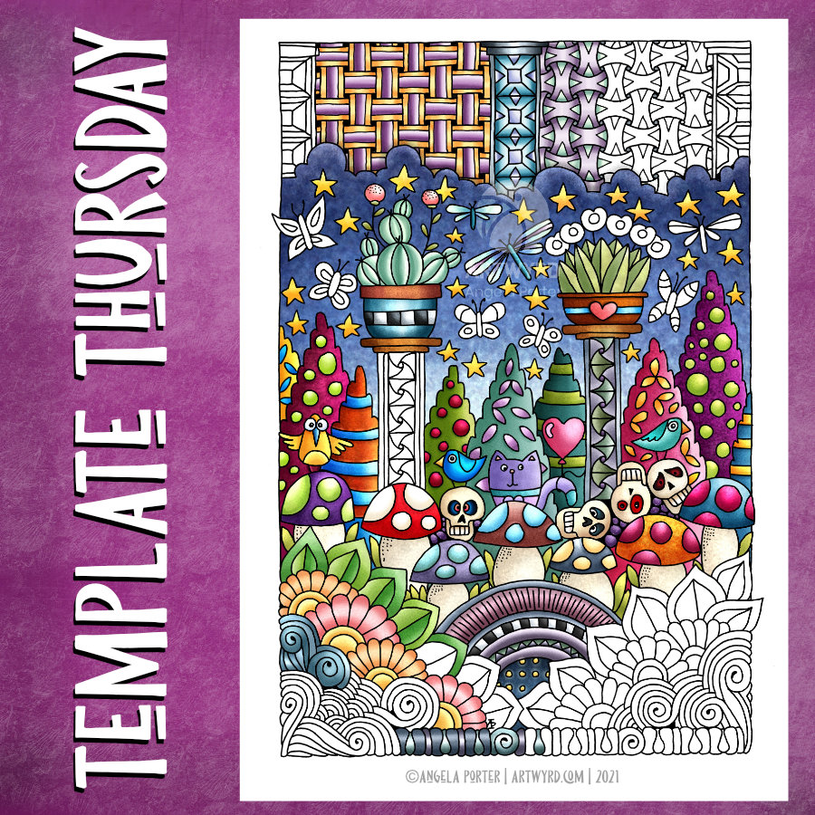
This one contains some zentangle patterns, some of my typically entangled designs, and some cute and whimsical elements that are reminiscent of Doodleworlds.
I posted somevideos yesterday showing me drawing this coloring template, or colouring page.
Good News!
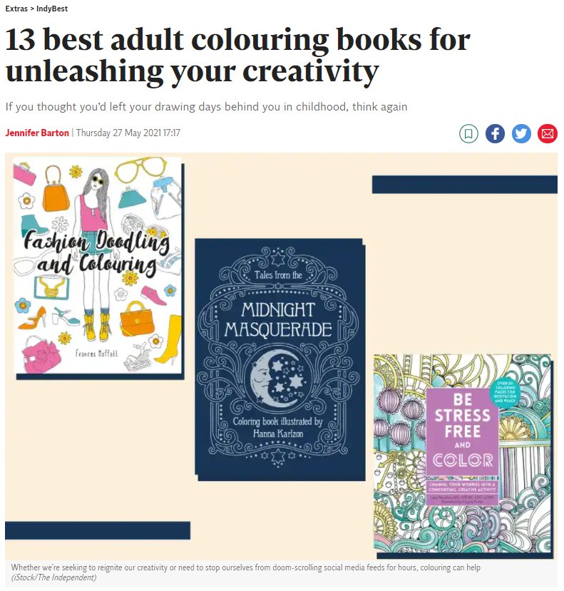
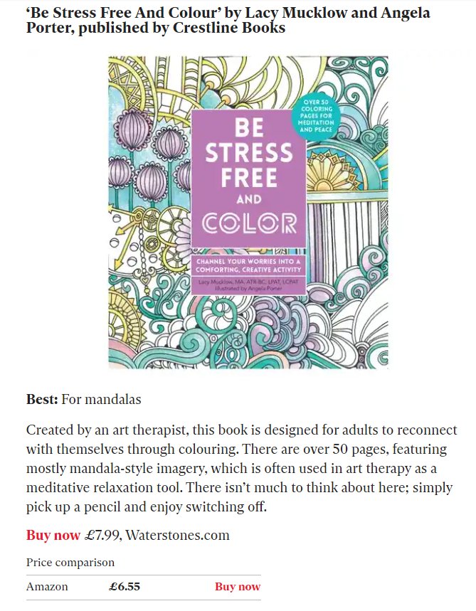
The good news bit is that Lacy Mucklow, the art therapist I worked with for the Color Me books, alerted me to the fact that our “Be Stress Free and Color” book is one of the best adult colouring books listed by The Independent, a UK newspaper. The book contains illustrations and text from the original books in the Color Me series.
It’s Wednesday, so one of my main tasks is to create a colouring template for the Angela Porter’s Coloring Book Fans facebook group. And as I drew this for my morning warm up art, I recorded it.
The time lapse version, which is about 15 minutes or so long, can be found via this link.
Yesterday, I wasn’t at all well. The usual upset stomach followed by a headache that needed sleeping off. The upset tummy had kept me up most of Monday night. What had caused it this time, I dunno. All I know is I slept a bit better last night, though I’ve been awake since 4:15 am and I’m beginning to feel rather tired again and my digestive system is still a bit tender. I’m sure I’ll be tickettyboo once again tomorrow.
It was lovely to spend some time this morning drawing just for pleasure. Don’t get me wrong, I do enjoy drawing for my publishers, but it’s different as there’s a lot more pressure on me to create templates that fit into a particular theme and their guidelines.
My weekly templates have no of those limits on them, so it’s a different kind of enjoyment.
There’s a lot of whimsical and cute elements to this weeks design, and I think that’s something I need to lift me up as I’m feeling a bit under the weather.
It was also a great pleasure to draw with pen on paper, and I think I’m going to have to do that with the templates for the book I’m working on. I get a much better sense of scale and overview of the design. Even when I scan a sketch in, I’m not all that happy with the digitally drawn version of it, usually.
So, that’s what I’m going to settle down to do for the rest of the day, once all my social media posts are done. Pen on paper, without the frustration I can feel when drawing digitally. Simple tools to focus on drawing ‘life size’ coloring templates.
And lots of tea is called for today, I think. Lots of good tea.
My morning warm up drawing was to do some more work on the entangled, abstract frame I started yesterday.
With fresh eyes, I could see I wanted to make the width of the design more consistent around the frame. So, my first job was to do a little bit more pen drawing.
Then, I could carry on with adding colour with Inktense pencils, the same colour palette as I used yesterday.
As is becoming my daily…habit? practice?…I also filmed the process and chattered away as I did so. And my chattering, rather, my thinking out loud actually helped me make some connections between my experiences of art from childhood through to the present day. And that helped me understand my perceived problems with using colour in drawings from real life.
I will need to spend some time with these memories and insights and journal later on. I can then work with them to help, hopefully, to overcome some blocks and difficulties in how I feel about my artistic expression. And then, hopefully I can become accepting of and comfortable with the way that I work.
I’ve been following a few courses on Domestika, and one of the common themes in the introduction by each artist is what has influenced them. Many go back to their childhood passions and how they have influenced their artistic voices.
That, I have discovered today, is so true!
Perhaps I’ll condense my words from today’s video at some point, once I’ve processed them myself. However, if you’d like to hear my thinking out loud while drawing/colouring today, then here’s the link to the video.
Having a bit of a break from the weird fish today. Instead, I drew this abstract, entangled frame and started to add some colour to it.
I’m working on A5 Arteza mixed media paper which has been coloured with Aged Mahogany and Rusty Hinge Distress Inks. The pen drawing was completed with a 0.38 Uniball Signo DX pen, which is both a consistent, fine line and is waterproof. I’m adding colour with Inktense pencils ( Red Oxide, Baked Earth, Crimson, Deep Blue and Sienna Gold).
I may add some more pen work as I work out if I’m happy with the inner space; I hope to add quotes to that space once the design is finished.
As far as the weird fish go, I have scanned them in and re-drawn them digitally using the vector drawing option in Clip Studio Paint. I’ve been experimenting with adding the shadows and highlights first then using different layer to add colour to the sections. I’m bumbling around with this at the moment, but I expect I work out how to get it to work in a way I like.
Yes, I know there are going to be tutorials out there that will show me how it can be done, and lots of ways of doing the same thing. However, by me bumbling and bimbling around the software, I’m learning more about it on my own terms.
Oh, I also filmed my drawing and adding colour this morning and the video is below. If you do choose to watch the video, then please choose to view it in YouTube as your view then counts to the channel stats, along with thumbs-ups! Cheers!